Thank you to everyone that participated in the Wildflower assignment. I know I "stacked the deck" a bit, since we were planning to be in Crested Butte at the time, and I really appreciate all of you that searched for wildflowers in other areas.
My
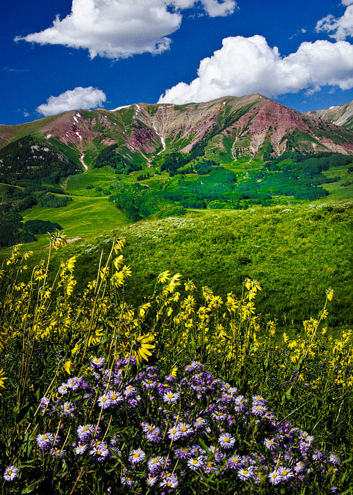
Brush Creek Road macro and
Wildflowers and Horses images were shot as part of my scouting for the workshop, and were intended to illustrate some of the possibilities in the places we would be visiting. As a matter of fact, these two images were shot from almost
exactly the same location (and with the same 85mm lens). This was a relatively small patch of wildflowers along Brush Creek Road; however the possibilities provided in this small area were almost endless, ranging from "grand scenics" that included the mountain ranges across the valley to "intimate landscapes," to flower portraits, and all the way down to macro images. I could have continued to shoot in this area for several
days and still produced images that were markedly different from each other. The variety of wildflowers to be found in this location was simply astounding. One could argue that we should have spent all three days of the workshop in this one location, and saved ourselves all the driving to different locations. Still, I have to acknowledge basic human nature, and invariably the workshop participants began to get restless after a couple of hours in the same location. A break, and a change of venue is often needed in order to get people back into the mode of being creative.
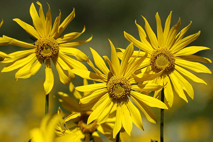
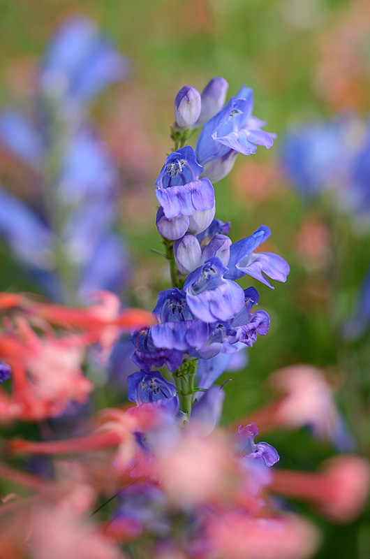 Brush Creek Road macro
85mm T/S macro lens, ISO 100, effective aperture of f3.2 (open to 2.8 on the aperture ring) 1/500 sec.
Contrasty mid-day light modified with a large 1-stop Wescott diffuser panel.
Photographed by Keith
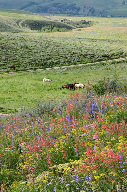 Wildflowers and Horses
85mm T/S macro lens with lens tilt applied to tilt the plane of focus along the horizon.
ISO 400, effective aperture of f13, 1/125 sec.
Photographed by Keith
Dave's
Grass Flowers at Sunset was another wonderfully creative image. I appreciate that Dave shared the techniques he used to create this image. Dave commented that "One way to get this is to use a long lens, wide open, shooting toward the light. I usually wait until the sun is behind some shrubs or trees. A shaft of light through the limbs is enough to create the circlular highlight. Compose and experiment to put it where you want it in the photo." I'm always inspired by the images where the artist arranges simple elements into an elegant design, and this image is one of my choices for
Editor's Choice for Artistic Merit.
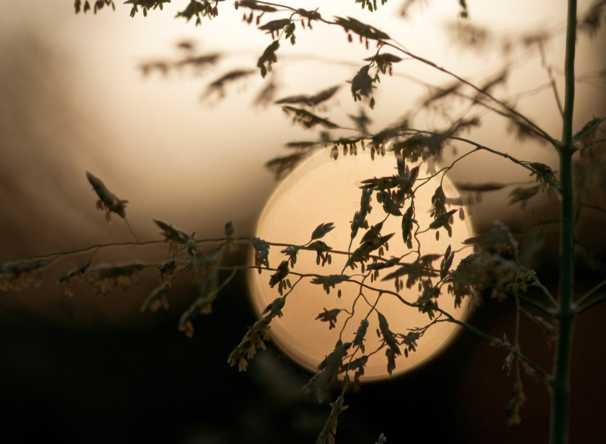 Grass Flowers at SunsetEditor's Choice for Artistic Merit
Photographed by Dave Leiker (prairiedust)
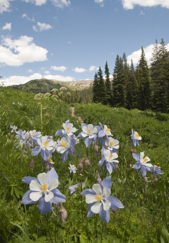
I don't think Sue realized how good her image of the columbines really is. Several people commented that they were looking for a composition like this during the workshop, but were never able to pull it off. Sue also mentioned that she was disappointed because her images never "looked right." I think part of that might be a white balance issue. Sue is halfway there in that she recognizes that the image just doesn't "look right." The next step is being able to pin down why. One clue is that the colors look "muted." This is a phenomenon that often happens when the color balance (white balance) is shifted too far in one direction. If the overall color cast of the image is too warm, cooler colors (like blue) become muted. So the key is to look at the image and try to determine which direction the colors are shifted. In this case, to my eye, Sue's image is too green, and too warm (yellow). I adjusted this by pulling the image into Photoshop and using the color balance adjustment to shift the image towards blue and then towards magenta. I didn't touch the saturation at all (or contrast) but the resulting colors seem to "pop" more because the cooler colors (blue) are no longer muted by the warm color cast. It's debatable whether my adjusted colors are shifted too much toward magenta. I don't think so, but maybe we're getting close.

I also added just a tiny bit of selective sharpening to the columbine to make them pop from the background and give the image more dimensionality. I've posted the modified image below Sue's for your consideration. I regret that we didn't have more time to process images during the workshop (isn't that always the case!), because I think folks would have been even happier with their images if they could have seen the processed results.
 Wildflower Workshop - Crested Butte
Photographed by Sue Pepin
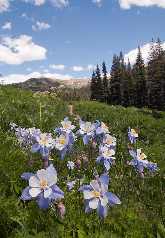 Wildflower Workshop - Crested Butte
Photographed by Sue Pepin, color balance corrected and slight selective sharpening added
Rick's
Glacier Lily was another gorgeous image, but again I thought the color balance was shifted a little toward green. (Traditionally we have thought of high altitude light as being a little cooler. Maybe it is a little greener too?) I brought the image into Photoshop and used the color balance tool to shift the colors a little toward magenta, applied just a touch of selective sharpening, and then while I had the image open I bumped up the contrast in the stamen a little bit to accentuate that important area of the flower.
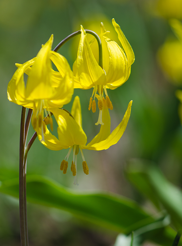 Glacier Lily
Photographed by Rick Pepin (TrvlRick)
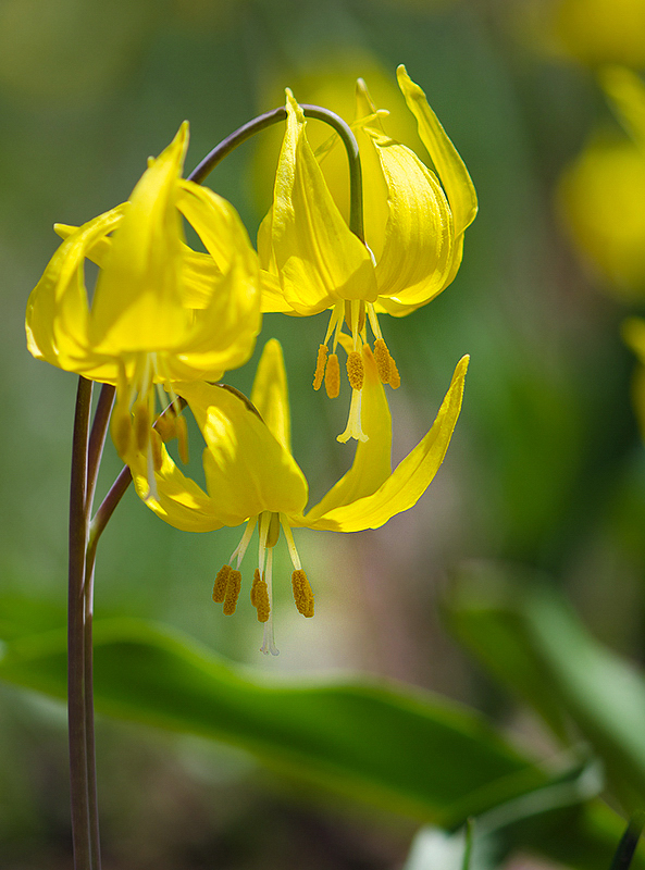 Glacier Lily
Photographed by Rick Pepin (TrvlRick), color balance and selective sharpening
I did the same for Tom's
Early Morning Light image. I now feel remiss in not emphasizing the use of a white balance target during the workshop. Whitebal (and other companies) make a small white balance card that you can place in the scene at the time of the shot and then use this card to "click balance" on to set the white balance of the image. After you have set the white balance of your image with the card included, you can copy this white balance setting to all of the images shot under the same light. It works well to correct color casts like we're seeing in many of the images from the workshop, and can take the "guess work" out of adjusting the white balance tint manually in your raw processor.
 Early Morning Light
Photographed by Tom Parrish
 Early Morning Light
(color shift towards magenta and selective sharpening)
Photographed by Tom Parrish
Marilyn's
Bee on daisy is a wonderful capture with great composition and framing (and great exposure and color too.). I looks to me like the focus was just a little off the bee, and I might have tried this shot with an aperture of f8 in order to gain a bit more depth of field. Remember that depth of field is reduced significantly with more magnification, and this image has quite a bit of magnification (with a long focal length lens shot close to the subject). Unless all of your subject is in a single plane parallel to your camera sensor, an aperture of f5.6 probably isn't quite small enough to give the depth of field needed for this level of magnification. Another alternative would have been to tweak the focus to ensure it was on the eyes of the bee, and let the areas of the flower go slightly soft. Still, this is a wonderful composition and a great capture. My suggestions are just recommendations that might make it a touch sharper next time.
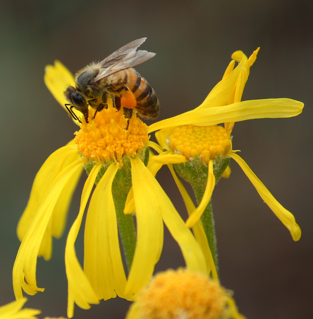 Bee on daisy
Photographed by Marilyn McKinney
Marilyn nailed the exposure in her
Hovering image, and the very strong (well balanced) composition make this a very captivating (and insightful) image. Given the need to prevent motion blur (and therefore maintain a decent shutter speed), Marilyn's choice of ISO and aperture were right on the mark. This image has nice clarity and color on the primary subject, and the focus falls off pleasantly into the scene. This was an outstanding capture Marilyn.
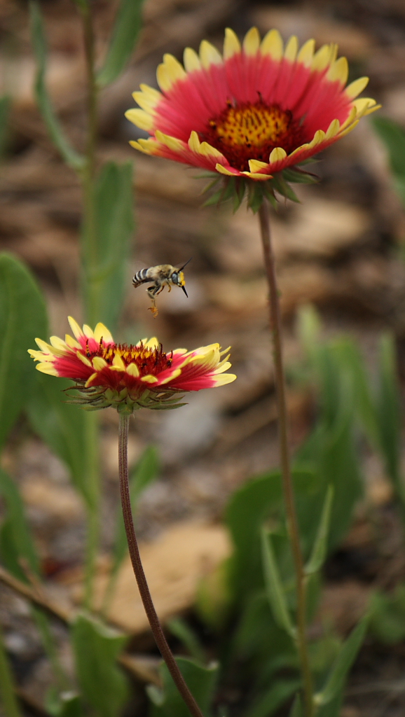 Hovering
Photographed by Marilyn McKinney
The saturated colors and strong contrast in Shee's series of images definitely helped them captivate the viewer's attention. These images had an HDR look to them (as if tone mapping and color boosting had been used to remap the colors and tones) and I should have asked Shee how she processed the images. Her
Sunflower and Flebane image was my favorite, with the rich "layers" of scenery providing a sense of depth, and the saturated greens and detail in the mountain serving to draw the viewer deep into the scene. The image was perhaps a bit too saturated for my taste, and I suspect that might have been partly due to processing the image on a display with a smaller color space or gamut than the one I am viewing the image on. The images were very reminiscent of the colors and contrast produced the the "classic" Fuji Velvia slide film, which was acknowledged as not being very accurate, but magazine editors loved it because of the "punchy" images that grabbed their viewer's attention.
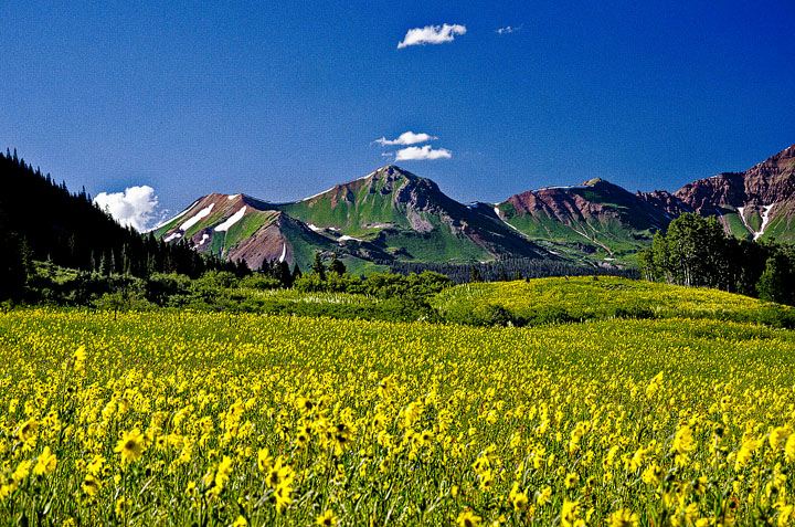 sunflower field
Photographed by Sheila "Shee" Anchetta (burzilai)
 sunflower and flebane, showy
Photographed by Sheila "Shee" Anchetta (burzilai)
 Fireweed plant @ Taylor Dam
Photographed by Sheila "Shee" Anchetta (burzilai)
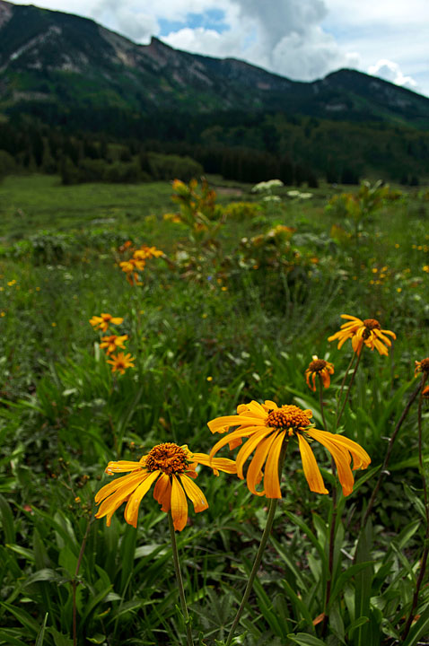 Orange Sneezeweed
Photographed by Sheila "Shee" Anchetta (burzilai)
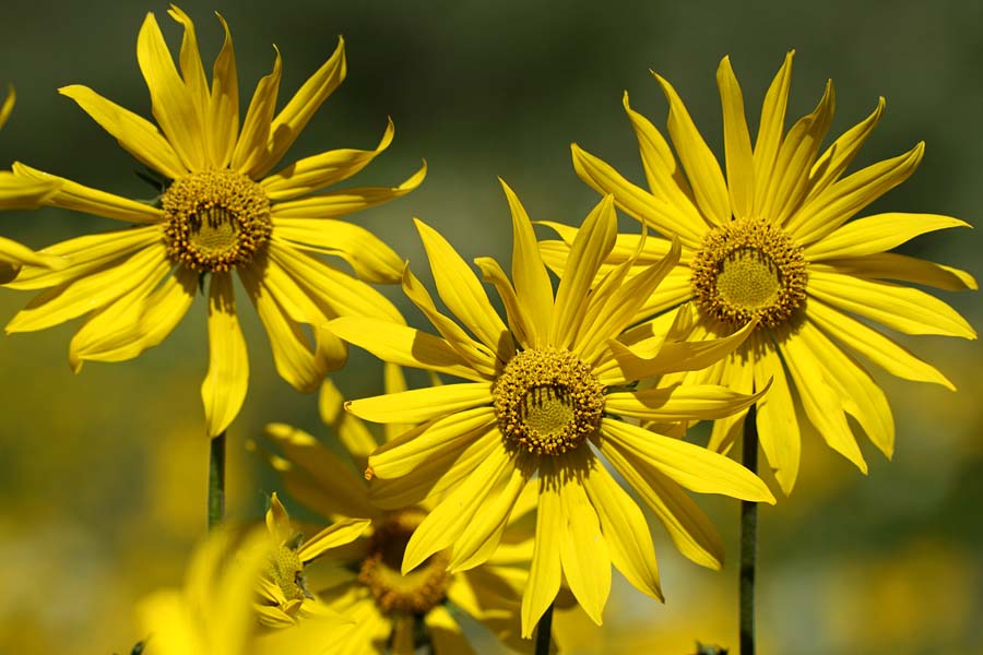
The last three of Rick's images in this thread are ones that I pulled in from the Crested Butte folder because I thought they should be considered in the assignment. Rick's
Sunflower and Lupine image was voted
People's Choice and selected as
Editor's Choice for Artistic Merit. Rick created this image by finding a subject with a lot of separation between the foreground and background. The out-of-focus lupine in the foreground were about three feet (one meter) in front of the single sunflower, and the sunflowers in the back were about 2.5 feet back from the single sunflower. This enabled Rick to frame the sunflower with a soft wash of color. By adjusting his aperture and viewing the results using his depth-of-field preview, he was able to adjust the aperture/depth-of-field to get just the right amount of "impressionistic" detail in the foreground flowers. There were an almost infinite number of variations of this image available for the making in this mixed field of lupine and sunflowers, and I think everyone that tried this came away with unique images (with a similar impressionistic feel). I think everyone found that they were more successful by using a telephoto lens in the 300mm range. This enabled them to use a smaller field of view and better isolate the subject against a small portion of the foreground and background. Everyone found that small shifts in camera position, focal length and aperture could make a very significant difference in the design of the image. In several images we "tweaked" the camera position so that the single sunflower was in front of a group of lupine, making the primary subject stand out from the background even more. It was also fun to play with different sunflowers "peeking" through the lupine (like the one in the lower left of this image). This is a wonderful image Rick, and you should play with this technique more in the future.
 Sunflower and LupinePeople's Choice
 and
Editor's Choice for Artistic MeritPhotographed by Rick Pepin (TrvlRick)
Rick's
Waterleaf Ballhead was another beautiful image with wonderful clarity, color and pleasing bokeh (softly out-of-focus background). Simply outstanding...
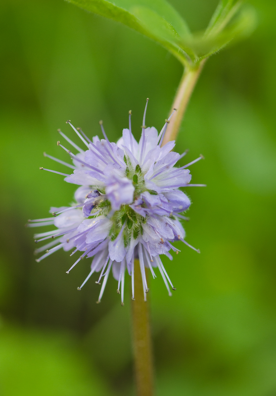 Waterleaf Ballhead
Photographed by Rick Pepin (TrvlRick)
Rick's
Sunflower was another outstanding image, with a very strong composition, excellent clarity and color and a very pleasing softly out-of-focus background that provides just the right amount of "context" without being distracting. This combination really makes the subject pop. Very well done Rick.
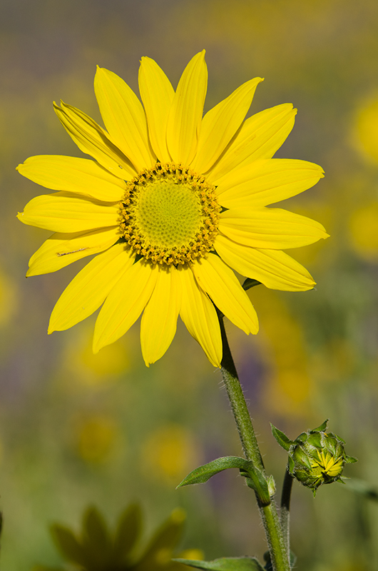 Sunflower
Photographed by Rick Pepin (TrvlRick)
Thank you again to everyone that participated in this assignment. I really enjoyed learning from all of you, and viewing your beautiful and creative images.
Keith


