Thank you to everyone that participated in the "Contrast" weekly photography assignment. The
guidelines for this assignment were to use varying contrast throughout the composition in a conscious effort to
direct the viewer's attention towards the center of interest.
Lars started of our assignment submissions with his intriguing
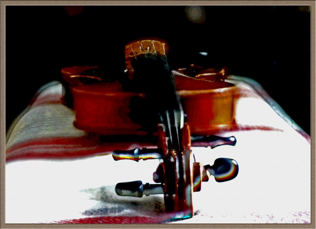
Violin contrast image. I thought this was a great experiment to see how different contrast areas in the image draw our eyes. I found that my eyes were initially drawn towards the highest contrast area on the right side of the image. This is one of the very few examples I have seen where my eye was primarily drawn to the "empty space" in an image, and it produces a very interesting effect that I might try to incorporate into a future composition. I could envision this as a useful method to provide a sense of depth in an image without including concrete elements that would distract from the primary subject. In this image, my eye goes to the high contrast area on the right, and then travels to the pegs, and then to the violin itself, illustrating that this is a useful technique for guiding the viewer's attention to specific areas of the scene. Dave described this image very aptly when he observed that "there seems to be an abstract quality in your photos that has a musical touch."
a
Violin contrastPhotographed by Lars
Dave's
Sunflower Bud image was a great example of composing an image to capitalize on a bright, high-contrast area to "highlight" the subject. I like that this image was deliberately constructed to take advantage of the backlight in order to illuminate the fibers and veins in the sunflower. The shallow depth of field was very effective at isolating the subject from a potentially distracting background, and the image is further improved by that almost "signature" vignetting that Dave often adds to help keep the viewer's gaze contained within the scene (and further reduce any potential distraction from background elements around the periphery of the frame). I've awarded this image
Editor's Choice for Technical Merit.
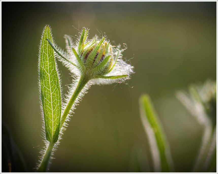 Sunflower BudEditor's Choice for Technical Merit
Photographed by Dave Leiker (prairiedust)
Michele's series of images of the abandoned house was an interesting exploration of how contract can be used to draw our attention to areas within the scene. In her
Old Door image, my eye was drawn first to the exposed bricks above the window, and then to the window itself. I thought Michele did a good job of toning down the color saturation of the grass to prevent the viewer's eye from being distracted by that portion of the image. This was a nice, well-balanced composition.
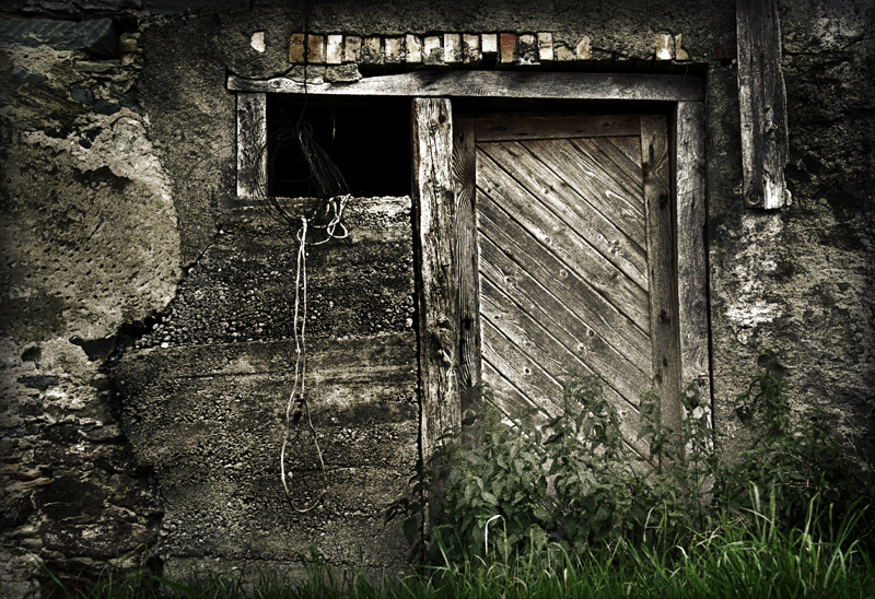 Old door
Photographed by Michele Bollhalder
Michele's
Window image was perhaps a bit stronger, primarily due to the simplicity of the composition and the contrast around the window that served to draw our attention to that feature. This image wasn't as well balanced as the first, but perhaps that worked to an advantage, since the slightly off-balance weight of the elements in this scene help to evoke an "unsettled" feeling in the viewer, which is consistent with the abandoned building.
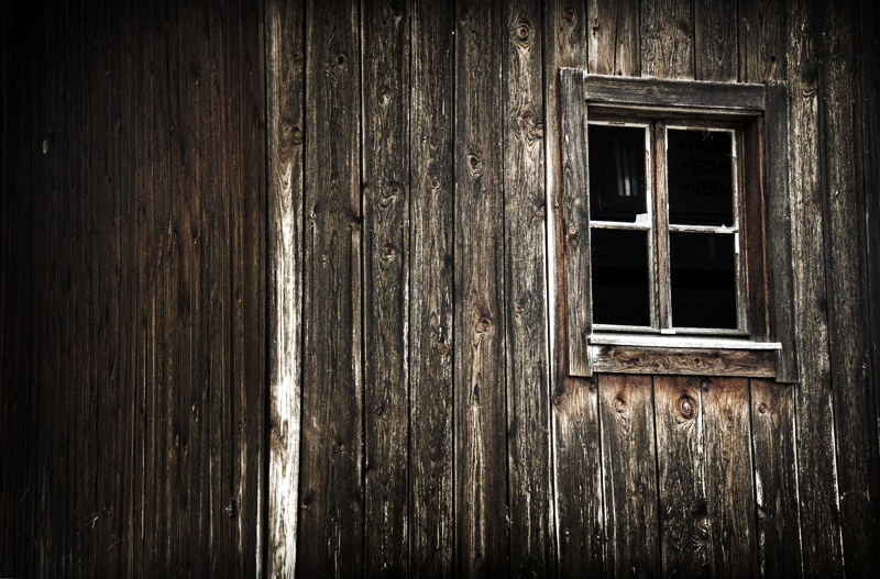 Window
Photographed by Michele Bollhalder
Michele's
Abandoned image was the strongest of the three, and used variations in contrast very effectively to draw the viewer into the scene. It was interesting to see different iterations of this image as Michele worked with it during post-processing. This version emphasizes the contrast around the window, and helps to highlight the ladder leading into the window, inviting the viewer to explore, if they dare... I suspect that Michele used a technique of "painting" a lighter layer onto a darker layer in order to highlight specific portions of the image. Hopefully Michele can tell us a little more about the techniques she used. This is a very successful image, at once "inviting" and haunting at the same time, provoking both the viewers desire to explore, and fear of unknown dark places. This image was selected as
People's Choice, and I have awarded it
Editor's Choice for Artistic Merit.
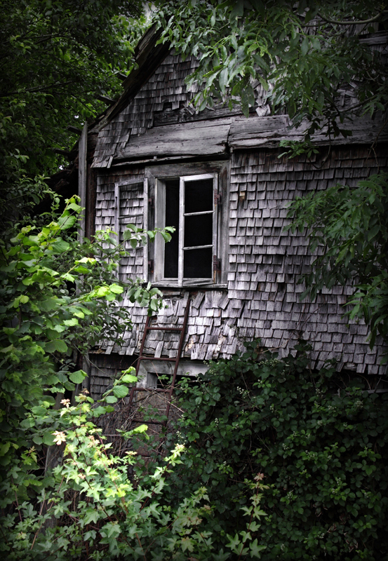 Abandoned
Photographed by Michele Bollhalder
People's Choice and
Editor's Choice for Artistic MeritRick picked a great subject for a study of contrast with his
Aspen Trees image, and his decision to convert this image to black and white was a very good decision. Simplifying the image to black and white really helps bring out the fine texture in the bark of the tree. I do find the out-of-focus tree in the center to be a bit distracting, and would have enjoyed seeing a version of this image (perhaps framed even tighter) that really highlighted the texture in the tree on the right. Rick did a wonderful job controlling the contrast in this image to produce a very pleasing tonality on the bark of the aspen.
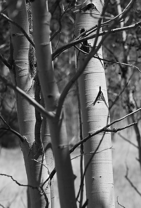 Aspen Trees
Photographed by Rick Pepin (trvlrick)
Lars' image of
The Blockmaker's House is a great example of how window light can be used to add depth to a scene, drawing the viewer through the scene toward the light. This was a challenging high-contrast scene, and perhaps a bit too much for the camera's sensor to handle without using HDR techniques, so in this case I think Lars made the right decision to select an exposure bright enough to show detail in the room, and let the window light be over exposed.
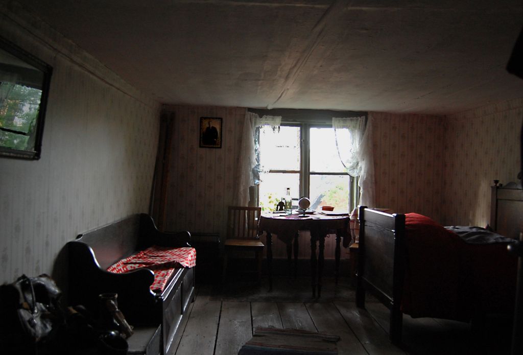 The Blockmaker´s House
Photographed by Lars
Dave's
Wagon Driver image was an outstanding rendition of a high contrast scene. I love the way Dave processed this image to produce a clean and simple "illustrator" look. In the "Rockwellesque" assignment, Dave talked about that "trademark Norman Rockwell clarity of composition" and this image has it in spades.
Outstanding image Dave!
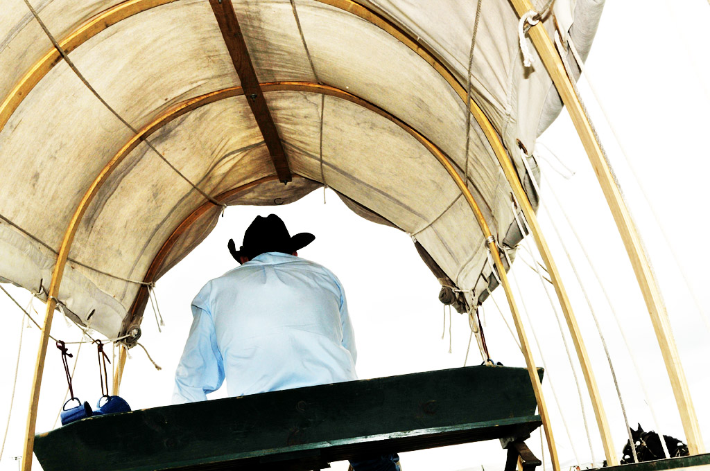 Wagon Driver - color
Photographed by Dave Leiker
My
Bluegrass Jam Session image was an attempt to rescue an uninspiring scene taken under flat light, and use contrast adjustments to reduce the prominence of the audience in front and try to draw the viewer's attention to the musicians in front of the cafe. If I were "on assignment" to capture images of the jam session I would have been embarrassed to submit the originals, and converting to black and white was one way to "rescue" the image.
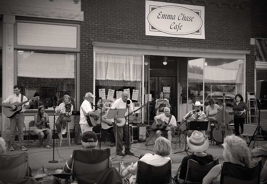 Bluegrass Jam Session
Photographed by Keith
The more I looked at Marilyn's
Green Eyes image, the more I grew to like it. While it's true that the bright green eyes were the center of attention, the other parts of the image came together very well to contribute to the whole, and even the tendrils of branches drooping over the wall added to the "Stephen King" feeling of this image.
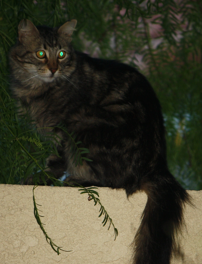 Green Eyes
Photographed by Marilyn McKinney
Rebecca did a great job transforming a lackluster image shot under flat light into a nice "story telling" image for her
Sowing Weeds image. It was useful to be able to see the original, and then see how she improved the image by cropping and adjusting the contrast.
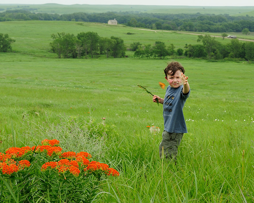 Sowing Weeds
Photographed by Rebecca
Thank you again to everyone that participated in this assignment, and especially to Dave Leiker and Michele who provided such wonder full examples of how we can use varying contrast throughout the composition in a conscious effort to direct the viewer's attention towards the center of interest.
Viewers are encouraged to respond to this thread describing why you like a particular image, or think it was particularly successful at meeting the guidelines of the assignment.
Keith


