Thank you to everyone that participated in the "Black and White" assignment. The guidelines for this assignment were to create a black and white image that focuses the viewers attention on the shapes, forms and textures of your subject.
I thought Dave Leiker's
Just Beyond the Corn Rows image was very effective at evoking a feeling of a bygone era. Dave used several compositional elements, including the barren windbreak partially obscuring the farmhouse, the mist, and the sepia color to evoke the sense of an isolated, desolate farmstead. I thought it was interesting that Dave "broke the rules" with this image by obscuring the primary subject. In this situation that technique helped to reinforce the desolate feeling, and so was effective at producing a sense of time and place consistent with the subject. Well done.
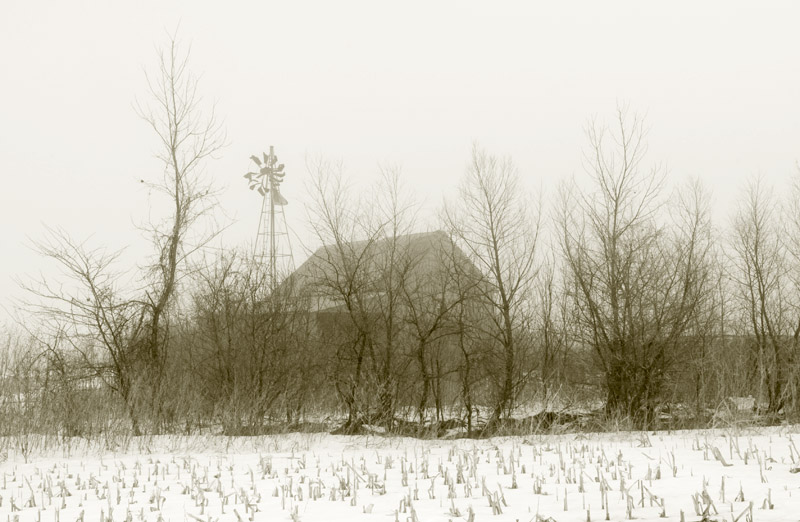 Just Beyond the Corn Rows
 Photographed by Dave Leiker
I liked Becky's
Flutterby image, and thought she did a great job capturing a sharp rendition of the butterfly. Normally I would question the choice to display this image in black and white, since the color in the image conveys important information about the subject (a viewer would use the color to identify this as a Yellow Swallowtail), and it's context (a viewer would need to know the color in order to positively identify the type of flower). However, once I looked at the image a little longer, I recognized that the absence of color placed much more emphasis on the patterns in the image, causing me to pay attention to an aspect of the butterfly that I hadn't paid much attention to in the past. When making the choice between color or black and white, it is important to consciously decide what aspects of the subject you what to emphasize, and then choose the medium that emphasizes those attributes the best. This image succeeds as a somewhat abstract image of a butterfly, placing strong emphasis on the patterns in the butterfly's wings.
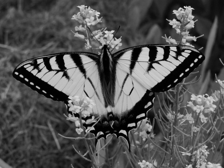 flutterby
 Photographed by Becky Jenner
The same comments hold true for Becky's
dawns early light image. There is so much symbolism and meaning associated with the colors of the flag that I normally would question the choice to display the flag in black and white. Choosing to display the flag in black and white implies a conscious decision to "neutralize" this symbolism, perhaps in order to focus our attention on other aspects of the subject. I do notice the folds in the flag more than I probably would if the image were in color.

I suspect that Becky was just experimenting with black and white and the flag was a convenient subject?
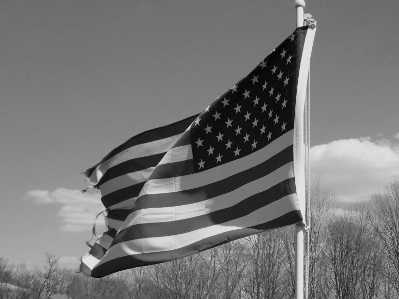 dawns early light
 Photographed by Becky Jenner
Becky's
Lissa & Beefy image was one of my favorites from this assignment (and others' as well, since this image tied for
People's Choice). In this case, converting the image to black and white doesn't remove any important information about the subjects, and removes potential distractions, letting the subjects personalities shine through. The soft light on the subjects translated well to black and white, providing a relatively smooth gradient in shadow tonalities that allows us to perceive the 3-dimensional forms of the subjects. The tight framing in this image made for a very strong composition. (Notice the "rule of thirds" placement of the primary subject.) Very well done! As a very minor critique, the image could be improved with more "separation" between the tonalities in the kitten's head and the background. I've awarded this image
Editor's Choice for Technical Merit.
 Lissa & Beefy
 Tied for
People's Choice.
Editor's Choice for Technical MeritPhotographed by Becky Jenner
I would like to have seen Sue frame the scene much tighter in her
Stream Trickle image. It is important to remember that our eyes are drawn to the highest contrast portions of the scene, which means that in this case they are drawn to the high contrast between the trees and the bright sky, stealing our attention away from the primary subject of the stream.
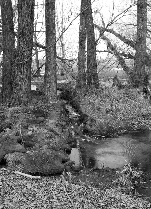 Stream Trickle
Photographed by Sue Pepin
This is a small crop of an already small JPEG file, but hopefully you can see the possibilities in framing the scene much tighter and focusing the viewer's attention on the stream and small pond.
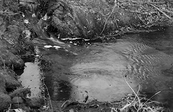 Stream Trickle
Photographed by Sue Pepin, cropped by Keith
Rick Pepin's image of the Old Mining Village was a great composition of a wonderful subject, but the tonalities on the wood were too dark for the viewer to perceive much of the texture in the weathered old wood that gave this village it's character. (Physiologically, we are able to perceive more detail in "mid-tones" and progressively less detail in dark or light tones. If we want to preserve detail in an object, it is important to reproduce the subject as close as possible to mid-tone.) When I opened the image in Photoshop, I realized that part of the problem was due to the color space, which was defined as "working gray." When posting images to the web, it is still best to post black and white images in sRGB color space in order preserve the tonalities as much as possible.
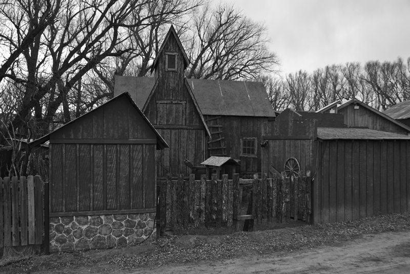 Old Mining Village
 Photographed by Rick Pepin
Converting Rick's image to sRGB enabled the weathered wood to display with a tonality closer to mid-tone; however, I still felt the image could be improved by adjusting the tonalities.
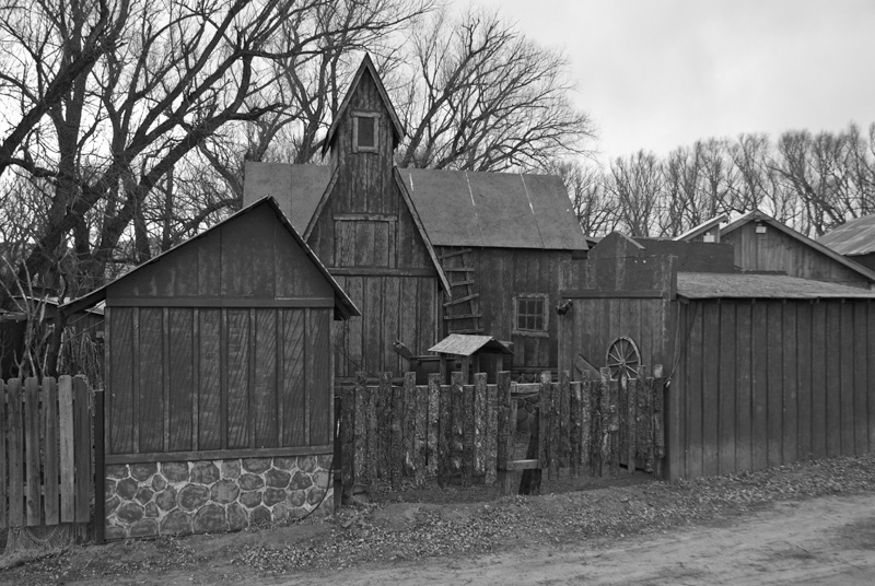 Old Mining Village
 Photographed by Rick Pepin, sRGB
I asked Rick for a color version of the image because I wanted to discuss another method of conversion in Photoshop that allows the photographer to adjust the tonalities in the black and white image based on their "vision." The black and white conversion tools in Photoshop (Image=>Adjustments=>Black and White) allow photographers to apply "filters" just like they would have in the old days of black and white film in order to control the contrast and modify the tonality of specific colors within scene. In this case, I chose to apply the "high contrast red filter," which brought up the tonality of the weathered wood into the tonal range where we can begin to perceive more detail and texture. I encourage you to experiment with the "filters" available under the Black and White image adjustment options in Photoshop to see how the different filters can affect the tonality of various colors within your image. Here's the conversion with the "Black and White" image adjustment tool and a high contrast red filter applied (and a little selective sharpening). In this version I can finally see the wonderfully crooked ladder that I thought was so endearing in the color version of this image.
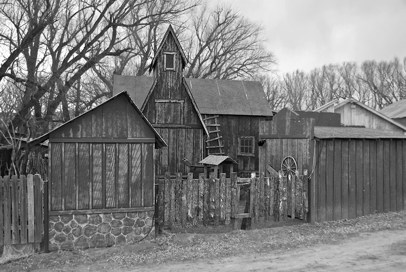 Old Mining Village
 Photographed by Rick Pepin, B&W conversion by Keith
Lar's choice of subject was a great match for the black and white assignment, since the conversion to black and white helped emphasize the interesting forms and textures of the snow. This was a very nicely composed image.
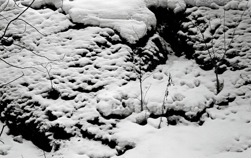 A snow cave
 Photographed by Lars
I really liked Sheila Ancheta's
Looming Storm image, but again felt the tonalities could be adjusted to better emphasize the storm clouds. I asked Sheila for a color copy of the image and then applied the "blue filter" in the Photoshop black and white image adjustment dialog. Her original image is shown below, followed by the image with the "blue filter" applied.
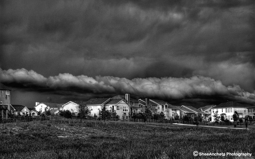 Looming Storm
 Photographed by Sheila Ancheta
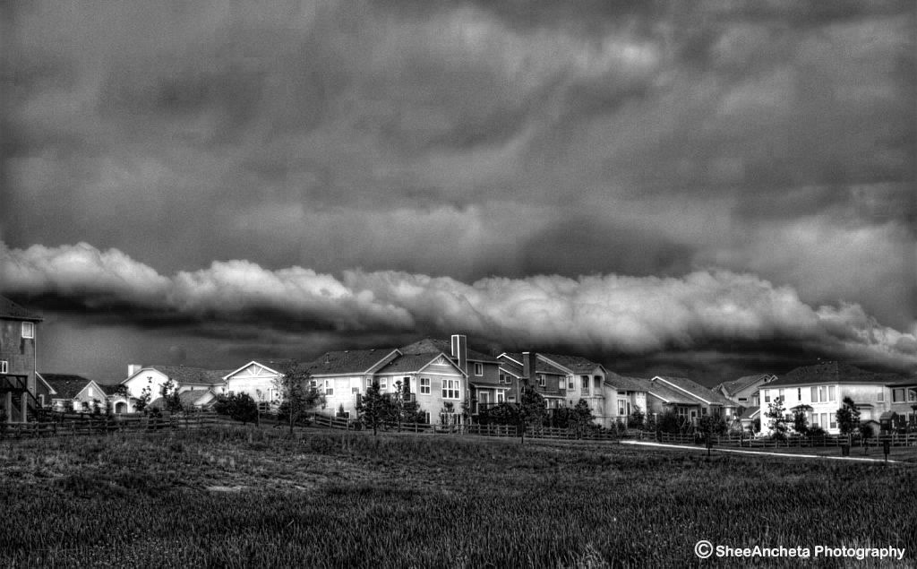 Looming Storm
 Photographed by Sheila Ancheta, Black and White conversion by Keith
While the darker clouds may have in fact looked more ominous and threatening, I wanted you to see how easy it is to adjust tonalities when converting to black and white in order to emphasize specific parts of the composition.
Becky's
black-eyed-suzies image was very nicely composed; however, this was another image that I felt might have been stronger in color. I found myself imagining the yellow color, wanting it to be there.
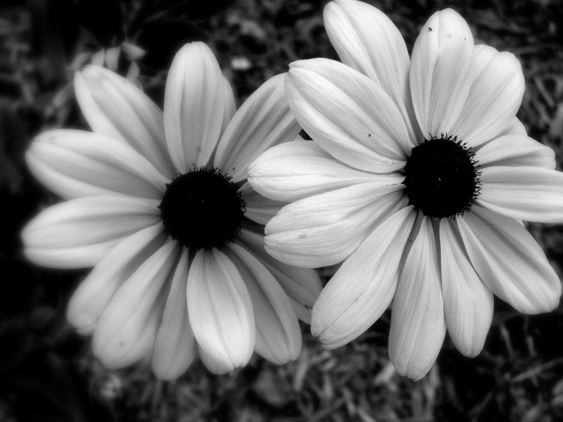 black-eyed-suzies
 Photographed by Becky Jenner
Marilyn's
Sunday morning walk along the wash image was a wonderful example of how some images can benefit greatly from a conversion to black and white. There were several areas in this image where the blown highlights would have been very distracting in a color image. However, in the black and white conversion, these highlights look natural, and add an ethereal quality to the image that makes it stand out. The lesson to learn from this is that when you are trying to rescue an image with blown highlights, consider converting it to black and white to see how it looks. This image tied for
People's Choice and I have awarded this beautiful black and white image
Editor's Choice for Artistic Merit.
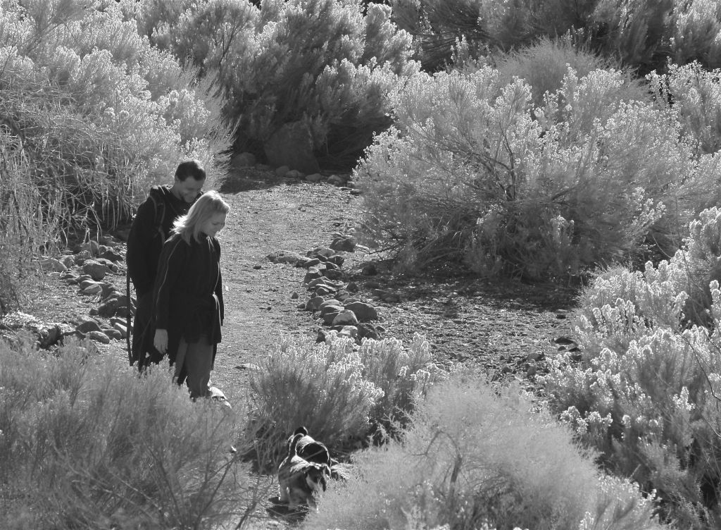 Sunday morning walk along the wash
 Tied for
People's Choice. Editor's Choice for Artistic MeritPhotographed by Marilyn McKinney
Marilyn's
Artist at Work image was another great choice for conversion to black and white, since the conversion toned down some of the potentially distracting color within the image and let the viewer concentrate their attention on the artist's face and his artwork.
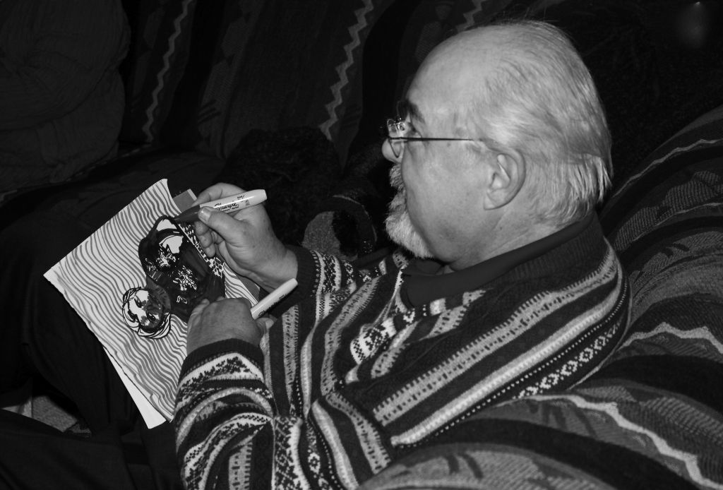 Artist at Work
 Photographed by Marilyn McKinney
I thought my
Views of a Tree image was a good example to showcase the strengths of black and white, which helps emphasize both texture and shape. And I had fun composing an image to include both of these aspects (texture and shape) into the frame.
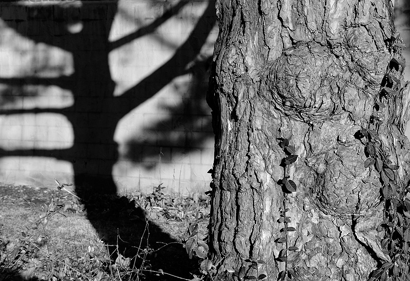 Views of a Tree
 Photographed by Keith
Rebecca's
Ducks Float, You Don't image definitely benefited from conversion to black and white, otherwise the "Pepto-Bismol pink" tile would have dominated the picture.
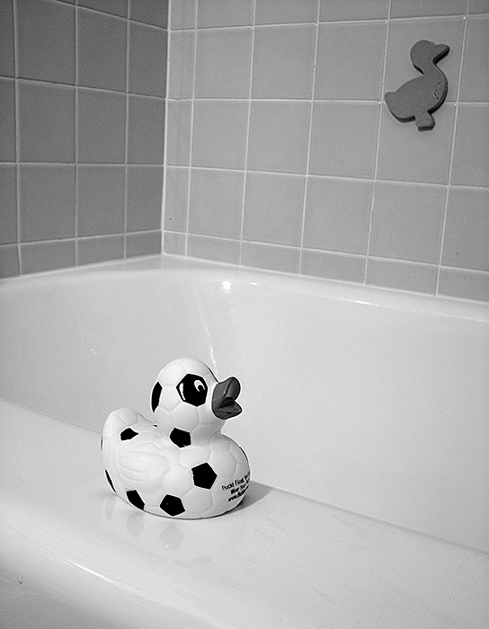 Ducks Float, You Don't
 Photographed by Rebecca
I thought Alan made an excellent choice of subject for the black and white assignment, since he picked a subject that would benefit from the strength of black and white to convey the 3-dimensional form of an object.
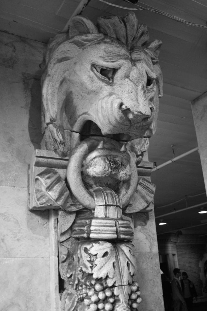 Guardian
 Photographed by Alan Albrecht (Ribot)
I did feel the image would benefit from sharpening, and posted the sharpened version below.
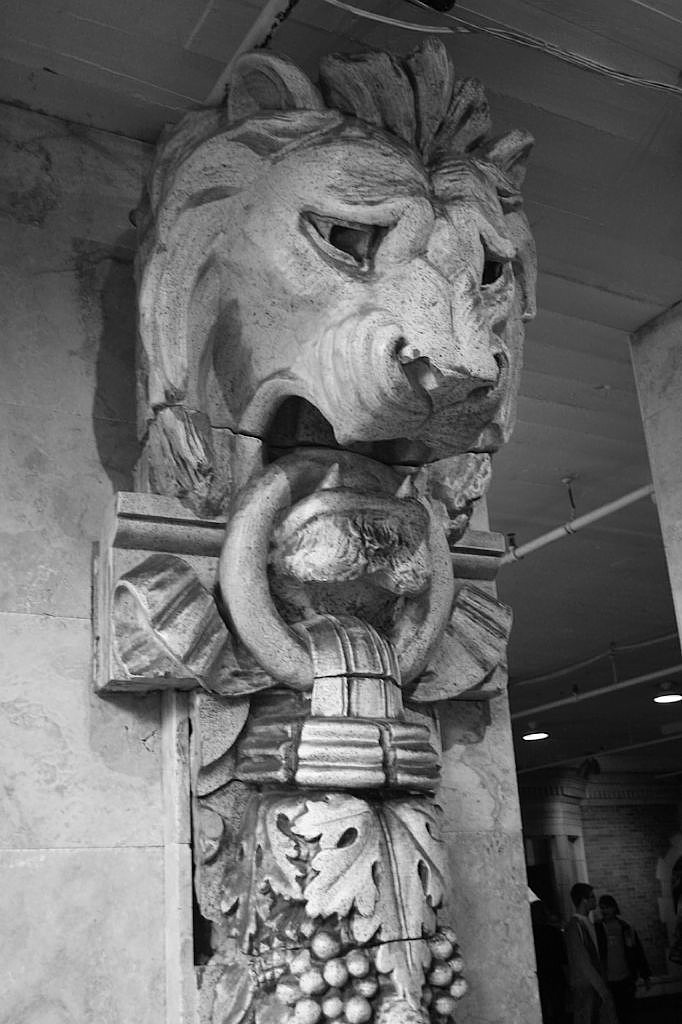 Guardian
 Photographed by Alan Albrecht, sharpened by Keith
Thank you to everyone that participated in this assignment. Congratulations to Becky Jenner, whose
Lissa & Beefy image, and Marilyn McKinney, whose
Sunday morning walk along the wash image tied for
People's Choice and were awarded
Editor's Choice for Technical Merit and
Editor's Choice for Artistic Merit respectively.
Viewers are encouraged to respond to this thread describing why you like a particular image, or think it was particularly successful at meeting the guidelines of the assignment.
Keith


