Bokeh (pronounced
bo-keh, and derived from the Japanese noun boke, meaning fuzziness or blur) is a photographic term referring to the aesthetic quality of the out-of-focus areas of an image. (NOTE: The proper spelling is boke, however the "h" was added several years back when the word was adopted into the English language in order to aid in pronunciation.) It is also worth noting that bokeh simply means "out of focus blur." Most discussions that talk about "good" or "bad" bokeh are actually referring to boke-aji, which translates to "flavor of blur," or its character. Typical "flavors" might be harsh, jarring, smooth, fuzzy, soft, round, buttery, etc. One of the most "disturbing" flavors of bokeh (called "ni-sen" in Japanese) produces double-line streaks when rendering out of focus objects. I once owned a Pentax 400mm f5.6 lens that was considered very sharp; however, objects such as tree limbs behind the plane of focus were rendered as a very disturbing double image. This lens would be described as having very bad bokeh. Hard geometric aperture shaped highlights in the image are also often considered "bad" bokeh. A lens with "good" bokeh creates smooth, aesthetically pleasing out-of-focus backgrounds and produces an image where the in-focus subjects stand out in sharp contrast to the blurred background.
While all lens designs attempt to minimize aberrations in the in-focus image, different designs will have different levels and types of aberration in the out-of-focus image and thus yield images with different bokeh. Many older lenses emphasized the sharpness of the in-focus image, and "over-corrected" for spherical aberrations, at the expense of introducing "ugly" out of focus effects such as "double lines" and harsh edge transitions. Photographers in general have become much more aware of bokeh in the last decade or so, and therefore, lens manufacturers have started incorporating features in their lenses that promote "smooth" bokeh, such as increasing the number of aperture blades to ensure the lens diaphram opening is round instead of a pentagon or hexagon, using "rounded" or curved aperture blades, and better controlling lens aberrations that affect the out-of-focus portions of the image. While many of these lens improvements can result in qualitative improvements in bokeh, the photographer is still in control of the "quantitative" application of bokeh in the image, or amount of blur applied to the background. For example, many of the "fast" lenses in the 50mm range will produce pleasing soft bokeh when shot wide open, or in apertures ranging from f1.4 to f2.8, but tend to produce "harsh" bokeh when used at smaller apertures.
Intuitively, techniques the photographer uses to decrease depth of field (using a larger aperture, a longer focal length lens, or getting closer to the subject) will increase the "bokeh" or out-of-focus blur in the image. Often the most effective technique is to adjust your composition in order to increase the "separation" between the foreground subject and background, thereby ensuring the background will be rendered as a pleasing soft "wash" of color. In the end though, the "character" of bokeh is defined not so much in terms of how blurred the background is, but how aesthetically pleasing the "texture" of the blur is to the observer. "Good" bokeh contributes to the overall design of the image, with pleasing regions of color and soft shapes used to complete the composition.
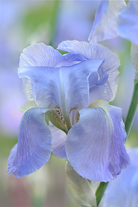
In the blue iris image above, I used limited depth of field to isolate the iris from the background and provide a pleasing blur to the background. The final image was "blended" in Photoshop from two separate images, the primary image used an aperture of f9 for the subject, while the second image used an aperture of f2.8 for the background. I used "align layers" in Photoshop and a layer mask to select the background from the image shot at an aperture of f2.8
While the bokeh in the image above is "chunkier" than I would typically prefer, it does contribute to the overall "feel" and composition of the image.
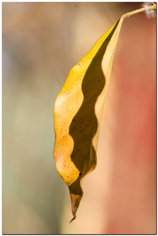
Last Wisteria Leaf
Photographed by Rod
The bokeh in Rod's
Wisteria Leaf image is beautifully "creamy," producing soft colors and shapes that contribute to the overall composition.
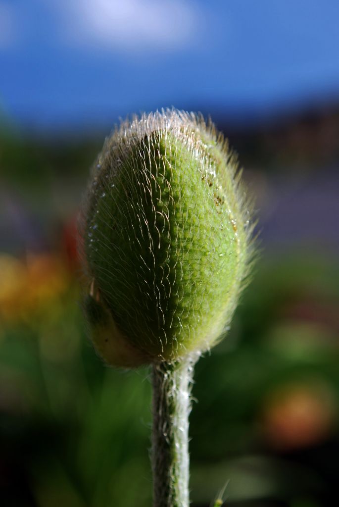
Lonely Bud
Photographed by Sheila Ancheta
The soft muted background colors produced by the wonderful bokeh in Sheila's
Lonely Bud image transform this simple image of an unassuming bud into a work of art.
The assignment for the week of 17 - 23 August is "Bokeh." You should strive to compose an image with aesthetically pleasing bokeh (out of focus areas in the image) where the soft colors and shapes contribute to the overall composition of the image. If you have any questions on how you might be able to create pleasing bokeh with your particular camera and lens combination, I encourage you to ask questions in this forum thread.
Please upload your images into the "Bokeh" album in the Weekly Assignments category of the Gallery no-later-than midnight, Mountain Time (GMT - 07:00) on Sunday, 23 August 2009.
I'll look forward to seeing your images.
Keith


