Thank you to everyone that participated in the "Linear Perspective" assignment. The goal with this assignment was to strengthen your ability to visualize and employ the techniques associated with linear perspective in order to enhance the perception of depth in your image. As in previous weeks, the "assignment" provided the incentive for me to actively look for scenes where I could employ linear perspective. "Exercising" my perception and visualization skills throughout the week will help me strengthen these skills over time.
The guidelines for "Linear Perspective" were: "Use converging lines to draw the viewer into the scene and establish a sense of distance and depth, or use transitions in size between near and far objects to provide a relative scale from which we can derive a sense of distance and depth. Curved lines (especially an S curve), can be very effective a drawing the viewer into and through the scene, while providing the cues used to perceive depth. Dont forget to use techniques we learned in the balance assignment to provide a pleasing composition and balance between primary and supporting elements in the scene."
Lars got the assignment started in the right direction with his beautiful image of Tyreso Castle, outside of Stockholm, Sweden.
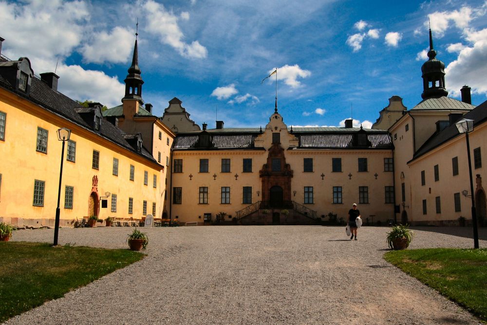
Tyreso castle outside Stockholm Sweden
Lars employed both converging lines, and transitions in size between near and far objects (the windows in the castle get smaller as they recede into the distance) to provide a sense of distance and depth in this image. Including a person in the scene is a very effective method for providing "scale" to the overall image.
Rod's example of linear perspective in "School bridge crossing" was a bit "over the top." (Sorry, I couldn't resist the pun.)
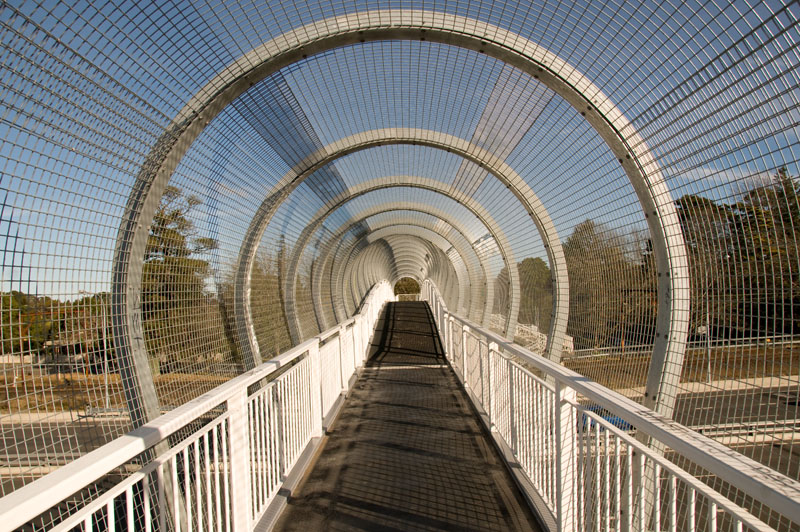
School bridge crossing
Rod used converging lines and transitions in size to very effectively convey depth. The repeating patterns in this image gave it somewhat of an abstract feeling. I like the way Rod composed the image to use diagonal lines originating from the corners of the image to lead the viewer into the scene. Leading lines that originate in the corners of an image can be very effective.
I thought Joyce's decision to submit "A Long Passage" as a black and white image was a good choice. The lighting looks like it would have been a bit "harsh" in the color version of this image; however, it provides a very pleasing rendition in black and white and helps to emphasize the shapes and forms. This was another very effective use of converging lines and relative scale to convey distance and depth.
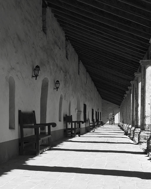
A Long Passage
I thought that the image became a little stronger at conveying depth if it was cropped a bit more from the bottom, like this:
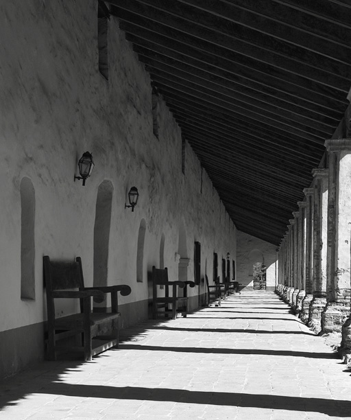
A Long Passage (cropped)
This crop seemed to emphasize the repeating patterns a bit more, and placed the far archway at a little stronger position in the frame.
I thought Rebecca's "Lily Path to Castle" image was stronger with a little bit cropped from the bottom as well. From this:

Lily path to castle
To this:
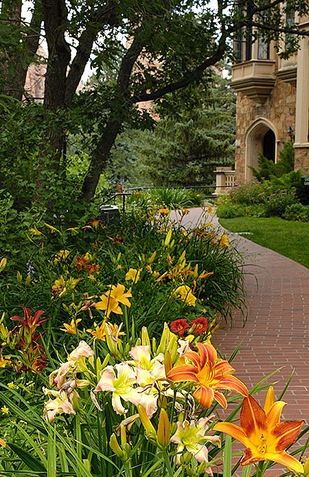
Lily path to castle (cropped)
And one more crop, from this:
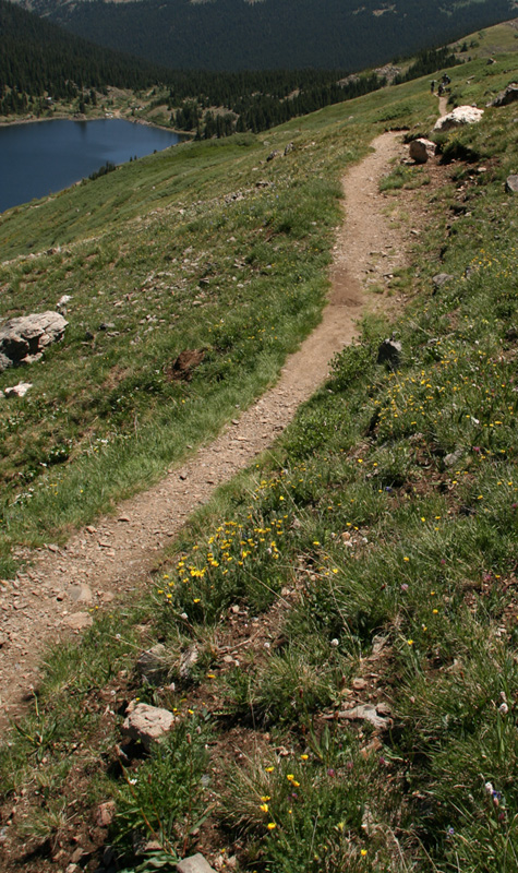
Long trail
To this:
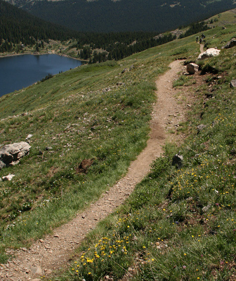
Long trail (cropped)
Providing a stronger leading line originating from the corner of the frame.
(I can hear people muttering under their breath, "If Keith tells me one more time that I need to crop my image I'm going to scream!"

My image of the Air Force Academy Chapel below could have benefited from a slightly wider angle lens. This would have allowed me to include the "peak" in the top of the frame, and emphasized the converging lines of the aisle a bit more. (I shot this scene at the wide end of my 18-35mm zoom, which is the widest lens I have for full frame.) This was the first time that I felt like I really
needed the new Nikkor 14-24mm lens.

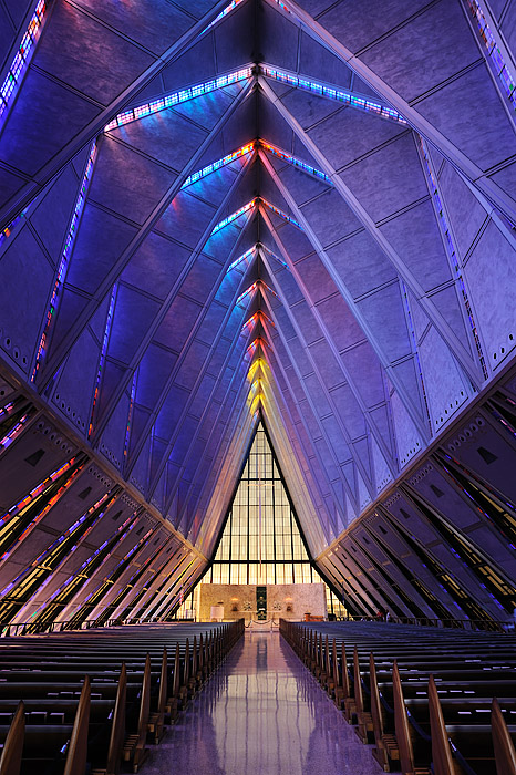
Air Force Academy Chapel
Tom's (Kermit) "Cadet Chapel Spires" image is a good example of "compressed" perspective, where using a longer focal length lens makes the spires appear closer together than the really are. We will talk more about "compressed" perspective in the assignment for next week.
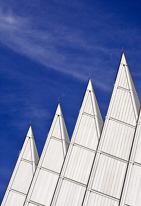
Cadet Chapel Spires
I really like the
concept of Tom's "Cadet Chapel West Aisle" image below, but the too bright areas on the right side of the frame distract my attention from the tremendous "depth" in this image. Perhaps shooting this same scene from the "shady" side of the chapel would have resulted in a less contrasty image? (Or maybe one more attempt in the HDR processing to bring down the highlights and upper mid-tones a bit more.) The repeating patterns of the window frame shadows are very effective at providing scale and drawing the viewer into the scene.
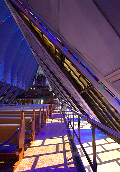
Cadet Chapel West Aisle
Much like my images of the same scene, Tom's "Cadet Chapel North Ceiling" wasn't as effective as I feel it could have been at conveying the height of the spires in the ceiling. Perhaps using a wider angle lens or including more of the lower level ceiling would have given more of an impression of height to the upper ceiling.
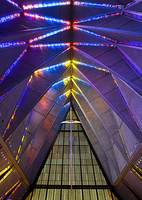
Cadet Chapel North Ceiling
Ellen's (jecc) "Blue Chapel" image needed to be shot with a slightly wider angle lens or from further away so as to not cut off the tops of the spires on the left side.

Blue Chapel
Congratulations to Joyce, whose image "A Long Passage," and to Rod, whose image "School Bridge Crossing" tied for the
People's Choice award.
Editor's Choice for Artistic Merit was awarded to Joyce's image "A Long Passage." Not only does Joyce use converging lines and changes in scale to convey depth, but all the compositional elements come together in this image to compose a pleasing whole. The image has a sense of time and place and "invites" the viewer into the scene. Converting this image to black and while was a wise choice, and enhances the "timeless" appeal of this image.
A Long Passage
Editor's Choice for Technical Merit was awarded to Rod's "School Bridge Crossing."
School bridge crossing
This image was literally an exercise in using the concepts of linear perspective. Rod used converging lines and changes in size of repeating elements very effectively to convey depth in this image.
Honorable Mention goes to Lars' Tyreso Castle image.
Tyreso castle outside Stockholm Sweden
Lars used converging lines and changes in size between near and far objects to provide a sense of distance and depth in this image. Including a person in the scene was a very effective method for providing "scale" to the overall image, and added a element of "human interest" to a scene that would have otherwise felt somewhat sterile.
Thank you again for everyone that participated in this week's assignment. Hopefully, by participating in this assignment and reviewing the images that were submitted, you have strengthened your ability to visualize and employ the techniques associated with linear perspective to convey a sense of depth in your images.
Keith


