Thank you to everyone that participated in the "balance' assignment. It was one of our more conceptually challenging assignments, and I appreciate all your efforts trying to understand the concept and create images with "balance." We will be exploring other related aspects of composition in future assignments.
The guidelines for the "Balance" assignment were: "It is the placement and prominence of the primary and supporting elements in the composition that affect the balance of the image. Compose an image that balances the "weight" of the elements across the frame, while using the attributes that affect the prominence of elements (such as positioning the primary subject in a "strong" location in the frame, using more prominent colors and tonality, etc.) to ensure the primary subject is still dominant in the image."
While some of the images succeeded, others were not quite balanced. In the images where the photographer was attempting to balance a nearby object with a distant one, how effectively they controlled the perspective (the apparent size and distance relationships of near and far elements) played a key role in whether they were able to successfully balance the image. I will briefly discuss how to control perspective (and balance) by selecting an appropriate focal length lens, and will discuss this concept in more depth in the three part "Perspective" assignment beginning next week.
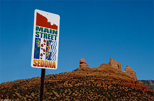
Although Cindy's "Main Street" image below is a great "location" shot for stock photography, and effectively uses primary and secondary elements in the frame to tell a story, I felt that the "Main Street" sign in the image was a bit too prominent, and overpowered the rock formations in the background.

Main Street
I feel this image could have been a bit stronger if the sign and background rock formations were better balanced. I couldn't read the EXIF information for this image

but let's assume for a minute that Cindy used a wide angle lens to capture the image. This would result in the foreground elements being emphasized, and the background elements being deemphasized. The way to correct this would have been to step further back from the sign (if possible) and use a longer focal length lens to compress the perspective and bring the background elements in closer. The resulting image would have looked something like this:
(Or there's always Photoshop

)
I would liked to have seen Cindy's image of the Saguaro Cactus shot with a longer focal length lens in order to make the moon much more prominent in the scene.
We're often disappointed with images like this when we get home and look at them on the monitor and are surprised at how tiny the moon is in the scene. Shooting with a wide angle lens will always make distant objects appear much smaller. As we will see in the "perspective" assignment, we can use this to our advantage to enhance the perception of depth in the scene, but need to be careful that we don't make important elements look too small.
When Rebecca saw this image:
Lone Flower
She said "I think that one would look better cropped." I think she was right. Cropping allowed us to get rid of some distracting elements and blown highlights and place the flower at a "strong" position in the frame:
Naomi's "Historical Balance" image also benefits from slight cropping from the right side of the image. From this:
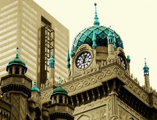
Historical Balance
To this:
Although a very subtle crop, this brings the dome of the old building into a stronger position and helps balance the "weight" of the compositional elements across the frame.
Cindy's "Path to the Gods" image provides a good illustration of an image that is well balanced across the frame when we view it as abstract shapes and forms.
Path to the Gods
I REALLY liked Joyce's "Headlight" image; however, two things bothered me about the image. First, I felt the headlight washer nozzle at the bottom of the frame was too out of focus and distracting. Second, I didn't feel like the image was quite balanced? It seemed to me that there was too much going on in the right side of the frame in comparison to the left side.
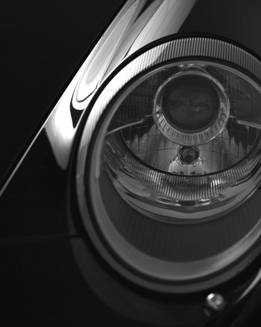
Headlight
I tried this crop instead:
Naomi swept the awards this week, with her "Historical Balance" image winning the vote for "
Peoples Choice" as well as both
Editor's Choice for Artistic Merit and
Editor's Choice for Technical Merit.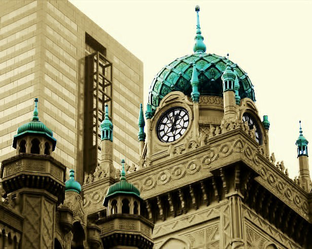
Historical Balance
Naomi very successfully limited her image to primary and secondary compositional elements that were used to tell a story. (The lesson here is to strive to simplify your image to only the elements required to tell your story. You should compose your image to eliminate unnecessary and distracting elements from the frame.) The elements were well balanced across the frame, and she placed the primary element in a "strong" position in the frame and used color to enhance it's prominence.
Thank you to everyone who participated in this week's assignment, and especially to Cindy for providing all the great examples for discussion. Next week's assignment on "Perspective" should be a great follow-on to this assignment, so I hope you can participate in that assignment as well.
Keith


