The
guidelines for this assignment were to choose one of the general "rules" of photography or composition that we have talked about, and then create a unique photograph by "breaking" the rules. I asked everybody to please tell us what rule they broke, and why they decided to deviate from common wisdom in order to achieve their creative vision.
Jaime's
heaven's on fire image was a bold graphic image that immediately grabbed the viewer's attention. It was interesting to note; however, how much the small spot of sunlight through the windows added to the image. This is a great example of how small details can often contribute much more to an image than we initially anticipate. Great job modifying the color and controlling the exposure to convey a concept Jaime.
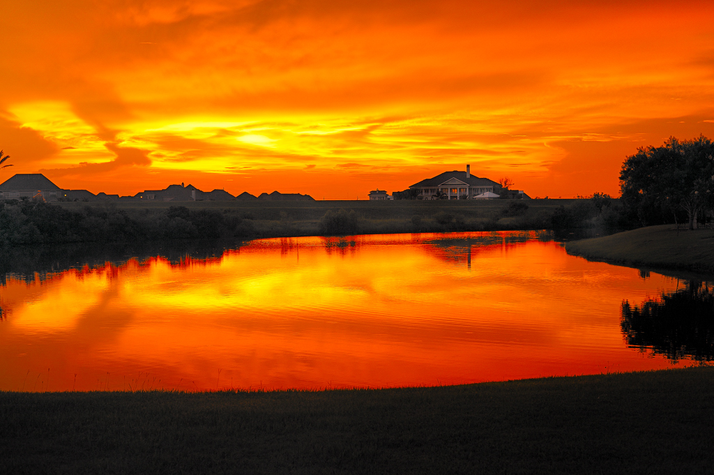 heaven's on fire
Photographed by Jaime Dorotan (girod)
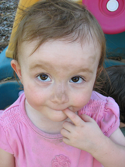
Jaime broke the rules (blew the highlights) in his image of
our Nana v.2 to produce a very effective high-key portrait of his daughter. There is a nice graphic design to this image, with the diagonal of Nana's arm leading the viewers gaze into her eyes, which are placed at a strong position in the frame. Jaime used the highlights in this image in much the way that portrait photographers normally use shadows, to add contrast that emphasizes the front of the face, focusing the viewer's attention on that area of the image and "narrowing" the subjects face (often used to flatter folks with "round" faces) through the use of light and shadow. Jaime effectively "broke the rules" to make this a dynamic and interesting image. He used the variations in light to provide nice modeling and depth and produce a wonderful portrait that captured the personality of his daughter.
 our Nana v.2
Photographed by Jaime Dorotan (girod)
Michele used a couple of techniques that went against common convention to emphasize the mood or feeling she wanted to convey with her
Help! image. She centered her subject and made the image a bit darker than normal, with lots of dark dead space surrounding the subject. This worked well to give the impression that as Michele said, "the little guy...is being pulled down into the hole by the ants" and the dark tones helped produced an ominous and dreadful feeling. The intruding foreground elements contributed to the perception that the subject was trapped, and the overly "busy" activity of the ants provoked an anxious creepy crawly icky feeling she wanted the viewer to experience. Very well done Michele. Not "beautiful" in the traditional sense, but very successful at provoking the feelings you were going for. (Now I need to take a break to brush the ants off.)
 Help!
Help!Photographed by Michele Bollhalder
Dave's amazing image of a spider
Making a Sack Lunch was a great example of how lack of clarity can sometimes be used to make a subject more menacing. The motion blur from the slow shutter speed helped portray the amazing speed at which the spider was moving to wrap its prey. The fact that those long legs were the clearest part of the spider tapped into a primeval fear humans have of spiders. This image wouldn't be a great scientific study, but it worked exceptionally well to convey the speed and dexterity of the spider and give us some insight into the complex method it uses to capture and immobilize its prey. Wonderful image shot in challenging lighting conditions Dave.
 Making a Sack Lunch
Photographed by Dave Leiker (prairiedust)
My
Eye of the Storm image was a "safety shot" more than anything else. I wanted to shoot something like the
Off Balance image I submitted later, but I wasn't sure I would have time. Instead, I photographed an abstract painting we have hanging in our basement. I pre-visualized the "eye of the storm" I wanted to create, and experimented with different shutter speeds and speed of camera rotation until I achieved the "eye" effect I was looking for. I found out just how hard it is to turn a lens exactly around the center for a 1.3 second exposure. :-)
 Eye of the Storm
Photographed by Keith
One rule or guideline we often hear when discussing photography of young children is to photograph from their level, not looking down on them. In the case of Rebecca's
The look... image, I think violating this advice and shooting from a higher angle provided just the right perspective to portray the guilty look of a child that knows they've done something wrong. Great capture Rebecca. (And kudos to our budding actress. Yikes! What we have to look forward to...)
 The look...
Photographed by Rebecca
I loved the "stance" and the implied tension in the two figures in Marilyn's
Reptilian Standoff image. She did a great job cropping this image to isolate the primary subjects, and effectively "broke the rules" by processing the image to produce a gritty "artsy" feeling that perfectly complemented the subjects. Nice job Marilyn.
 Reptilian Standoff
Photographed by Marilyn McKinney
I enjoyed the visual treat of Marilyn's
Self-portrait image, in which she broke the rule of "clarity" by composing the image to show a soft reflection behind a hard-edged diamond pattern. I liked the depth this optical illusion provided, and the playfulness of the image. As an abstract image the colors and forms worked really well together, with the soft organic pastels of her portrait juxtaposed against the hard geometric shapes of the diamonds. I commend Marilyn for having the vision to "see" this image and compose such an interesting self-portrait. What strikes me most about this image is that it makes a great metaphor for modern life. Because it has the potential to be such a powerful metaphor, I've awarded this image
Editor's Choice for Artistic Merit.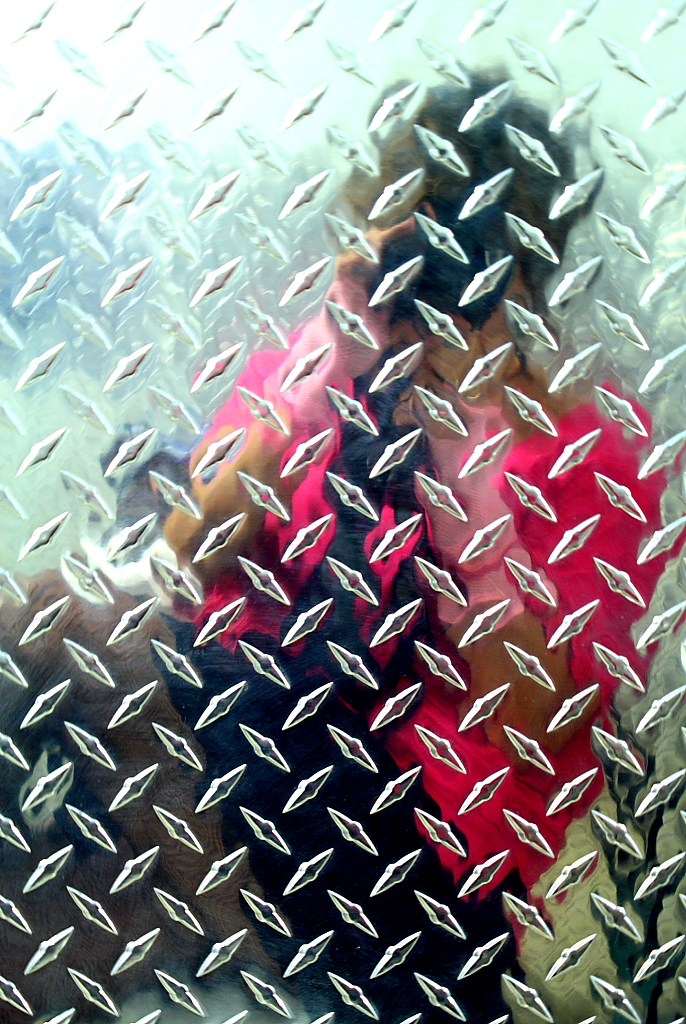 Self-portraitEditor's Choice for Artistic Merit
Photographed by Marilyn McKinney
I think it is probably fairly obvious what "rules" I broke in an attempt to accentuate the off balance feeling of my image. In order to accentuate the perception that Evan was falling to one side of the image, I tilted the horizon and purposely skewed the balance or weight of the elements to one side. I also made the image very high contrast in order to de-emphasize the facial expressions and other distracting details, and emphasize the outline of the flailing arms. I originally darkened the brick a bit more, but then decided that having the brick lighter helped to shift the weight towards the darker silhouette, and helped to emphasize the lack of balance within the image, and the impression that the "heavier" (darker) weight of Evan's body would cause him to topple over.
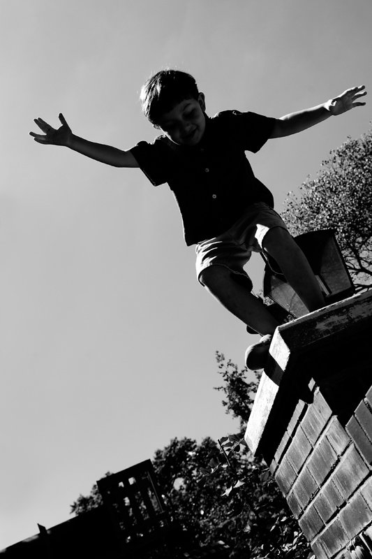 Off Balance
Photographed by Keith
I thought it was ironic that the rule Rick chose to break would play right into our next assignment emphasizing catchlight in the eyes. This is an interesting image, and helps to portray how the quail almost becomes abstract if you can't see its eyes.
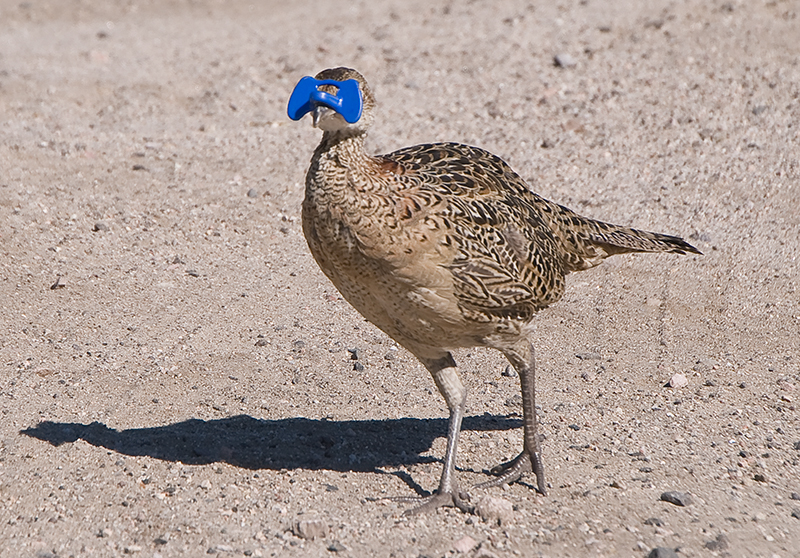 "Quail with Blinders"
Photographed by Rick Pepin (trvlrick)
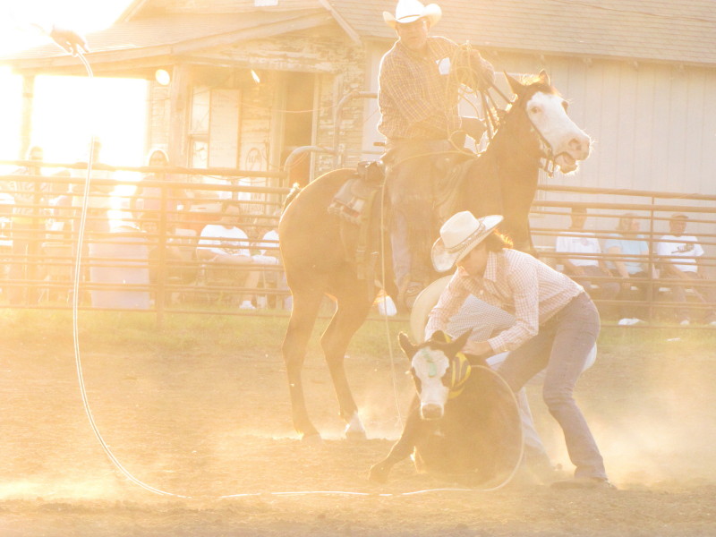
Chris'
Ready to Rodeo image broke several rules, including the advice not to cut the image in half with the horizon line. In addition, the image doesn't really isolate a primary subject for the viewer, and instead gives an overall view of the rodeo. What makes this image successful in the end is the light. The strong, low-angled afternoon light (assuming Chris' camera clock is correct.) portrays the feeling or "sense of time" as the cowboys get ready for the rodeo. This is a nice image that would help tell the story of the rodeo when presented with other images in a series.
 Ready to Rodeo
Photographed by Chris Franklin
Chris'
Ghost Rider? image broke several rules, including composition rules (cutting off all of the cowboy on the left except his arm). By shooting directly into the sun, Chris managed to break several rules at once by blowing out the highlights in the exposure and causing so much flare from the sun that it severely reduced the contrast and color saturation in the image. But this was a successful image that effectively conveyed the "feel" of being at the rodeo and witnessing this scene from the sidelines. He captured a lot of drama in the shot, and the backlighting helps accentuate the dust (and the violent movements that caused it) and the flare and lack of contrast help to mask what might have been a very distracting background. Great job breaking the rules Chris!

 Ghost Rider?People's Choice
Photographed by Chris Franklin
Chris'
Dust to Dawn Explosion was a fun image that reminds us that sometimes creativity requires a bit of experimentation. I was intrigued by the green mist effect that made the image look like something out of a sci-fi movie (or low budget horror flick). I would probably try to figure out what caused that effect, and then put that into my quiver of techniques for the next time I wanted to create a "sci-fi" look in my images.
 Dusk to Dawn Explosion
Photographed by Chris Franklin
Chris'
Holy Fill Flash Spiderman image was another great experiment that illustrated how effective light from the flash could be at both highlighting the detail of the web and hairs on the spider, and helping to isolate the spider from the background. This would be another technique to put into the quiver, potentially using just a bit stronger "fill" than normal to accentuate the detail and isolate the subject from a darker background, without going to quite the extremes that chris did in this image.
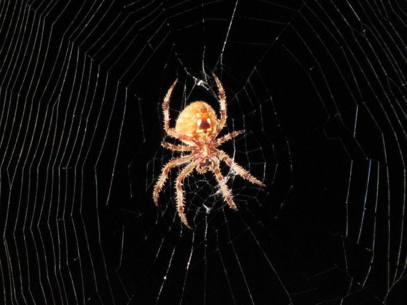 Holy Fill Flash Spiderman
Photographed by Chris Franklin
I thought this was a fun assignment that helped me step outside my normal rigid thinking about the "rules" of photography and stretch my creativity a bit more than I might otherwise have done. I hope you enjoyed the assignment too.
Keith


