Thank you to everyone that participated in the "Panoramic" assignment. The guidelines for this assignment were to compose a "wide aspect ratio" image (at least twice as wide as it is tall). As I mentioned in the assignment description, this exercise was designed to stretch your composition skills. Since not all scenes lend themselves to being effectively presented in a wide format, you would be required to frame the scene in your mind and visualize what it might look like in a wide format.
I enjoyed Lars'
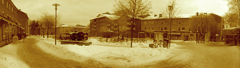
old aged photo stitch image, and thought the sepia treatment was a great complement to the scene.
 old aged photo stitch
 Photographed by Lars
One thing worth noting is the prominence of the road in this image, and how it diminishes the importance of the scene in the background. You can change the emphasis in the image, and place more importance on the on the buildings by cropping like this:
 old aged photo stitch
 Photographed by Lars, cropped by Keith
I thought Kay's
reflections image was a very beautiful image. It reminded me of a watercolor, and evoked a peaceful nostalgic feeling. It didn't quite meet the criteria of "twice as wide as it is tall" to be called a panoramic, but it is a beautiful image nonetheless.
 reflections
Photographed by Kay Loudenberry
Kay's river runs thru it was another nice image, but again, didn't quite meet the criteria for a panoramic. Just for fun, I decided to see if I could crop the image to make a panoramic out of it. While I had the image open in Photoshop, I assigned a color space, converted to sRGB, and added just a touch of "smart sharpen" (100% at a radius of 0.4 pixels). Here's the original image, and then the cropped version just below that.
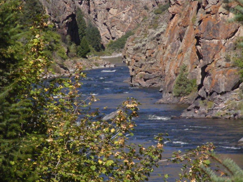 river runs thru it
 Photographed by kay Loudenberry
 river runs thru it
 Photographed by kay Loudenberry, cropped to panoramic by Keith
I think the cropped version also benefitted by removing some of the distracting out of focus branches in the foreground of the image.
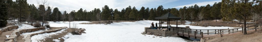
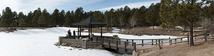
Kay's
great view image was a panoramic crop of a nice view. To be honest, cutting off the top of the tree on the left bothers me, and makes it feel like the image is incomplete. I thought the image was a little soft, and so added a little selective sharpening by using layer masks and smart sharpen in Photoshop. I was careful not to sharpen the sky or the lower parts of the peak, since that brought out too much noise in the image. Here's the original, followed by the sharpened version.
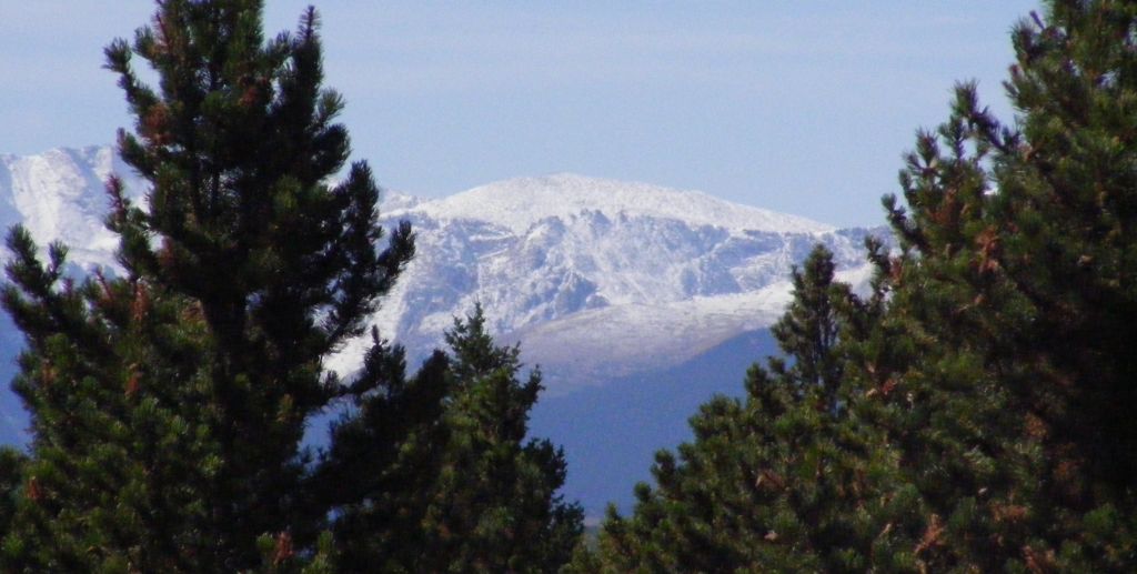 great view
Photographed by Kay Loudenberry
 great view
Photographed by Kay Loudenberry, selective sharpening by Keith
Kay's
Houses on Stilts image was a great scene for a panoramic, and very well composed. The clouds were a bit overexposed, but given the choice of overexposing the clouds or getting too little light on the front of the buildings, I think Kay made the right choice. (Another option would have been to shoot the scene at a different time of day, if she had that luxury.)
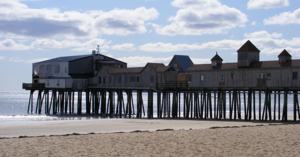 Houses on Stilts
 Photographed by Kay Loudenberry
Kay's
Horses so pretty image was a nice scene, but the blown out clouds at the top of the image grabbed your attention away from the horses and the mountains. I thought the image worked better when these blown out clouds were cropped out of the image. I've posted the cropped image just below the original.
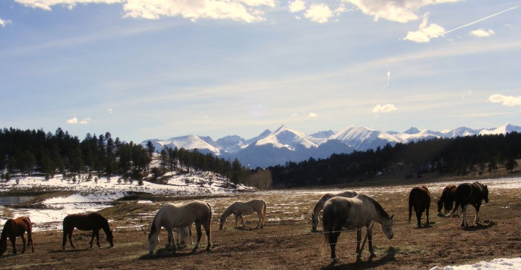 Horses so pretty
 Photographed by Kay Loudenberry
 Horses so pretty
 Photographed by Kay Loudenberry, cropped by Keith
Rick's
View from our back deck image was a great stitching job. I can't see any stitching lines or anomalies in the image. Great job Rick (and Photoshop CS4 photomerge :-) )
 View from our back deck
 Photographed by Rick Pepin
Dave Leiker's Combat Air Museum image was another great stitching job. This image has great color and contrast, and was very well composed. Dave mentioned when he posted the image that it was a 180 degree pano stitch from 6 images. Great job Dave!
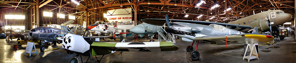 Combat Air Museum
 Photographed by Dave Leiker
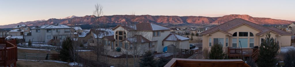
Sheila did a great job handling the exposure for this challenging scene in her "Gateway" image. This scene reminds me that I should mention that if you are stitching images, you will get much better results if you put the camera in manual exposure, manual white balance, and manual focus. That way the exposure and white balance will stay consistent across the frames and you won't have to worry about "seams" in your image. It also helps to use a relatively small aperture in order to minimize vignetting on the edges of the frames. This gives the stitching software a better chance of matching the color and brightness across the scene, especially in blue skies. You should also use a tripod and a bubble level on the camera.
 Gateway
 Photographed by Sheila Anchetta
Sue did a very nice job stitching her
Fox Run Park image. Although it was a nice stitch, the image almost looked like two different scenes, one on the right, and one on the left. I thought the scene on the right was a beautiful scene that lent itself well to a panoramic image, and that the scene on the left was a distraction. I tried an alternate crop that I thought highlighted the wonderful scene on the right. The crop is posted just below the original.
 Fox Run Park
 Photographed by Sue Pepin
 Fox Run Park
 Photographed by Sue Pepin, cropped by Keith
Of all the Images that were submitted for this assignment, I thought Marilyn's
Bridge Under Construction: Hoover Dam image was the one that called out the most for a panoramic format. Marilyn's panoramic crop provided the perfect framing for this scene. I did notice that this image seemed to have color space issues. It appeared too saturated on my monitor, and when I pulled it into Photoshop, it didn't have an embedded color space. I ended up choosing "Apple RGB" as the color space that gave me the most realistic colors.
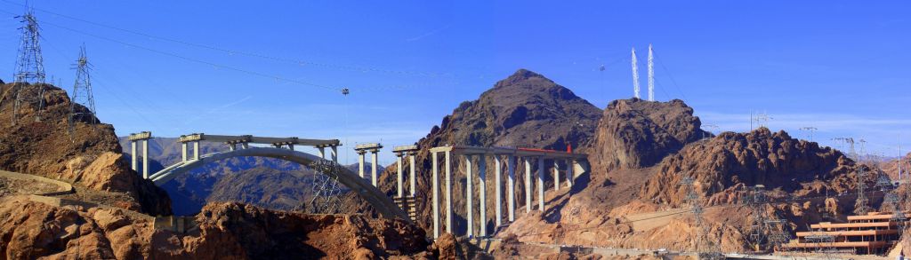 Bridge Under Construction: Hoover Dam
 Photographed by Marilyn McKinney
 Bridge Under Construction: Hoover Dam
 Photographed by Marilyn McKinney, color space embedded by Keith
When I looked at Dave's
Stone Arch Bridge at Admire image on my old laptop, I thought "nice image." When I looked at it a few days later on my new wide gamut monitor, I thought "Wow!" The light and colors in this image are beautiful. I can imagine that this image looks even more impressive in a larger size. I like the way Dave captured the curve of the river, and provided context for the stone bridge. I've awarded this beautiful image
Editor's Choice for Artistic Merit.
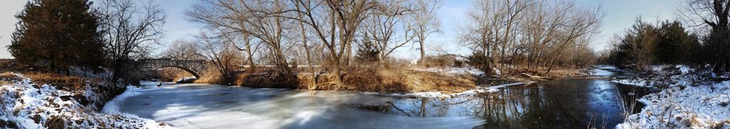 Stone Arch Bridge at Admire Editor's Choice for Artistic Merit
 and tied for
People's ChoicePhotographed by Dave Leiker
Rebecca's
Lunenburg image is another great example of a scene that
needs a panoramic format. A "normal" aspect ratio of 2x3 would have included too much "dead space" in the foreground. By stitching several frames together to capture a panoramic format, she was able to compose an image that emphasizes the waterfront buildings, with just the right amount of water in the foreground to provide context.
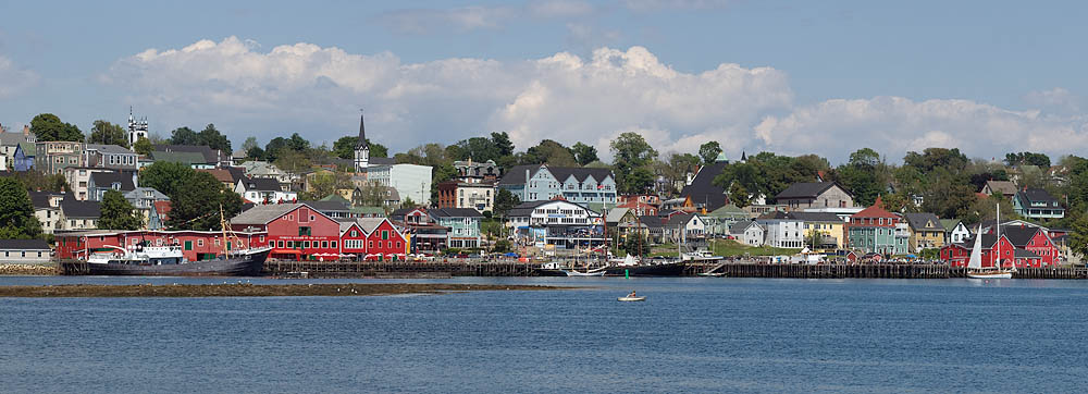
Lunenburg
Tied for
People's ChoicePhotographed by Rebecca
We had a three way tie in the voting this week, with Dave Leiker's
Stone Arch Bridge at Admire image, my
Garden of the Gods image and Rebecca's
Lunenburg image tying for People's Choice. Congratulations Dave and Rebecca.
Thank you to everyone that participated in this assignment.
Viewers are encouraged to respond to this thread describing why you like a particular image, or think it was particularly successful at meeting the guidelines of the assignment.
Keith


