Thank you to everyone that participated in this assignment. I loved seeing the variety and creativity of the images you submitted.
The
guidelines for this assignment were to compose an image while controlling the physical distance and depth of field between the foreground and background elements in order to separate the primary subject from the background and provide the impression of a 3-dimensional scene.
I loved the whimsical (and philosophical) nature of Jaime's
am I me? image. I guessed that Jamie's intent was to convey the reflection as being more "real" than the actual object (based on his comment that "Too often I get separated from myself, so much so that my mirror-image thinks that I am him.") Although the colors made for an interesting and artistic presentation, I thought that the more "real" the presentation of the reflection, the more it would emphasize his point. Therefore, I corrected the white balance using a blue photo filter in Photoshop, bumped up the contrast just a bit, and added just a small touch of selective sharpening to the reflection.
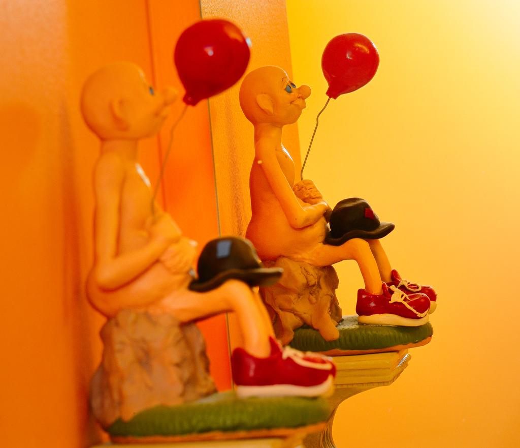 am i me?
Photographed by Jaime Dorotan (girod)
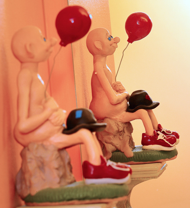 am I me?
 Photographed by Jaime Dorotan, color corrected by Keith
Alan's image
Just like so many others! was a great example of a well defined foreground subject in front of a softly defined background that provided context without being too distracting. It's an interesting commentary on how many photographers approach their photography.

 Just like so many others!
Photographed by Alan Albrecht (Ribot)
Lars'
He's Looking At You Kid image is a great example of how we can use limited depth of field (separation) to emphasize the eyes. We don't really notice that the body of the cat is relatively soft, it's those eyes that captivate us and hold our attention. I would probably have tried to avoid the blown highlights in the background, but given the prominence of the eyes, the background doesn't detract from the image too much. Good job Lars.
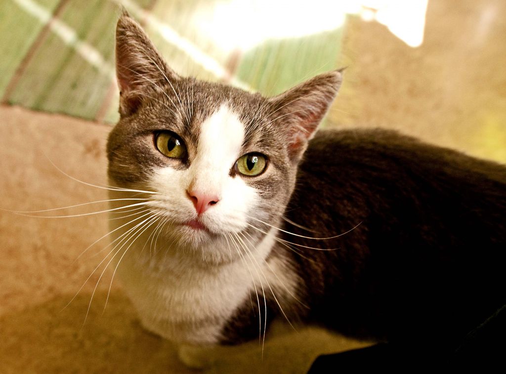 He`s Looking At You Kid
Photographed by Lars
Becky's
Simply Separated Dew Drops is a wonderfully refreshing image, especially in the heat of the summer. In this case, I might have tried aligning the front element of the lens with the plane of the web, thus allowing the entire web to fall within the depth of field of the lens. (If you keep the edges of the web at the same distance from the lens as the center, then the whole web should be sharply in focus.) I have no idea though if the background would have allowed Becky to shift her position in order to align the focus plane, while still keeping the web offset against the dark trees in the background. It's something to consider next time photographing a similar scene. Even so, we can overlook the soft edges of the web since the center is sharp, and it's a refreshing image of one of nature's wonders. Good job using a large aperture to help separate the subject from the background Becky.
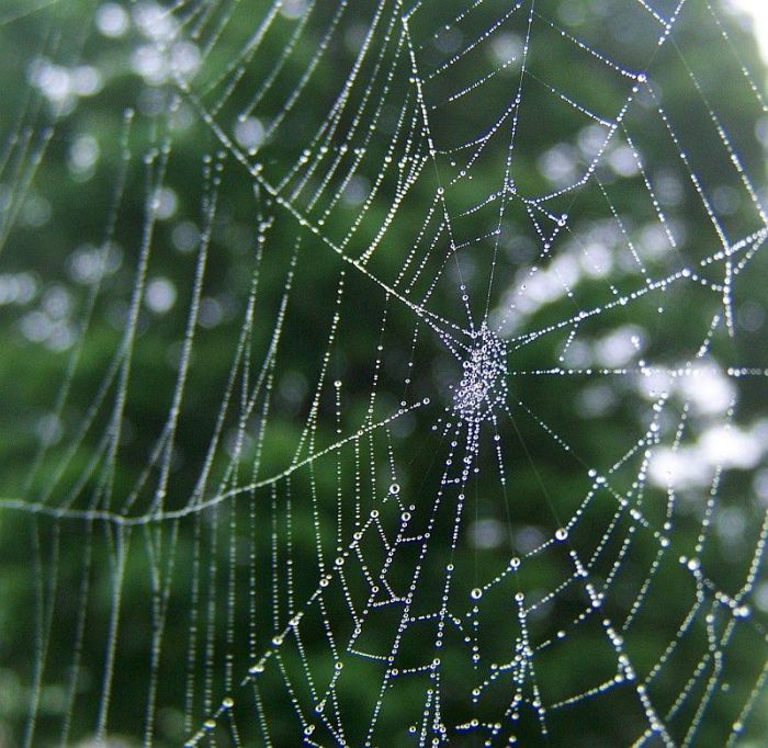 simply seperated dew drops
Photographed by Becky Jenner
Marilyn's
Yellow Cleome/Bee Plant Flower image had wonderful separation from the background. This was a challenging image because the red channel started clipping so much earlier than the rest of the image, and prevented Marilyn from exposing the image any brighter without clipping the red channel and loosing data. In this case, the best course of action is often to protect the color channels from clipping during the exposure (so Marilyn's capture was spot on) and to correct the image in post processing. I used a curves adjustment in Photoshop to bring up the exposure on the midtones while still protecting the brightest areas from clipping. I did this by opening the curves dialog, placing my cursor over the darkest area on the flower that I wanted to lighten, noting where this area was on the curve, and then dragging that area of the curve upwards until those tones had the appropriate brightness. While I had the image open I applied a very small amount of selective sharpening to the flower. This was a wonderful composition Marilyn, perfectly captured. It just required that the midtones be brightened a bit during post processing.
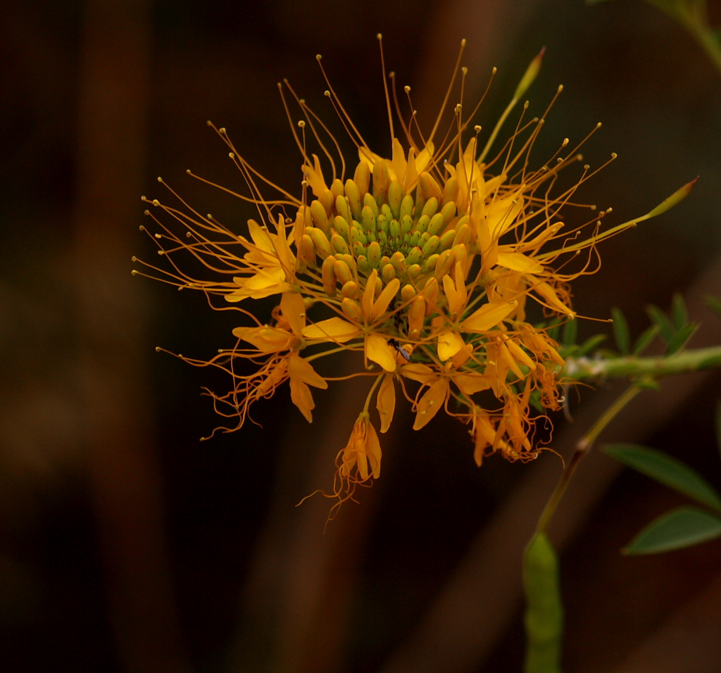 Yellow Cleome/Bee Plant Flower
Photographed by Marilyn McKinney
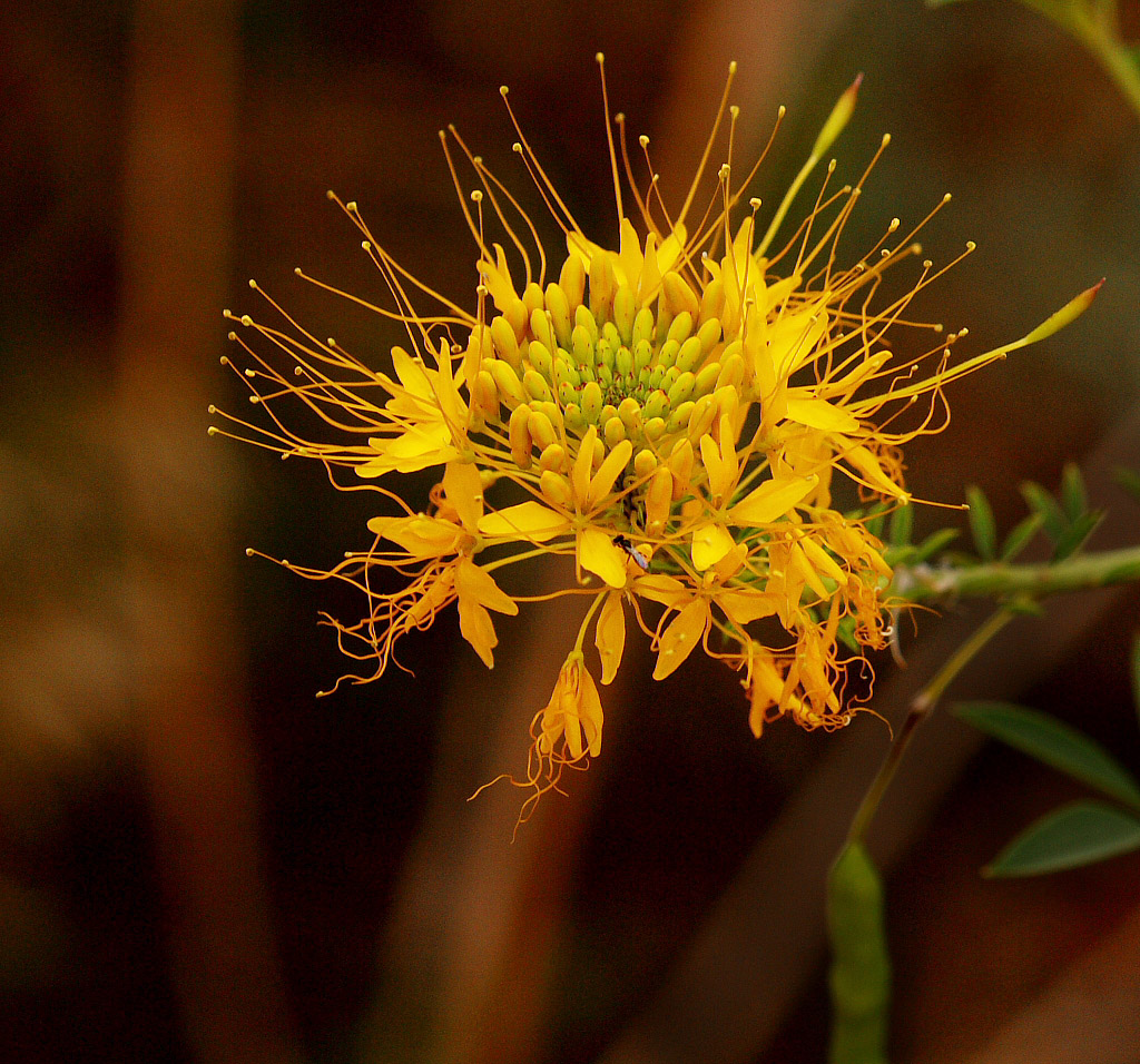 Yellow Cleome/Bee Plant Flower
Photographed by Marilyn McKinney, curves adjustment by Keith
Marilyn's S
eparation of cultures and times image was another nicely composed and perfectly exposed image, with a different take on "separation." Nicely done Marilyn.
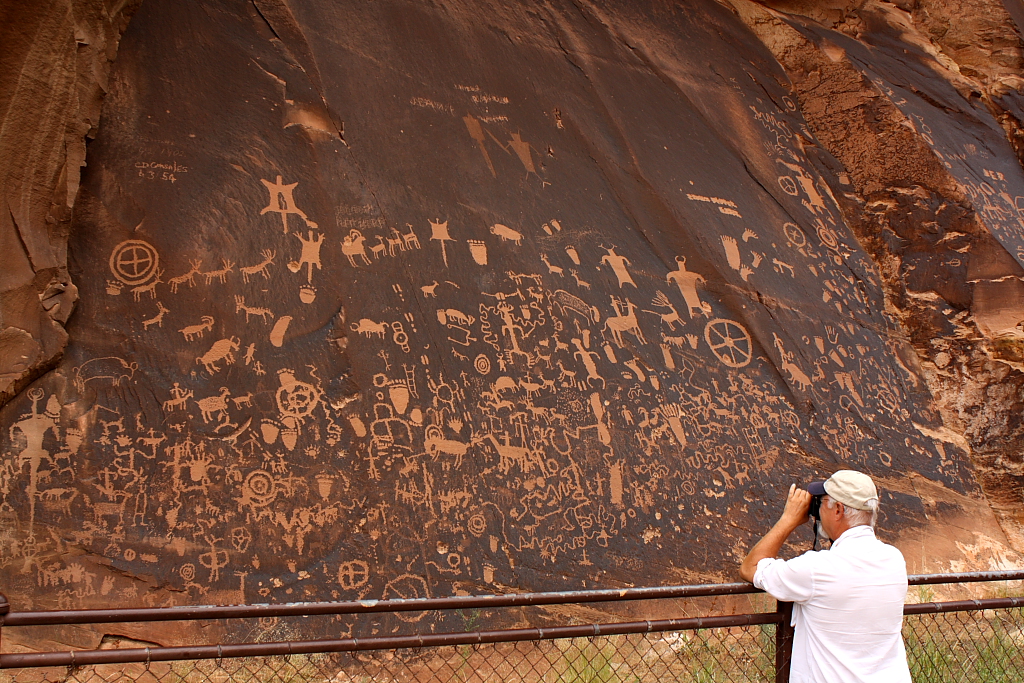 Separation of cultures and times
Photographed by Marilyn McKinney
Michele's
It's what we do image was one of the most creative of the bunch, and the well deserved selection for
Peoples' Choice. Very creative (and well executed) Michele!
 It's what we do!People's Choice
Photographed by Michele Bollhalder
As I mentioned in the gallery, I tried to use both light and distance (depth of field) to separate the flowers from the background for my
Unknown Flower image. I would have preferred a softer background with a wider aperture, but had to stop down a bit to get all three flowers acceptably sharp.
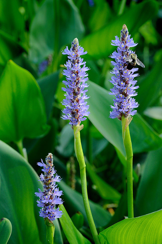 Unknown Flower
Photographed by Keith
When I composed my
Rose image, I first made a conscious decision about what the most important areas were, so that I could orient the camera so the focus plane intersected those points on the flower. I decided the most important portions of the image were the area in the center of the rose where the small petals spiraled together (this is where my eye was naturally drawn to) and the edges of the petals on the left side of the rose. I guessed that if I could keep these two areas sharp, I would be able to let the other areas fall slightly outside the focus plane without them appearing too soft. This was a small rose, so I was quite close in order to fill the frame and therefore the depth of field was very narrow. I positioned my body to shade the background, and then used a cable release and mirror lockup, waiting until a lull in the wind to snap the exposure.
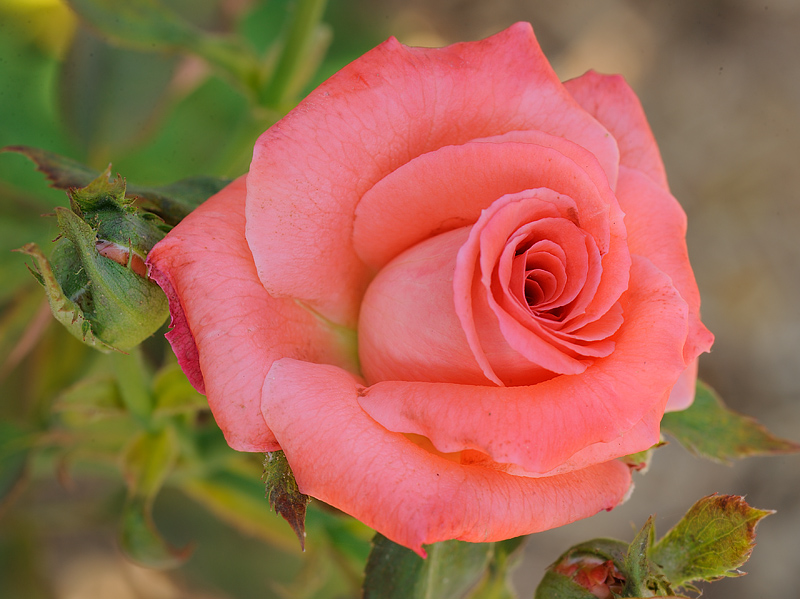 Rose
RosePhotographed by Keith
I thought Rebecca's
Suspended image was a wonderful composition, with the defocused background providing a nice backdrop and context for the web. The light filtering through the trees helped set the scene and the feel of the forest, while the light on the web helped separate it from the darker background. Nicely composed.
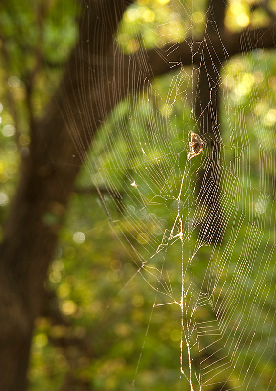 Suspended
Photographed by Rebecca
Rebecca's
Butterfly image was a nice capture of a beautiful butterfly, with very nice light. I thought however that the background, which was higher contrast than the foreground, was a bit too distracting in this image. I might have tried shooting this image with a cable release or self timer and then attempting to shade the background with my body to reduce the prominence of the background in relation to the subject.
 Butterfly
Photographed by Rebecca
Another tactic might have been to crop the image to remove the highest contrast areas in the background. Like this:
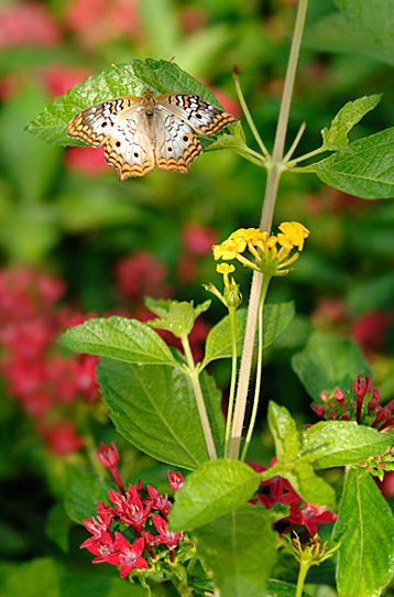 Butterfly
Photographed by Rebecca, cropped by Keith
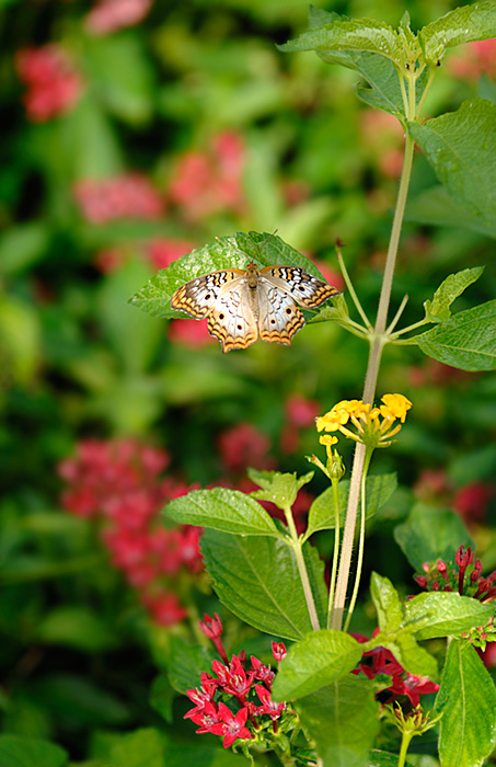
Rebecca's
Hang in there image was another wonderful composition, with a nicely blurred background that complemented the colors in the butterfly. This was an image that came together very well, with the shape of the leaves complementing the shape of the butterfly, and the overall symmetry of the image adding to its impact. This was another very nicely composed image, and Rebecca did a nice job using light and depth of field to provide separation between the foreground and background. I've awarded this image
Editor's Choice for Artistic Merit.
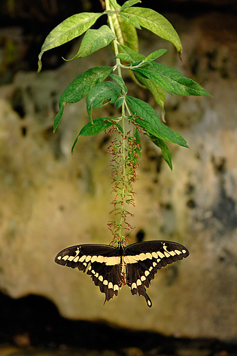 Hang in thereEditor's Choice for Artistic Merit
Photographed by Rebecca
Lars'
Separation4 image was a nice macro shot of an interesting subject. This subject was nicely separated from the background, with wonderfully sharp detail in the snail. Very nicely captured Lars, with very precise positioning of the focus plane.
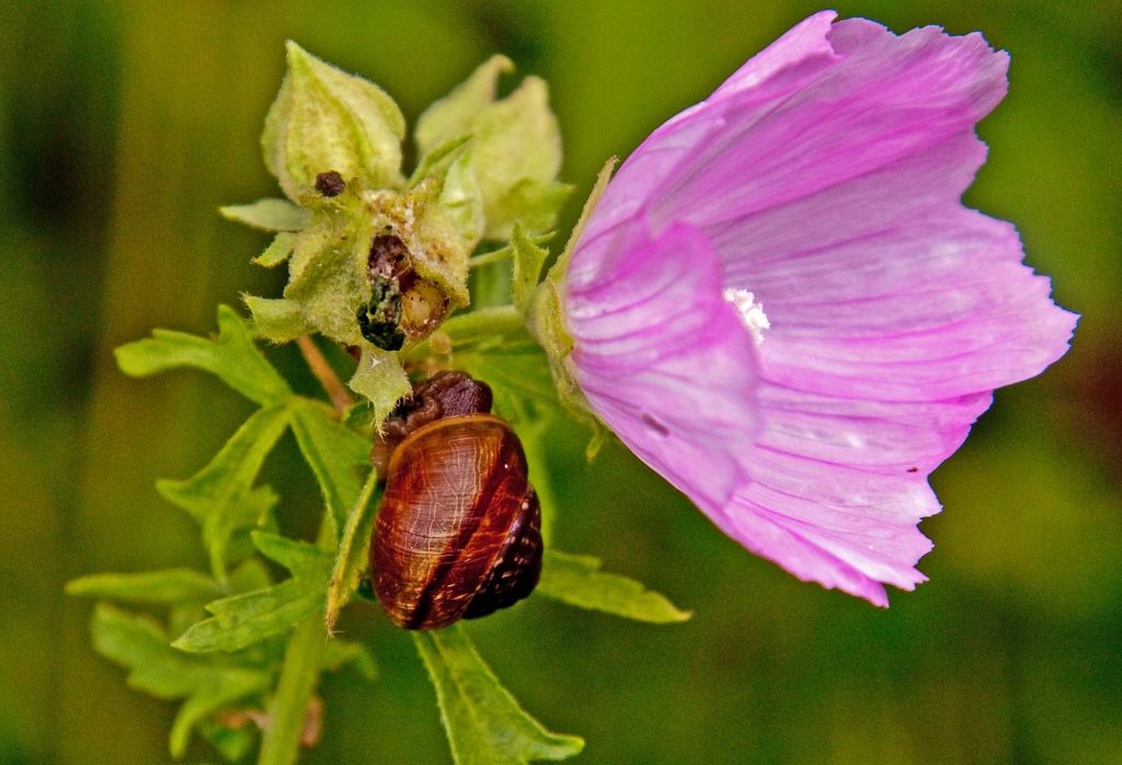 separation4
Photographed by Lars
Lars'
Separation1 image was another wonderfully creative image. I think Lars is having lots of fun with his new wide angle lens. This was a great perspective Lars, and a wonderful example of the creative possibilities.
 Separation1
Photographed by Lars
I thought Lars'
Separation online image was one of the best examples of separation, with a foreground that really popped from the background. I also liked the use of linear perspective, which gave the image even more depth. Very nicely done Lars! I've selected this image as
Editor's Choice for Technical Merit.
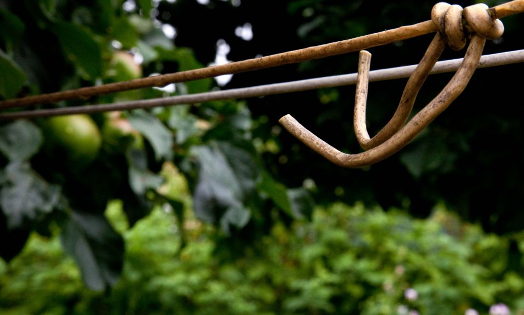 Separation onlineEditor's Choice for Technical Merit
Photographed by Lars
Rick's image of
Very expensive shotguns was nicely composed, and he very wisely chose a large aperture in an attempt to separate the subjects from the background. This image is a great example of how less magnification (shooting from further away or with a wider angle lens) will result in more depth of field compared to the same scene photographed with more magnification. Rick might have been able to get a bit more separation by stepping further back from the subject and using a longer telephoto lens. All in all this was a nice composition, and a great illustration that less magnification on the subject will result in more depth of field.
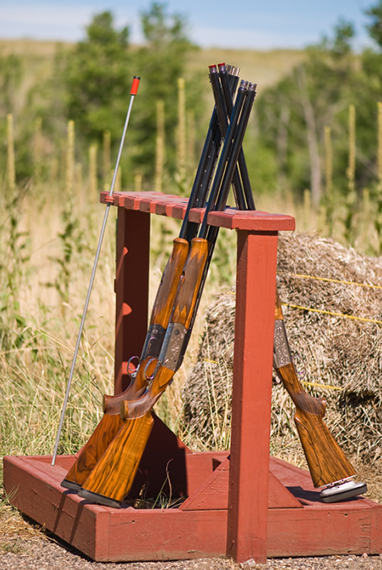 Very expensive shotguns
Photographed by Rick Pepin
Chris' images of
Uncle David and
Grandma were great examples of using a wide to medium aperture to provide nice separation between a portrait subject and the background, while still providing enough of a background image to give context to the portrait. I think Chris did a great job capturing the personalities of both of his subjects.
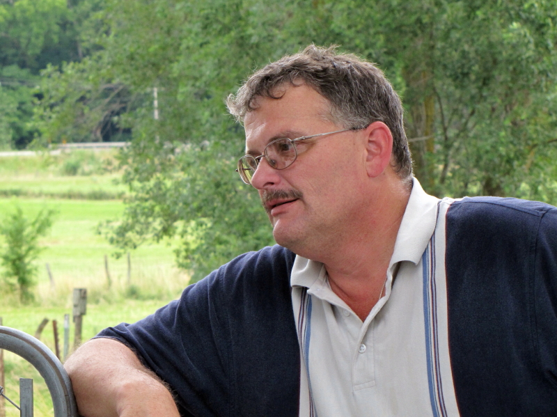 Uncle David
Photographed by Chris Franklin
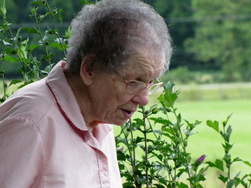 Grandma
Photographed by Chris Franklin
Thank you again to everyone that participated in this assignment. I enjoyed seeing your images, and your creativity keeps me inspired.
Viewers are encouraged to respond to this thread describing why you like a particular image, or think it was particularly successful at meeting the guidelines of the assignment.
Keith


