Thank you to everyone that participated in the "Zone VI" assignment. You all continue to inspire me. This was another week where I had a tough time picking just one favorite.
The guidelines for this assignment were to use manual metering mode and spot/partial area metering to properly expose a subject with a "Zone VI" exposure. The
assignment description suggested caucasian skin tones, or pastel colors as potential Zone VI subjects.
Why an assignment on "Zone VI?" Because I think it is important to recognize that some scenes (or subjects) are not "average" tonality and that to successfully produce the image we have visualized (or should have visualized), we will need to increase the exposure, either during the exposure itself, or during post processing. Increasing the exposure during capture will almost always help us produce a higher quality final image, with better colors and tonality. If we always use "evaluative" or "matrix" metering at its default setting, then we often don't stop to think whether our subjects
should be rendered at a lighter tone. Hopefully this exercise was useful in helping you recognize tonalities that should be rendered lighter than "average." And, this was a useful exercise to help you practice manual metering. Even if you don't use manual metering in your day-to-day photography, learning how it works will help you to understand and adjust your cameras "default" behavior when it isn't appropriate for the scene.
Michele's
Graceful line image was a wonderful image that consisted primarily of tonalities in Zone VI (the dress) and Zone VII (the lighter parts of the legs and feet). It should be apparent that this image would have a completely different "feel" if the meter had been left on default and the image rendered darker. The lighter tones definitely contribute to the "airy" feeling of this image, and the exposure (and rendering of tonalities) for this image were just about perfect. The composition was also very nice, providing a "sense" of ballet, without including any distracting elements in the scene. I could envision an image like this being used for a brochure or high-end advertisement. I've awarded this image
Editor's Choice for Technical Merit.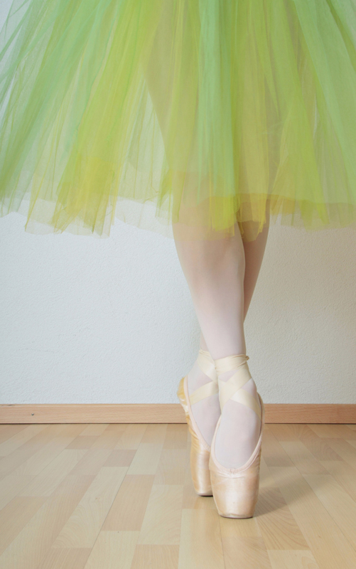 Graceful lineEditor's Choice for Technical Merit.
Photographed by Michele Bollhalder
McKenzie wouldn't stand still for my
Morning Walk image, so as an alternative to using manual exposure, I dialed in +1 EV of exposure compensation, set the exposure mode to aperture priority, dialed in a relatively wide aperture of f4 to softly blur the distracting background, and used spot metering (linked to my active autofocus point) to focus on her pink hat, which I judged to be Zone VI. (I was trying to challenge myself by picking a Zone VI color, which I know can be tricky at times.) I think I came pretty close to nailing the exposure, since applying any additional exposure in post processing tends to "blow out" the pinks for this image. It is probably also worth noting that the soft light on her cheeks is also in Zone VI, so metering for skin tones would have also worked in this situation. And yes, I could have used manual exposure and achieved the same results; however I was "experimenting" with metering on many different tonalities and colors at +1EV, and so this was a convenient way to compare the results.
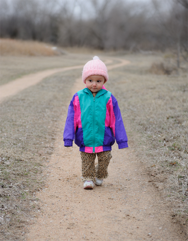 Morning Walk
Photographed by Keith
Jaime's
Mardi Gras 2010 (New Orleans) was a good example of using manual exposure and spot metering for "Zone VI" to achieve good skin tones. As Jaime and I talked about in the comments in the Gallery, I thought this image was just a little bit "hot" (over exposed) and attributed this to Jaime's decision to meter at +1.5EV for the skin tones. In general I recommend not going any "hotter" than +1 EV when metering skin tones unless you are going for a "high key" effect. Although the skin tones on the woman's face are OK, the color is starting to look "funky" on her hand, and on the face in the background. There is a balancing act when exposing skin tones, and I feel this image was just a bit over exposed. Had Jaime exposed the original image at +1 EV, he could always add a bit more exposure in post processing if he felt the image needed it, while still protecting the highlights. That said, this was an awesome capture that evokes the "essence" of Mardi Gras.
 Mardi Gras 2010 (New Orleans)
Photographed by Jamie Dorotan
Dave Brooks'
Fairy image was another "airy" image that worked well with the ZoneVI assignment. Dave used spot metering and manual exposure, and the fairy's skin tones and skirt were effectively rendered in Zone VI. Dave's use of a dark cloth for the background, evoking the feeling of a dark cave, was also a very effective treatment for this image. I suspect that if he would have used evaluative metering for this shot, the fairy would have actually been overexposed because of the preponderance of the dark background. This was a fun image, and a great submission for the assignment.
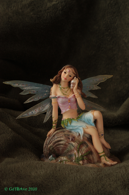 Fairy
FairyPhotographed by Dave Brooks
Rick did a great job identifying and metering on Zone VI colors in his
Spring Flowers image. This was another great example where metering on the flowers as a "mid-tone" would not have provided an accurate rendition of the colors and tonality of the flowers. Good job Rick. I enjoyed the color combination and the feeling of Spring evoked by this image.
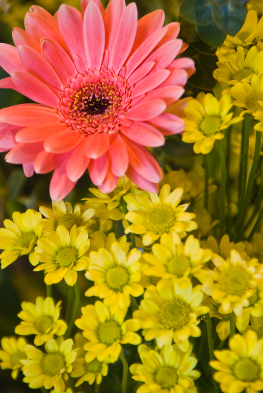 Spring Flowers
Photographed by Rick Pepin
Lars' Angel image is another great example of an image that wouldn't have been rendered properly without "intervention" from the photographer. The preponderance of tones in this image (primarily from the light colored wall) are mostly in the upper end of Zone VI and lower end of Zone VII. This would have caused the image to be significantly underexposed if Lars had left the camera on "defaults" and simply used matrix/evaluative metering and one of the autoexposure modes for this image. Lars' manual exposure settings resulted in a very nice rendition of the angel, especially the skin tones on her face. We should also recognize the nice soft light Lars used for this image, which gave nice "modeling" on the face. Great exposure Lars.
 Angel
AngelPhotographed by Lars
Ahhh, and then there was Marilyn's
Spring Blossoms image. Of all the images submitted for the assignment, this was the one that most called out for a Zone VI exposure. This beautiful rendition just would not have been the same if the image had been rendered darker. (I did notice that because this image didn't have an embedded color profile, it rendered quite differently on our different displays. It was a bit "flat and blue" on Rebecca's laptop display, but rendered with beautifully vibrant colors on my wide gamut display. I'll look forward to helping Marilyn figure out how to implement color profiles using iPhoto when we are on our upcoming workshop. I'm not that familiar with iPhoto (I don't have a Mac) but I've read there are "quirks" that hopefully we will be able to work through so that she can embed profiles in her images so they will display consistently across our various displays.) Although the tonality in the flowers varies from high Zone V (in the red leaves) to Zone VII in the sunlit portions of the petals, the area metered using Marilyn's "partial area" (large spot) meter would have averaged out to a Zone VI exposure. This was a beautiful image that definitely evoked the feeling of Spring. Wonderful! I've selected this image as
Editor's Choice for Artistic Merit. 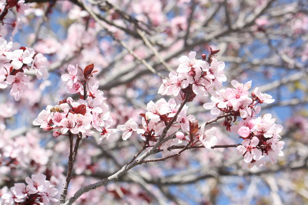 Spring blossoms Editor's Choice for Artistic Merit.
Photographed by Marilyn McKinney
Dave Leiker's
Flint Hills - Late Winter image was one of the inspiring images submitted for this assignment that made it so difficult for me to pick a favorite. Dave's image was the one that most made me want to "step into the scene." Which is even more remarkable since it was an image of Kansas instead of the Colorado mountains. Just kidding about the "Kansas" part.

This image made me look forward to the opportunity to go "wildly exploring" with Dave. I love his sense of the land, and the way he is able to capture that feeling in his images. This is a
wonderful image Dave. Other folks thought so as well, since this image won the vote for
People's Choice.
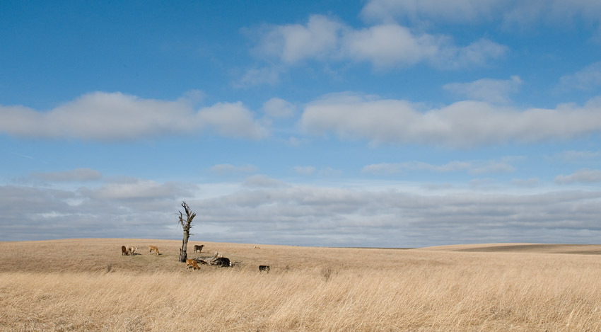 Flint Hills - Late WinterPeople's Choice
Photographed by Dave Leiker
Thank you to everyone that participated in this assignment. Hopefully this week's assignment helped us recognize that some scenes (or subjects) are not "average" tonality and that to successfully produce the image we have visualized (or should have visualized), we will need to increase the exposure, either during the capture itself, or during post processing. (Increasing the exposure during capture will almost always help us produce a higher quality final image, with better colors and tonality.)
Viewers are encouraged to respond to this thread describing why you like a particular image, or think it was particularly successful at meeting the guidelines of the assignment.
Keith


