
|
Digital Photography Tutorials |
Digital Photography “From Camera to Print”By Keith and Rebecca SnellTransferring the Image from the Camera Basic Post-processing in Photoshop Building and saving a Sharpening Action
|
|
Camera Raw
Image Import Parameter Adjustment Before we get into making adjustments to the image, I want to talk about setting the image import parameters first, because how you set these parameters will potentially affect the rest of your adjustments. The settings I’m talking about can be found in the lower left of your camera raw window.
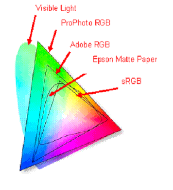
Color Space The Space setting gives you the choice of four color space settings: sRGB, Colormatch RGB, Adobe RGB, and ProPhoto RGB. I’ve listed these settings in order of the smallest color space to the largest color space. The relative sizes and colors contained in these color spaces is illustrated in Figure 2 below.
The “color space” setting determines how the sensor-recorded color and tonal values are mapped to the image file. As we discussed in our previous lesson, your camera’s sensor “sees” light differently than your eyes. In order to portray an accurate representation of the scene, you need to translate the values recorded by your sensor to values that will look accurate on your output device.
Many common output devices have a relatively small color space, and narrow color spaces like sRGB were developed to provide a more accurate mapping of your sensor data to colors that can be displayed by the typical computer monitor. The potential drawback of selecting a small color space is that some colors recorded by your sensor might fall outside the range of that defined color space. As a result, these colors won’t be transferred into the image file. These colors will be “clipped,” which may result in unnatural looking colors when the remaining parts of the three color channels are combined to produce our final image colors.
Color channel clipping is often visible in bright reds, but can be seen in inaccurate representations of other colors as well. Once a color channel is clipped, there is no way to regain that information or obtain an accurate color representation on that part of the scene. Because Adobe RGB is a wider color space than sRGB, it can contain more of the colors captured by your sensor, and is therefore typically considered a more “accurate” color space than sRGB. The Color Match color space was designed to match the native color space of the old Radius Pressview monitors and is a smaller gamut alternative to Adobe RGB for print production work. (Color Match is rarely used.)
Adobe RGB has a wider color gamut than sRGB, and therefore a wider color spectrum can be represented in that color space without clipping. You can readily observe this effect by viewing a bright red object in Nikon Capture and toggling between the color modes listed under the advanced raw dialogue. (Modes I and III correspond to the sRGB color space and Mode II corresponds to Adobe RGB.) The result of clipping in the red channel will result in over-saturated, inaccurate colors and lack of tonal gradations.
You can see the effect of choosing the different color spaces in Camera Raw by toggling through the different color space options and observing the histogram. Note the difference between selecting the Adobe RGB and sRGB colorspace. Since sRGB is a “narrower” color space, the colors and tones in the image are mapped closer to the extremes of the histogram. If you had an image with a wide color gamut, it might clip the extremes in sRGB, causing an inaccurate representation of the remaining colors, whereas Adobe RGB is a “wider” color space and can accommodate more extremes in color.
So why not always use the widest color space? Again, you should understand that if you try to display an image in Adobe RGB color space in a non color-smart application (many web display tools aren’t color-smart), it won’t be properly mapped to the monitor color space and will look “flat,” meaning both the contrast and color saturation will be too low. There is no one “best” color space, and you should select your destination color space based on how the image will be used.
The sRGB color space more closely matches the display colors of most monitors, so if your primary goal is to display on the web, then sRGB is probably the better choice as your destination color space. If you are submitting the images to a magazine editor that will be converting the image to a CMYK color space or 4-color separation process for printing, you should submit the images in Adobe RGB or another wider color space since this will provide a more accurate conversion to CMYK.
This brings us to the distinction between your “working” color space and your final destination color space. The goal of most photographers in the initial raw conversion process is to develop the highest quality image possible from their raw file, and use this image as a starting point for any future image output. Therefore we will try to preserve all the image information present in the raw file during our initial conversion from raw.
The widest color space available in Camera Raw is the ProPhoto color space, which contains almost all the visible colors that can be recorded by your camera’s sensor. In the past, this color space wasn’t recommended as a working color space, primarily because earlier versions of Photoshop had very limited capability to work in 16-bit mode and Photoshop’s very powerful layer functions were only available in 8-bit mode.
When photographers using earlier versions of Photoshop attempted to use the ProPhoto color space in 8-bit mode, the limited tonal values that can be represented in an 8 bit file were spread too thin across the wide color space, resulting in color “banding” in some images. (Remember from our earlier lesson that an 8-bit implementation represents 256 discrete tonal values for each color channel (RGB), while a 16-bit implementation represents 65,536 discrete tonal values for each color channel.)
Because of the “banding” issues associated with using ProPhoto in 8-bit mode, the narrower Adobe RGB color space was recommended as the working color space. Adobe RGB is wide enough to contain most of the colors available from your sensor, but narrow enough that the tonal values in 8-bit mode aren’t spread so far apart that they show banding.
Now that Photoshop CS supports most functions in 16-bit mode, many photographers are beginning to use ProPhoto as their working color space in order to retain as much information from the raw file as possible. But that doesn’t mean that you should automatically chose the widest possible color space for every image. Because most output devices have a much narrower color spaces, you will invariably have to remap your image colors from the larger color space to a smaller output color space before you can print or display the image. Unfortunately, mapping colors from a very large color space to a smaller color space can sometimes cause inaccurate colors as well, since maintaining accurate color relationships can be a challenge if certain colors are missing from the more narrow color space. Explaining why this is the case would require a more detailed explanation of the differences between the “perceptual,” “relative colorimetric” and “colorimetric” conversion algorithms in Photoshop. I would prefer to save this detailed explanation for a later time.
For now it is sufficient to say that as a general rule, you should choose a working color space large enough to contain all of the color data in the image without clipping. You can see whether you are clipping colors by using several tools available in Camera Raw. The primary method is by observing the red, blue and green histograms in the histogram display and noting whether they show “clipping” of specific color channels at the extremes of the histogram. We will talk about another method of determining what colors are being clipped when we discuss the use of the exposure slider.
Once you have all the colors mapped into a working color space without clipping any colors, then you can use this as your “working” color space and then use the “perceptual” conversion capability in Photoshop to re-map the colors to a smaller destination color space for your chosen output device. The “perceptual” conversion in Photoshop attempts to maintain the color relationships in an image, so that even though it is mapping the colors into a smaller color space, our brain “perceives” that the colors are similar to the original colors because the color relationships between the three color channels are maintained.
The “perceptual” mapping is only an approximation, therefore it is always a good idea to avoid drastic changes in color space where possible. Again, we want to chose a working color space large enough to contain all of the color data in the image without clipping, but no larger. If all your colors fit into the Adobe RGB color space without clipping, use this color space. If you see clipping in one of the color channels, then select ProPhoto as your working color space.
In our discussions above we briefly mentioned the rationale for choosing 16-bit mode as your working bit depth instead of 8-bit mode. In the next section we will cover “bit depth” in a little more detail.
Transferring the Image from the Camera Basic Post-processing in Photoshop
|
|
Spirit of Photography Keith and Rebecca Snell |