The guidelines for this assignment were to photograph a scene under challenging lighting conditions (other than direct sunlight) and use a digital gray card or equivalent spectrally neutral target to "click balance" or preset your white balance for the scene. I encouraged people to post a "before" and "after" image showing their white balance adjustments, and I have included the "before" and "after" images in the post below so you can see the differences.
Lars made a great choice to shift the white balance towards blue in his Clouds image. The shift towards blue really helped accentuate the colors of the water and sky and helped to highlight the amazing sky. This was a wonderful image that made me imagine that I was floating way up high in a hot air balloon among the clouds.
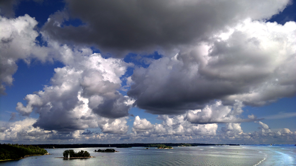 Clouds
Whitebalance more blue
Photographed by Lars
I agree with Rebecca that the composition of Lars'
rainbow image does a great job conveying a sense of place, and the double rainbow was a nice bonus that was accentuated by shifting the white balance towards red. Nice job Lars.
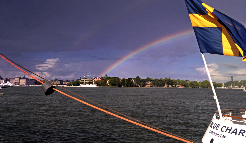 rainbow
Whitebalance more red
Photographed by Lars
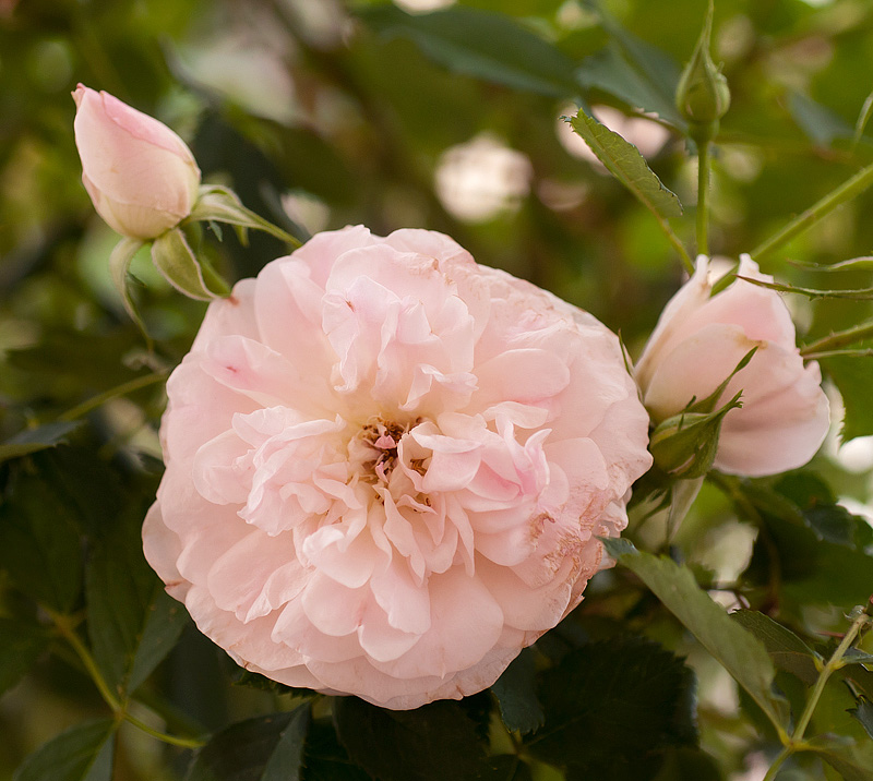
I appreciated being able to see both the "before" and "after" versions of Sue's image of the
Pale Pink Roses. The colors in the "before" version were definitely more muted, and the corrected version was certainly an improvement. I'm not sure why, but I still felt like the image could use just a little bit of a shift towards magenta, and have posted a third alternative below with a small shift towards magenta. I suspect the "after" version might be the most "accurate," but that the third version might better match the way we would remember the colors, with the pink standing out more from the green. Often times setting white balance with the gray card provides the best starting point, but we still have to "tweak" the color balance based on how we remember the scene (or want viewers to see it).
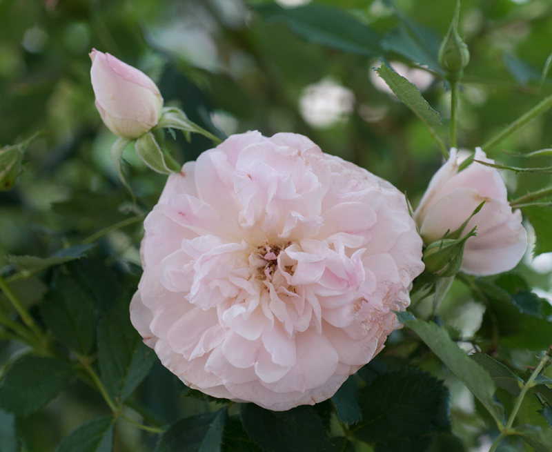 Pale Pink Roses
 Before white balance adjustment
Photographed by Sue Pepiin
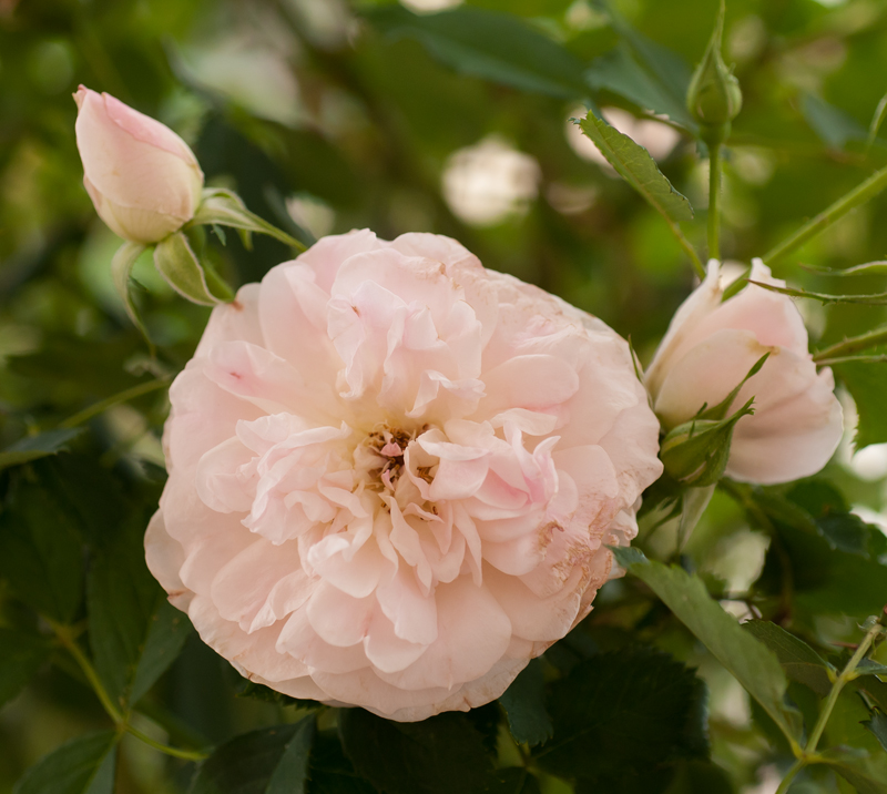 Pink Roses
After white balance adjustment
Photographed by Sue Pepiin
 Pink Roses
After white balance adjustment, shifted just a bit towards magenta (away from green)
Photographed by Sue Pepiin
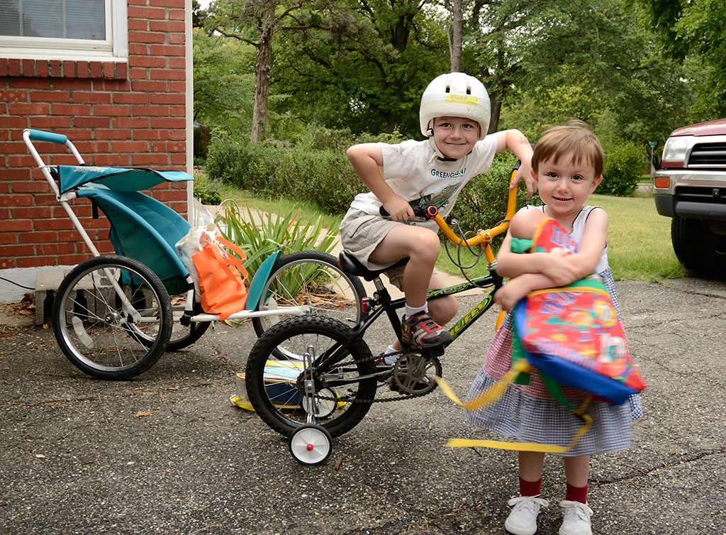
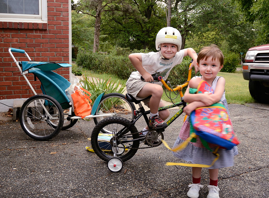
I appreciated seeing all three versions of Rebecca's image of
Mac's first day of school. As Rebecca mentioned, if you don't have a gray card handy, sometimes clicking on a neutral white in the scene will do the trick. You will find that clicking on different "whites" in the scene can sometimes return significantly different results. The key is to find a neutral white in the same light as your subject's skin. I thought the overall color in Rebecca's corrected image still had a bit of a greenish cast, so I pulled the image into Photoshop and used the "snap to neutral" eyedropper in the curves dialog to try to correct the color cast. Part of the difference between the two versions will be because I chose to click balance on the white wheel on Evan's bike instead of MacKenzie's shoe. And now I see from going back to Rebecca's image comments that she thought her "corrected" version looked a little too green as well, and proposed the "daylight" image as an alternative. I tend to agree that the daylight version was the best of the three she posted.
I also used the "dodge" tool to lighten up the faces a bit. Skin tones are tough, and you will often find that shifting skin tones a bit more towards magenta will make them more pleasing. (We tend to think that "pasty" (blue or greenish) skin tones make people look sickly or unhealthy.) Anyway, I've added the adjusted version as the fourth image in the series for your consideration.
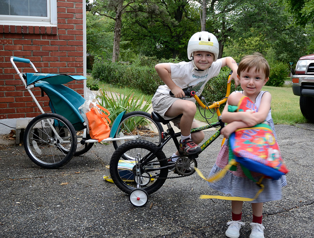 Mac's first day of school
No adjustment
Photographed by Rebecca
 Mac's first day of school
 Daylight wb
Photographed by Rebecca
 Mac's first day of school
Corrected
Photographed by Rebecca
 Mac's first day of school
Corrected
Photographed by Rebecca
I want to thank Michele for going through the trouble to post two versions of her image, one where she set a "pre-set" white balance in the camera based on a white card, and a second image where she used the click balance eyedropper to set the white balance in the raw processor. I suspected that these two methods might return slightly different results, and Michele's experiment helps confirm this suspicion. I still want to find the time to do a little more testing so I can better understand the differences.
 Training 4
WB set directly into the camera.
Photographed by Michele Bollhalder
 Training 4
WB in RAW using the card
Photographed by Michele Bollhalder
Dave's image of
Evening Light - Morris County was a GREAT example of how auto white balance can unintentionally neutralize or desaturated the colors in our images. We need to be especially careful about this when photographing the warm light of sunrise or sunset, but it can happen any time we have saturated colors in a scene. It was only after he shifted the white balance that Dave was able to bring back the rich colors of the original scene. This wonderful image was selected as
People's Choice and
Editor's Choice for Artistic Merit.
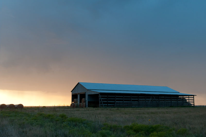 Evening Light - Morris County
 Before white balance adjustments
Photographed by Dave Leiker (prairiedust)
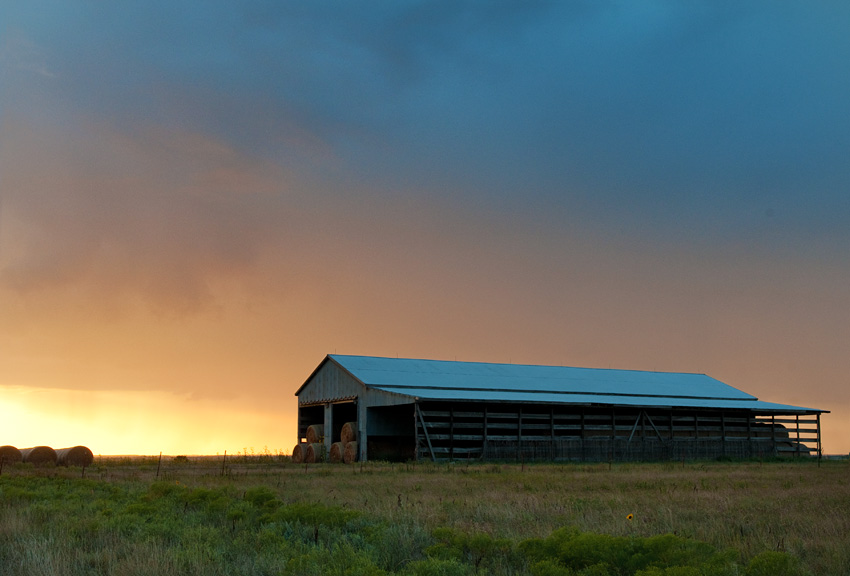 Evening Light - Morris County
 After white balance adjustments
People's Choice and
Editor's Choice for Artistic MeritPhotographed by Dave Leiker (prairiedust)
Thank you to everyone that participated in this assignment. I know it wasn't one of our more exiting assignments, but hopefully it helped illustrate the importance of choosing an appropriate white balance for your images.
Keith


