I apologize for taking so long to provide feedback for the images submitted for this assignment. We had lots of things going on earlier this week, including electrical/air conditioning repairs and plumbing repairs, and I didn't get the feedback done like I should have. I will try to be more prompt in the future.
The
guidelines for this assignment were to compose an image of the natural landscape that illustrates the relationships between harmonious elements within the scene. In general, the intimate landscape concentrates on a small portion of the overall scene and does not include a horizon or skyline. Unlike the grand scenic, which includes the "grand" view out to infinity, the intimate landscape typically encompasses a view from 10 to 100 feet (3 to 30 meters) in front of the viewer.
Michele's
Bench image tied for
People's Choice. This image was composed with several elements that came together very well to produce this "intimate landscape." The path leading into the area in front of the bench definitely helped draw the viewer into the scene and provide depth, while the frame provided by the branches and leaves in the upper right helped to both enhance the sense of depth and produce a more intimate feeling. Framing the scene with these branches helped the viewer understand that they were walking under a canopy formed by the trees and helped convey the intimacy of the environment. The contrast between the bench and the surrounding green also helped to draw the viewer's eye to the focal point of the scene. The patterns in the sunlit trees behind the bench provided a visual element that gave the scene the most interest (and also provided a sense of depth beyond the bench). I'm just a bit bothered by the overexposed area in the tree trunk on the left side of the bench, and wonder if the image might have been a little stronger if it had been underexposed a bit more during the capture (to protect the color and detail in that tree trunk) and then the exposures brought up in the surrounding areas during post processing. The yellow sign on the left of the image definitely helps to balance the composition. Since I'm not able to read the words on the sign, I don't know whether it really contributes to the image or not. Normally I would be predisposed to edit a yellow sign like this out of my image, but I don't know enough about the meaning of the sign to know if it contributes anything meaningful to the image. This composition is a very nice example of an intimate landscape. It draws the viewer into the scene, invites them to linger for awhile and gives them something visually interesting to keep them engaged. This is definitely an image worth spending time with. Although there is no spectacular subject to grab the viewer's attention, the individual elements come together very well to produce a visually interesting image that satisfies the viewer on several levels.
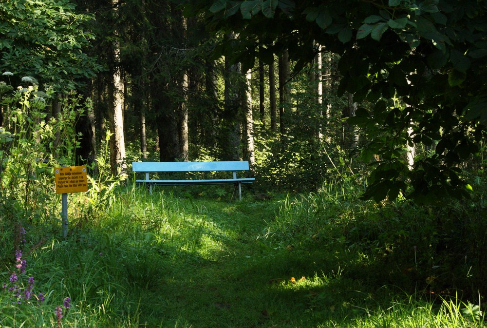 Bench
BenchTied for
People's ChoicePhotographed by Michele Bollhalder
Michele's
Secluded Bridge is another very nicely balanced composition, with the path and bridge working very nicely to draw the viewer into the scene and provide a sense of depth. The high contrast areas on the path and bridge again help draw the viewer's attention to the "focal point" of the scene, and the hint of sky and fields beyond the bridge give the viewer the sense that there is more to explore. The element that perhaps contributes the most to the success of this image is the visually interesting pattern provided by the backlit leaves of the trees. The contrast, colors and patterns in this visual element give the image "punch" and help to engage the viewer. This is another image that is worth spending time with. It doesn't have a spectacular subject, but succeeds because of the combination of visual elements into an effective composition that engages the viewer. This is another nice example of the genre because it invites the viewer to slow down and explore their immediate environment.
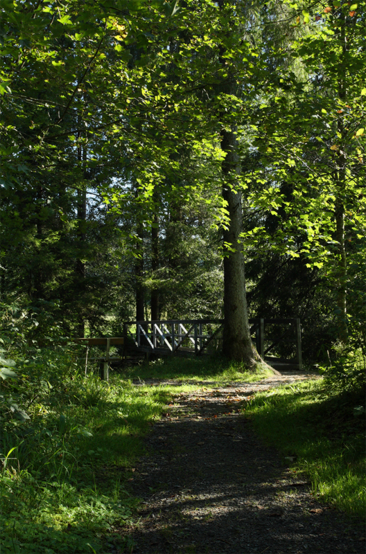 Secluded Bridge
Photographed by Michele Bollhalder
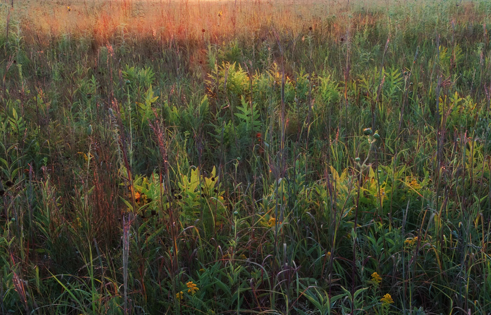
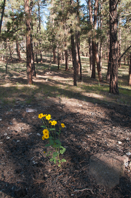
Dave's
Morning at the Weed Patch image was perhaps the best example of an image designed to "illustrate the relationships between harmonious elements within the scene." It is, as John Fielder would say, "a portrait of the planet - its geology and life forms - without the distraction of what is happening [in the larger landscape]." More than the others, this image invites the viewer to explore a very small area of the earth, and appreciate it for what it is. The visually interesting patterns of branches and light in the grass are what engage the viewer the most and compel them to give this scene more than a passing glance. Nicely done!
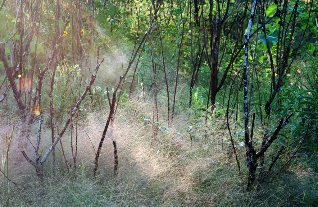 Morning at the Weed Patch
Photographed by Dave Leiker (prairiedust)
Dave's
Prairie Morning #8818 was another great example of a scene made beautiful by the magical light. The image would probably better represent an "intimate landscape" if it were cropped as in the example just below Dave's original image. (Notice how cropping out the high contrast area in the upper part of the image helps bring the viewer's attention back to the grass in their immediate surroundings.) However, Dave's image is wonderful just as it is, with the hint of a horizon helping to provide a sense of place that is missing in the cropped version.
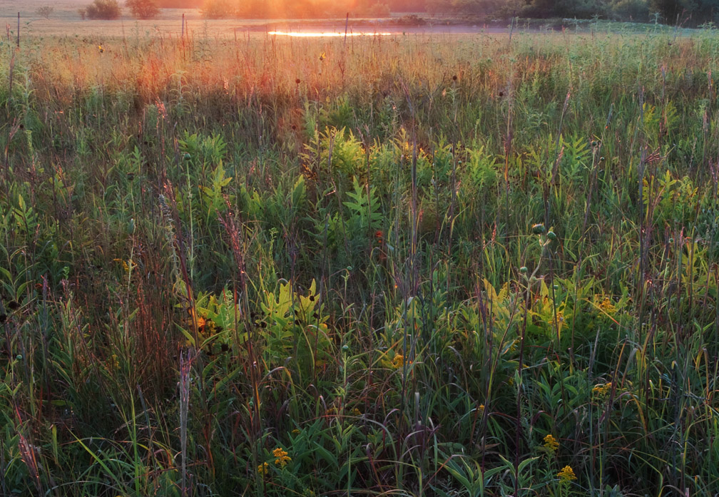 Prairie Morning #8818
Photographed by Dave Leiker (prairiedust)
 Prairie Morning #8818
Photographed by Dave Leiker (prairiedust), example crop by Keith
Rick's
Sunflower Field was a nice composition; however, I must confess that I enjoy seeing the harmonious relationships of elements in a natural scene more than seeing a homogeneous artificial planting like this. I think Rick's
Aspen Grove images succeed better as intimate landscapes.
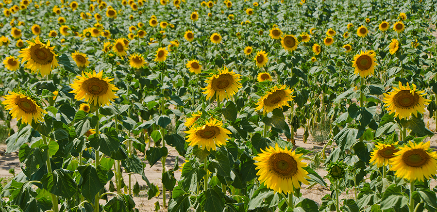 Sunflower Field
Photographed by Rick Pepin (TrvlRick)
Of Rick's two
Aspen Grove images, I found his B&W image to be the strongest. The color version was perhaps too much of a jumble of competing elements, while the B&W version was composed of a visually interesting pattern of white aspen trunks that more closely resemble our "ideal" of what aspens should look like. The bright "splash" of leaves at the top of the B&W image added an interesting element that contributed a bit of sophistication (and depth) to the image.
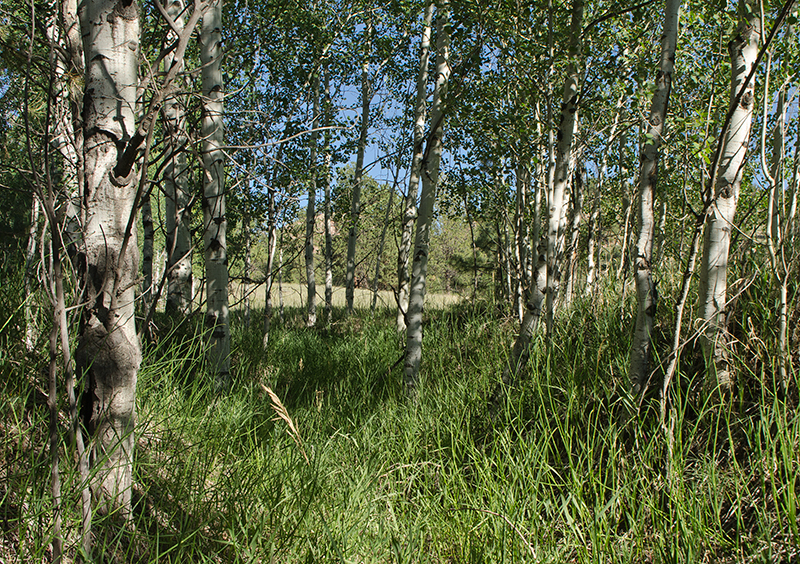 Aspen Grove
Photographed by Rick Pepin (TrvlRick)
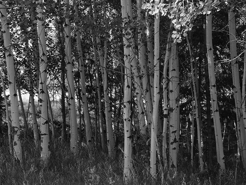 Aspen Grove B&W
Photographed by Rick Pepin (TrvlRick)
I appreciated Sue's
Daisies in the Woods image the most because it helped to tell a story, and therefore was more than just a "pretty picture." I think this image might have been a bit stronger if Sue would have moved in a bit closer to the daisies. The scene would have also had a more intimate feeling if Sue could have composed it without including the sky. As it is this is a nice image that helps tell a story, and the inclusion of the forest definitely helps provide context. Nicely done Sue.
 Daisies in the Woods
Photographed by Sue Pepin
I wasn't very happy with the way my
Water Garden image turned out, and I think that was primarily due to the high contrast light. It tried to use a polarizer to compensate for some of the contrast (and reduce the glare on the leaves) but the reality is that it is very hard to convey "intimacy" in a scene with bright high contrast light. It was a good learning experience though, and gave me a chance to experiment with using my polarizer and gray cards.

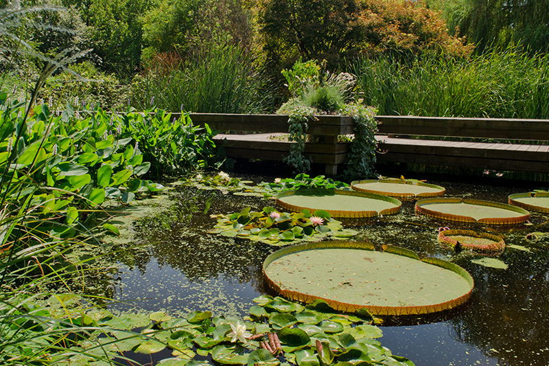 Water Garden
Photographed by Keith
My
Small Stream image was more of what I consider an intimate landscape, but I must confess that it was an "afterthought" that I took hurriedly as I was walking back to the car. This is another example of an image that succeeds in large part due to the inclusion of a visually interesting element (the reflection of the tree in the water) that helps to engage the viewer.
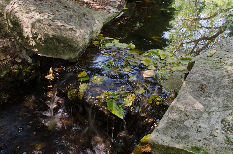 Small Stream
Photographed by Keith
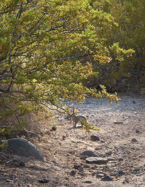
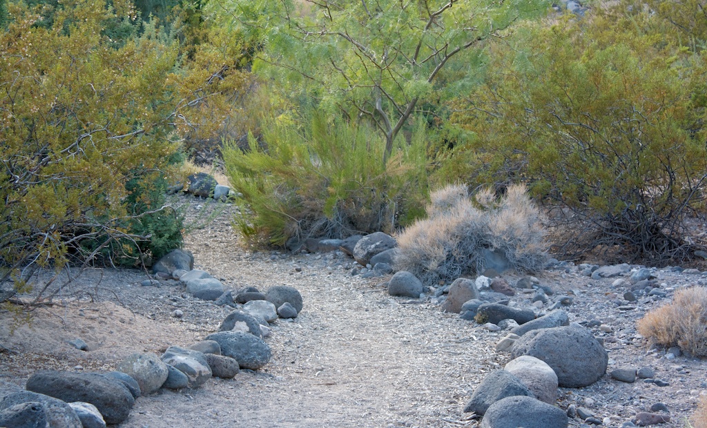
I appreciate Marilyn's attempt to illustrate the "harmonious relationship of elements" in her
Sanctuary image. It's a shame that the rabbit didn't cooperate better. While the inclusion of the width of the wash helps provide context, I wonder if the image isn't a bit stronger when cropped? (I did play with the contrast a little in portions of the cropped example (using layers and masks in Photoshop) to help direct the viewers eyes towards the center of interest.)
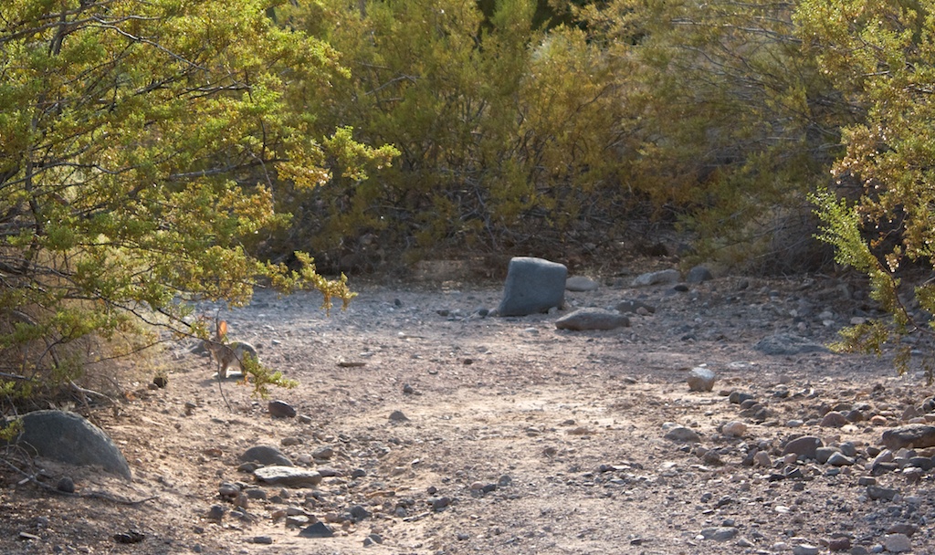 Sanctuary
Photographed by Marilyn McKinney
 Sanctuary
Photographed by Marilyn McKinney, example crop by Keith
The soft light and cooler colors in Marilyn's image of
Hidden trails along the wash did a wonderful job of evoking the feeling of an evening walk in the Southwest. I played with this image a bit in Photoshop, experimenting with increasing the contrast and brightness in specific areas and adding a bit of selective sharpening, but those changes diminished the feeling of an "evening walk" and so in the end I decided the image was successful just like it is.
Of all the images submitted for the assignment, this one best "invites me in" and makes me want to explore the immediate environment. It also does a great job conveying the harmonious relationships between the different elements, therefore I have selected it as
Editor's Choice for Artistic Merit.
 Hidden trails along the washEditor's Choice for Artistic Merit
 and tied for
People's ChoicePhotographed by Marilyn McKinney
Thank you again to everyone that participated in this assignment. The "intimate landscape" is one of my favorite genre's of photography, and one that I need to practice more often.


