I've been wanting to do an assignment dealing with white balance for quite some time, but have been unsure how to best present it. I'm still unsure of the best way to present the topic, but here goes anyway.

Stated simply, white balance is an adjustment your camera or software applies to adjust the balance of the Red, Green and Blue (RGB) color channels to compensate for the color of light falling on the scene. We don't normally think about "light" as being different colors, because our mind does such a wonderful job of adjusting the colors automatically based on reference or memory colors. In other words, when we look at a white object under incandescent light, our perception will adjust automatically so that we still consider the object "white" even though in reality it is yellow because of the color of the light source. If however we take a digital image without adjusting the white balance, the resulting image will have a yellow tint. Because we view the print (or display) in an environment that doesn't have that same light source, the whites will look yellow. To compensate for this, the in-camera processing or raw processing software will attempt to adjust the color channels in order to produce neutral whites. The camera can normally do a pretty good job adjusting white balance if there are neutral whites in the scene, or if the light falling on the scene is close to normal daylight. If however, there are no neutral whites in the scene, and the scene contains strong color components, the white balance algorithms can be fooled, resulting in an image with colors that are shifted along the yellow blue axis (color temperature), or along the magenta green axis (color "tint").
The reality is that although your camera or software can sometimes do an adequate job estimating the proper white balance, it is very rarely exactly correct. All raw processing software allows the user to manually adjust or correct the white balance, but correctly adjusting the white balance can be daunting to many photographers. I find myself constantly comparing "real" sky colors to the colors I've seen produced in my raw processing software. Why? Because many times the blue in the images coming from the raw processor doesn't quite look right, and I'm trying to understand why. Once you start paying attention, you begin to realize that there isn't just one typical sky color, but that it varies across a wide range of blues with various "tints." Sometimes going towards magenta, and sometimes towards green. Sometimes warmer (more yellow) and sometimes cooler (more blue). So what is the "right" sky color?
To complicate maters even more, objects in "open shade" (illuminated by the wide expanse of blue sky, but shielded from the direct light from the sun) will always have a bluer tint than objects in direct sunlight. This makes it very difficult for the photographer to judge how to correct the white balance. We can often tell that the colors are "off," but less often know intuitively how to correct them. One very useful technique, and the subject of this assignment is the "digital gray card." This is a gray card designed to be spectrally neutral across a wide range of light sources. By including this card in a reference image, we can "click balance" on the gray card to automatically balance the color channels to obtain a neutral gray in the image, thus taking much of the guess work out of our white balance adjustments. Once we've click balanced our reference image, we can easily copy and paste this white balance adjustment to other images taken in the same light.
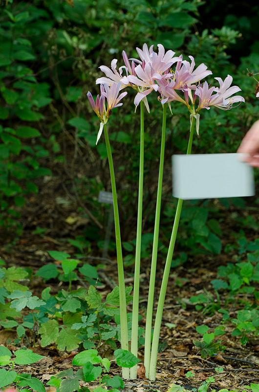
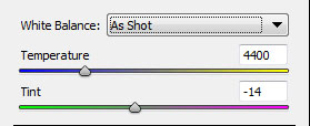
Let's look at an example. The image below was taken in mixed "hazy bright" light and shade, with sunlight coming through high thin clouds and filtering through the overhead green foliage. To make things even more difficult for the camera's white balance algorithm, the flowers were a bright pink. In the resulting image with the "as shot" white balance, the colors are shifted too much towards blue (along the yellow blue axis) and towards green (along the green magenta axis). The beauty of using Adobe Camera Raw (ACR) to analyze the image is that it shows the color temperature (4400K) and tint (14 units towards green) used to render the "as shot" white balance. The colors in the rendered image look muted, which is often the case when the white balance is shifted too far in any one direction. If the white balance is shifted too much towards the cool colors, warmer colors in the image will loose their vibrance. In this case, the pink in the lilies is much too muted.
Often when trying to adjust white balance, I find "daylight" white balance to be a good starting point. ACR sets daylight white balance as 5500K with a tint of +10 towards magenta. In the resulting image below, the pinks become more vibrant (we aren't muting them so much by shifting towards blue) but the image is still too green (probably caused by a combination of the light filtering through the high clouds and the overhead foliage.
Since I knew I took the image under high thin clouds and partial shade, I decided to give the "cloudy" white balance preset a try. Whoa! way too warm, with everything shifting too much towards yellow.
Sometimes, especially if there are neutral (or close to neutral) whites present in the scene, the auto setting will result in a decent approximation. Not in this case though, with the auto setting again resulting in colors that are way too cool.
And of course we've finally come to the reason for including the gray card in the scene. For the next rendition of the image I click in the center of the gray card using the eyedropper tool in ACR to obtain a custom setting of 5600K and tint of +24 towards magenta. This gives me the vibrant pinks I remember, and corrects the green tint in most of the previous images.
I know it is tough to compare white balance and color tints when you are scrolling up and down on the display, so I've included a table with all of the variations side-by-side. You should be able to see the subtle color variations across the various renditions (assuming of course that you are viewing this in a color managed browser on a calibrated display
). The Daylight white balance setting actually wasn't too bad, but comparing them side-by-side I can see that the pinks in the rendition where I click balanced on the gray card are definitely more vibrant.
Here's the final comparison between "as shot" or auto white balance and the click balance using the gray card. The click balanced rendition is definitely better, with more accurate and more vibrant colors on both Rebecca's color calibrated display and on mine. Don't assume that the auto white balance setting on your camera is resulting in the best color rendition. If the colors look muted or flat (or "off") in some way, try examine the neutral or reference colors in the scene to determine which direction you need to adjust the white balance and tint.
The digital gray card I used in this scene is the original WhiBal card. They have a newer version of that card out now, and quite a few "knockoffs" that can be purchased on Ebay or Amazon.com. The important thing is to use a card that is spectrally neutral under a wide range of lighting conditions. The WhiBal cards are made of pigmented plastic, so the color goes clear through the card and cannot be rubbed off. The cards are durable and can be washed with soap and water if needed. Gray cards definitely aren't a perfect solution (sometimes you want a slight color tint in your images, and removing that tint makes them look unnatural); however, it is a very useful tool to allow you to analyze your images to determine what white balance settings result in neutral grays, and then adjust for "artistic intent" or perception from there.
I've made this a 2-week assignment in the event that some of you need time to purchase a digital gray card. They can be found relatively cheap on Ebay or Amazon.com (or you can spring for the slightly more expensive "certified" neutral WhiBal cards). You can also try using a piece of white paper, but be aware that many white papers actually have brighteners to make them look more "white," and these brighteners can result in wildly varying white balance corrections under different light sources. (Some white fabrics do this too!)
The assignment for 29 August - 11 September is to photograph a scene under challenging lighting conditions (other than direct sunlight) and use a digital gray card or equivalent spectrally neutral target to "click balance" or preset your white balance for the scene. You may want to take one version of the scene with the gray card included and then copy and paste the white balance settings from that image into the image of the same scene without the gray card included. Try it! You might be surprised at the difference it can make in your images.
Please upload your submissions to the "White Balance" album in the weekly assignments category of the gallery no-later-than midnight Mountain time (GMT -07:00) on Sunday 11 September.
By the way, I plan to announce another assignment next week to run concurrently with this one, so we will still have two assignments over the next two weeks.
I'd be glad to answer any questions you have about the assignment, or white balance in general.
Keith


