Yes, I am often guilt of trying to capture and render a scene that is higher contrast than what the sensor is designed to effectively handle. Sometimes I can pull this off by lifting the shadows (or maybe even mid-tones) a bit, or by "exposure blending" using bracketed exposures or a dark and light rendering of the same raw file. However, I also know that an "optimum" image capture is one where the dynamic range of the scene fits within the approximately 6-stops of dynamic range that your camera system (hardware and software) is designed to effectively capture and render. This assignment was an attempt to encourage you to consider the dynamic range of the scene and adjust your composition in order to ensure that the tonal values fall within a range that can be "optimally" rendered.
Guidelines for this assignment were to find a high dynamic range scene, and then adjust your composition to include only areas within the scene that can be effectively captured and rendered with a "normal" contrast curve.
Jaime's image titled
Inseparables is a good example of how a high-dynamic range scene
can be processed and rendered to effectively convey the scene. As we talked about in the gallery comments, I think one of the reasons this image works is because it is a portrait image, with the primary focus on the people. The beach just provides context. As such the (too bright?) sand plays a supporting role. I don't think the same exposure would work well for a landscape image, where the viewer would expect a more realistic representation of the sand. In this application however, it is a great exposure/rendering. Jaime's image processing to lift the shadows was very effective, resulting in natural looking shadow detail and colors. Nicely done.
 Inseparables
Photographed by Jaime Dorotan (Girod)
Jaime's
Pink "hat" summer at Perdido Key was more like what I was looking for in this assignment. Jaime's framing of this image isolates portions of the scene so that the entire composition fits within the dynamic range of the camera & software, helping to give this image wonderful clarity and color. Very well done, and easy to see why this image was voted
People's Choice. The outstanding composition, wonderful clarity, detail and colors, nice subject isolation and pleasing background bokeh, and the wonderful expression all led me to select this image as
Editor's Choice for Artistic and Technical Merit.
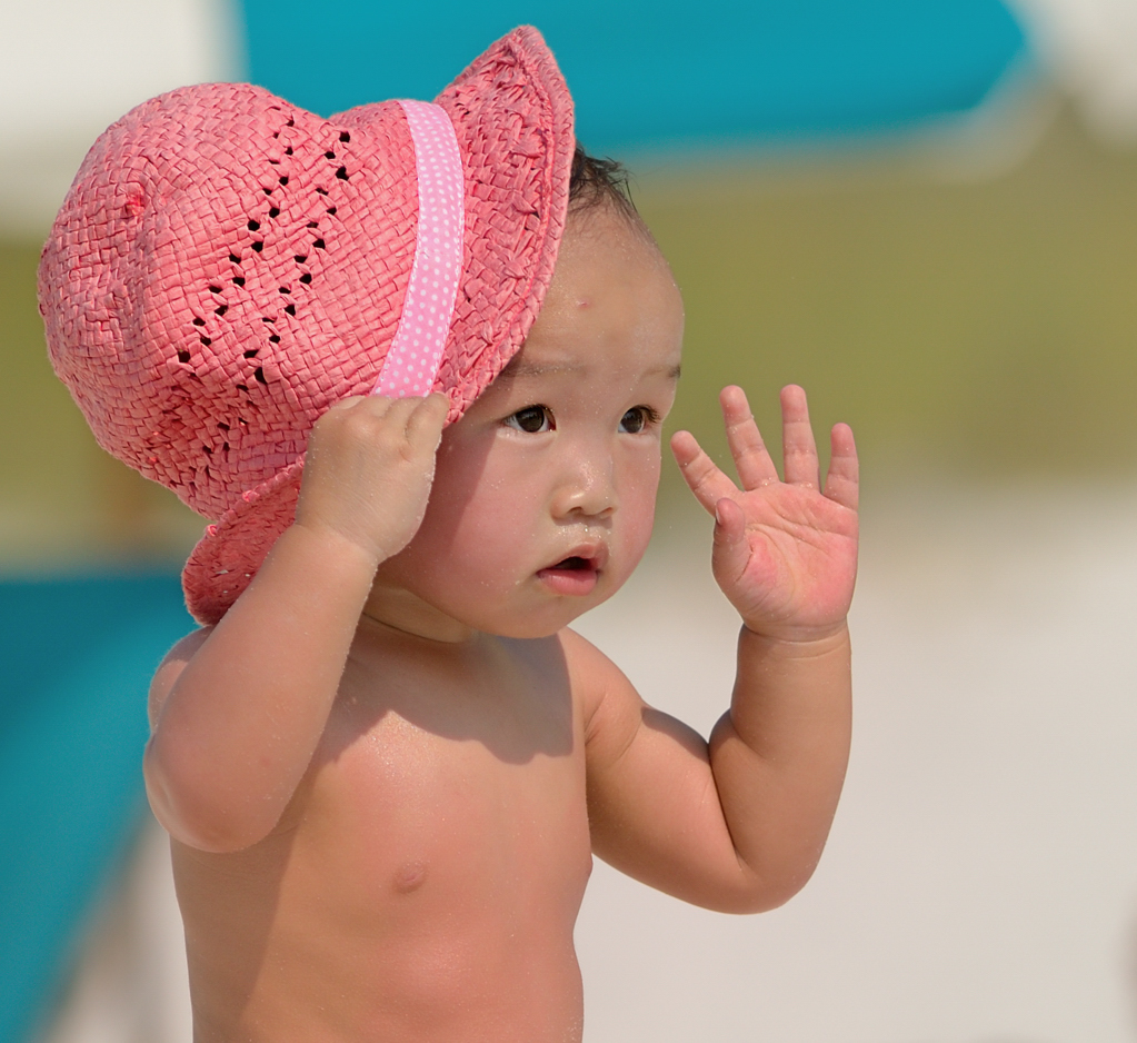 Pink "hat" summer at Perdido KeyPeople's Choice
 and
Editor's Choice for Artistic and Technical MeritPhotographed by Jaime Dorotan (Girod)
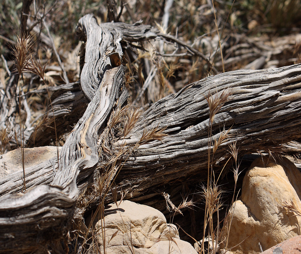
Overall I liked the texture and detail in Marilyn's image
In the heat of the desert 2. There are still a few "hot spots" (the bright spots in the lower right of the image) that tend to grab the viewer's attention away from the primary subject. I tried an alternate crop (below) to see if I could eliminate the distractions.
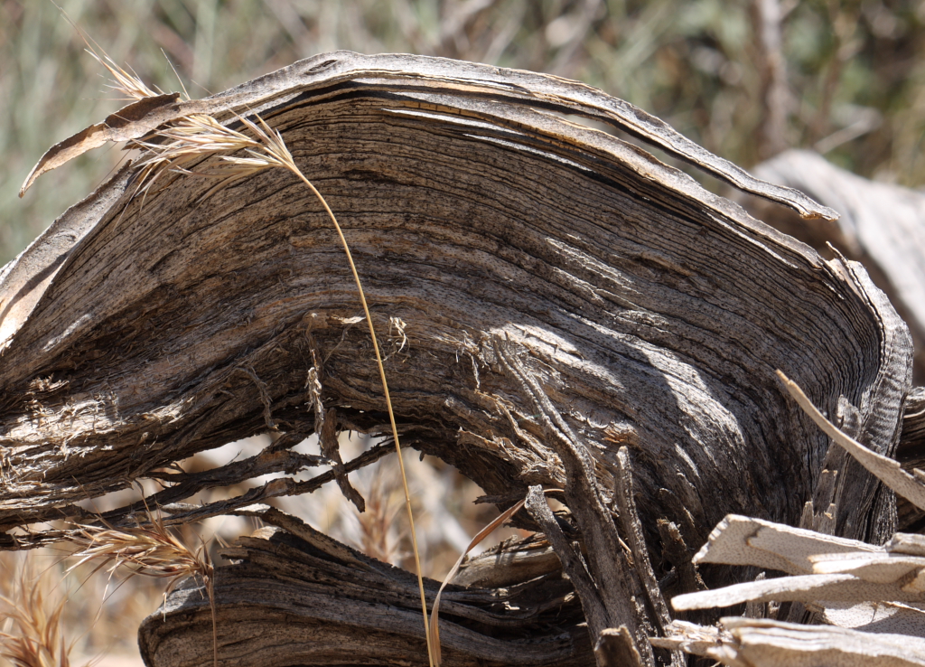 In the heat of the desert 2
Photographed by Marilyn McKinney
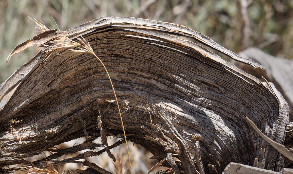 In the heat of the desert 2
Photographed by Marilyn McKinney, alternate crop by Keith
I did end up cutting off the bottom part of the grass that I really liked in the original image, so it's debatable whether the crop is an improvement.
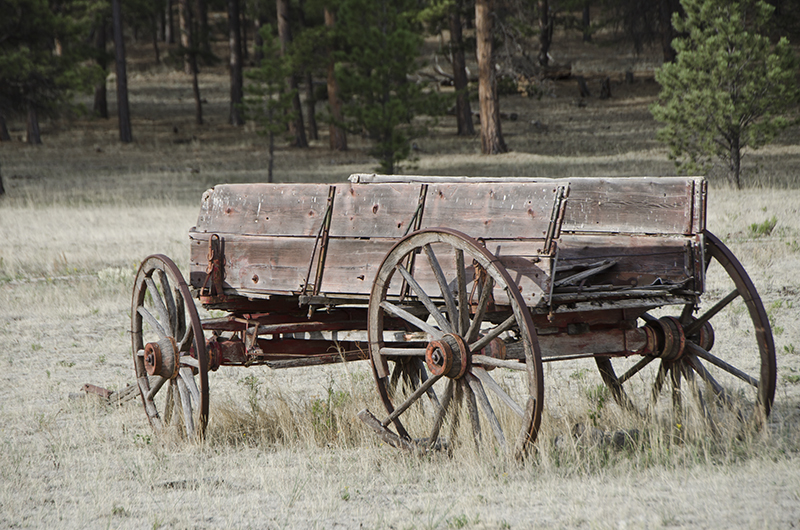
I thought Marilyn did a better job composing for dynamic range in her image titled
In the heat of the desert 1. I did end up toning down the exposure on the rock in the bottom center so that it didn't dominate the image quite so much. (I was guessing that the weathered wood was intended to be the primary subject.)
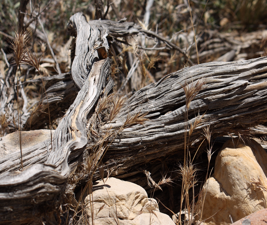 In the heat of the desert 1
Photographed by Marilyn McKinney
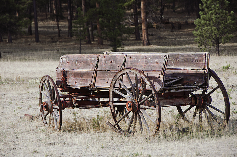
 In the heat of the desert 1
Photographed by Marilyn McKinney, slight exposure reduction on rock
I liked Rick's image titled
If we only had some horses, but it looked to me like Rick might have lifted the shadows a bit, which he confirmed when I asked the question in the gallery. To my eye, the version with the shadows (and therefore some of the mid-tones) boosted looked a bit "flat" (i.e. low contrast) and I was curious what the image might have looked like before Rick lifted the shadows. I pulled the image into Photoshop and used the curves dialog to apply a medium contrast curve. To me this adds a bit of "punch" back into the image and helps focus the viewer's attention on the primary subject. The image also had a bit of a greenish color cast on my monitor (and Rebecca's too) so I applied 4 units of magenta in the Color Balance tool in Photoshop. I've posted the modified image below for your consideration.
 If we only had some horses
Photographed by Rick Pepin (TrvlRick)
 If we only had some horses
Photographed by Rick Pepin (TrvlRick), contrast and magenta tint added
The same feedback applies to Rick's image titled
From shade to sun. Maybe it's my "old school" sense of what this image should look like, but I would expect this image to have deeper shadows and a bit more contrast than the version Rick posted. I'm curious to know how Rick processed this image, and whether he lifted the shadows in post-processing.
 From shade to sun
Photographed by Rick Pepin (TrvlRick)
Rebecca's image titled
Stained glass - Anti HDR is a good example of composing a scene to eliminate high contrast elements. It's also a good example of how challenging it can be to get a "correct" white balance when photographing in mixed lighting. To my eye, the skin tones on the man's face seem a bit too cool, while the skin tones on the woman's face seem a bit too warm. I suspect that more of the incandescent spotlights are hitting the woman's face (and less of the flash) which makes it very difficult to pick a white balance setting that will work for both subjects, often forcing the photographer to pick a compromise. One way to handle this is to "overpower" the ambient with the flash. Another way would be to use a gel on the flash to match the color temperature of the flash to the ambient lights.
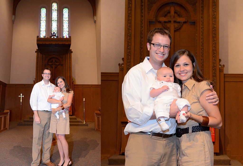 Stained glass - Anti HDR
Photographed by Rebecca
The compositions in Chris'
Shotgun Playground and
Spring Fork Lake were both well chosen for their dynamic range. The design of the
Shotgun Playground image was very nice as well.
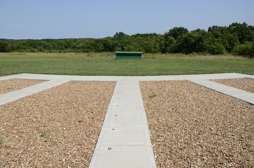 Shotgun Playground
Photographed by Chris Franklin
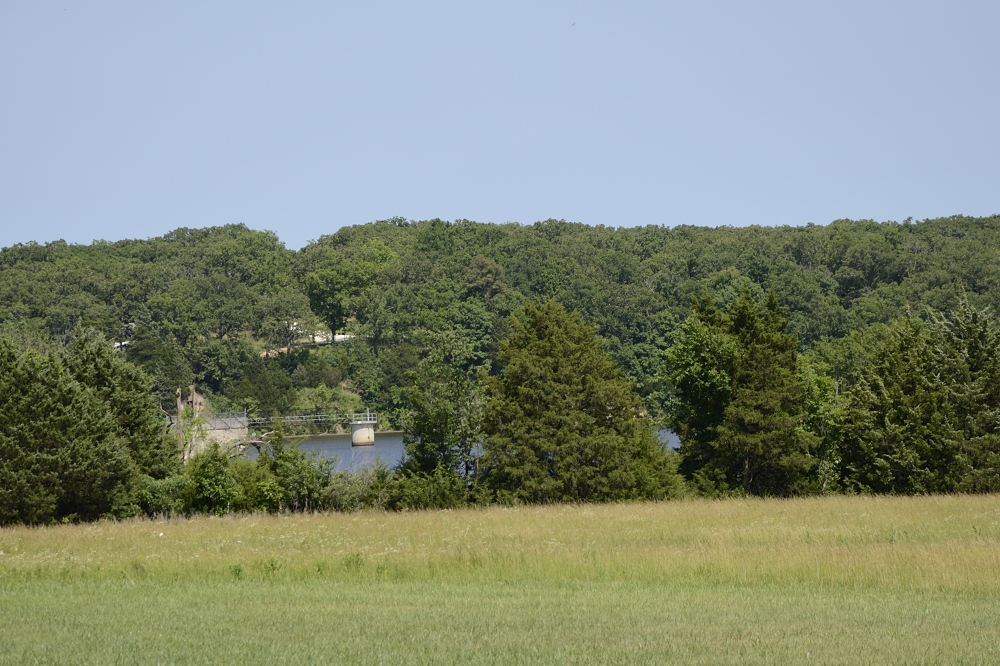 Spring Fork Lake
Photographed by Chris Franklin
Chris' image of
Cousin Shirley was a nice portrait, and the background wasn't too distracting. I might have tried using fill flash for this image. It would have better balanced the light on his subject with the background, and made white balance selection a little bit easier. Having a background that is brighter than your portrait subject doesn't usually work quite as well as having a background that is slightly darker.
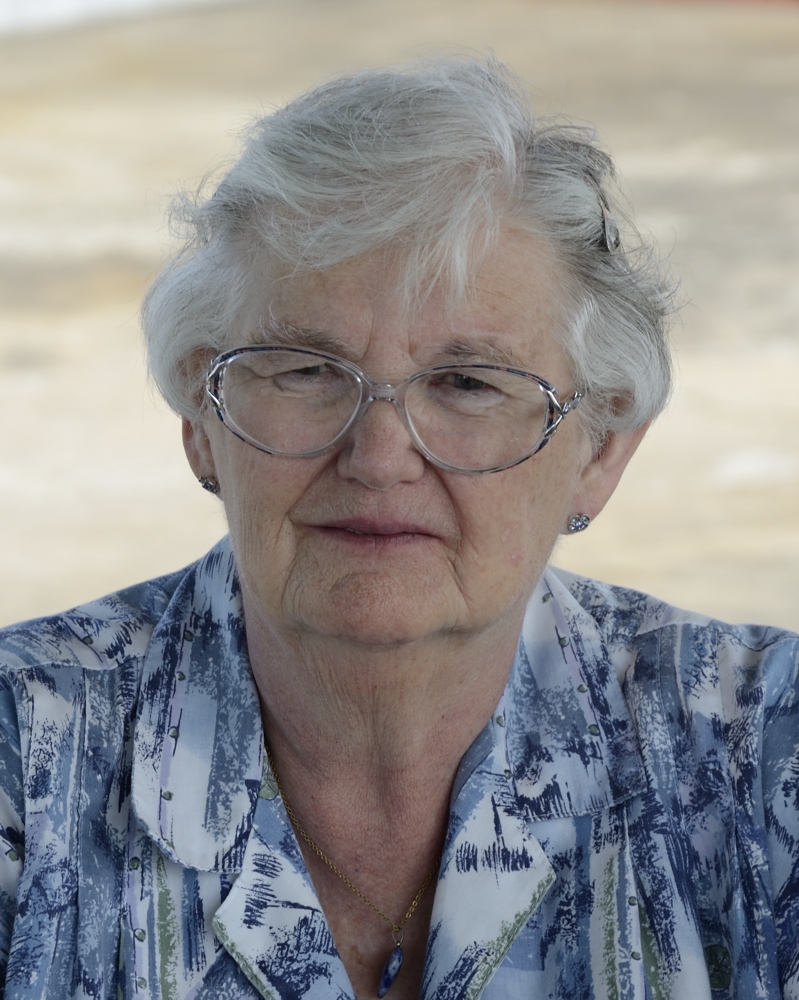 Cousin Shirley
Photographed by Chris Franklin
Chris picked a nice low contrast scene for his
Wet Willie image, but perhaps it was a bit too low contrast? The image looked a bit "flat" to me, with a bit of a blue color tint. I bumped the contrast up a bit in Photoshop, used the Shadows and Highlights adjustment tool to pull the skin tones up a little, and then used the Color Balance tool to warm up the color tint (shifting the colors towards yellow and magenta). I could have probably warmed up the skin tones a little more, but I was sensitive to overdoing it.
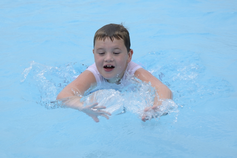 Wet Willie
Photographed by Chris Franklin
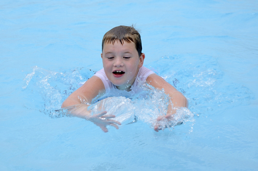 Wet Willie
Photographed by Chris Franklin, more contrast & magenta tint
Chris did a wonderful job with his
Mother and Daughter image. The light is flattering (and low contrast) and the color balance pleasing. I like that the skin tones are slightly brighter than the background in this image, which keeps the background from stealing too much attention away from the primary subject. Nice focus on the eye too. Best of all, Chris managed to capture very nice expressions and interaction between the two that conveyed their connection. Well done!
 Mother and Daughter
Photographed by Chris Franklin
Thank you again to everyone that participated in the assignment. I fear that I didn't explain the assignment very well in the beginning, but hopefully some of you were able to glean useful information from the assignment. There are often too many compromises involved when you try to capture a scene with too much dynamic range, and often the best option is to recompose the image to eliminate high contrast areas that are not essential to your composition.


