The
guidelines for this assignment were to compose an image with a pleasing balance of the visual weight (prominence) of the primary shapes and forms across the frame. Recommendations were to pay attention to position, size, contrast, and color and use other compositional techniques (leading lines, etc.) to ensure the primary subject still remains the focus of the image.
I have to say upfront that I knew this would be a very difficult assignment to provide feedback for. "Balance" can be very subjective at times, and people can see things in different ways depending on how color and contrast affect their perceptions. (Some people are more sensitive to saturated colors than others, and given the wide variance in our displays, there's a good chance that color and contrast will look different to all of us just based on our different displays.) Still, I think it is useful to learn to pay attention to the balance in our compositions, and use that as one criteria in creating a pleasing composition.
I think Lars had fun challenging us to decide whether or not we thought a scene looked balanced or unbalanced. I agree with Dave that Lars'
Balanced or Unbalanced ? image "teeters" a bit, but it's a fun (and challenging) image because the viewer is unsure in which direction the image is "teetering" with the leftward lean of the signs playing off the horizon that is tilted to the right. It has a bit of a "fun house" effect to it that makes this an interesting image. In the end, I think the right side of the image is a bit more prominent because of the higher contrast. Like Dave I enjoyed the "study" of balance in this image.
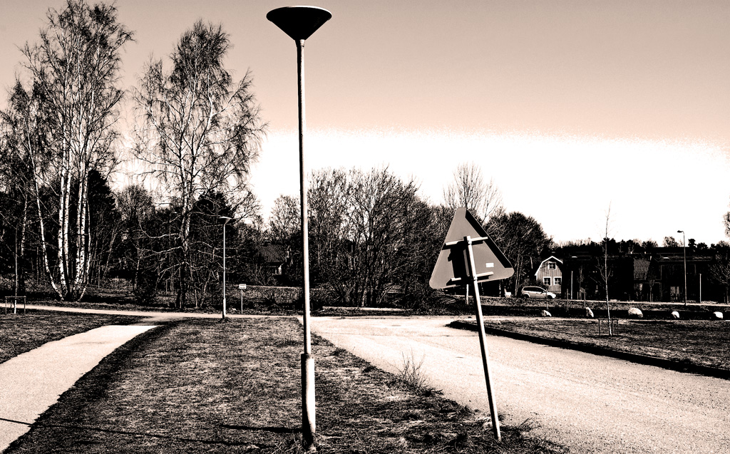 Balanced or Unbalanced ?
Photographed by Lars
I enjoyed the elegant balance in Michele's
L'amour! image. I'm not a fan of perfectly symmetrical balance, and believe that the true art of creating a balanced image is in arranging a pleasing distribution of image elements of different weights across the frame. One reason Michele's image works so well is because of the colors in the pillars that echo (and offset) the strong tones in the birds. The pillars are larger, but also lower contrast, so their visual weight and position in the frame provide a very nice balance with the birds. Very well done Michele.
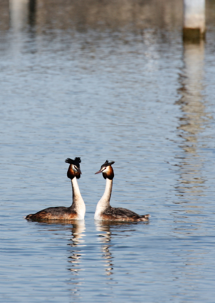
L'amour!
Photographed by Michele Bollhalder
Carol's beautiful
Maroon Bells Reflection image made me homesick for Colorado. I do think the image would have benefited from a little more depth-of-field (smaller aperture); however, I can also see that given the ripples on the water, Carol was probably trying to maintain a high enough shutter speed to overcome the potential blurring from the moving water. I've been there before, waiting trancelike for a calm moment to snap the shutter, sometimes spending hours in the same position waiting for the perfect moment. It's not a bad way to spend a morning...
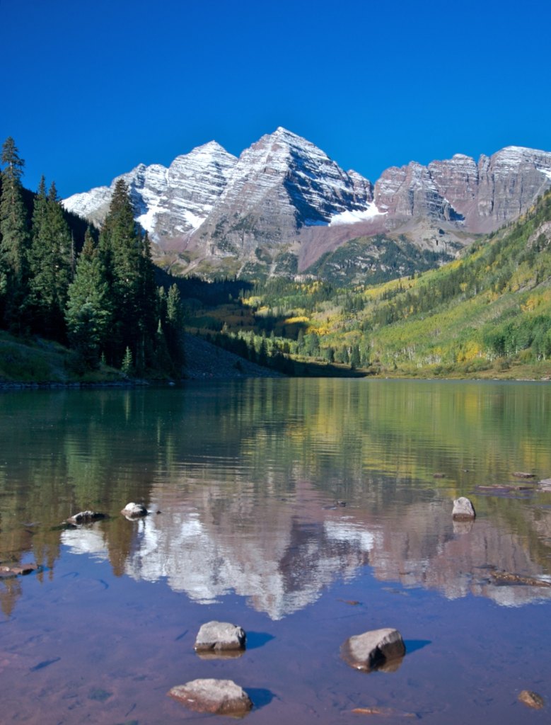 Maroon Bells Reflection
Photographed by Carol Burkett
I love the expression Jaime captured in his image titled
You think I'm unbalanced? This was one of those images that isn't obviously balanced, but it works because of the bright "negative space" on the left side of the image that helps to balance the prominence of the bird. It's not normally the type of composition I would pre-visualize, but it works very well in this instance. I did notice that the image has a green tint, and I suspect that is due to the light being filtered through green foliage. This type of light a challenge to work with, because attempting to neutralize the greenish tint will often result in the image looking "unnatural." We seem able to accept the greenish tint as long as the reason (light filtered through the leaves) is apparent.
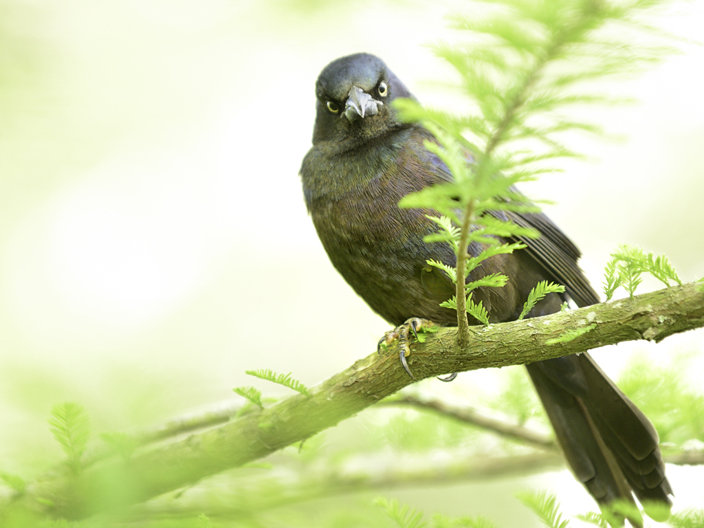 You think I'm unbalanced?
Photographed by Jaime Dorotan (girod)
Jaime's image titled
I can't see my world! was another beautiful image. Rebecca thought the light clouds on the right side of the image did a nice job balancing the shot. Personally, I don't think the clouds have quite enough visual weight to balance the tree, and would have probably moved the bird a bit more to the right side of the image.
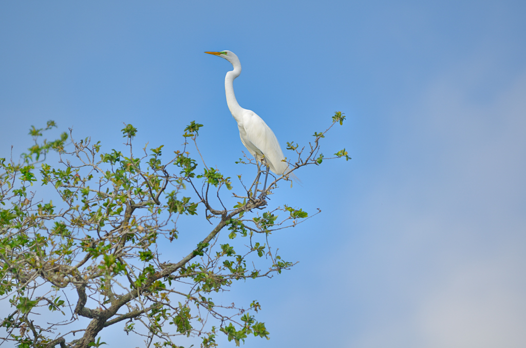 I can't see my world!
Photographed by Jaime Dorotan (girod)
Oddly enough, I think this composition would have worked a little better if the egret was looking in the opposite direction, like this:
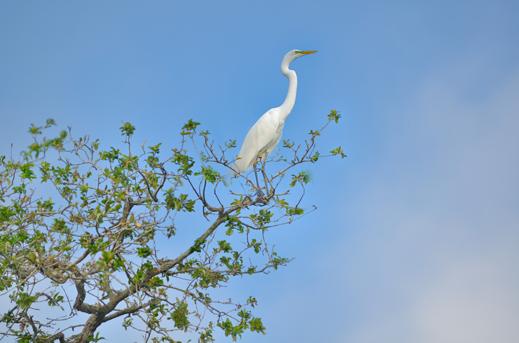 I can't see my world!
Photographed by Jaime Dorotan (girod), Photoshopped by Keith
And then I probably would have cropped it slightly, like this:
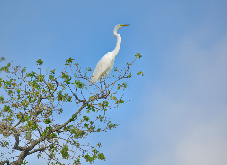 I can't see my world!
Photographed by Jaime Dorotan (girod), Photoshopped by Keith
Lars'
Balanced or Unbalanced 2 image was another fun challenge. This image is composed of several different elements of widely varying visual weight that all seem to balance in the end. Although it is physically smaller, the higher contrast and bold patterns of the fence on the left are so prominent that I think it helps balance the visual weight of the house on the right. It's a fun image with shifting and dynamic balance that works to keep the image visually interesting.
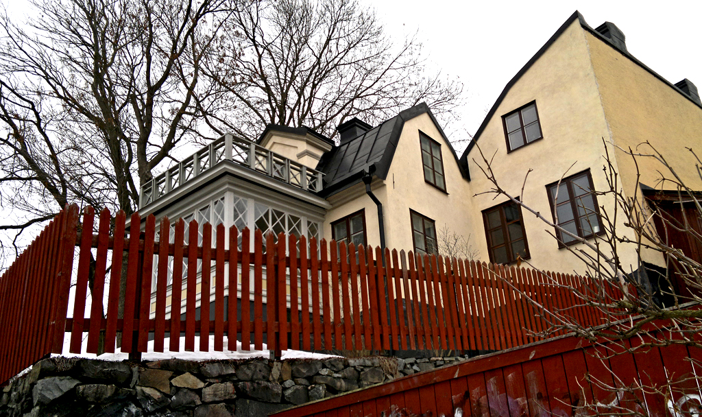 Balanced or Unbalanced 2
Photographed by Lars
Jaime's
Balancing off the edge was another wonderful image with fascinating detail in the eyes of the dragonfly. The image is nicely balanced, with pleasing bokeh, but perhaps just a bit overexposed. The blown highlights in the tail of the dragonfly are a little too distracting and I think that underexposing this image a bit (in order to save the highlights) and then bringing up the mid-tones in post processing would have produced an image without the distracting overexposed areas on the tail of the dragonfly.
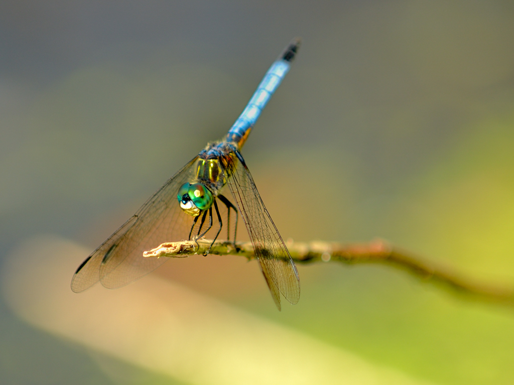 Balancing off the edge
Photographed by Jaime Dorotan (girod)
I liked the balance (and the message) in Jaime's
Fallen image. I wonder if this image might have been starting to suffer a bit from diffraction effects of shooting at such a small aperture (f22), since this image wasn't quite as sharp as some of Jaime's other macro shots with the 105. I might have tried "bracketing" the apertures and shot a few at f16 and f11 as well, then examined them in post to see which shots had the best overall sharpness.
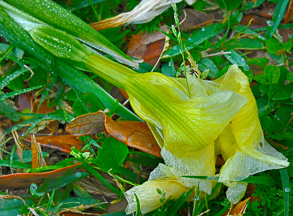 Fallen
Photographed by Jaime Dorotan (girod)
Rick's
Mallard Duck was a wonderful image that rewarded the viewer for lingering. The colors, tonality and overall composition of this image all came together to convey a sense of time and place, with the ripples in the water providing a beautiful impression. Rick used a 300mm f2.8 lens with 2x teleconverter for this shot, at 1/100 sec, f5.6 and an ISO of 250. In his position, I might have considered bumping the ISO up just a bit more, either to get a slightly faster shutter speed to combat motion blur, or a smaller aperture. (I usually try to avoid shooting "wide open" with a teleconverter.) I think an ISO of 800 would have still provided enough dynamic range for this scene, and would have resulted in a slightly sharper image. Those are just minor tweaks though. This is a very beautiful image and one Rick should be proud of.
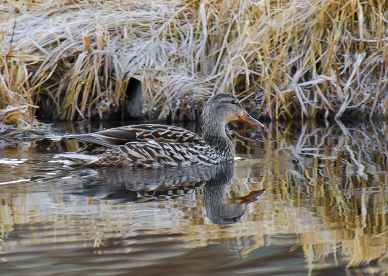 Mallard Duck
Photographed by Rick Pepin (TrvlRick)
This was such a beautiful image that I couldn't resist playing with it a bit in Photoshop. I added a bit of selective sharpening to the duck and a very subtle vignette in order to prevent some of the higher contrast areas in the scene from stealing attention away from the primary subject. The changes are subtle, but I think they improve the image just a bit.
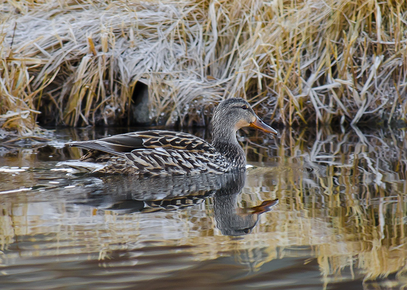 Mallard Duck
Photographed by Rick Pepin (TrvlRick), slight vignette and very slight selective sharpening
Lorin gets the reward for making me the most homesick for Colorado Springs.

Beautiful colors, wonderful detail and very nice balance in this image of
Garden of the Gods, CO. Very nicely done Lorin. (I'd love to see the shooting information. I'm guessing an aperture of f8 or f11?)
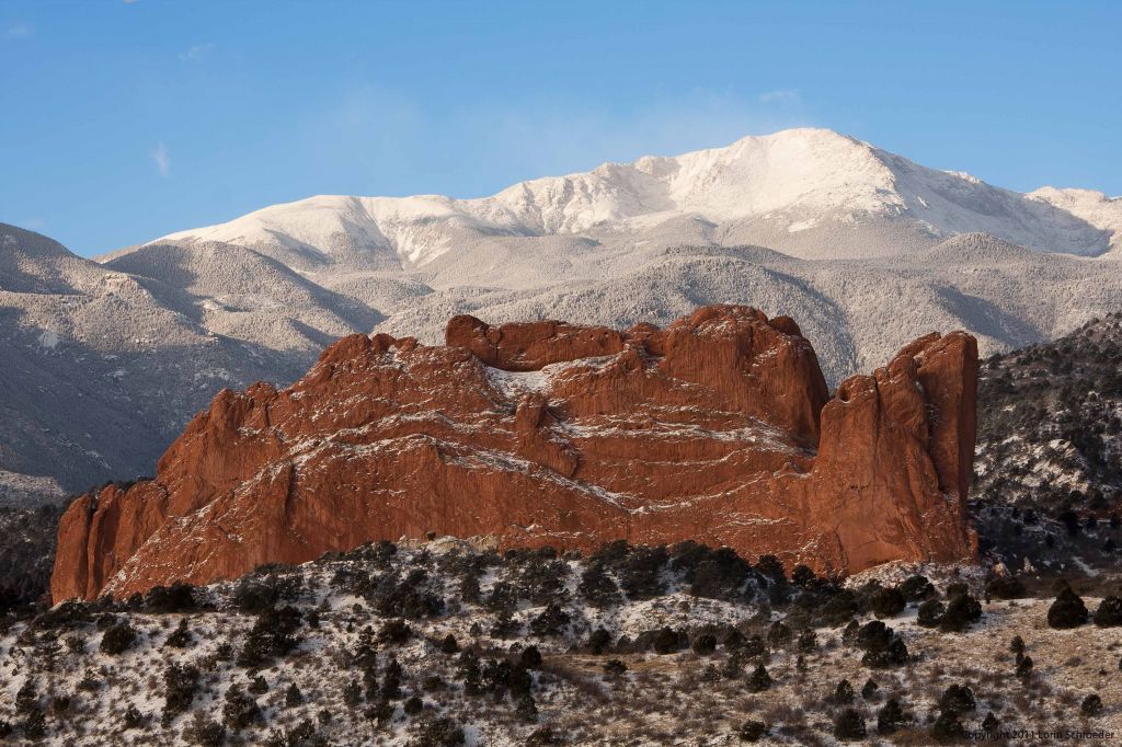 Garden of the God's, CO
Photographed by Lorin Schroeder
Rebecca recommended cropping Jaime's
Forgotten image, so I thought I would try it. I've included the crop below for your consideration. (Oh, and I couldn't help adding just a touch of selective sharpening to the flower while I was at it, and I cloned out the dead leaf on the left side of the image.) It's amazing to think that this image was taken with a 70-200 zoom with 2x teleconverter!
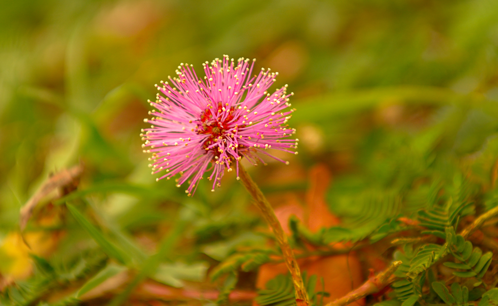 forgotten
Photographed by Jaime Dorotan (girod)
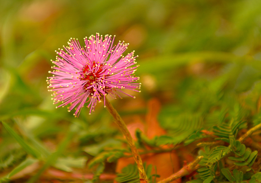 forgotten
Photographed by Jaime Dorotan (girod), crop recommended by Rebecca
Rebecca's feedback on Jaime's
hidden image was on the mark too. Rebecca loved how the limb follows the flow of the duck and nicely frames the scene, but noticed that the top limb was cut off too abruptly at the edge of the frame. One way to handle this if you notice it when reviewing your images on the computer is to "trim" the branch in post processing so that it doesn't exit the frame. In the image below Jaime's original I simply used the clone tool to remove the portion of the branch down to the junction, so that the remainder of the branch looks natural.
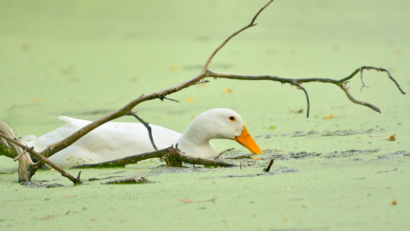 hidden
Photographed by Jaime Dorotan (girod)
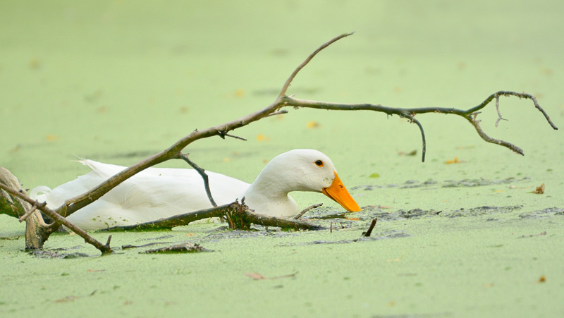
Photographed by Jaime Dorotan (girod), branch photoshopped by Keith
Jaime's
"Unforgiven" was a well balanced and very effective image. The contrast between the orange on the bottle and the green of the "pond scum" definitely drew the viewer's attention. Nice job balancing all the elements in this scene Jaime.
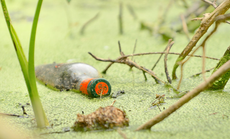 "Unforgiven"
Photographed by Jaime Dorotan (girod)
Jaime's
balancing off the middle was another image that showed the wonderful clarity (and very narrow depth of field) available with the 70-200 (version II) plus 2x teleconverter combination. Focusing was spot on for this image; however I think it might have benefited from slightly less exposure in order to keep the portion of the dragonfly's tail (and part of the branch) from blowing out, and then any adjustments could have been made to the mid-tones in post processing. The "Sunny 16" rule might have been a good "sanity check" for the exposure settings being used. According to that rule, at an aperture of f16, the shutter speed should be one over the ISO. In other words, at an ISO of 200, the
most exposure you expect for a sunlit scene would be equivalent to f16 and 1/200 second. For a "hazy bright" condition (I would guess from the contrast of the light in this scene that it was "hazy bright"), then you would typically lower these settings by about 1 stop, to an equivalent of f11 and 1/200. Jaime's settings are 1 2/3 stops "hotter" than this, so I'm not too surprised that the shot is a bit overexposed. I try to remind myself to do a "sanity check" of my exposure settings by either evaluating the scene based on the Sunny 16 rule or checking my histogram.
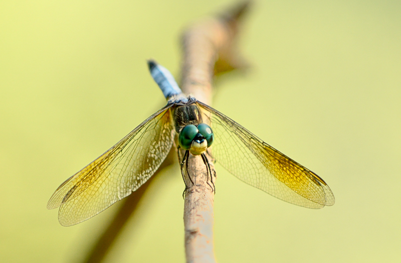 balancing off the middle
Photographed by Jaime Dorotan (girod)
Rebecca shot her
Portrait in the Park image with a wider scene, and then chose a well-balanced crop in post processing. She asked for advice on how to crop the image, but the final decisions were hers. I like that she didn't place her subject in the middle of the frame, and used the rock and higher contrast reflection of the tree in the water to balance the composition. I think it is beautifully balanced composition, with just the right amount of emphasis on the primary subject. Having watched Rebecca create this image, I know that she painstakingly composed the scene and set her exposures for the background, and then diligently worked to control the lighting on her subject. The final result is a very nice rendition of her subject, with outstanding clarity, color and tonality in a beautiful setting. I've selected this image as
Editor's Choice for Technical Merit.
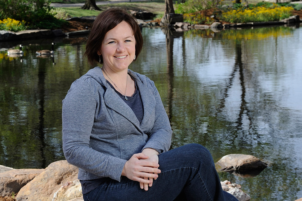 Portrait in the ParkEditor's Choice for Technical Merit
Photographed by Rebecca
Julie's image titled
Hurry up Daddy! was another image that didn't appear to be purposely balanced; however, once I spend more time looking at the image, I could see how the curve of the path in the upper left of the frame helps to balance the people (hey, that's me!) in the lower right. Rebecca suggested cropping more off the bottom of the image, and I agree with that recommendation.
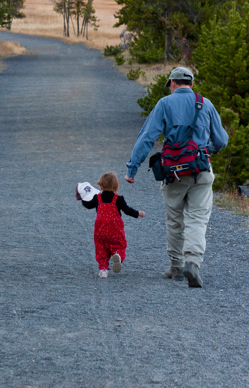 Hurry up Daddy!
Photographed by Julie Schroeder
Recommended crop:
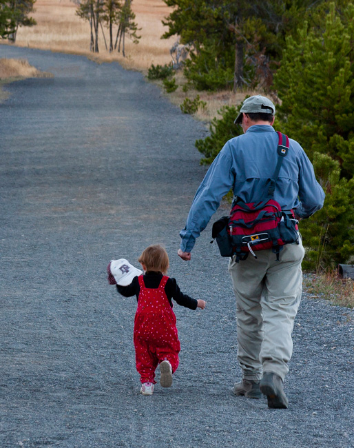 Hurry up Daddy!
Photographed by Julie Schroeder, crop recommended by Rebecca
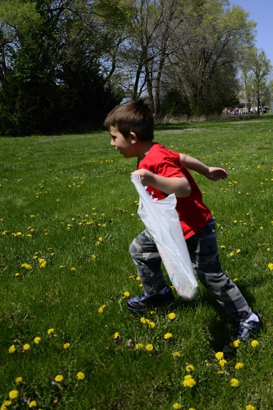
Alan's image titled
Gosh! So little and I already have a gut! was one of those wonderful images that made me smile. This image is wonderfully executed, with great color and clarity and captured at just the right moment. I think the fact that Alan captured the shot when the boy was in mid-stride and moving forward helps to "balance" the image, leaving enough space in front of the boy for the impending movement forward. Very well done Alan!
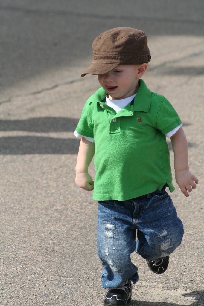 Gosh! So little and I already have a gut!
Photographed by Alan Albrecht (Ribot)
I love the expression and personality that Alan captured in his image of
Jose Rinilla - Jockey. The image is slightly overexposed, and just a touch soft, but it is a wonderful image nonetheless. I might have traded a bit of exposure for a slightly smaller aperture. It looks to me like the focus point was just in front of Jose's eyes (the goggles are in sharp focus) and so better precision in placing the autofocus point, or a smaller aperture might have helped.
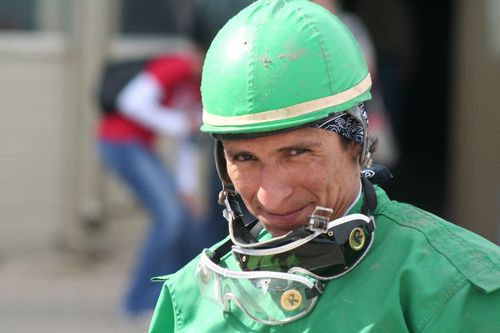 Jose Rinilla - Jockey
Photographed by Alan Albrecht (Ribot)
I enjoyed Luc's series of image of rape seed flowering above his village. I was most impressed by his exploration of the golden rule. It is so very rare to find good examples of this in photography these days, and his third image, titled
rape seed above the village of Alle in the Jura was an OUTSTANDING example of the golden rule. Very nicely done Luc. The third image in this series is stunning, and deserving of
Editor's Choice for Artistic Merit.
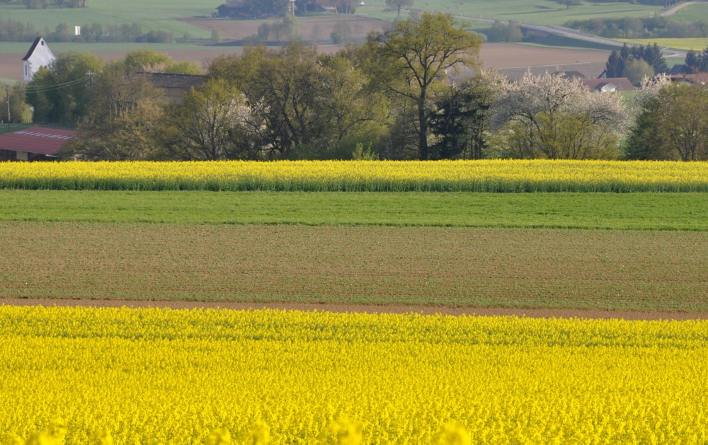 rape seed starting to flower above our village
Photographed by Luc Bigler
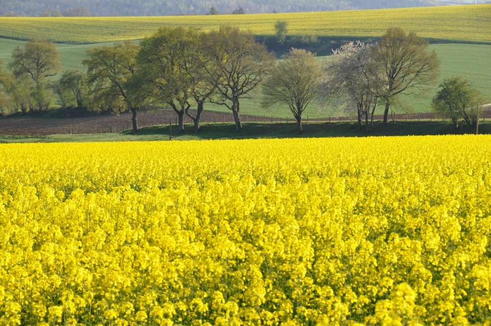 rape seed in full bloom above our village of Alle
Photographed by Luc Bigler
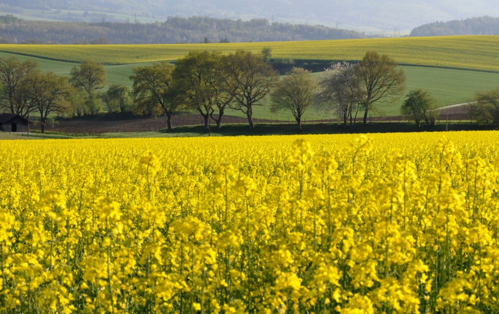 rape seed above the village of Alle in the JuraEditor's Choice for Artistic Merit
Photographed by Luc Bigler
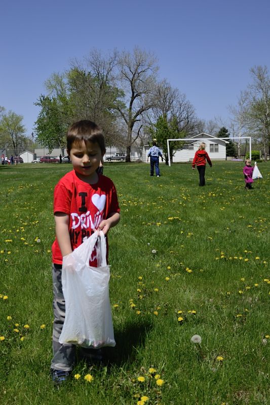
I enjoyed Chris' series of the Easter egg hunt as well, and again thought that his third image in the series was the strongest, with the people in the upper right of the frame helping to balance his son Michael in the lower left.
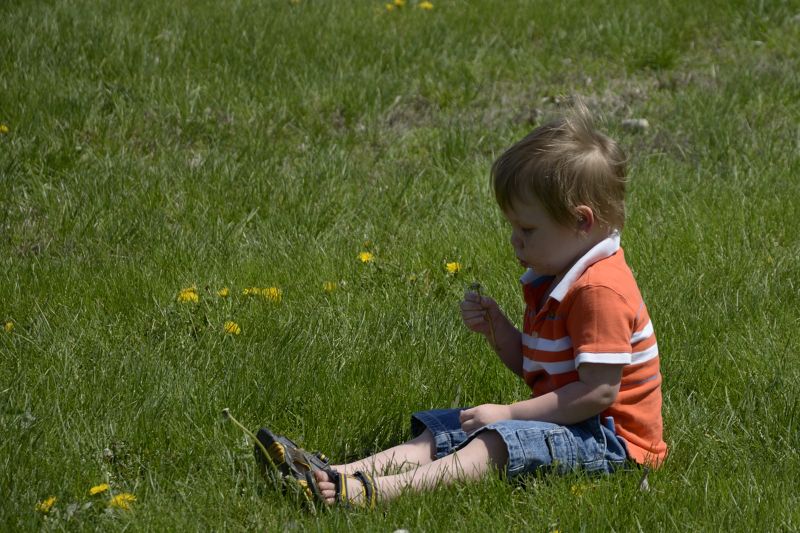 Boy in the Grass
Photographed by Chris Franklin
 Candy Spotted!
Photographed by Chris Franklin
 Hunting Eggs
Photographed by Chris Franklin


