When we talk about "balance" with respect to a photograph, we're talking about how the photographer arranges the primary subject and supporting elements in their composition so that the visual "weight" or prominence of those elements is balanced across the frame. Obviously the visual weight or prominence of an object is influenced by it's size in relation to the other elements; however, other characteristics come into play as well, including contrast and color. Areas of high contrast will attract the viewer's attention (have more prominence), as will more saturated colors. We almost always want the primary subject to have the most visual weight in the frame; however if that weight isn't balanced by other elements within the frame then the image will look "off kilter" and often isn't as aesthetically pleasing to the viewer. (Of course the astute photographer can use this to their advantage by composing an "unbalanced" image when they want to viewer to feel ill at ease.)
One way to balance an image is by making it symmetrical across the frame; however, this often results in static looking images. It's usually not very effective to split the frame down the middle (unless of course we're highlighting a perfectly symmetrical building, or a reflection in a pond, or some other scene where symmetry is one of the primary defining characteristics).
Some photographers find the "rule of thirds" a useful construct for helping them avoid "centered" subjects or horizons that split the frame down the middle. Proponents of the rule of thirds subscribe to the principle that the main subject should occupy a "strong" position in the frame. The rule of thirds defines where these strong points are, based on the intersection of thirds. The four intersecting points are all areas of strength within the frame, and placing the main subject at one of these intersections can give it more prominence over elements placed in other locations.
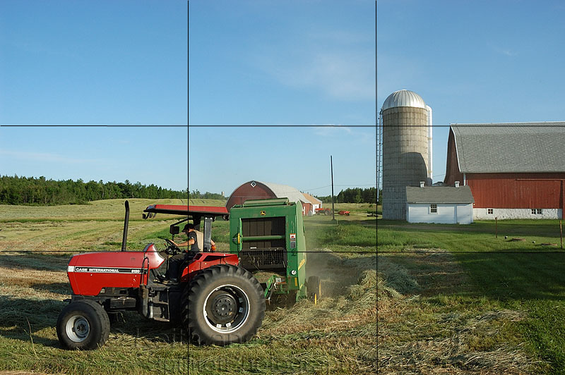
The rule of thirds is most useful when you have a primary subject and several supporting elements that you are using to "tell the story." The secondary elements in the scene should be placed to balance the composition without being so prominent that they draw attention away from the primary subject. In the example above, the primary subject (the farmer bailing hay on his tractor) is placed at a rule of thirds position of strength in the lower left corner of the image. The relatively bright saturated colors of the tractor serve to draw the readers attention to the primary subject. The barn is a secondary element which serves to provide context and contributes to the story. With the inclusion of the barn we can see that the farmer is bailing hay on a dairy farm in the Midwestern U.S. The placement of the barn on the right edge of the frame serves to balance the weight of the tractor on the left side of the frame, while the comparatively subdued colors and tonality of the barn ensure that it doesnt draw too much attention away from the primary subject. (I did break a few other "rules" with this image, including having the subject going out of the frame instead of into the frame, and placing the horizon line in the center of the image, but sometimes you have to work with what presents itself.)
It is worth noting that foreground elements will attract a viewer's attention before background elements, all else being equal. (Perhaps this is instinctual, since our ancestors that paid more attention to their nearby surroundings would have a better chance at survival.)
But don't get too hung up on using the rule of thirds, it's just one useful formula for helping us get the subject or horizon out of the middle of the frame. Balance is simply ensuring that the compositional elements in your image are distributed within the frame so that the image doesn't seem heavy on one side. One way to visualize balance is to imagine your image or scene with a fulcrum or pivot point under the center of the image. The visual weight of the compositional elements should be distributed so that the image seems balanced on this pivot point. Like this:
Not like this:
And an image where I consciously tried to compose an "unbalanced" image in order to enhance the viewer's perception that Evan was going to fall:
Back in my film days when I shot primarily with a large format view camera, I found that "balance" was much easier to achieve in my images. Why? Because the image on the ground glass of the large format camera was reversed and upside-down. This abstracted the subjects in the viewfinder and enabled me to see them primarily as forms and shapes, which made it much more obvious when the resulting scene was unbalanced.
When you are composing your images for this assignment, try to concentrate on the shapes and forms you are seeing in the viewfinder and balance the visual weight of these shapes and forms across the frame. You should pay attention to position, size, contrast, and color and use other compositional techniques (leading lines, etc.) to ensure the primary subject still remains the focus of the image. (Don't be afraid to use subtle photoshop techniques, (dodging and burning, saturating or desaturating) to change the emphasis on key elements in the scene during post processing.)
Please upload your images for this assignment to the "Balance" album in the "Weekly Assignment" category of the gallery prior to midnight, Mountain Standard Time (GMT -07:00) on Sunday, 17 April 2011. I'll look forward to seeing your images.
Keith


