I'm a bit overwhelmed this week, and quickly running out of time before we have to start the long drive up to Wisconsin to photograph a wedding, so I hope you will forgive me if I post the results and feedback for the assignments in increments. I'll post the feedback for the next two assignments as soon as possible.
I should start by saying that there were so many wonderful images submitted for this weekly assignment that I (and others) had a tough time choosing any one "best" image. As usual, I had to fall back to the assignment guidelines in order to guide my selection of the images that best met the intent of the assignment. The
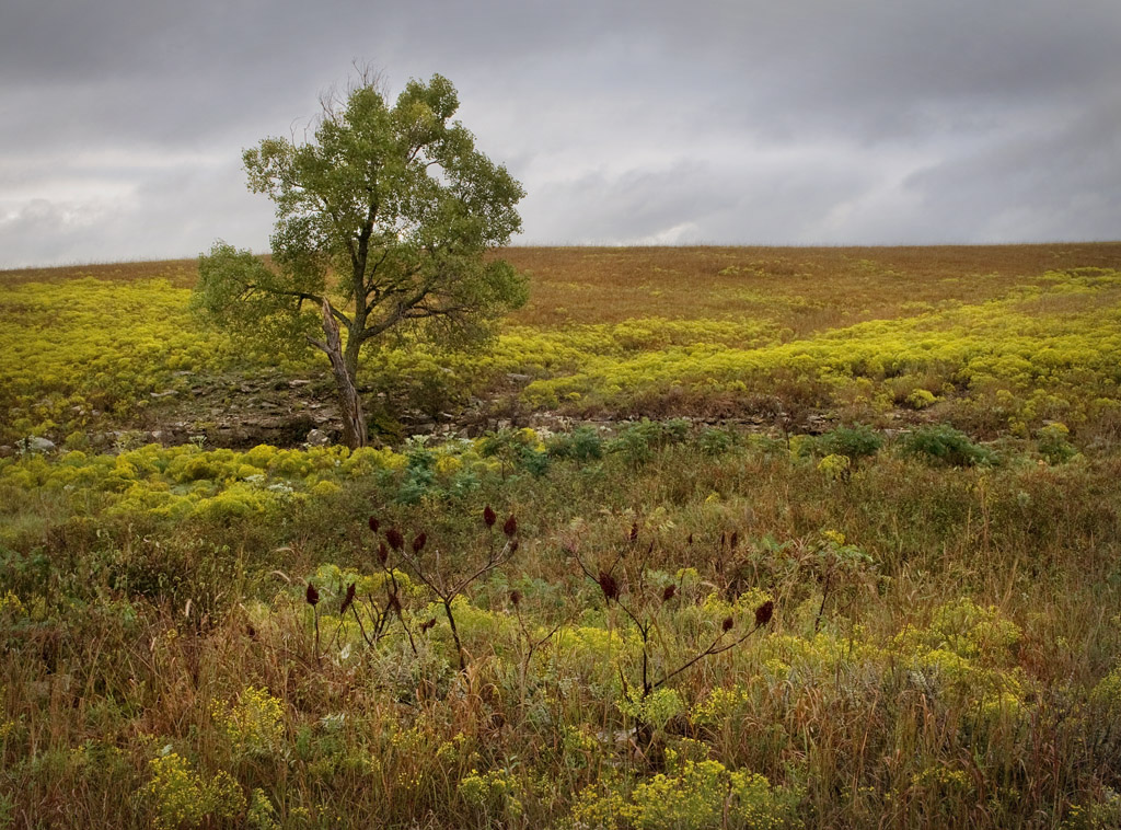
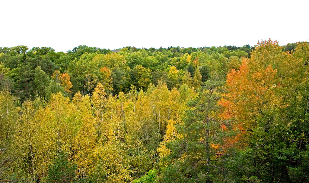
guidelines for this assignment were to strive to compose an image that portrays a change in the seasons.
I felt like all of the Fall images I submitted for this assignment that had strong yellow components were displayed too dark, which was a conscious decision on my part to prevent saturating the red channel. Unfortunately, sRGB is a lousy color space for any image that has a strong red or yellow component. Displaying the images in AdobeRGB, which has a wider gamut in the red channel would have allowed me to brighten the image to where I wanted it; however, only viewers with a monitor capable of displaying the adobeRGB color space that were also using a color managed browser (like Safari) would have been able to view the images correctly. The images would have looked really bad to anyone that was using Internet Explorer to view the images. (You aren't still using Internet Explorer are you!

) My only other choice would have been to lighten the images and clip the red channel, which would have destroyed all the detail in the leaves and whacked out the color and tonality in the clipped areas. My "best" solution was to reduce the brightness to prevent clipping, and hope that viewers had their display brightness set too bright so that the images would look OK.
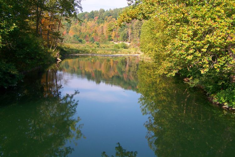
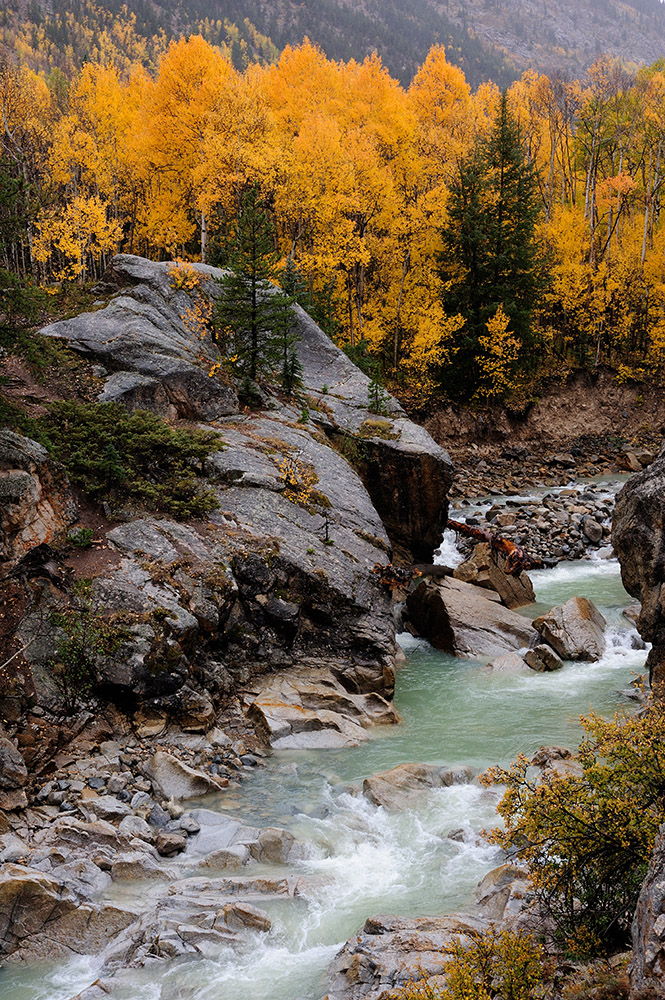 Roaring Fork River
Photographed by Keith
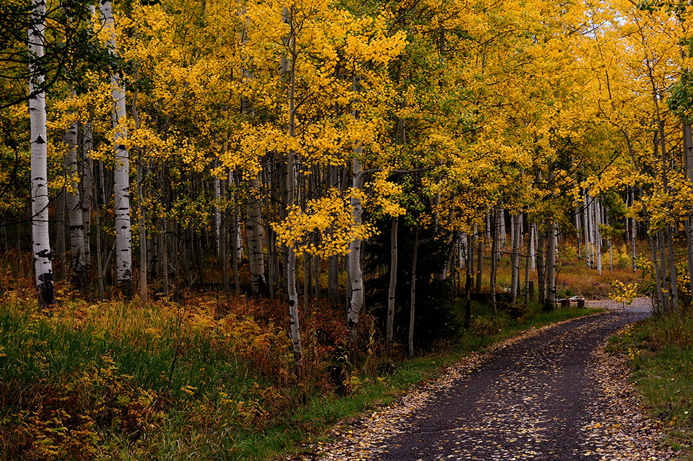 Aspen, Colorado
Photographed by Keith
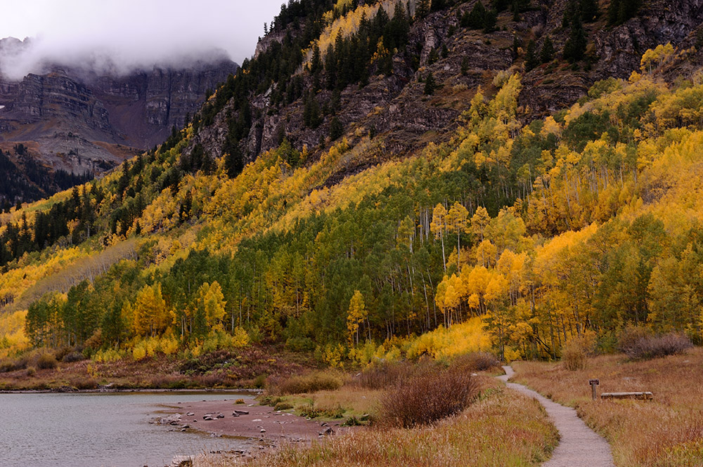 Path by Maroon Lake
Photographed by Keith
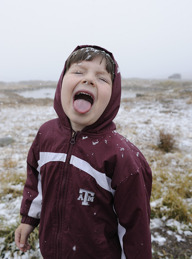 Catching Snowflakes
Photographed by Keith
Rebecca's images,
Let it Snow!,
Tractor, and
Not quite trespassing, were all taken in very flat light, yet the scenes had a wide dynamic range which made it difficult to process them so that they rendered in a pleasing manner (and then of course there was the limitation of the sRGB color space). I helped Rebecca with the processing for her
Tractor image, but after seeing it on the website I felt that it was still a bit "flat" in the midtones. I probably should have pulled the shadows down darker to give the image a bit more contrast. (The yellow leaves were already clipping because of the rather limited red channel in the sRGB space.) Rebecca did a great job "seeing" this composition though, and taking it from the car window as she was entertaining the kids while I photographed the scene in
Not Quite Trespassing.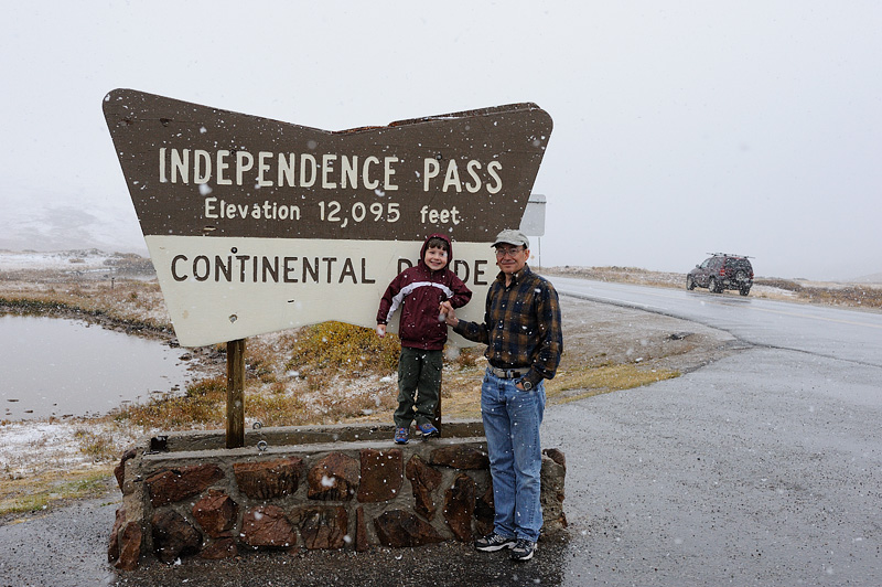 Let it Snow!
Photographed by Rebecca
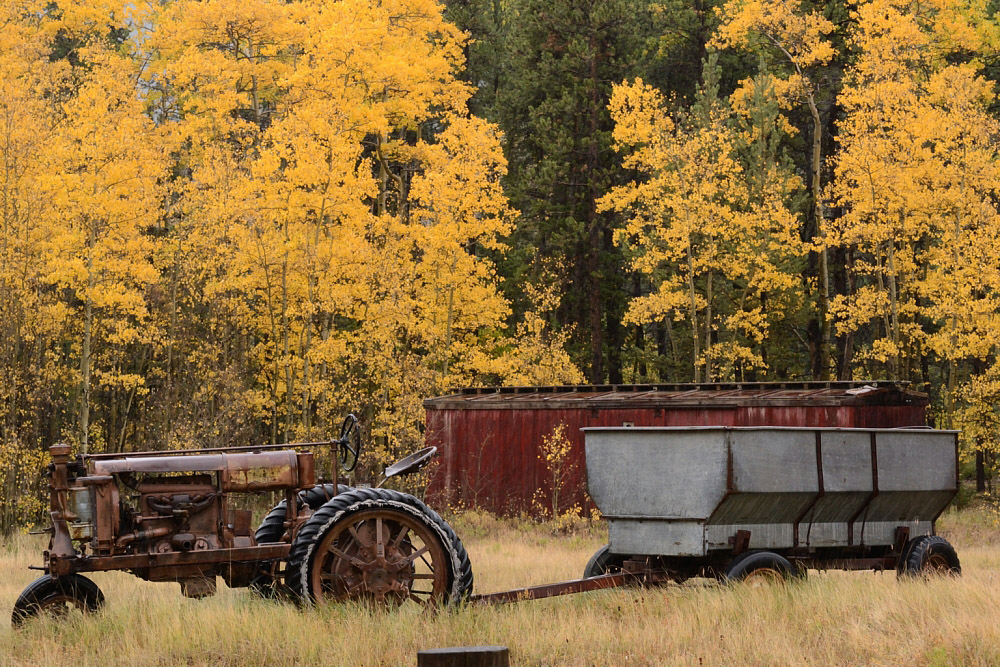 Tractor
Photographed by Rebecca
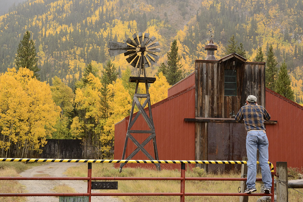 Not quite trespassing
Photographed by Rebecca
Chris did a great job illustrating the change in seasons in his
Approaching Harvest image, with the mix of greens, yellows and browns. As an observation, one of the strengths of a compact camera like the SX20 is the tremendous depth of field you can get when shooting at the wide end of the zoom. Because the physical focal length of the lens is much shorter than when shooting with a larger sensor, we have the capability to produce images with tremendous depth of field. However, the SX20 also has an extended zoom range, and when you get up into the telephoto range (this one was shot at a focal length of 61mm), you are in the range of very narrow depth of fields. I might have played with this composition a bit, trying to zoom out more to get enough depth of field to keep the foreground in focus.
 Approaching Harvest
Photographed by Chris Franklin
Becky's
on the bridge image was a wonderful composition that conveyed the peace and tranquility of this special place. My first inclination was to wish that she had zoomed in closer to show more of the Fall color in the distance; however, I quickly realized that zooming in would have eliminated much of the foreground that gave this image such depth. We would have missed the beautiful green of the water, and lost the feeling of tranquility this scene conveys. EXCELLENT job composing this image Becky.
 on the bridge
Photographed by Becky Jenner
I really enjoy images like Lars'
A colorful Death. One of the great things about photography is that it helps us to open our eyes and see things around us that we might otherwise pass by without noticing. I love the "found treasures" like the beautiful leaf contrasted against the green moss in Lars' image.
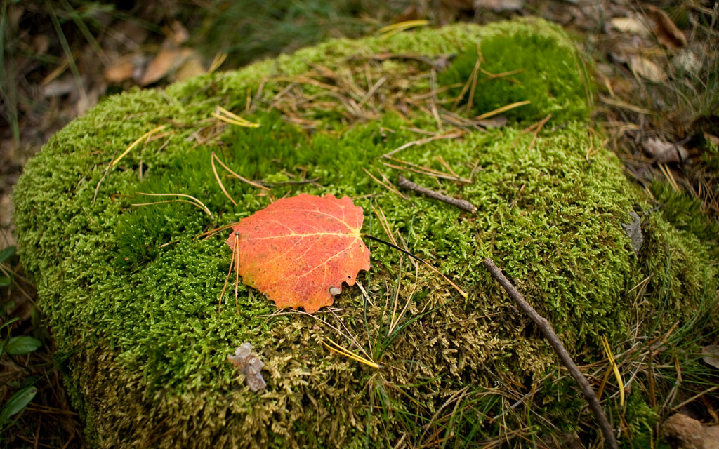 A colourful Death
Photographed by Lars
Lars' image of
The last wooden deer (for the seasons) brought a big smile to my face. This was another "found treasure" that revealed the imagination and creativity of the photographer. I love that Lars has the ability to see these shapes and forms in everyday objects, and encourages us all to be a bit more imaginative and creative. Thanks for keeping us inspired Lars.
 The last wooden deer (for the seasons)
Photographed by Lars
Lars' image of the
Dangerous "Amanita muscaria" was wonderfully sharp with great color. I like that this image shows us the mushroom in the context of the forest floor. I played with the cropping a bit on this image, but came to the conclusion that Lars composed the image very effectively. My first inclination was to crop off more of the right side of the image; however, this left the image unbalanced and removed too much of the context. This was a wonderfully understated image with sharply rendered detail in just the right places. Very well done Lars.
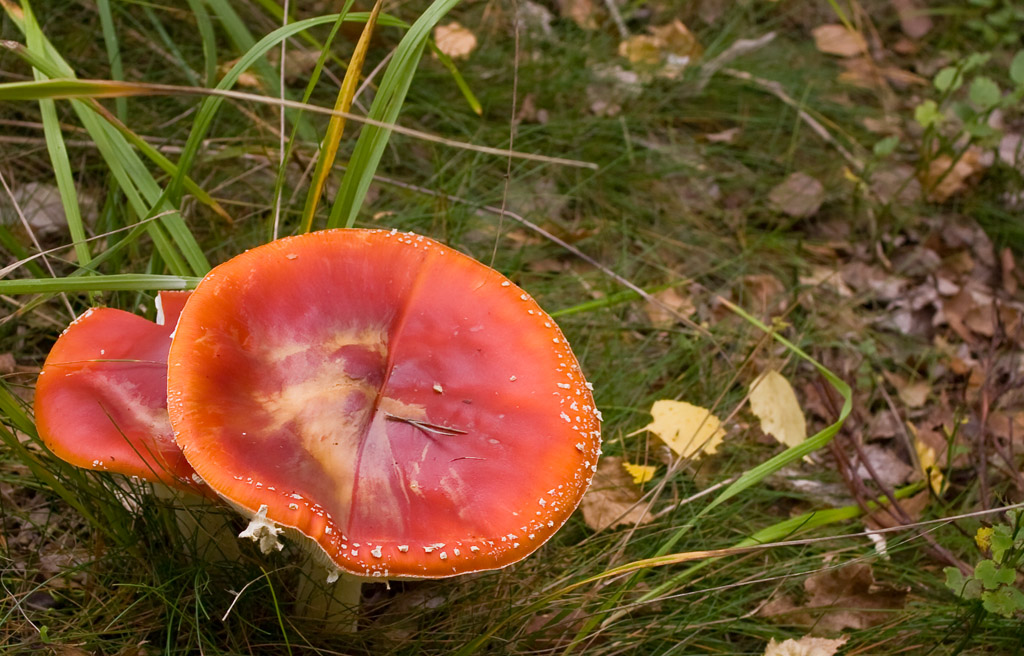 Dangerous "Amanita muscaria"
Photographed by Lars
Congratulations to Dave Leiker, whose
Autumn - Chase County #2 was selected as
People's Choice. Dave's wonderful rendering of the light in this image was reminiscent of landscape paintings of the old masters. He did a outstanding job utilizing near, middle and far elements and capitalizing on the leading lines provided by the variations in terrain (and vegetation) to give this image a great sense of depth. It perfectly evokes memories of similar rainy days on the prairie. Masterfully done Dave!
 Autumn - Chase County #2People's Choice
Photographed by Dave Leiker (prairiedust)
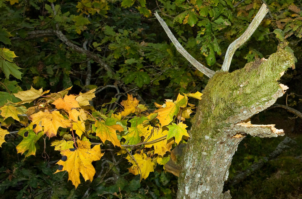
Lars'
Autumn Color was another understated image that warranted a second look. The play of light and shadows on the trees helped to differentiate the three different groups of trees and provided a sense of depth to the forest. I might have tried cropping off even more of the bright sky, and concentrating the viewers attention more on the trees.
 Authumn color
Photographed by Lars
I really enjoyed Marilyn's series of
the tree people. I'm glad she included the third image of
another look, because that gave us insight into the context of the scene and helped me appreciate what a masterful job Marilyn had done composing the first two images to eliminate the distracting surroundings. Marilyn made a great choice to use flash in her first image. That helped to reduce the emphasis of the potentially distracting background I can just barely see through the base of the tree branches. (I might have darkened that area just a bit in post processing, but that's only minor recommendation to make an already great image just a little better.) Great job capturing the eyes on the first image Marilyn, they're riveting, and largely responsible for giving this image such character.
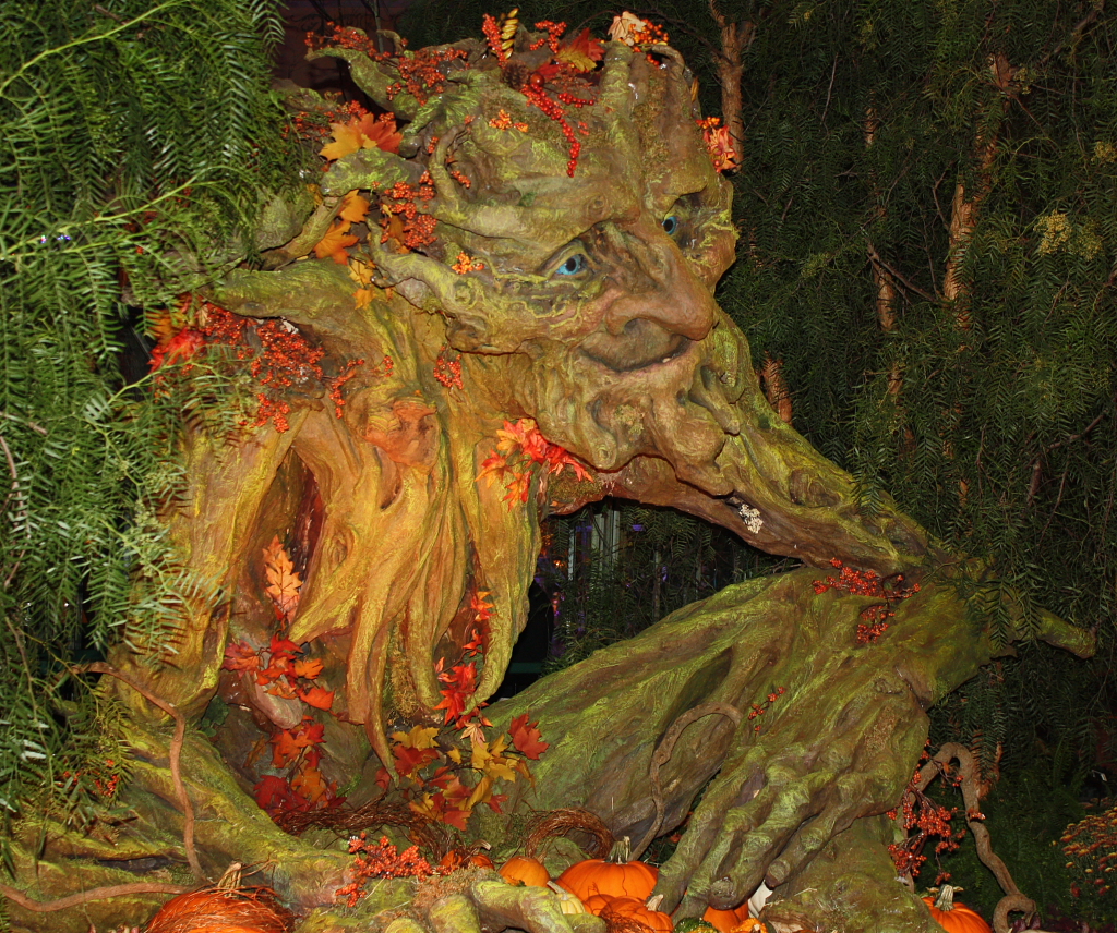 One of the fall tree people
Photographed by Marilyn McKinney
My favorite image of Marilyn's series was
Woodland hand. This was the eeriest image of the series, had the strongest composition, and was the best portrayal of Fall.
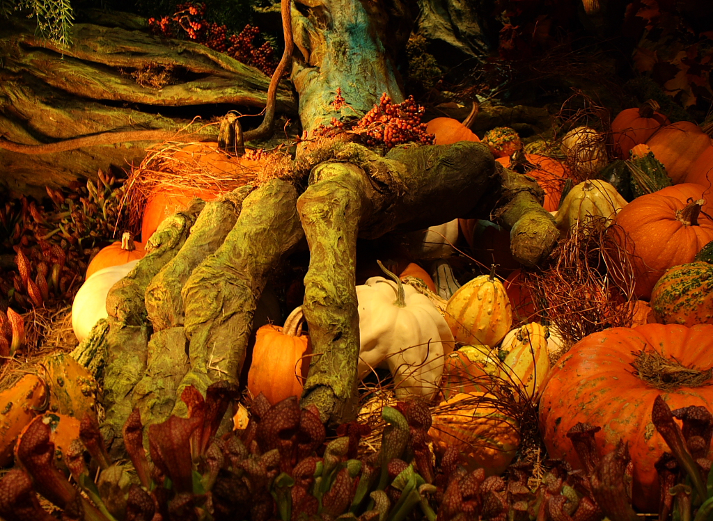 Woodland hand
Photographed by Marilyn McKinney
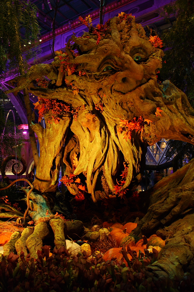 Another look at the Bellagio tree guy
Photographed by Marilyn McKinney
Of all the images submitted for the assignment I thought Alan's image of
The Perfect Pause did the best at portraying the essence of Fall. Alan did a great job controlling the depth of field in this image to render a sharply focused leaf with beautiful softly focused splashes of Fall color in the background. Even the soft traces of a white picket fence in the background added to the story this image told, setting the scene in a well manicured "traditional" neighborhood. I loved the simplicity and the artistry in this image and selected it as
Editor's Choice for Artistic Merit.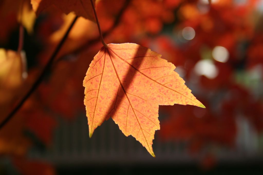 The Perfect PauseEditor's Choice for Artistic Merit
Photographed by Alan Albrecht (Ribot)
Jaime did a great job finding Fall color in New Orleans.
The sharply defined water droplet and stamen are what made this image a success. Nice job handling the extremely narrow depth of field at these high magnifications Jaime.
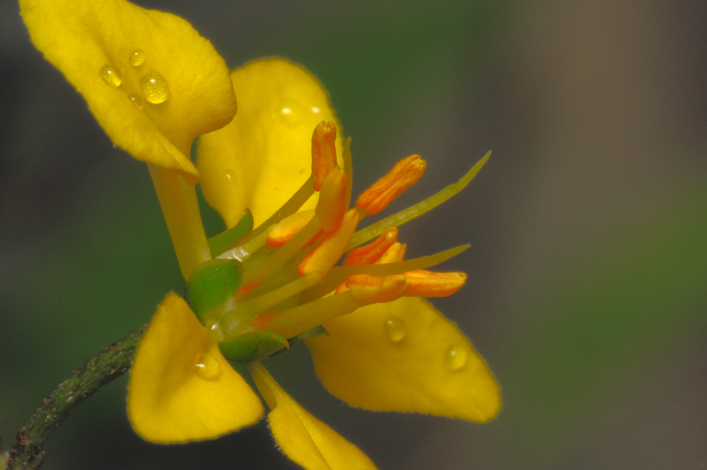 September yellow rain in New Orleans
Photographed by Jaime Dorotan (girod)
Michele's use of a triptych to portray changing seasons was very effective, and a nice combination of three beautiful images. (My favorite is the winter scene, with the wonderful texture and detail in the snow.) Nice work Michele. This image was the strongest portrayal of "changing seasons," and worthy of
Editor's Choice for Technical Merit.
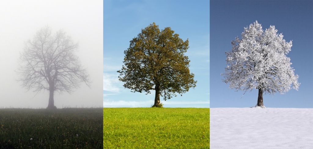 Changing SeasonsEditor's Choice for Technical Merit
Photographed by Michele Bollhalder
Rick's image of
Oxbow Bend was beautiful; however, my "color sense" tells me that the white balance was a tick too far towards magenta in this rendering. I know from experience that this scene typically throws off the camera's white balance, and it's tough to get it back to where it should be. I played around with the image a bit in Photoshop, and using the neutral eyedropper in the curves dialog I was able to produce a rendition that portrayed the colors in a way that I felt was a bit more accurate (and more pleasing to my eye). I also added just a touch more contrast to the image while I had the curves dialog open. Great job capturing the cormorant in this scene Rick! It adds an interesting bit of action to an otherwise static scene.
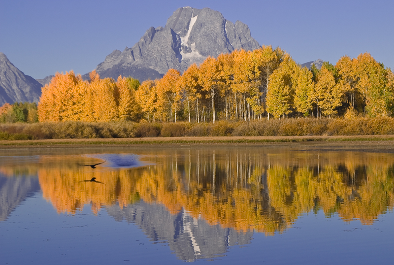 Oxbow Bend, Grand Teton National Park
Photographed by Rick Pepin (trvlrick)
Here's the version with more neutral colors and a bit more contrast:
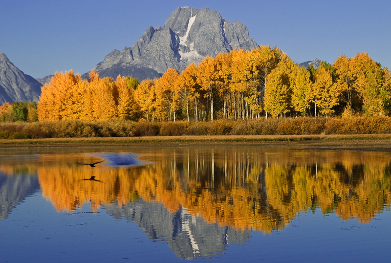 Oxbow Bend, Grand Teton National Park
Photographed by Rick Pepin (trvlrick), adjusted by Keith
I really loved the light and color in Sue's
Aspen in Grand Tetons image. Another thing I know from experience is that it is much more difficult than it seems like it should be to capture an image of an aspen grove that portrays the luminance and depth of the scene like you remember it. Sue did a GREAT job capturing that luminance, color and depth to produce an image that I would be proud to call my own. This is another image that reminds me of a painting, and one that would look nice on the wall of that mountain cabin in my dreams.
 Aspens in Grand Tetons
Photographed by Sue Pepin
Sue's second image of the Aspen is beautiful as well. However, even though this image has more striking color, it doesn't have the same depth as the first image, and doesn't do as much to draw me into the scene. This is a great opportunity to examine the differences between the two compositions and try to determine what it is about the first image that gives it so much more depth. Then use that knowledge in the future to produce more images that invite the viewer to step into the scene.
 Aspens in Grand Tetons II
Photographed by Sue Pepin
I like Carol's take on the same grove of Aspen. Including the photographers in the scene adds an element of human interest, helps draw the viewer in, and provides a wonderful portrayal of our time photographing the Aspen. It's also nice to see the mountain setting for this grove of Aspen. I suspect that the smoke in the air was the main cause of reducing the contrast in this image. It would be a good idea however to make sure that you are using a lens hood and don't have any filters on your lens before shooting towards the sun as in this scene. Great image Carol. It brings back fond memories of our time in the field.
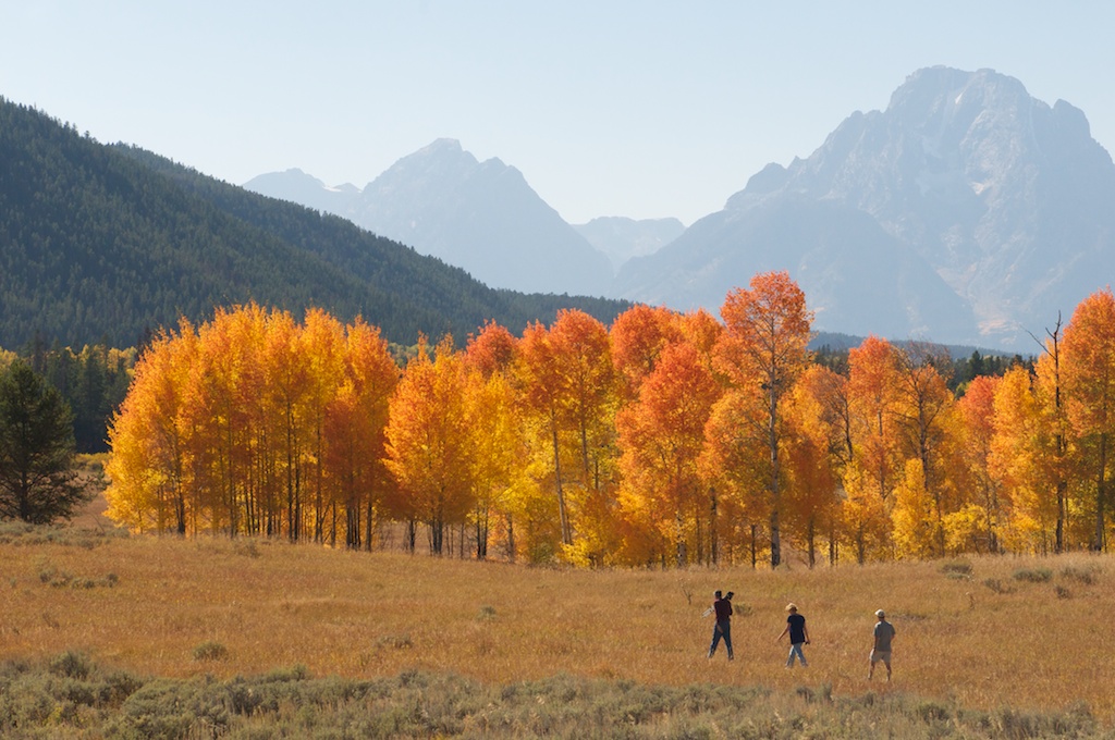 Photographers in the autumn
Photographed by Carol Burkett (Carola)
I like the concept, and the vibrant colors in Julie's
Aspen Beginning to Change image. I'm guessing from this image that Julie was going for the artistic effect of a narrow depth of field. I like the sharply defined section of bark; however, the far branches of the tree are in that "intermediate" focus zone that can be distracting. I can't see the shooting data, but I suspect that if Julie would have shot the image with her aperture wide open she might have been able to render the out-of-focus leaves in a more pleasant soft focus.
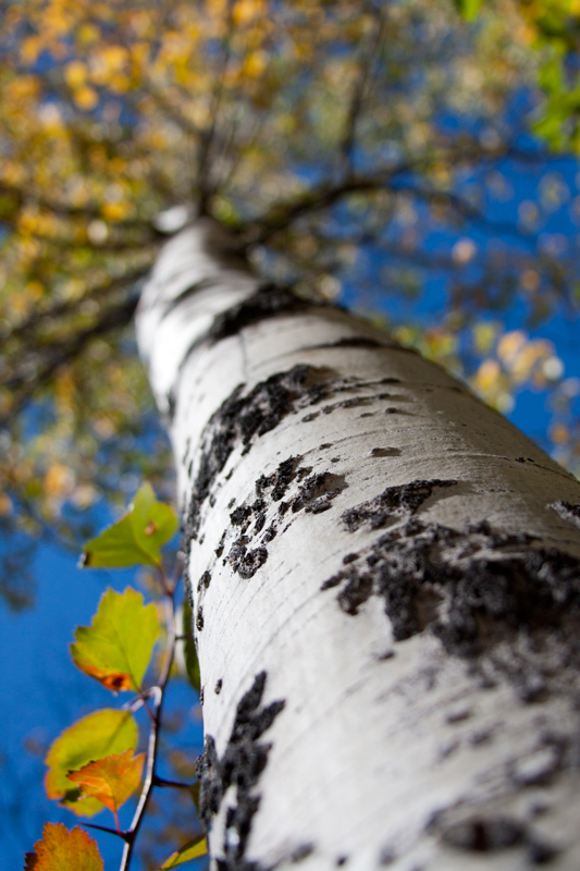 Aspen Beginning to Change
Photographed by Julie Schroeder (WriteHeart)
I think it is wonderful luck that Julie's image of the cinnamon black bear was the last image submitted for the assignment. What a wonderful way to wrap up the assignment. We had VERY limited opportunity to get a clear shot of this bear and Julie nailed it. The composition, focus and exposure are all outstanding. This is an image to be proud of Julie, and one that I hope brings you back to Yellowstone time and time again.
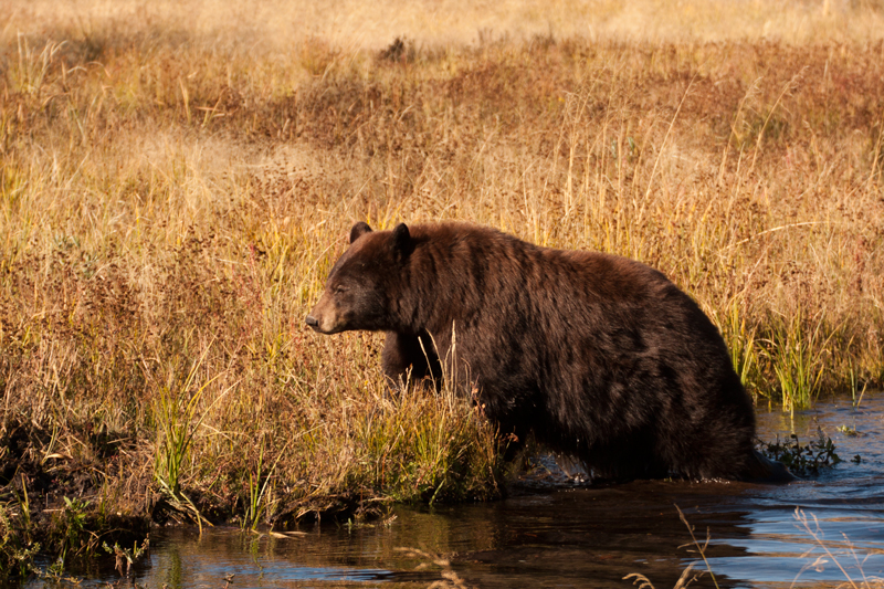 Fall...Time to Prepare for the Long Winter
Photographed by Julie Schroeder (WriteHeart)
Thank you again to all the participants who shared their beautiful, creative and inspiring images for this assignment.
Keith


