I really didn't want to select any of the images for Editor's Choice for this assignment, because doing so forces me to choose between so many outstanding images. You all continue to amaze and inspire me! In the end, I used the criteria listed in the assignment description to help me choose the Editor's Choice images. The
guidelines for this assignment were to compose an image while using good technique to retain the maximum amount of detail and realism for your subject.
Michele's
Planets image was a creative image that piqued my interest on several levels. First, I wondered how she did it (thanks for sharing that with us Michele). I also marveled at all the creative possibilities this image unveiled. I can imagine an almost unlimited number of variations to the placement of elements within the scene, the balance, patterns, colors and relationships between the different components. And when you exhaust the possibilities with one scene, just swap out the background, or stir and try again. What a wonderful technique for exercising our compositional skills. I was also fascinated by the portrayal of depth within this image. The very narrow depth of field in this image caused some of the bubbles to "pop" into focus, while some of the other bubbles were more softly defined, providing a sense of depth. The different sizes of the oil and water bubbles also provided a sometimes conflicting depth cue. This, in conjunction with the even more softly focused background, gave a sense of almost unlimited depth to the image, and really drew the viewer into the scene. One key element that contributes to the sense of depth, but isn't immediately evident, is the way the transition in colors on the right edge of the oil bubble in the top center of the image replicates the shadow on a three dimensional ball or globe, almost like sunlight grazing the surface of the moon (or a planet). I find it fascinating how our minds use this artificial depth cue to create the perception of a three dimensional sphere out of this flat bubble. Very creative, intriguing, and extremely well executed Michele!
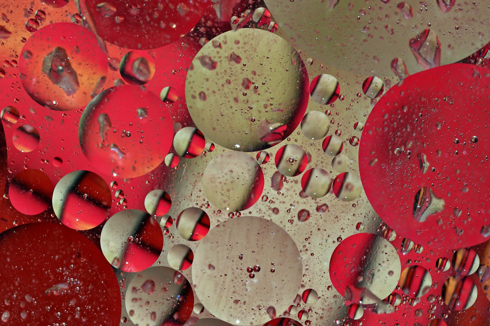 Planets
Photographed by Michele Bollhalder
Michele's
Kiwi fresh image was another creative and well composed image that tied for
People's Choice. The design of this image definitely helped portray the concept of a refreshing treat.
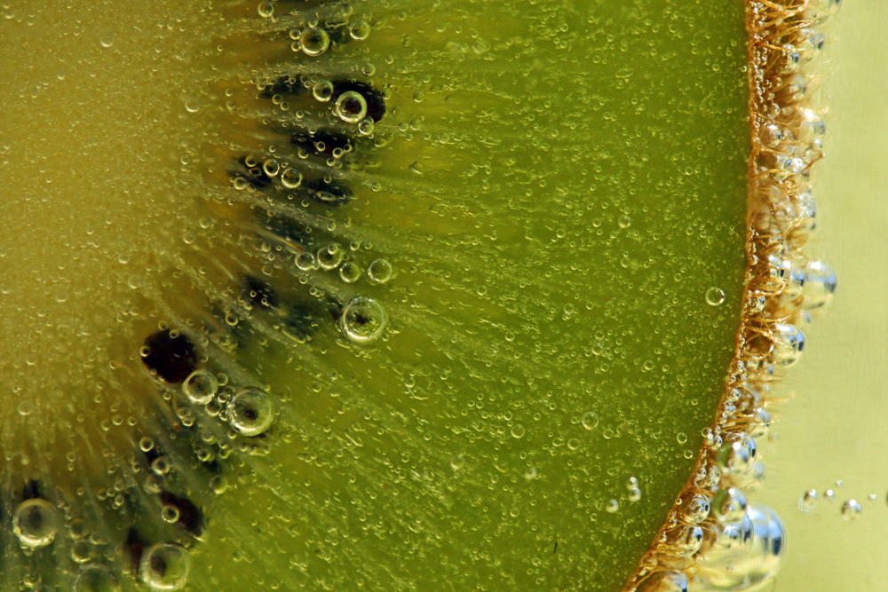 Kiwi fresh
Tied for
People's ChoicePhotographed by Michele Bollhalder
In the assignment description, I talked about how "at a certain level of 'clarity' an image becomes more than a flat 2-dimensional representation of our subject, and becomes a 'window' that helps us explore the subject in more detail." When the representation is close enough to reality, with enough detail, texture and depth, it provokes a much stronger memory of what that object is like in real life, Our vivid imaginations take over, and for a moment we are connected with the subject itself, and not merely looking at its 2-dimensional representation. Michele's
Kiwi fresh image came very close to provoking this response when I viewed the image, but not quite. I'm not quite sure why (the shooting parameters seemed right to me), but the detail on the kiwi seemed just a bit soft to me. I should say that the amount of sharpening appropriate for an image can be a bit subjective at times, and is often more art than science. The appropriate amount often depends on the subject, the shooting conditions, the lens and sensor, and the
resolution and type of monitor the image will be viewed on. I often have to fight the urge to over-sharpen an image, and sometimes will look at an image after I've posted it and think "yuck, too much sharpening." That said, I thought Michele's image could benefit from just a touch more sharpening. To my eye, the additional sharpening (using smart sharpen in Photoshop) helps to bring out the detail and texture in the image and perhaps brings it up to that level of clarity that makes the subject more real to me. Rebecca likes Michele's original version better than the sharpened version, and commented that the sharpening puts too much emphasis on the bubbles, and draws attention away from the kiwi. I can see her point and would be interested in hearing your opinions.
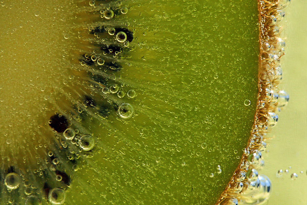 Kiwi fresh
Tied for
People's ChoicePhotographed by Michele Bollhalder, sharpened by Keith
Michele's
Fly on the wall image was a great example of an image that enables us to see an object
better than in real life. How many of us have the opportunity to examine a fly so closely that we can see the veins on its wings and the hairs on its legs? This image obviously provoked a response in viewers, and tied for
People's Choice. Well done Michele.
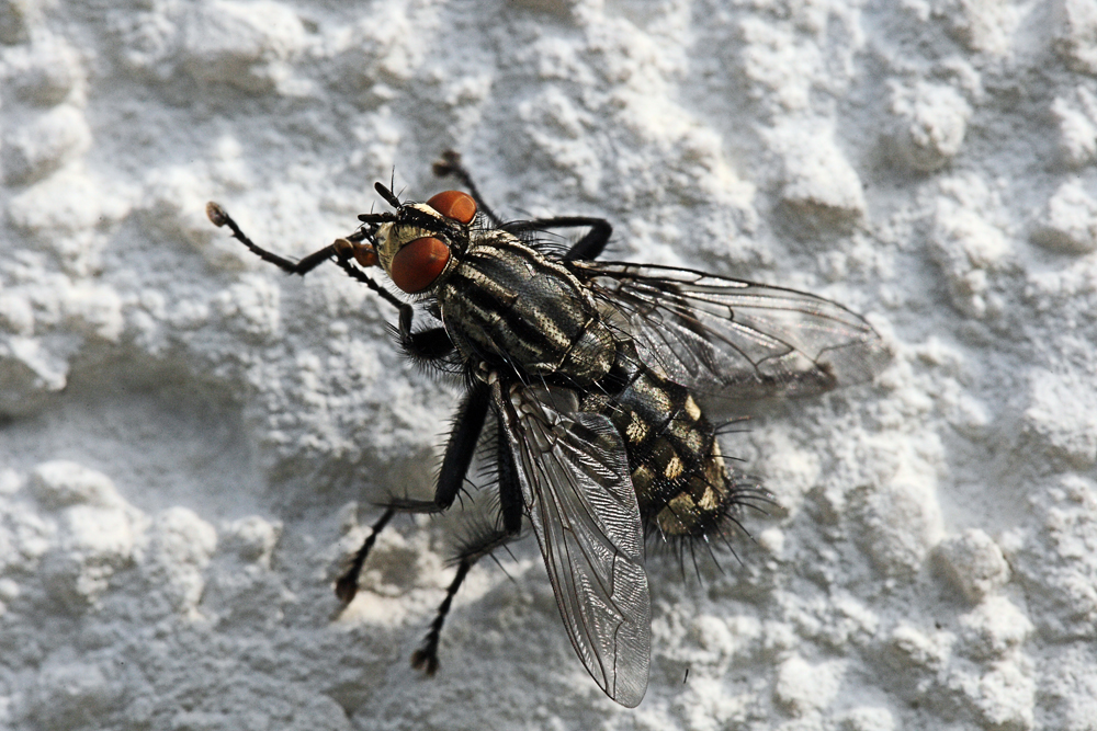 Fly on the wall
Tied for
People's ChoicePhotographed by Michele Bollhalder
I thought Michele's
Can I offer you a cup of coffee? image was her best image of the series. The wonderfully soft side-lighting and the 3-dimensional modeling and texture it produced, along with the sharply defined detail gave this image a level of clarity that made it seem real for me. I could imagine smelling the coffee grounds, and savoring the taste of that wonderful European coffee. I connected with this subject much more than the other subjects, and have awarded this image
Editor's Choice for Technical Merit. Very well done Michele.
 Can I offer you a cup of coffee?Editor's Choice for Technical Merit
Photographed by Michele Bollhalder
Rebecca's
Sunset image was a little bit different take on detail. This was a nicely composed image that captured all the subtle variations in colors and shapes of the clouds. I think it's wonderful that our weekly assignments encourage us all to look for and create images of the beauty around us.
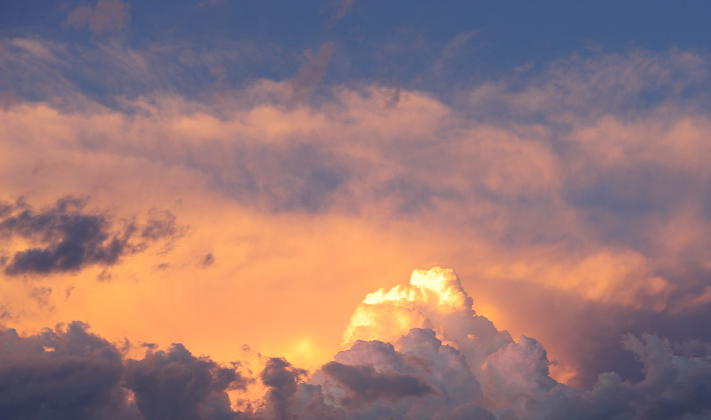 Sunset
Photographed by Rebecca
The crystals in the
Celestine and Sulfur image I posted are actually very small, and when I thought about potential subjects for the assignment I remembered all the intricate detail in those crystals. The image you are looking at is actually about 2x life size, and that level of magnification made it difficult to achieve the depth of field I needed. I took a few test shots and determined that my 85mm macro lens would allow me to capture adequate detail at an effective aperture of f22, but that anything smaller resulted in significant softening of the image from diffraction effects. Even at f22 I didn't have enough depth of field to capture all of the features in sharp focus, so I focused on the closest part of the rock and took my first exposure, manually adjusted my focus to "middle distance" (relative to the depth of the features on the rock) and took another image, and then adjusted my focus to render the crystals at the top edge of the formation sharply. I brought all three images into Photoshop as layers, and then used the "align layers" and "blend layers" function to seamlessly blend the three exposures into an image with extended depth of field. In retrospect, I wish I would have cleaned up the background a bit more. There are a few white pieces of dust that show up on the black velvet background. I didn't see them until I had posted the image. Given more time I would have redone the image to remove these minor distractions and make the background pure black.
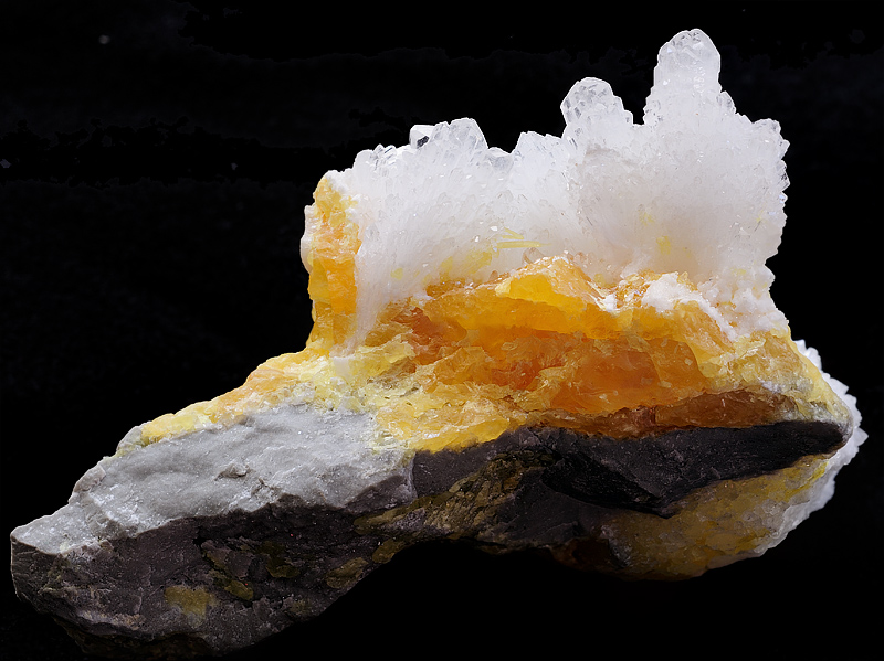 Celestine and Sulfur
Photographed by Keith
For my second take, I repositioned the rock in an attempt to use more direct light to accentuate the detail in the crystals. I used a thin shaft of natural light coming in beneath the window shade to backlight the front portion of the crystals and sulfur. The light falloff towards the back of the crystal formation helped to mask the fact that these crystals were outside of the depth of field; therefore, I was able to take a single shot (at an effective aperture of f25) with enough depth of field so the crystals in the light were adequately sharp. The high contrast light significantly changed the look in this image, but I liked the way it highlighted the translucence of the sulfur.
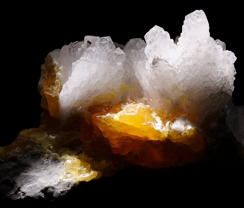 Celestine and Sulfur, Take II
Photographed by Keith
I enjoyed watching Evan get so excited about photographing the amethyst crystals (with a little help from Rebecca setting up the tripod). He even used a silver lid reflective disc (I think from one of his arts and crafts kits) to backlight the crystal formation. He used our old D100 for the shot, and I helped him get the background darker in Photoshop.
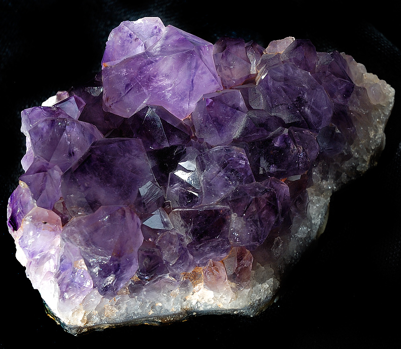 Amethyst
Photographed by Evan
I always enjoy Lars' creative images, and I'll have to add his
Picasso through a Magnify Glass to my long list of favorites. (His "Foggy Thoughts Self Portrait" is still one of my all time favorites: http://spiritofphotography.com/coppermine/albums/userpics/10058/me.jpg ) The saturated colors and sharply defined detail definitely provided a lot of "clarity" to this special view of the cat. Amazing and very Imaginative Lars.
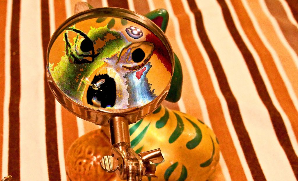 Picasso through a Magnify Glass
Photographed by Lars
Rick's
Peach and Bug image was another very well executed image, and definitely one that met the intent of the Detail assignment. His choice of f11 for the aperture produced very sharp detail on the peach fuzz, and his effective use of side-lighting helped to bring out the texture of the peach fuzz and 3-dimensional form of the peach. Rick asked if he should have used a smaller aperture, and my answer was that although a smaller aperture might have allowed him to gain a little depth of field to cover the peach fuzz in the foreground, it probably would have softened the sharp detail in the plane of focus (due to diffraction), and he would not have been able to produce such pleasant background bokeh and very nice separation between the subject and background. I think Rick's execution of this image was very well done.
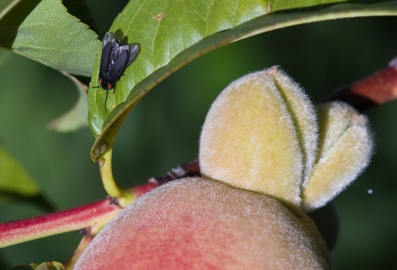 Peach and Bug
Photographed by Rick Pepin
Lars gets the award for simplicity (a good thing) with his
Nail Head image. This is the first time that I have ever considered a nail head "fascinating;" however, this one intrigues me with the fine detail and rough texture. This nail looks like it is very old, and perhaps made by hand instead of the machine made nails of today. Dave described this image best when he said that it was "wonderfully spare and most effective."
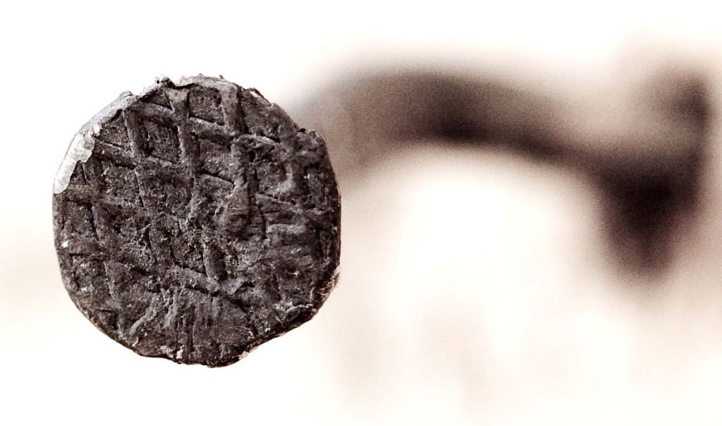 Nail Head
Photographed by Lars
Dave's
Perfume Bottle image was stunning. The image has a simple, elegant design, with all of the elements coming together so that the "sum of the parts is greater than the whole." The strong, simple graphic design of the blinds is wonderfully counterpointed by the playful and surprising twists of light viewed through the perfume bottle. The balance of the composition is outstanding, and the vignette adds a "completeness" to the image and keeps the viewer's focus contained in the frame. I often wonder how images like this come about. Did Dave notice the light through the bottle some time ago and finally get around to photographing it, or was he wandering around with his camera, actively looking for something to photograph when he saw the possibilities and created this composition? Wonderful work Dave.
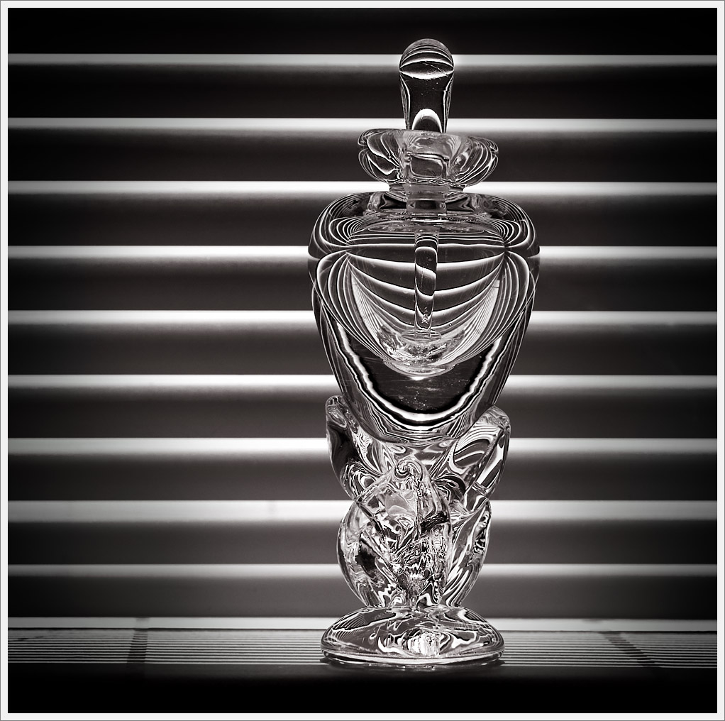 Perfume Bottle
Photographed by Dave Leiker
Dave's
Fragments triptych was a masterpiece that told a wonderful story. Dave describe the image as "a romantic fiction, just a creative exercise." And a wonderful creative exercise it was. Dave's image reminds us that the best imagery tells a story about the subject. I love the way Dave deliberately put together "found" objects to hint at the details of a story. His creation leads the viewer far enough along that they can fill in the blanks with their imagination, and as Michele said, it has "music, romance, love letters (postcards), lace, a key. It certainly tells a love story." The wonderful artistry that went into this image deserves the merit of
Editor's Choice for Artistic Merit.
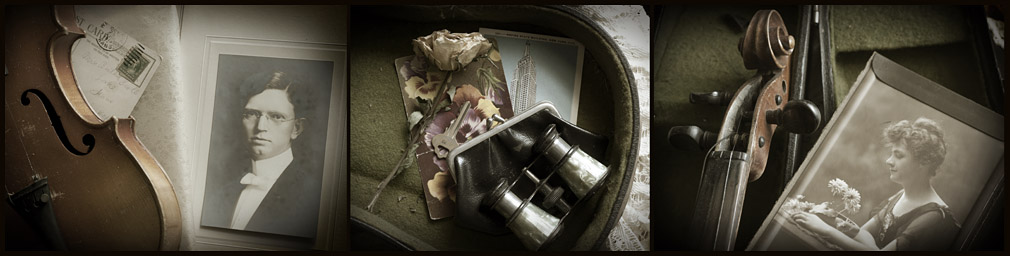 FragmentsEditor's Choice for Artistic Merit
Photographed by Dave Leiker
Marilyn submitted a beautiful image of a
Mbira on display. I helped Marilyn a bit with a correction to the white balance (by clicking on a neutral part of the image) and by increasing the contrast and brightness a bit in Photoshop. As Dave said, the image was a success in that it made it "easy to imagine how fingers delighted in the springy touch and tone of its keys." NIcely done Marilyn (and good job improvising a tripod to hold the camera steady).
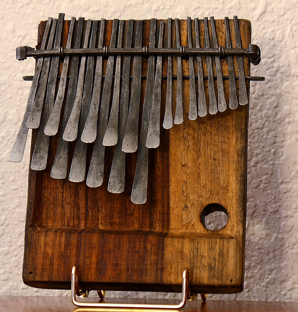 Mbira on display
Photographed by Marilyn McKinney
Sue's image of the Leadville 100 Mountain Bike Race provided enough detail in the straining arms and expression of the rider that helped us imagine the athleticism of the race. Great capture Sue.
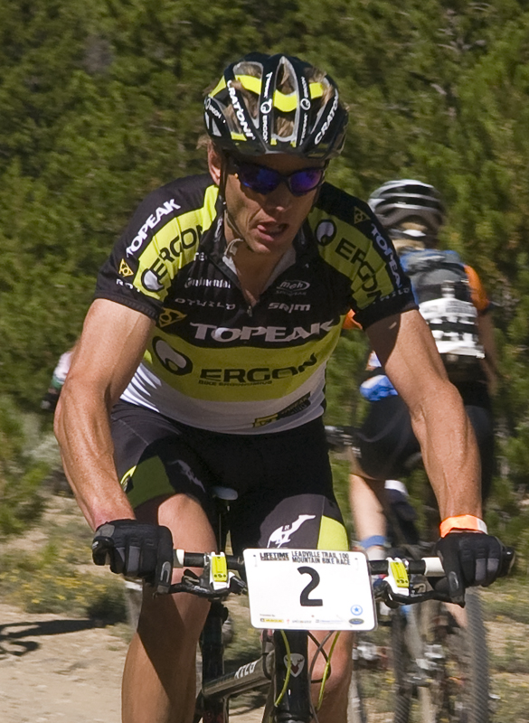 Leadville 100 Mountain Bike Race
Photographed by Sue Pepin
Jaime's image titled
I need free healthcare or I'm done was one of those images that made it so tough to pick a favorite for this assignment. Jaime's image was beautifully composed and executed and had a wonderful Zen-like feeling. I loved the simplicity and elegance of this image, and was fascinated by the detail in the wings, and the reflection in the eyes. I'll make up a new category for this image, Editor's Choice for just being simply beautiful.

Very nicely done Jaime, and thank you for giving us all a glimpse into the fascinating world of the dragonfly.
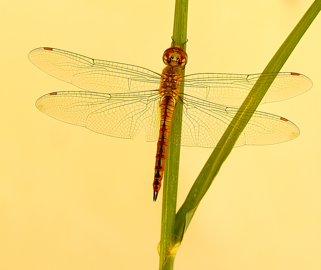 I need free healthcare or I'm done
Photographed by Jaime Dorotan
You all amazed and inspired me with your submissions for this assignment. Thank you.
Keith


