With all of the "monochromatic" days we've had recently, I've decided this would be an opportune time for a "Black and White" assignment. With the advent of digital photography, and the ease of shooting in color, we often overlook the fact that many times black and white images are more effective at conveying information about our subject than a color image would be. So let's take a quick look at some of the factors that can make black and white images more effective than a color image of the same subject.
It is important to understand that black and white images rely on "tonality" to convey a representation of the subject. It is the transition in tones from dark to light that reveal the shapes and textures within the image. Typically, the more range in grey tones there are in an image, the more effectively you can convey changes in shape and texture. By presenting an image in black and white, and effectively controlling the tonality within the image, you can focus the viewers attention on the shapes and textures within the image (and remove the sometimes distracting aspect of color).
I'll use my recent
Evening Light image as an example. Here's the color image I posted for the "color of light" assignment (with the intention of showing how the color of light changes between direct sunlight and shade):
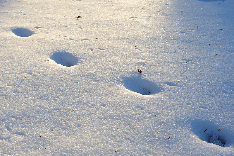 Evening Light
If my intention was to highlight the shapes and textures in the snow, then this image is more effective in black and white. Here I've simply used the "saturation" adjustment in Photoshop to completely desaturate the image, making it in effect a black and white image. Note how the textures and shapes in the snow are more prominent now that I've removed the distraction of color.
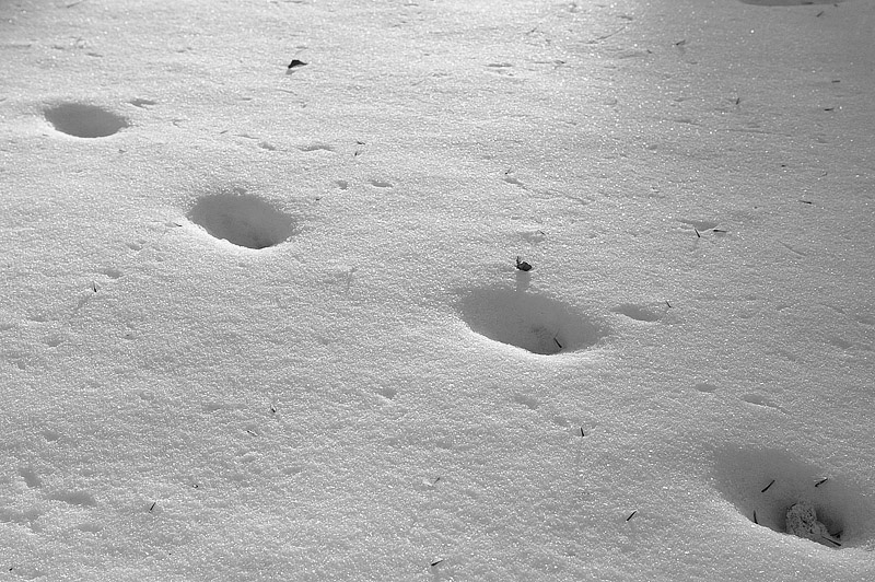 Evening Light
Converted to black and white using saturation adjustment in Photoshop
In this next rendition, I've used the auto contrast adjustment in Photoshop to slightly increase the contrast in the image, and then used the levels adjustment to adjust the midpoint. Both of these adjustments were necessary to better match the image to our normal perception of snow (as being brighter than mid-tone).
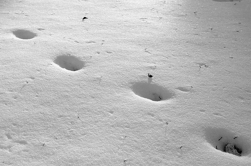 Evening Light
Auto contrast and midpoint adjustment in Levels
It is interesting to note that a few photographers that are very advanced at image editing will sometimes convert an image to black and white in order to get the "tonality" right, and then add the colors back into the image.
The
Evening Light image I used is also a good example of how unnatural clipped highlights can be masked by converting an image to black and white. When color channels are clipped (over exposed) it can result in an image that looks unnatural (because the color balance will be off in the portions of the image with "clipped" color channels). (In the
Evening Light image, the "clipping" occurred when I converted the image to sRGB.) By converting the image to black and white, I've removed this unnatural color balance and the distraction it caused.
Marilyn's
Column Clarity image is another great example of the use of black and white to focus the viewer's attention on the shapes, forms and textures in the image (and mask the clipped color channels).
 Column Clarity
Photographed by Marilyn McKinney
The assignment for the week of 18 - 24 January 2010 is "Black and White." You should strive to create a black and white image that focuses the viewers attention on the shapes, forms and textures of your subject. Please upload your images to the "Black and White" album in the Weekly Assignments category of the Gallery no-later-than midnight, Mountain Time (GMT -07:00) on Sunday, January 24th, 2010.
I'll look forward to seeing your images.
Keith


