Thank you to everyone that participated in the "Sense of Place" assignment. I enjoyed seeing your images and this was another assignment where it was very hard to pick a favorite image.
In the assignment description I stated that "a photo that conveys a "sense of place" is more than a documentary photo of a specific location, and is composed with the goal of conveying an ambiance, mood or feeling consistent with what someone would experience when visiting that place. Photographers will often compose their images to emphasize attributes (color, light, motion, depth, etc.) in the scene that contribute towards the feel of the image, and will often include symbolic elements that convey the meaning associated with a place. "Sense of place" is often tightly linked to culture and can also be conveyed by including people in the scene and illustrating how they relate to or behave within that place."
Congratulations to Rick whose
Leadville 100 image tied for
Peoples Choice. I thought Ricks
Leadville 100 Bike Race image did a great job capturing the excitement of the crowd during the start of the race. I could almost feel the excitement as I viewed the image.
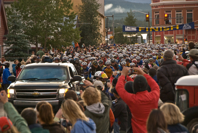 Leadville 100 Bike RaceTied for People's Choice
Photographed by Rick Pepin
My
Wing Walker image was the other image that tied for People's Choice. I loved the family atmosphere at this airshow and tried to capture some of that atmosphere with this image.
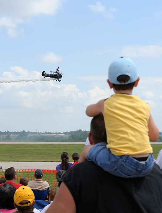 Wing WalkerTied for People's Choice
Photographed by Keith
When Marilyn posted her Vegas image in the gallery, she asked if there was a way she could have more clearly captured the moon so that it doesn't look like a street light. I will try to answer Marilyn's question about better capturing the moon, although I will in a sense be "Monday morning quarterbacking" since I don't know whether the local geography would have allowed her to shift her camera position from where she took the shot.
If Marilyn had been able to move her camera position further back from the motel sign and shift to the left a bit, she could have accomplished two things that would have helped. 1) She could have put more separation between the motel sign and the Stratosphere (you should avoid overlapping elements when possible), and also placed the moon in between the motel sign and the stratosphere. Moving the camera to a position further from the motel would also have placed the moon higher in the sky in relation to the motel sign. 2) Moving further back would have allowed her to use a longer focal length lens and still include all the elements in this scene; therefore, she would have been able to make the image of the moon appear much larger in relation to the size of the motel sign (making it look more like a moon than a street light). (See the
controlling perspective assignment for more details on how changing focal lengths will affect size relationships of elements in the scene)
Were often disappointed with our images of the moon because it doesnt look nearly as impressive in our image as it did in real life. Most of the time, this is because we have used a wide angle lens to capture the scene. As described in the controlling perspective
controlling perspective assignment, using a wide angle lens will emphasize the foreground elements, while making distant elements appear smaller in relation.
One other common challenge with photographing the moon is obtaining the proper exposure. Because the moon is surrounded by an expanse of dark sky, the default exposure recommended by our exposure meter will result in overexposure of the moon, which wipes out the detail we see in real life and makes the moon look like a white blob. Proper exposures of the moon are often much closer to daylight exposures than what you would suspect. One technique to obtain proper exposures of the moon is to use a telephoto lens and spot meter on the moon, setting your exposure for +1.7 or +2 EV. This setting will result in an image of a bright moon, while still retaining detail in the surface of the moon.
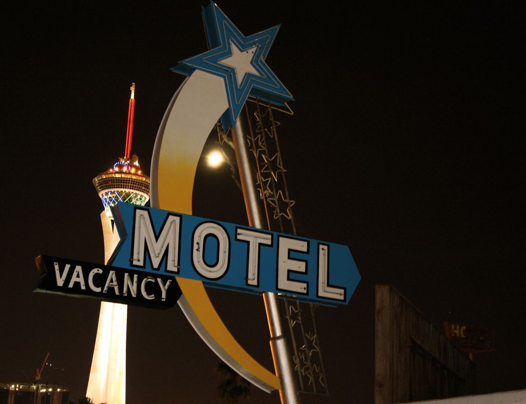 Saturday night cruising north of the Vegas strip
Photographed by Marilyn
Joyces
The Road Less Traveled image was a beautiful image that truly made me want to be there. Although it might not have been immediately apparent, the leaves on the road indicated that this road was indeed, less traveled. I would love to have the opportunity to explore and photograph this place. I thought this beautiful image deserved
Editors Choice for Artistic Merit. 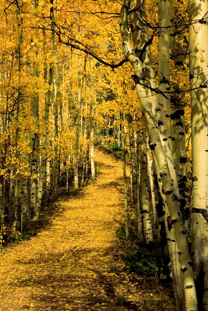 The Road Less Traveled Editor's Choice for Artistic Merit
Photographed by Joyce Donaldson
Lars image of
A Very Blue Lagoon in Iceland was the image that best met the intent of the assignment. This image gave me a better sense of what it would be like to visit or live in Iceland, with the rugged terrain and volcanic rocks offset by the modern architecture and people leisurely relaxing in the warm waters. This image did a great job portraying a sense of place and was awarded
Editors Choice for Technical Merit.
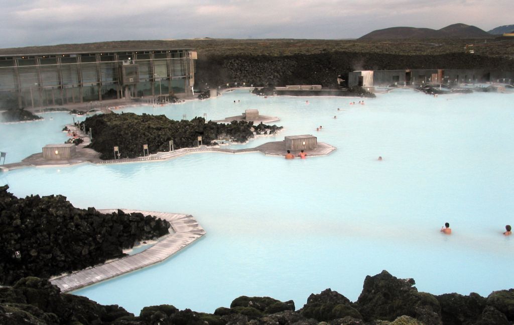 A very Blue Lagoon in IcelandEditor's Choice for Technical Merit
Photographed by Lars
Thank you again to everyone that participated in the Sense of Place assignment, I enjoyed viewing your images.
Keith


