Thank you to everyone that participated in the "Wide and Close" assignment. The objective of this assignment was to encourage participants to get as close as possible to the "near" element in their compositions in order to emphasize the perception of depth in the scene. I recommended using their widest angle lens to compose their images, and getting as close as possible to the "near" element in the scene while still keeping the farthest objects in the scene within the depth of field for the selected lens and aperture.
I enjoyed Lars' whimsical
Garden Inside a Bubble images and thought they were great examples of how getting "wide and close" could be used to emphasize the near elements in the scene.
 My garden inside a bubble 2
Photographed by Lars
My
Botanica image was chosen as People's Choice for this assignment.
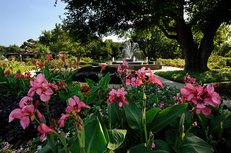
Botanica
People's ChoicePhotographed by Keith
The sun was almost directly in front of me in this scene, so I used the large tree in the middle distance as a sun shade. This was a challenging high-contrast scene, and the original image, with no exposure adjustments to the raw file, looked like this:
 Botanica
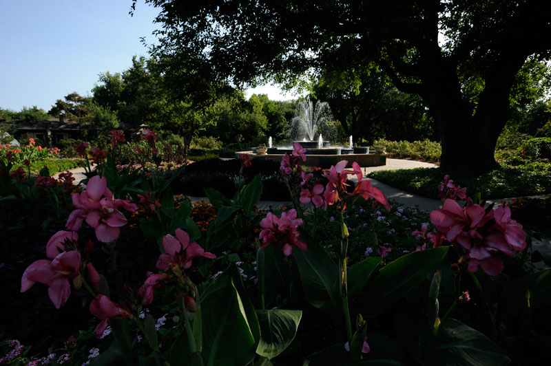
 original unprocessed file
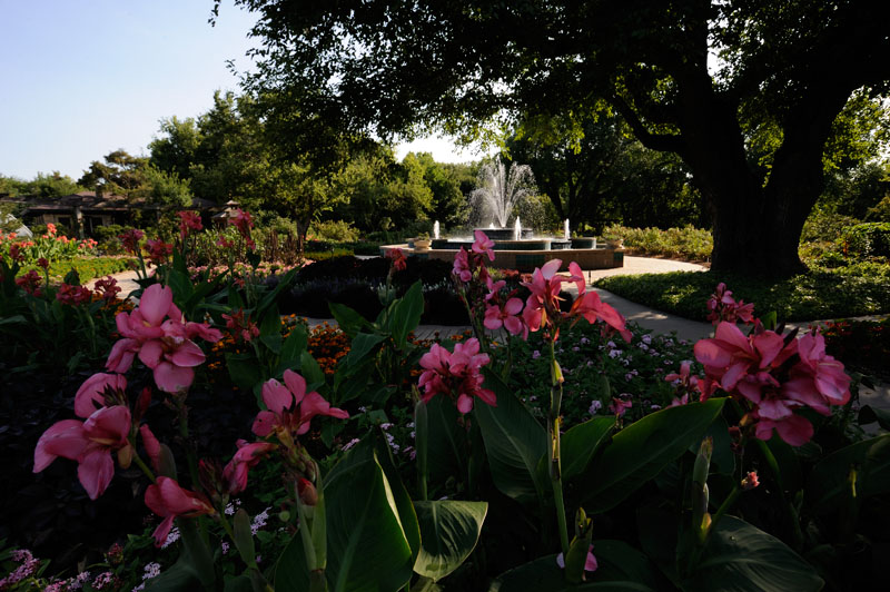
The contrast range of the image was too great to display properly without some adjustments to the file in raw processing. The foreground flowers were in deep shadow, and the sky was a bit blown in the "out of camera" raw file. However, I knew I could use "exposure blending" techniques to produce a final image with a pleasing rendition for both the bright sunlit areas of the scene and the shadow areas. I did this by first adjusting the image in my raw processor to produce a pleasing rendition of the sky (by reducing the exposure by about 1/3 EV), and then opened this image in Photoshop. The "sky" version of the image looked like this:
Botanica (adjusted -0.3EV for sky)
I then adjusted the same raw file to +1 EV, in order to get enough light in the shadow areas, and opened that image in Photoshop. The "foreground" version of the image looked like this:
Botanica (adjusted +1 EV for foreground)
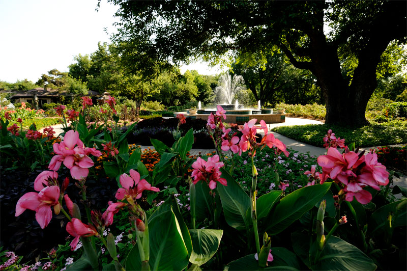
I then copied and pasted the "sky" version of the image onto the foreground version as a new (top) layer, and applied a layer mask to allow only the sky to show through on the top layer, producing the composite image shown below. (NOTE: this image will only display properly in a "color managed" browser such as Safari.) The challenge with creating an exposure blended image like this is producing a "realistic" blend of shadows and sunlit areas. I could have brightened the shadows even more; however this would have resulted in the shadow and sunlit areas looking "out of balance," so some compromise had to be accepted with the slightly too dark shadow areas in the image.
Botanica (final "exposure blended" image)
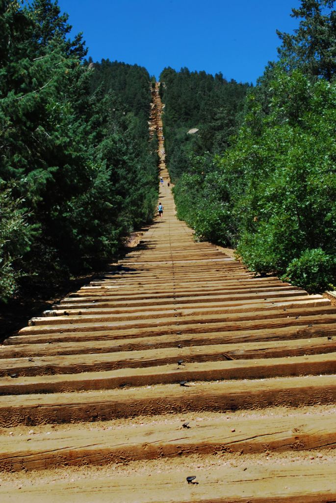
I enjoyed seeing the different possibilities presented in Sheila's series of images from the Manitou Incline. (This is a VERY step route up the mountain from the historic Manitou Incline Rail, now very popular with runners training for the Pikes Peak ascent and other high altitude endurance races.) Each image in the series presented something unique, and (at least for me) made me wonder if if would have been possible to combine the best attributes of each of the "takes" on the incline. Sheila's
Stairway to Heaven image emphasizes linear perspective and the perception of depth by filling the bottom of the frame with the ties from the incline railway bed. I thought this was a very effective use of "wide and close" to emphasize depth; however, the dark sky removes a visual cue that helps us recognize the incline is actually a steep rise. In this image, without the visual cue of the blue sky, it almost looks like we are going
down a step incline.
 Stairway To Heaven
 Photographed by Sheila Ancheta
Sheila's
Are We There Yet? image does a great job of adding in the visual cue of a blue sky, but we lose the exaggerated perception of depth produced by the ties filling the foreground in the horizontal version of this image.
 Are We There Yet?
Photographed by Sheila Ancheta
I thought Sheila's
One Step at a Time image was the best rendition. It appears that she positioned her lens closer to the railroad ties in the foreground, which serves to emphasize the depth more than in the other versions of the image. However, I think this image suffers a bit from a too dark sky. It appears to me that Sheila used a polarizer for this shot, which resulted in the skies appearing too dark. As a word of warning, using a polarizer at higher altitudes (this shot was probably taken between 8,000 and 9,000 feet in altitude) will result in skies that are too dark. When you are using a polarizer at a higher altitude, it helps to "back off" on the amount of polarization, and perhaps take a few shots with different levels of polarization applied. Overall though, I thought this image used "wide and close" techniques very effectively, and awarded the image
Editor's Choice for Technical Merit.
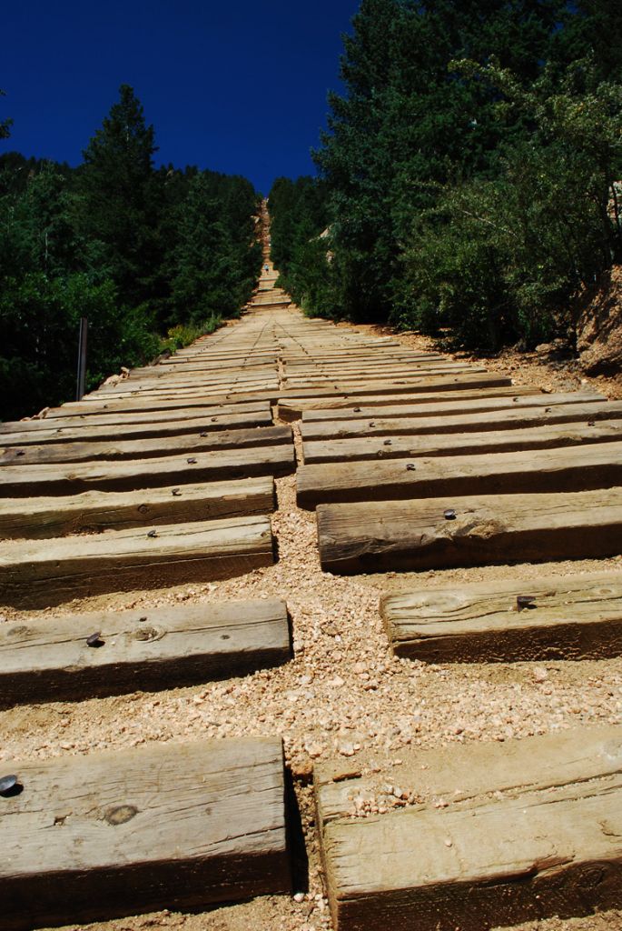 One Step At A TimeEditor's Choice for Technical Merit
Photographed by Sheila Ancheta
I wanted to point out one other small but very important "visual cue" in this image. On the left side of the railroad ties you can see a small vertical metal pole about twenty feet up from where the picture was taken. This small detail adds a very important visual cue that helps us (subconsciously) determine how steep the incline really is. When composing images that include steep inclines, it is always useful to include a "reference" to vertical that will help the viewer construct a correct perception of the scene.
Joyce's
Windmill Sunrise is a very beautiful image that effectively uses the "leading line" of the fence to draw the viewer into the scene. Very well done. I've awarded this image
Editor's Choice for Artistic Merit.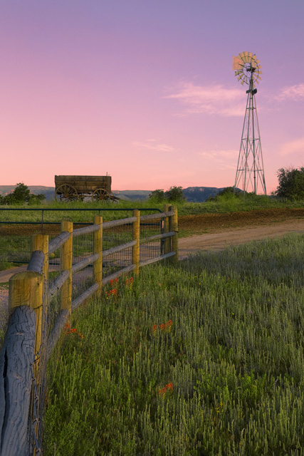 Windmill Sunrise Editor's Choice for Artistic Merit
Photographed by Joyce Donaldson
Thank you again to everyone that participated in the "Wide and Close" assignment. I hope you had fun experimenting with "wide and close" and now have a better sense of how this technique can be used to emphasize the "near" elements in your scene and enhance the perception of depth in an image.
Keith


