The
guidelines for this assignment were to capture a macro image (defined as life size in a 4x6 inch print) while concentrating on using good techniques to convey as much detail as possible in the image.
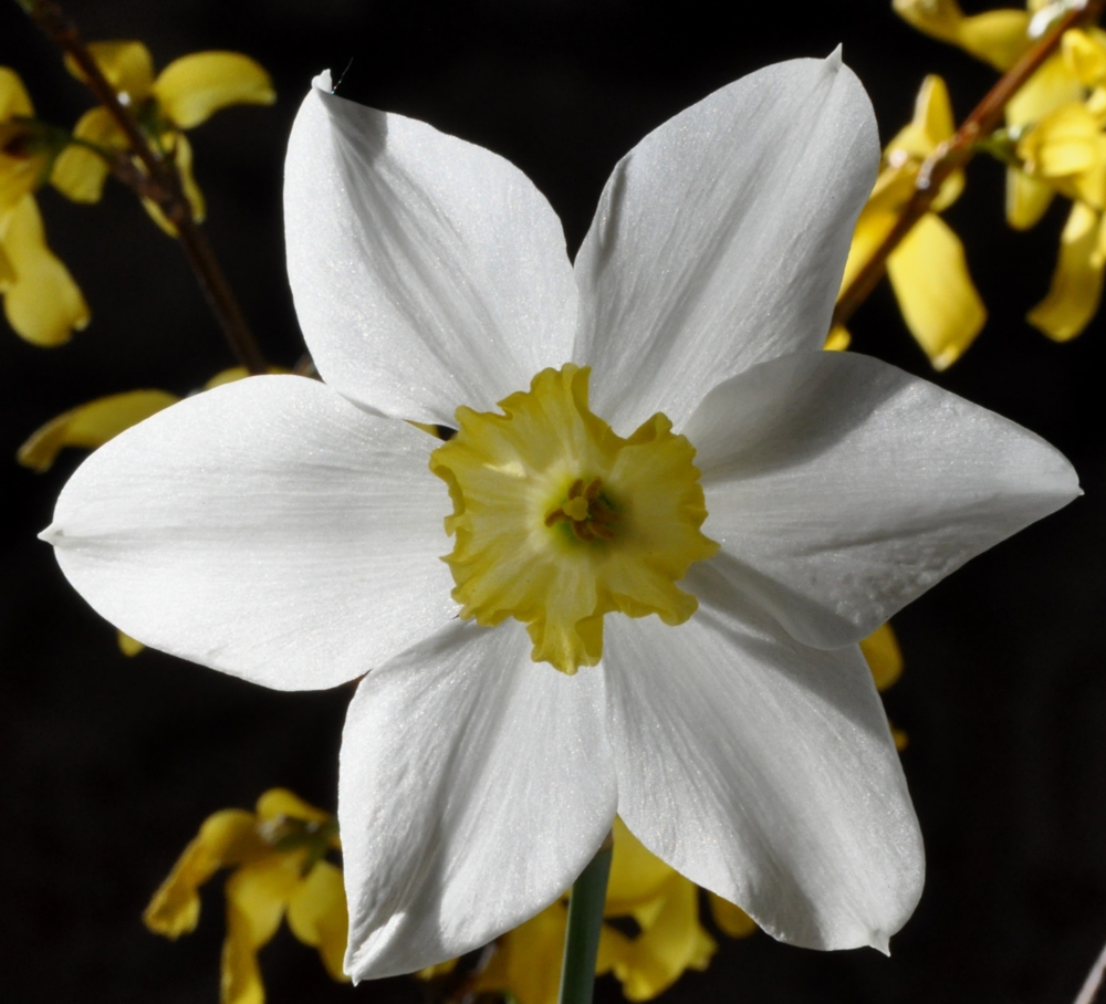
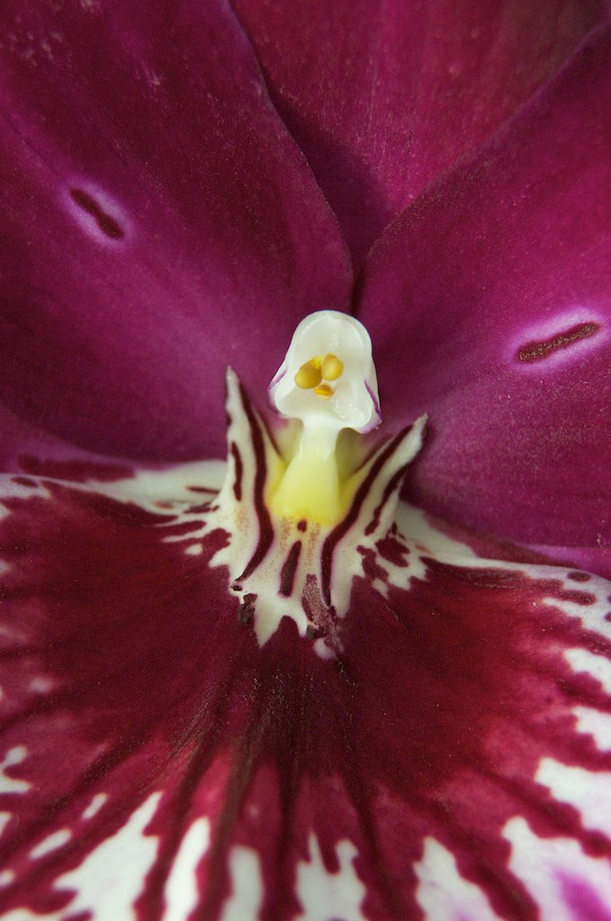
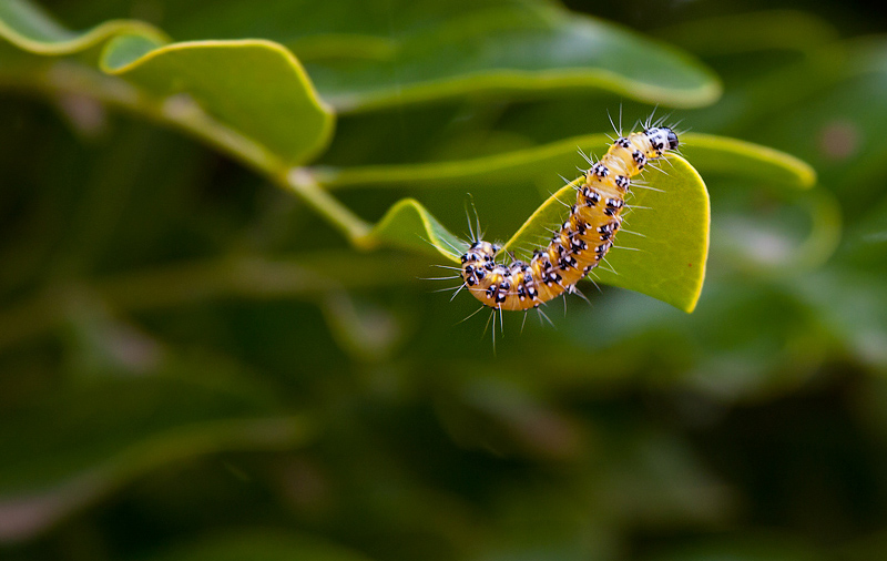
In the assignment description I mentioned that what typically captivates our attention and draws us into a macro image is the amazing details that we don't normally see with our naked eye. A well executed macro image illustrates characteristics of the subject that fascinate us. While there were many great images submitted for the assignment, and many of them showed us fine details of the subject, the details in Rick's image titled
It's not Spring here yet! really popped. The clarity of the portion of this image in the focus plane was simply outstanding. The angle of light, precise focusing, steady camera, spot-on exposure and beautiful colors, tonality and pleasing contrast all contributed to the outstanding clarity and captivating nature of this image. The depth of field was controlled so that if fell off smoothly into an unobtrusive and visually pleasing background. Technical execution of this image was simply outstanding! I've selected this image as
Editor's Choice for Technical Merit. Well done Rick.
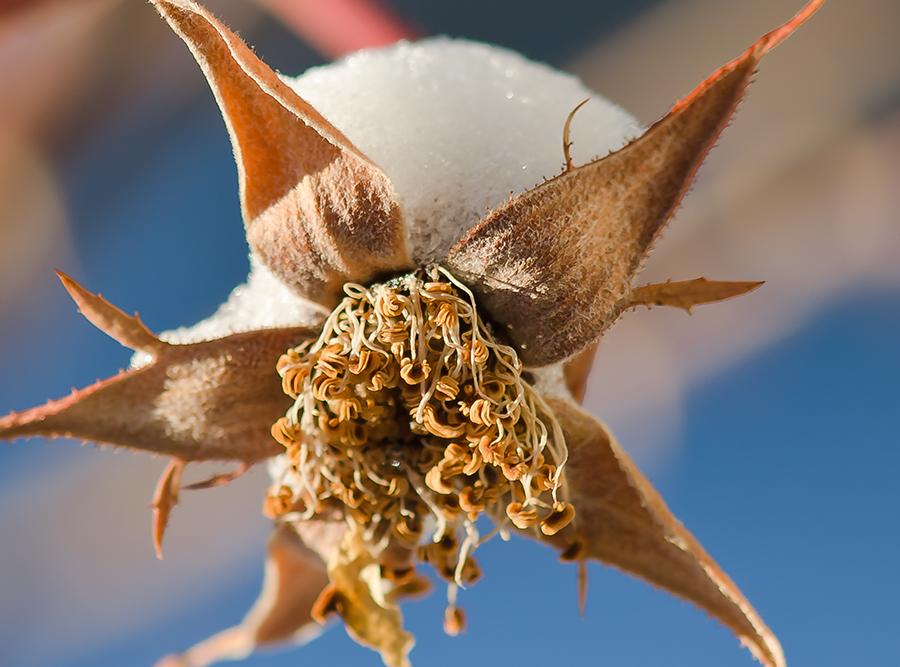 It's not Spring here yet!Editor's Choice for Technical Merit
Photographed by Rick Pepin (TrvlRick)
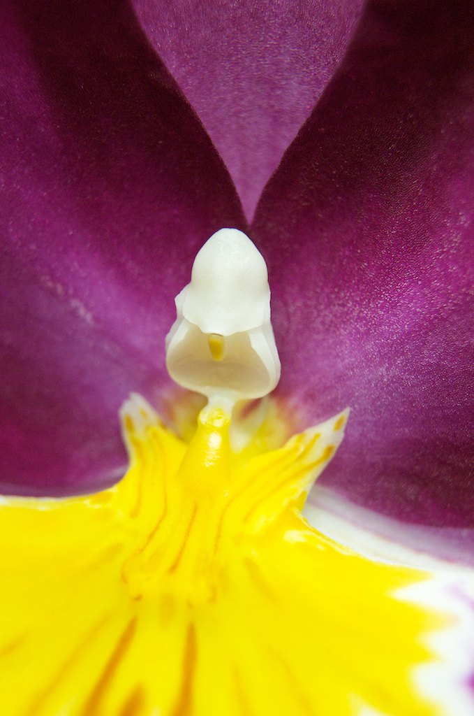
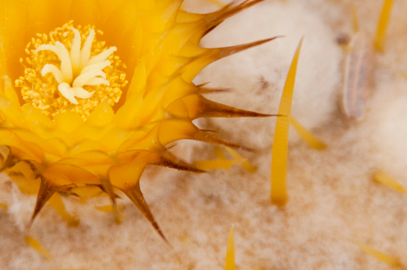
Lorin's
Desert Flare was another stunning image. The colors on my monitor were super-saturated, but I suspect that is because the image didn't have a color space tag embedded, and therefore the image was displayed in the most saturated reds possible on my monitor (which is pretty "over the top" compared to most monitors). Pulling the image into Photoshop and tagging it with either the Adobe RGB or sRGB color space helped to moderate the colors quite a bit. Once I got past the distraction of the super-saturated colors I was able to enjoy the detail in this image. Lorin appropriately focused on the stamen of the flower, and the few really sharp spines that also fell into focus were a nice bonus. Very nicely captured Lorin.
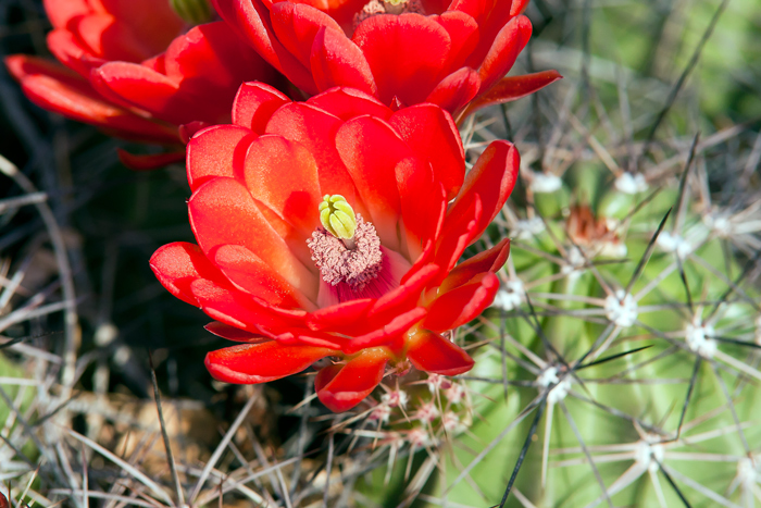 Desert Flare
Photographed by Lorin Schroeder
Michele's image titled
"Mommy, do I really have to brush my teeth?" was a cool image, but I didn't really appreciate it as much until she posted her image of the overall scene. Once I saw the overall scene I was able to appreciate the masterful job Michele did in composing this image to eliminate the distracting background. Well done!
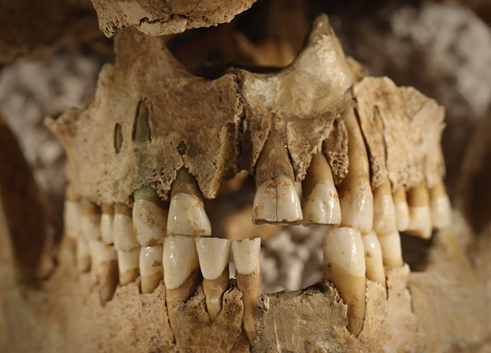 "Mommy, do I really have to brush my teeth?"
Photographed by Michele Bollhalder
The lighting, detail and tonality of Michele's
Woman image all contributed towards making this a stunning image. The conversion to black and white was very effective, and helped focus the viewer's attention on the detail and shapes and forms in the image. Very well done Michele. Your image makes me want to see and admire the sculpture in person.
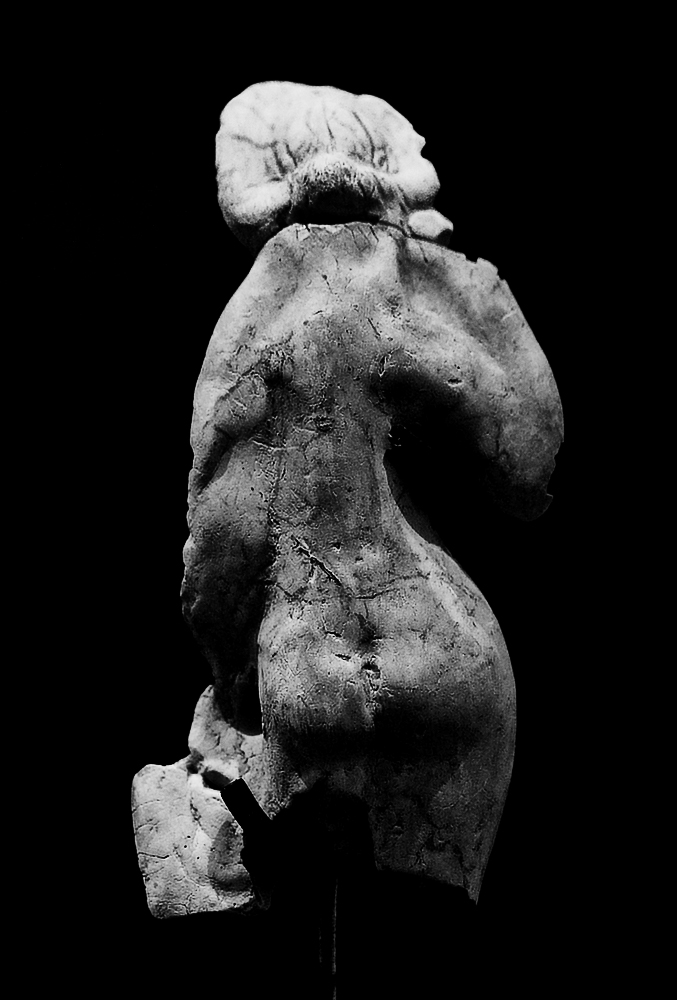 Woman
WomanPhotographed by Michele Bollhalder
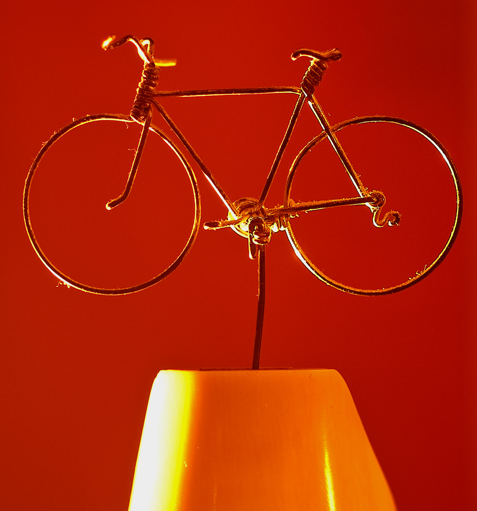
Lars' series of candlelight macros was an imaginative and whimsical series that makes me appreciate Lars' creativity. My favorite was the wire sculpture of the bicycle. I was pleasantly surprised (amazed even) at how well the candlelight helped define the shape of the bicycle, providing beautiful "rim light." What a cool sculpture too! I admire the artist who created this work of art.
 Candle light macro 2
Photographed by Lars
 Candle light macro 3
Photographed by Lars
Lars'
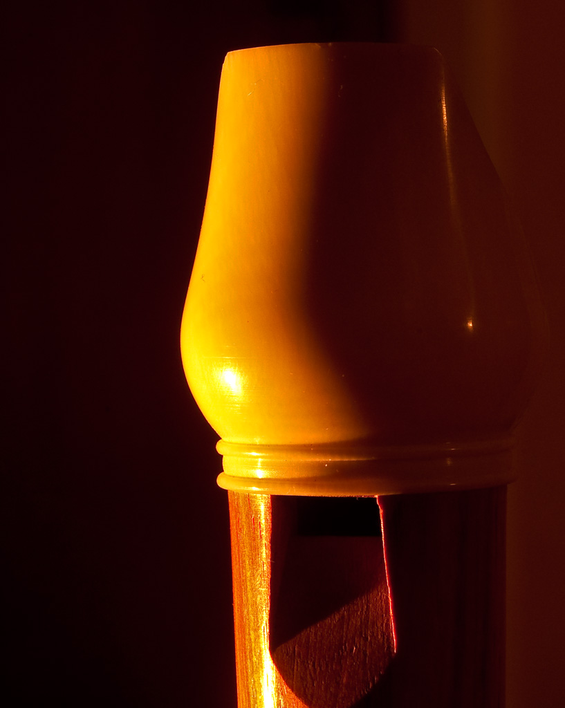
Lens candle light image was another wonderfully creative image, rewarding the viewer with a surprise (or two) when they viewed the image. The play of light within the lens elements was fascinating to see, and was a wonderful way to illustrate the complex lens designs that we take for granted in our photography. Very cool image Lars.
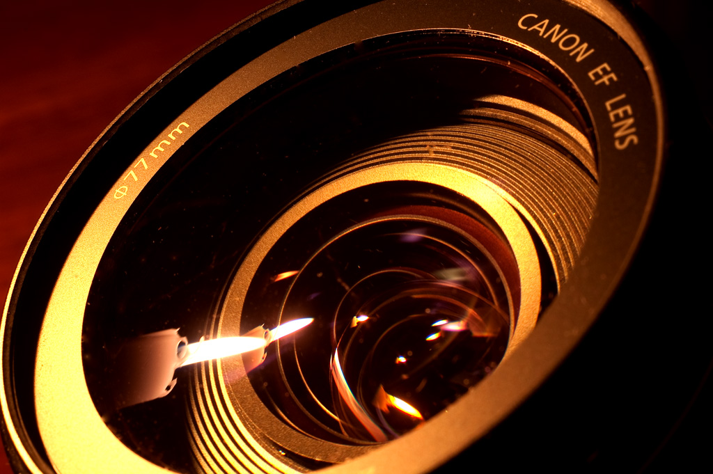 Lens candle light
Photographed by Lars
I was amazed by how Michele was able to take a row of simple objects like the old nails in her image of that name and turn them into works of art. The narrow depth of field was very effective in this image, helping to "abstract" the nails and their surroundings and turn them into works of art. As Luc said, the colors and textures were outstanding, and a great counterpoint to the smoothly defocused background. Very well composed and executed Michele.
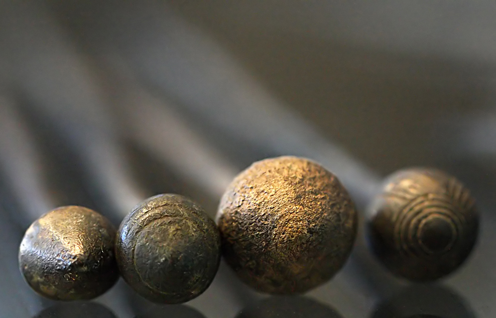 Nails
NailsPhotographed by Michele Bollhalder
Luc's
Narciss image was another beautiful work of art. The backlighting was simply stunning in this image. I thought the image would benefit from just a touch of sharpening, and when I pulled it into photoshop I noticed the image didn't have an embedded color space, so I did my best to pick an appropriate color space the closely replicated the colors of the image Luc uploaded (at least on my display).
 narciss
Photographed by Luc Bigler
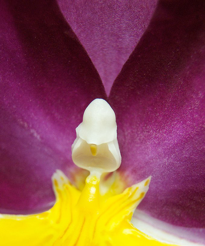
Here's the image with a bit of sharpening applied and an embedded color space:
 narciss
Photographed by Luc Bigler
Marilyn did an
amazing job creating a composition where the background complemented the subject in her image titled
From my kitchen window. This is one of those images that I probably would have been stunned and surprised by as I was reviewing my images on the computer. I love how the "feel" of the stained glass is replicated in the out-of-focus background. I do see a bit of motion blur in this image, so it might have helped to bump the ISO up just a bit and shoot at a higher shutter speed. I think ISO 400 and a shutter speed of 1/50 might have done the trick. Still, this is a beautiful, artistic image, and the slight softness in the heart doesn't detract too much.
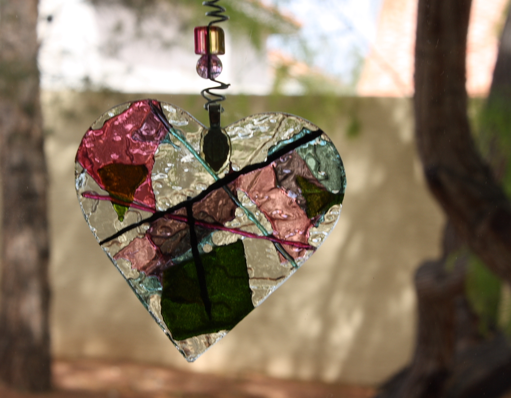 From my kitchen window
Photographed by Marilyn McKinney
Marilyn's image of
Antique baby doll slippers had
outstanding detail and clarity. I'm guessing that she used a tripod and very good technique to capture this image. Very nice job placing the focal plane for this image too Marilyn.
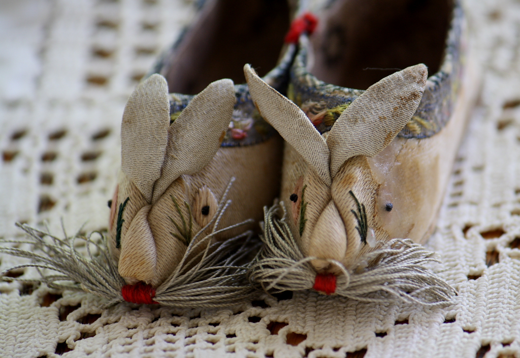 Antique baby doll slippers
Photographed by Marilyn McKinney
Dave's
Macro - Dandelion was another one of those images that illustrated the potential power of macro photography to captivate the viewer. I never knew that dandelions could be so beautiful. I'm also sure that it was Dave's artistry, and appreciation for the subject that resulted in such a beautiful rendition of a simple dandelion. The plane of focus was very precisely placed in this image and the technical execution was extremely well done, but more that anything else, this was an image that celebrated and masterfully conveyed the beauty of an ordinary, everyday "weed." I've selected this image as
Editor's Choice for Artistic Merit, and will never quite look at a dandelion the same again.
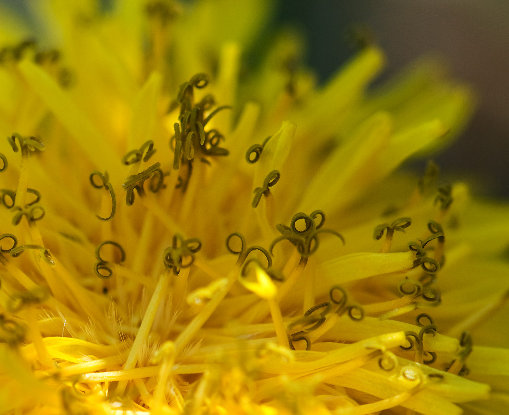 Macro - DandelionEditor's Choice for Artistic Merit
Photographed by Dave Leiker (prairiedust)
Carol's
Orchid images were both very beautiful. I was curious about the difference in sharpness between the
Orchid 1 image and
Orchid 2, with
Orchid 1 being much sharper across the frame. Both were shot with an aperture of f7.1, so my first inclination was to wonder why the first image seemed to have so much more depth of field. After examining the images in more detail, I think there might be two reasons for this. First, the
Orchid 2 image seems to have a bit more magnification than
Orchid 1. I'm guessing that Carol moved in a bit closer for the second image, and so even though her aperture was the same, the closer focusing distance (more magnification) resulted in proportionately less depth of field. Second, and perhaps more importantly, it looks like Carol took great care to align the plain of focus in her
Orchid 1 image so that not only was the stamen in focus, but the plane of focus skimmed across key areas in the upper and lower petals, giving us the perception of sharpness throughout the image. In the
Orchid 2 image, the plane of focus seems to be aligned differently (in order to keep the front face of the "hood" in focus). The upper and lower petals are outside the plane of focus, and therefore the areas of the image that were sharp in the first image (edges of the petals and detail below the stamen) go soft in the second image. Overall, I think Carol's execution of the first image was more successful.
 Orchid 1
Photographed by Carol Burkett
 Orchid 2
Photographed by Carol Burkett
There are two things that typically draw me into macro images of flowers. The first is the fascinating detail. The second thing that draws me to flower images, and perhaps provides even more pleasure, is the flowing shapes and forms of the petals. In Carol's Orchid 2 image, I thought the most beautiful part of the image was the shapes and forms of the upper petals, in combination with the structure of the stamen. Yet, the bright saturated yellows of the lower part of the flower kept drawing my attention away from the subtle beauty of the upper petals and forms. To compensate for this, I'd like to propose an alternate crop, shown below:
 Orchid 2
Photographed by Carol Burkett, proposed crop by Keith
It isn't initially apparent
why she framed the image in the way she did; however Julie's composition of her Hanging On image was very effective. Leaving extra space at the bottom of the image for the caterpillar to fall into was essential to reinforcing the theme of "hanging on." If Julie had cropped in closer on the bottom of the frame, the viewer would be much less likely to perceive that the caterpillar was in danger of falling. The darker tonalities at the bottom of the image also reinforce the perception that the caterpillar would be falling into a "void." This is a wonderful example of a composition that reinforces the image caption. I'm curious to know whether Julie had this "theme" in mind when she initially composed the image (if so, she deserves a gold star!) or whether she thought of the theme when she saw the composition during image review, or whether she cropped the image during post processing to reinforce the theme. Whatever the process, this is a very effective composition.
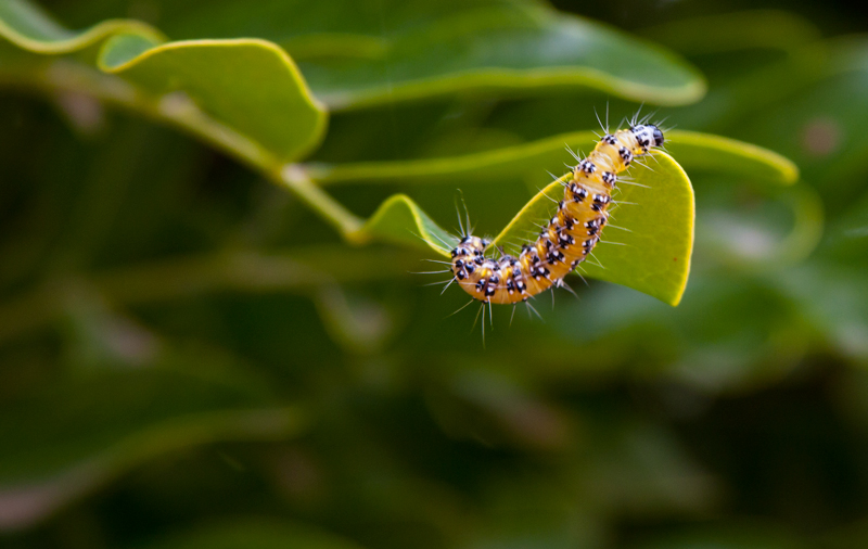 Hanging On
Photographed by Julie Schroeder
The caterpillar in Julie's image appeared a bit soft, which could probably be attributed to a combination of slight motion blur and just a tiny bit of "back focus" in the image. This small amount of softness can sometimes be compensated for in post processing with the application of a little bit of unsharp mask (Smart Sharpen filter in Photoshop) like this:
 Hanging On
Photographed by Julie Schroeder, selective sharpening by Keith
Julie's Cactus Flower was another beautiful composition with fascinating detail. I suspect that the relatively large aperture didn't provide enough depth of field to produce sharp detail in this image (although it did result in a pleasantly smooth out-of-focus white fuzzy background. I think this image might have benefited from the use of a smaller aperture and a bit more depth-of-field in order to bring more of those fascinating details into focus.
 Cactus Flower
Photographed by Julie Schroeder
I was intrigued by the spider in Julie's
Camouflage image. As Dave said, this was a very nice find, and a tribute to Julie's perceptiveness. I do think the focus point was a little off in this image, with the flower petals directly underneath the spider being in sharper focus than the spider. I think the image would have been more effective with the focus on the spider instead of the flower. (Although having the spider just slightly out of focus does help reinforce the "camouflage" theme.) I should also mention that none of Julie's images were tagged with a color space. I loved the colors on my monitor, but also know that the image will display wildly different on other monitors, since the computer will default to showing the colors in the most saturated gamut available to each different monitor out there. Julie if you are using Photoshop to save your JPEGs, you should be sure and check the "ICC profile" box in the save dialog.
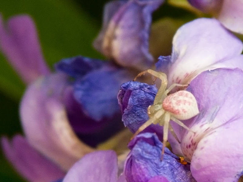 Camouflage
Photographed by Julie Schroeder
Chris' images of
Shaping Glass were both very strong compositions. The strong diagonals in the first image, along with the bold colors and flowing motion of the flame made this a very dynamic image. I can almost hear the sound of the blowtorch! Chris handled the exposure
extremely well for this image (and I see he had to dial in -1 EV exposure compensation from what the meter was recommending.) Very well done for both of these images Chris.
 Shaping Glass
Photographed by Chris Franklin
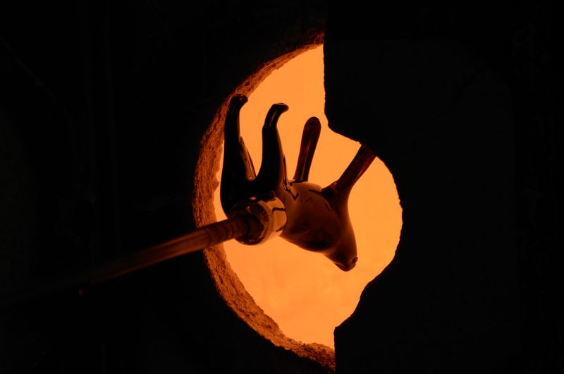 Hot!
Hot!Photographed by Chris Franklin
Rebecca's image titled
What little boys are made of was a great capture that very effectively conveyed the idea of a little boy catching and gently cradling a tiny frog. As several people mentioned in the gallery, the glistening wetness of the hand and the grains of sand contributed to the overall "feel" of this image. Rebecca used several techniques to effectively capture this image. Because of the level of magnification (it really was a very tiny frog) Rebecca knew she would need a small aperture to get enough depth of field. In order to shot at a decent shutter speed (1/320) and use a smaller aperture, she bumped her ISO up to 800, even though it was a bright sunny day. Selecting that ISO allowed her to capture the image with an aperture of f16, which provided enough depth-of-field and helped her to compensate for any missed focus from either camera movement (she was handholding) or more importantly, from Evan moving his hand. (How still do you think a small boy can hold his hand when there's a tiny frog squirming in it?

) If you look closely at this image you can see that the plane of focus was actually on the palm of Evan's hand, so the small aperture was essential to providing enough depth of field to provide acceptable sharpness on the frog.
One other technique Rebecca used when photographing the frog was to put the camera on continuous focus and a high frame rate and then gently squeeze off a series of exposures, in effect "focus bracketing" and letting the camera try to compensate for subject movement.
However, for this image she only managed to squeeze off one shot before the frog jumped out of Evan's hand. This image wonderfully conveyed the essence of the moment, and was selected as
People's Choice.
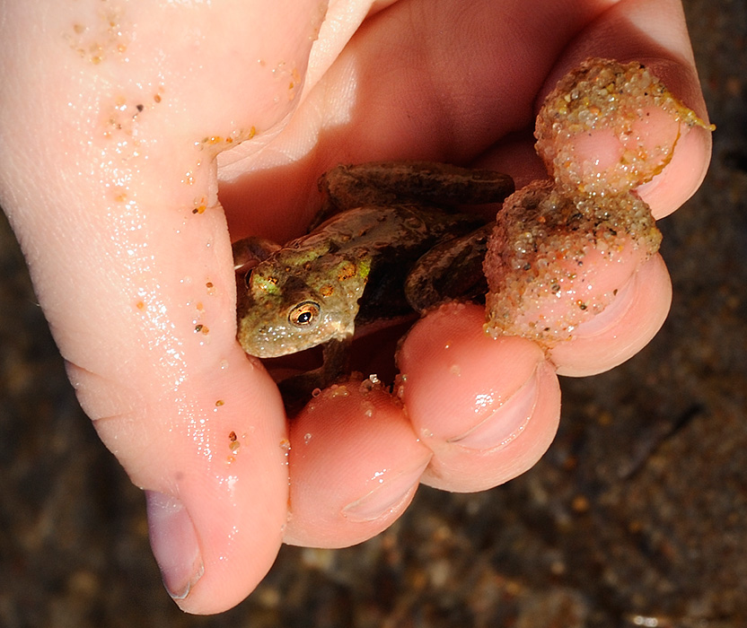 What little boys are made ofPeople's Choice
Photographed by Rebecca
Thank you again to everyone that participated in this assignment. You continue to inspire me, and this assignment in particular has motivated me to try to find time to enjoy more macro photography.
Keith


