The
guidelines for this assignment were simply to photograph something that inspires you and fuels your creativity as a photographer. Thank you to everyone that participated in this week's assignment, especially Jaime, who started us off on such an inspirational note with his
Whisper... that I may see image, and the poetic caption. This was a stunning image, with amazing detail and clarity. The color was perhaps just a bit too saturated on my wide gamut monitor, but didn't detract from this image. The composition was exquisite, and perfectly framed the sensuous forms of the flower. We should always be careful about including bright "blown out" areas in the background, lest they steal the viewer's attention away from the primary subject; however, in this case the primary subject was so eye-catching that the background wasn't distracting. Awesome image Jaime! Thank you very much for inspiring us. I've awarded this image
Editor's Choice for Technical Merit. 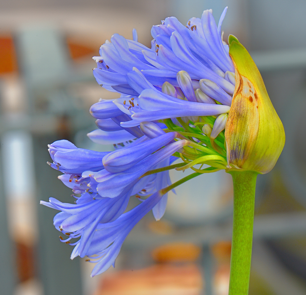 whisper...that i may seeas i grow, i'm giving up so much irrelevance and simply come back to my senses to be inspired constantly
.
Editor's Choice for Technical MeritPhotographed by Jaime Dorotan (Girod)
Rebecca's
Just a little help from my friends was a well composed image with a great message. Rebecca did a great job making the best of a scene with challenging high-contrast lighting. Sometimes capturing the moment means you have to photograph in less than optimum lighting conditions and then make the best of it in post-processing.
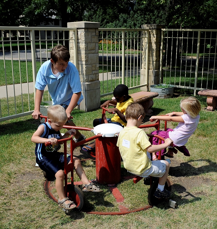 Just a little help from my friends"... all help to make it go..."
Photographed by Rebecca
Dave's
Potter's Hands image was the well-deserved
People's Choice, as well as
Editor's Choice for Artistic Merit. Dave did a wonderful job using the available light to emphasize the "wet" of the clay. (It's the reflection of that light in the clay that gives us the perception of "wet" isn't it? If Dave had shot from a different angle, or accidentally blocked the light with his body, we wouldn't have been able to use that cue to perceive the wetness of the clay.) He also masterfully controlled the shutter speed to allow a bit of blur to show the motion of the wheel, while at the same time keeping parts of the scene sharp. This is a challenge to do at 1/30th of a second, and takes a conscious effort from the photographer. And as usual, Dave's framing and composition complemented the subject perfectly. Very well done Dave!
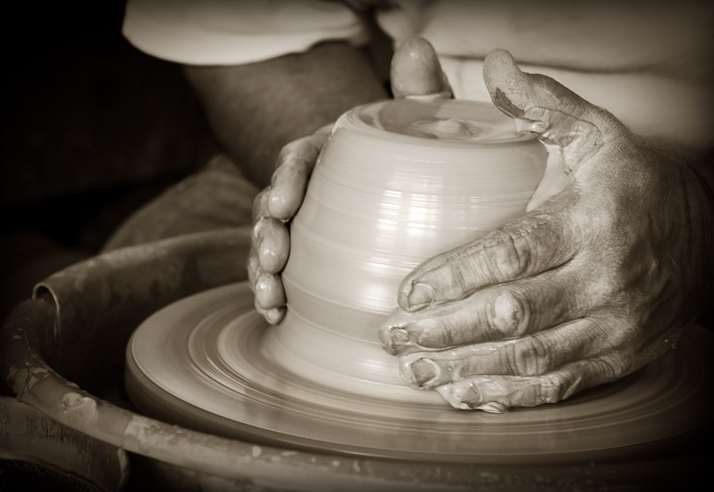 Potter's Hands 'Humble Clay', Larry Matson's studio in Cottonwood Falls. The front room, right off the street, is small but filled with texture: tools, finished pieces, buckets of clay, and dozens of things that trigger the potter's imagination. Most especially I'm most inspired by his attitude toward creativity and the need for work to be an important part of our lives.People's Choice
 and
Editor's Choice for Artistic MeritPhotographed by Dave Leiker (prairiedust)
I appreciated the message in Michele's image of
A blank canvas. We have that opportunity so many times with our photography. We chose what to "see" and what to include in our frame and how to compose the elements to convey something about our subject. Just walking around with my camera with the intent to explore opens up so many creative possibilities.
 A blank canvas "...a white canvas full of possibilities..."
 Photographed by Michele Bollhalder
I also empathized with Lars inspiration from the little beetle in his
rests on my window image. It doesn't take much to spark our inspiration if we are open to the possibilities. I loved the different perspective from photographing this beetle from the "underside" and the background was a nice pleasing abstract blur of colors. This was one of the most artistic images I've seen of a beetle in a long, long, time. (It's amazing how those little bug eyes of the beetle allow it to see almost 360 degrees around its body!)
 rests on my windows"This little Beetle on my windows today did help me to find inspiration to get out and shot some macros."
Photographed by Lars
Tanya's
Blue Jay image was a wonderful example of how the color and variety in nature can provide limitless inspiration.
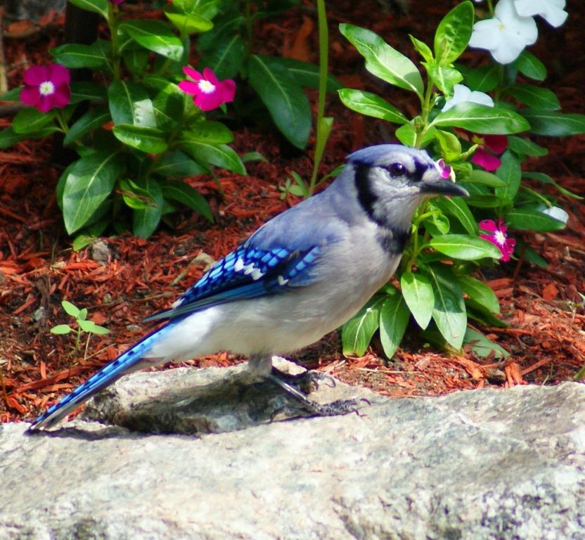 Blue Jay"Color and variety in nature..."
 Photographed by Tanya Mackenzie
I took a moment to try a few enhancements to this image in Photoshop in order to add a bit of clarity to the Blue Jay. First I added a bit of selective sharpening (using smart sharpen in conjunction with a layer mask) to the Blue Jay, then I used the shadows and highlights tool to lower the intensity of the highlights on the rock in front of the jay. Finally I assigned a color space to the image (I had to guess at what the appropriate color space was) in the hopes that a color aware browser would be better able to portray accurate colors for this image. Here's the result:
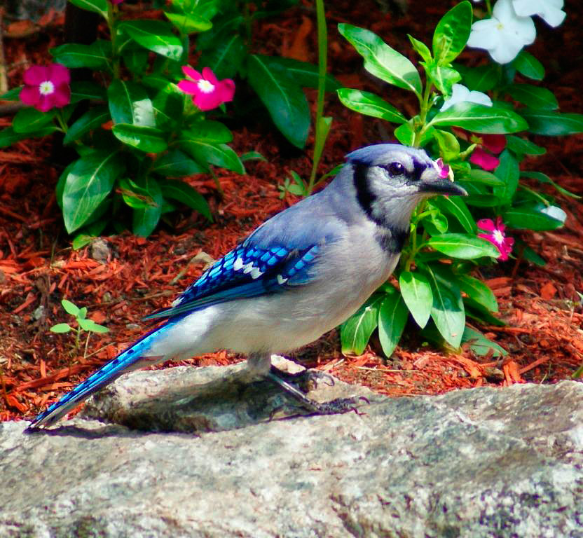 Blue Jay"Color and variety in nature..."
 Photographed by Tanya Mackenzie, sharpening and highlight reduction by Keith
Having a young son of my own, Alan's image titled
My Son (and the accompanying quote) was an inspiration to me. Alan did a great job capturing an image of his son that conveyed his pride in this young man. Don't be afraid to "tone down" or de-saturate areas of an image that detract from the primary subject.
 My Son"You don't raise heroes, you raise sons. And if you treat them like sons, they'll turn out to be heroes, even if it's just in your own eyes." ~Walter M. Schirra, Sr.
Photographed by Alan Albrecht (Ribot)
I thought the bright yellow fence top in Alan's image detracted from the primary subject, so I pulled the image into Photoshop, duplicated the layer and desaturated the duplicate, then used a layer mask to blend the desaturated fence top back in with the original layer. I also added a bit of selective sharpening to Alan's son's face while I had the image open in Photoshop. (Oh, and I assigned a color space, which might account for a slight difference in color rendering if you are viewing the image in a color-smart browser like Safari.)

\
My Son"You don't raise heroes, you raise sons. And if you treat them like sons, they'll turn out to be heroes, even if it's just in your own eyes." ~Walter M. Schirra, Sr.Photographed by Alan Albrecht (Ribot), slight desaturation and sharpening by Keith
Thank you again to everyone that participated in this assignment. I had a tough time getting inspired at the beginning of this assignment, and your images and words helped tremendously.
Keith
P.S.
The family and I are "on the road" until the end of the July, and so I won't be able to spend quite as much time on the website as normal. I hope you all continue to participate and to encourage each other to improve your photography.


