Thank you to everyone that participated in the "Cropped" assignment. The
guidelines for this assignment were to crop an image in order to remove extraneous or distracting elements from a composition and better focus the viewers attention on the primary subject, improve the position of elements within the scene, or better balance the composition.
I hope that by experimenting with different crops for your images, you were able to observe and reinforce your understanding of what "works" and what doesn't work with respect to image composition and balance. There's always a bit of inertia to overcome when we are editing our images, and I find that I am often motivated to crop an image only when I am "correcting" something disturbing about the image. This assignment was a useful reminder that many great photographers believe that "an uncropped image is an unfinished image," and that virtually all images can be improved by judicious cropping. I also find that the exercise of visualizing and comparing various crops helps me learn to visualize and construct better compositions as I am shooting.
Your submissions included many great examples of how cropping could dramatically improve an image. Lars'
Bird image was one of those examples, and illustrates how a tight crop can be used to eliminate distracting portions of an image and focus the viewer's attention on the primary subject. I liked how Lars composed the cropped image so that the branches formed a diagonal originating from the corner. The resulting diagonal lines helped make this a much more dynamic image.
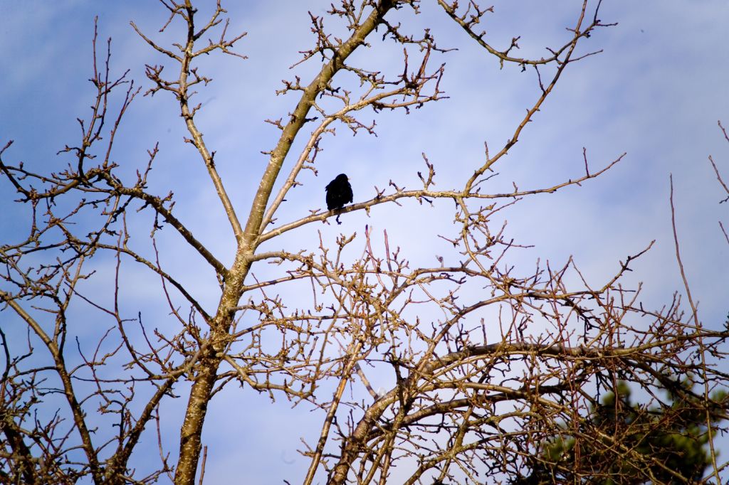 Bird
Bird, Original
Photographed by Lars
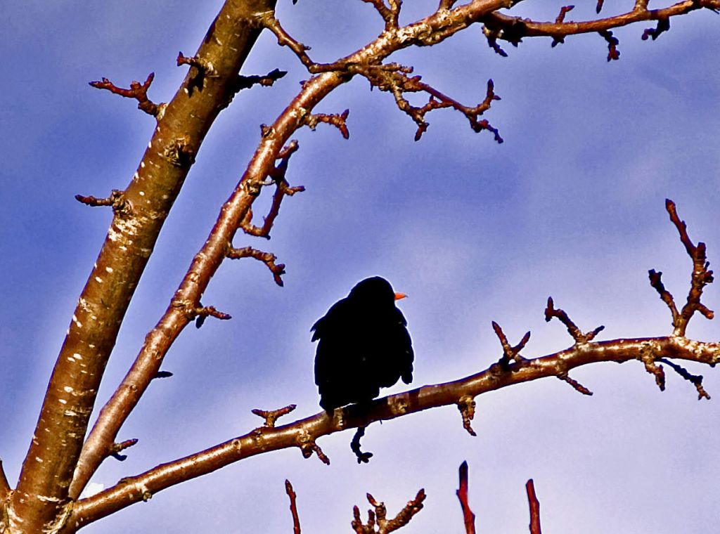 Bird
Bird, Cropped
Photographed by Lars
Michele's
Sharing a Candle image was a great example of an image that was cropped in order to correct/remove a distracting portion of the image (the blown out bouquet in the foreground); however, it is also a great example of an image that dramatically improved when other distracting elements were removed, the primary elements were positioned more effectively in the frame, and the viewer's attention was focused on the primary subjects. If Michele is like I am when processing very large batches of images, the images that are "acceptable" receive very little processing, and I only spend time processing the images that need correcting. In this case, the time taken to crop the image was well worth the effort, not only because it removed an overexposed portion of the image, but because it dramatically improved the composition. Great example Michele!
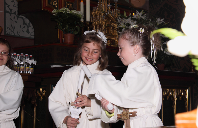 Sharing a Candle
, Original
Photographed by Michele Bollhalder
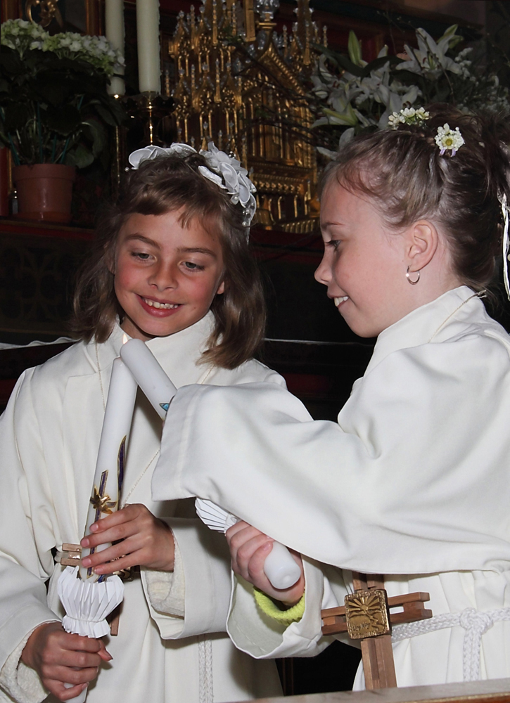 Sharing a Candle
, Cropped
Photographed by Michele Bollhalder
Sue did a wonderful job cropping her Crocus image, and transformed the image from a snapshot to an artistic rendition of a crocus. I was very impressed with the sharpness of the stamen in this capture. (Sue must have used a tripod!

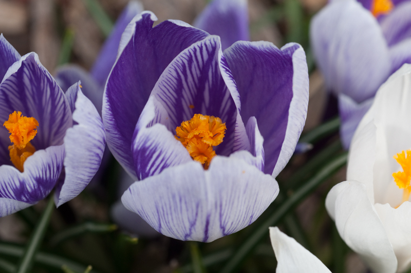 Crocus
, Original
Photographed by Sue Pepin
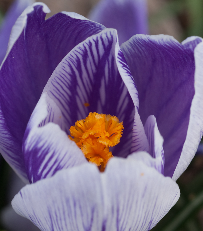 Crocus
, Cropped
Photographed by Sue Pepin
As is my habit, I played with the image a bit in Photoshop and experimented with different crops in order to see if I could make the image stronger. It turns out that I ended up with just about the same crop as Sue, with a subtle difference on the right and left edges. I liked the shape of the petals on the left side of the crocus, but didn't think the out of focus petal on the right side added anything to the composition, and felt that it made the image look too "square," so I shifted the crop a bit to the left. This also helped retain the pleasing curve of the petal on the left, whereas the original crop interrupted this curve and reduced it to two parts. It's a subtle difference, but I like the more dynamic feel of the adjusted crop. At least for me, the adjusted crop shifts my attention more to the interesting center petals, and emphasizes the diagonal lines a bit more. This tends to give the image a more dynamic feeling instead of the "solid" feel of the square crop. What do you think?
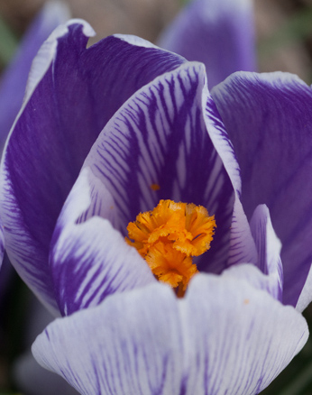 Crocus
, Cropped v2
Photographed by Sue Pepin, cropped again by Keith
I thought Rebecca's crop of her
Pansies image was effective as well, and helped focus the viewer's attention on the most interesting flowers in the scene. Her modifications transformed the image from being too busy to a nicely balanced "group portrait" of a few interesting flowers.
 Pansies
, Original
Photographed by Rebecca
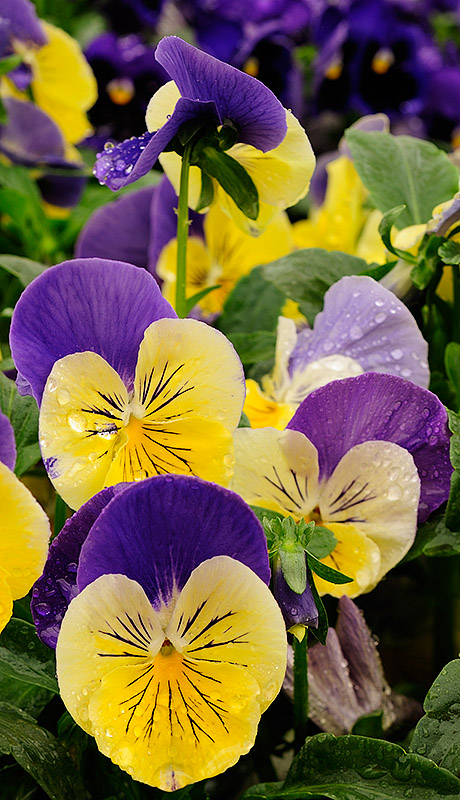 Pansies
, Cropped
Photographed by Rebecca
Dave's crop for his
Out of Hibernation image was very effective also, but I'd like you to notice something else about the cropped version of the image. As he often does, Dave used vignetting in this image to help focus the viewers attention on the primary subject. Although photographers often come to think of vignetting as a lens defect, this technique is taught to landscape painters as a way to guide the viewer's perceptions of the scene. The technique of lowering the contrast, subduing the colors, and slightly darkening the outer edges of a scene in order to contain the viewers gaze and direct their attention towards the primary subject has been around for centuries, and is a very effective technique when done with subtlety. Painters are also taught that your primary subject should have more contrast and more vibrant colors than the surrounding scene, and that less important elements should be lower contrast and more subdued. I wonder if Dave has some formal training as a painter?
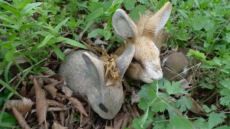 Out of Hibernation
, Original
Photographed by Dave Leiker (prairiedust)
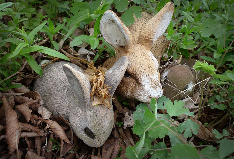 Out of Hibernation
, Cropped
Photographed by Dave Leiker (prairiedust)
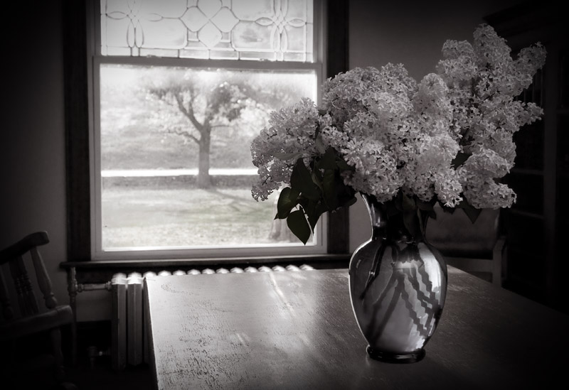
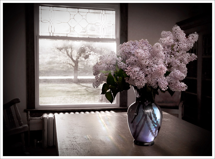
Dave used these techniques even more effectively in his
Lilacs image. Dave used vignetting again, in conjunction with cropping, to de-emphasize potentially distracting background elements in the scene. Dave's challenge was to remove the distraction of the chair and bookcase in the background; however he couldn't really crop them out without cutting into the frame too much and destroying the composition. He handled this challenge very well by using vignetting as a "virtual" crop that enabled him to partially hide and de-emphasize those elements, while still maintaining the framing he wanted and leaving enough "space" around the primary elements of the scene.
It's also very important to observe how the emphasis changes between the B&W and "colorized" versions of the image. In the B&W version (which still retains just a trace of color) the higher contrast of the scene outside the window immediately grabs our attention and draws the viewer outside the window, with a sense of the surrounding room. In the colorized version, the touch of additional color added to the lilacs keeps the viewers attention on the flowers and vase, and keeps us in the room, with a sense of what is just outside the window. The colorized version has a wonderful depth, with the viewers attention first directed towards the color of the lilacs, and then the light on the table leading the viewer to the scene outside the window, only to be drawn back to the beautiful color in the lilacs and vase. I commented when I saw the image in the gallery that I could almost smell the lilacs. This image was the well deserved
People's Choice, and is a great example of an appropriate crop, in conjunction with other techniques, to direct the viewer's attention. I liked this image so much that I really wanted to award it an Editor's Choice, but in the end I was convinced that the assignment guidelines called for more of an emphasis on cropping to "make" the image. This was an absolutely beautiful image; however it would probably have been successful even without the slight crop, whereas other images submitted for the assignment were
significantly improved by cropping.
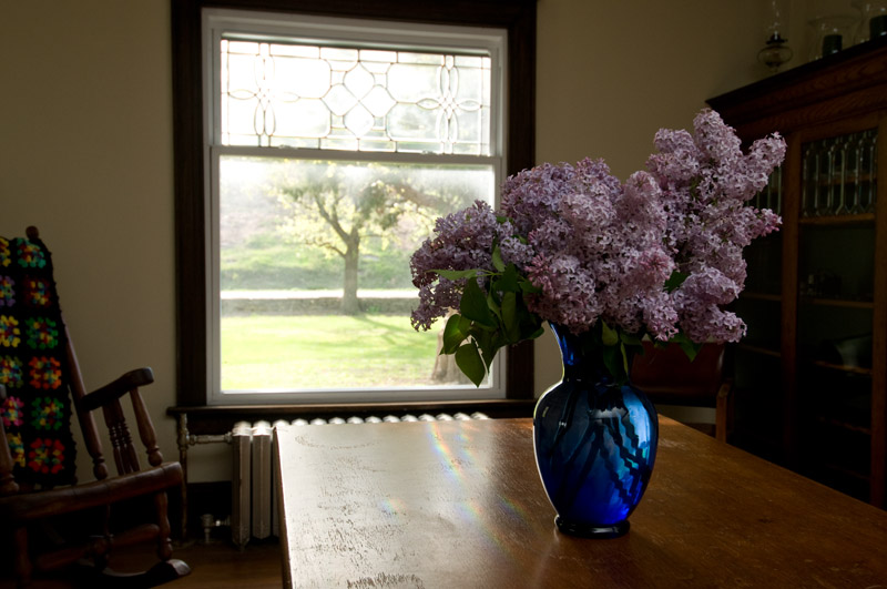 Lilacs
, Original
Photographed by Dave Leiker (prairiedust)
 Lilacs
, B&W Cropped
Photographed by Dave Leiker (prairiedust)
 Lilacs
, Colorized, Cropped
People's ChoicePhotographed by Dave Leiker (prairiedust)
Rebecca really liked Lars'
Lunch at Seaside image, and thought he did a great job with the crop. Rebecca pointed out that Lars effectively removed the dead space in the foreground of the image and transformed the image into a "high key" paparazzi style human interest story. I felt that the image might have been cropped a bit too tightly; however, when I played with the image in Photoshop, I couldn't really come up with a crop that I liked better than Lars' version.

Any wider crop lost the "human interest" in the scene, and de-emphasized the interaction between the people (and the duck). In the end, I grew to like Lars' crop more than I expected.
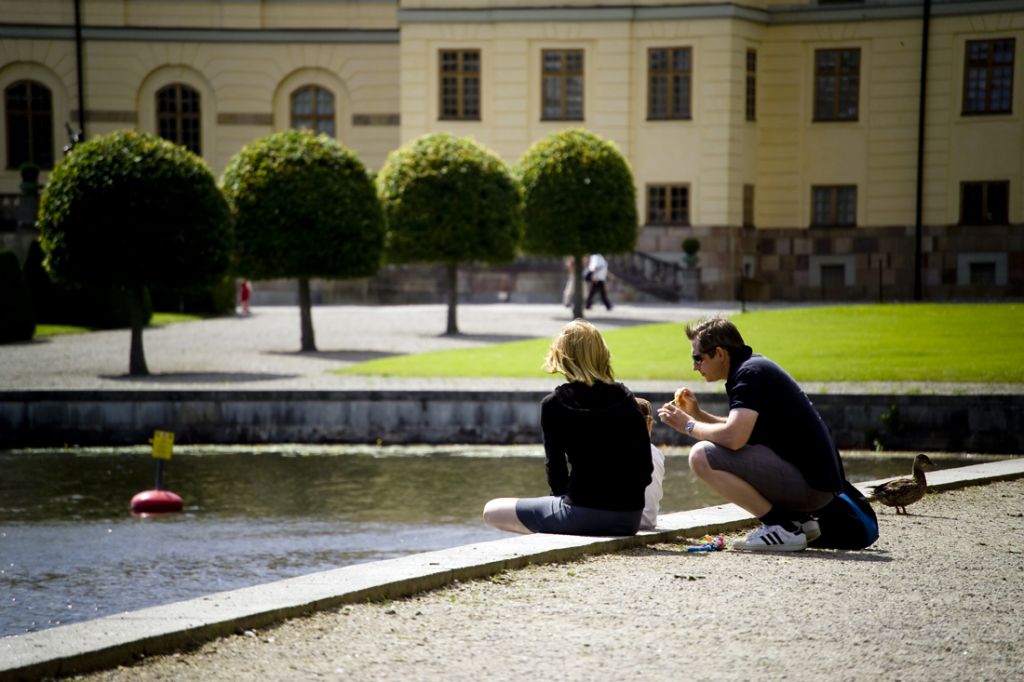 Lunch at Seaside
, Original
Photographed by Lars
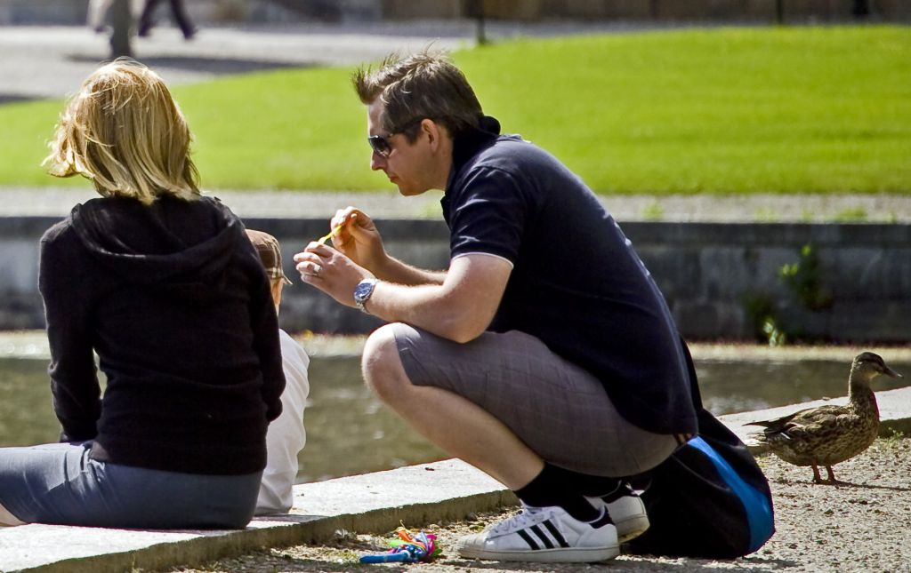 Lunch at Seaside
, Cropped
Photographed by Lars
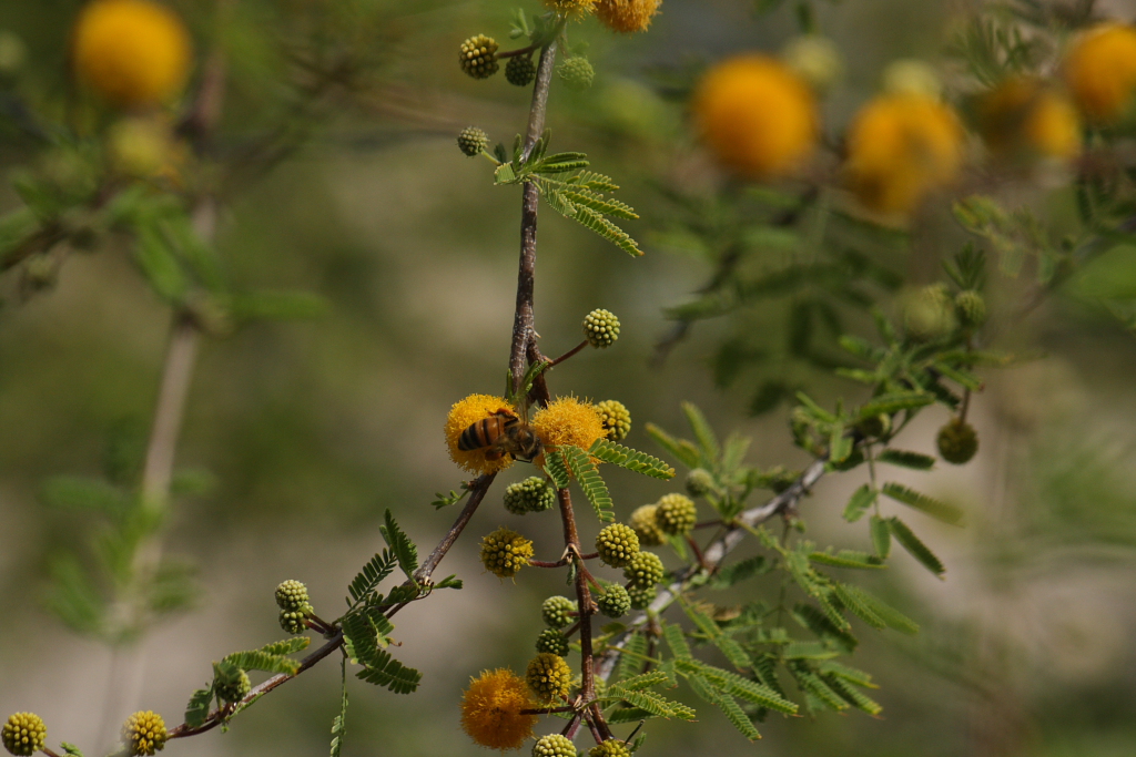
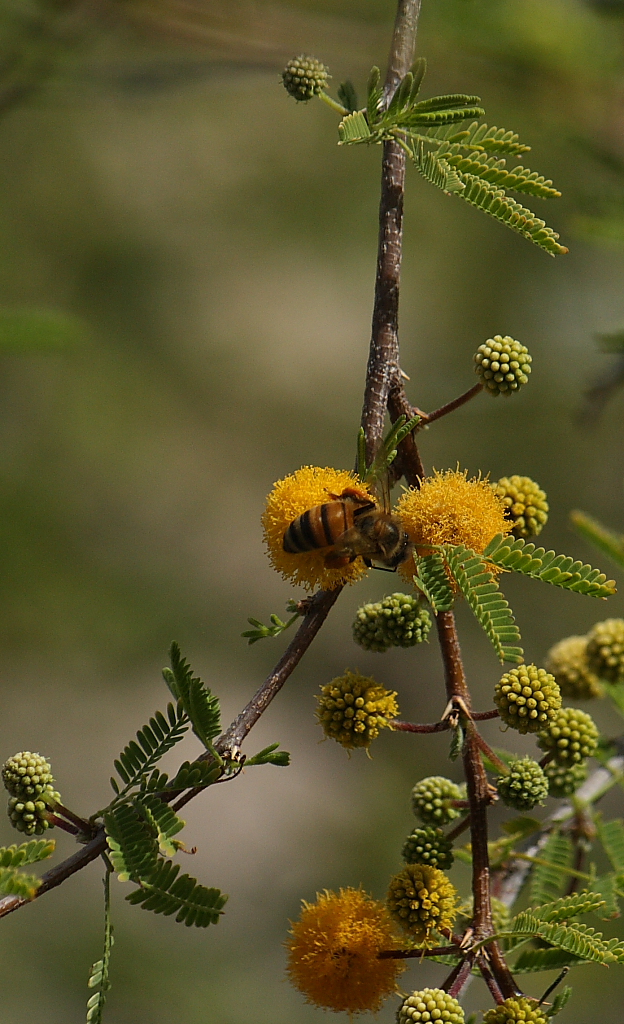
Marilyn's "narrow" crop of her
Acacia in Bloom image transformed an otherwise busy image with distracting out of focus elements into a simple and elegant composition that had the "feel" of a Japanese painting. This was one of the images where I felt the crop made a tremendous difference, and highlighted the artistic eye of the person who composed the image. As I mentioned in the gallery comments, I love the very nice bokeh of the background. It's pleasantly soft, with just enough detail to provide context. The wonderful bokeh and nice separation really make the foreground "pop" and give the image a 3-dimensional depth. The image was photographed in very nice light too. Lots of things come together to make this a beautiful image, and I have selected this image as
Editor's Choice for Artistic Merit. Well done Marilyn.
 Acacia in Bloom
, Original
Photographed by Marilyn McKinney
 Acacia in Bloom
, Crop 1
Editor's Choice for Artistic Merit Photographed by Marilyn McKinney
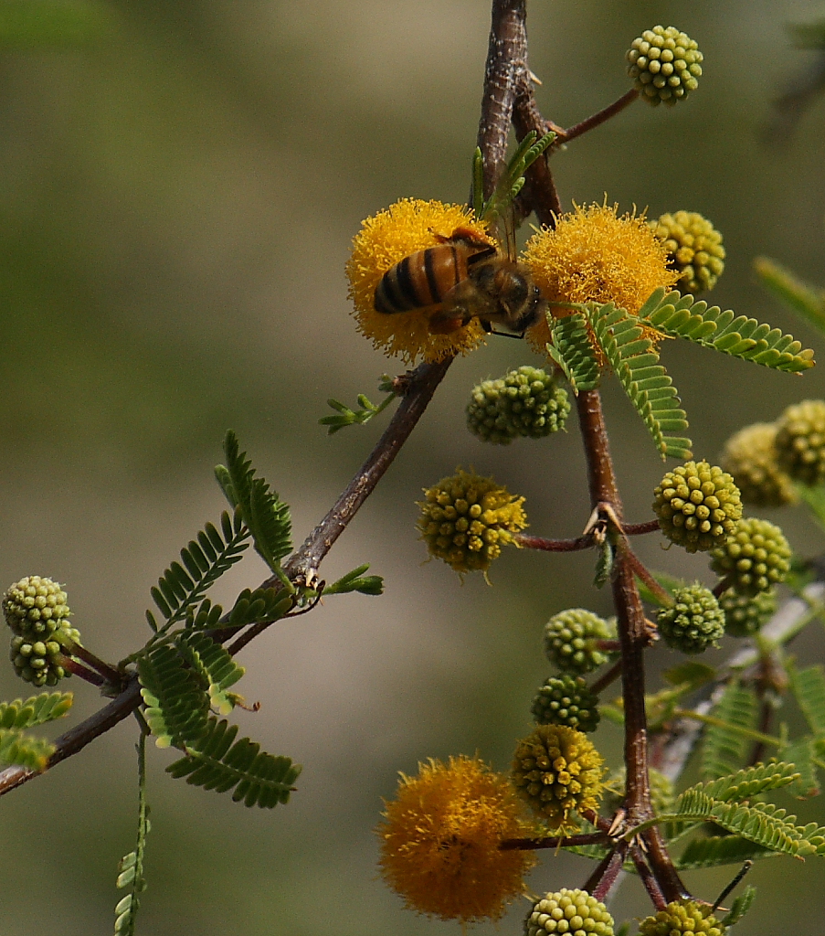 Acacia in Bloom
, Crop 2
Photographed by Marilyn McKinney
Rick's
Bodie and Ball image was another image that I thought was significantly improved by cropping. Rick turned an otherwise "average" image into a very dynamic image by cropping the image into a much stronger composition. In addition to removing distracting elements from the scene, Rick's crop repositioned his subject into a much stronger position in the frame. The vertical crop emphasizes the lower viewpoint and Bodie's "bounding" personality. The crop resulted in such a significant improvement to this image that I have awarded it
Editor's Choice for Technical Merit. (NOTE: Just a touch of fill flash would have provided a catch light in Bodie's eyes, and infused even more life into the image.)
 Bodie and Ball
, Original
Photographed by Rick Pepin
 Bodie and Ball
, Cropped
Editor's Choice for Technical MeritPhotographed by Rick Pepin
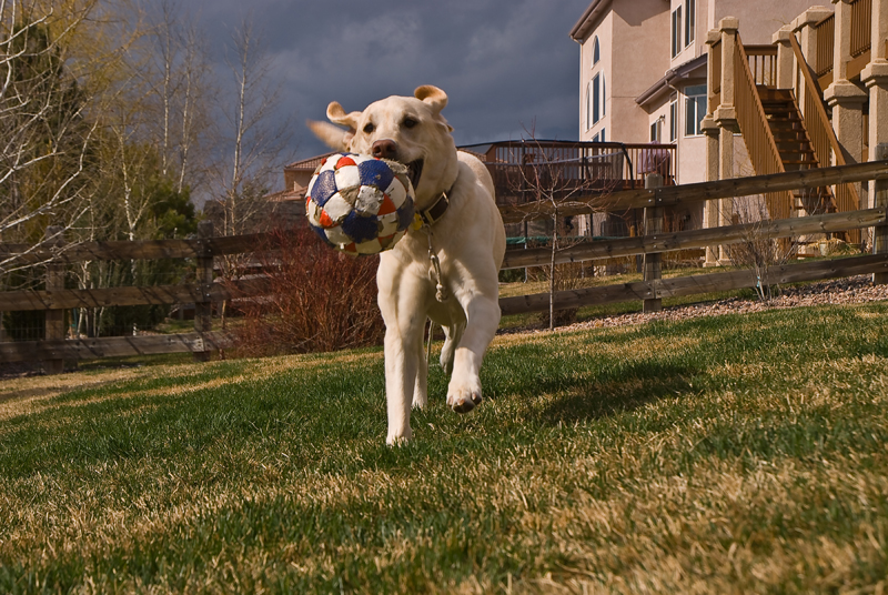
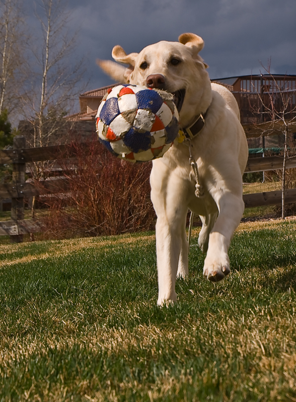
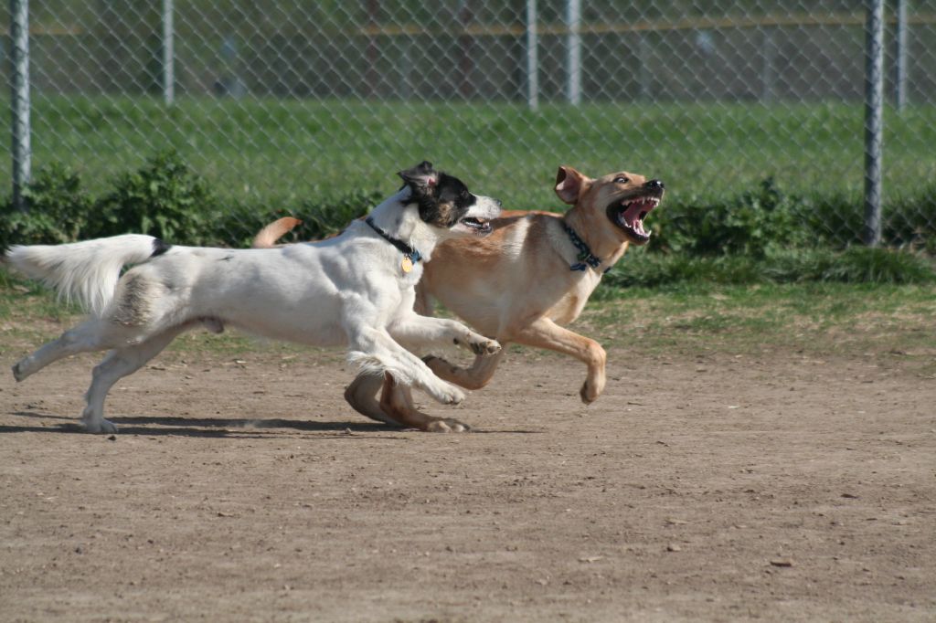
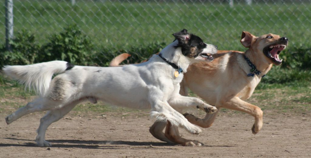
Alan's image of
Leroy the Lab with friend! was another image where although the crop removed distracting elements and focused the viewer's attention on the subjects, I thought the crop might have been just a bit too tight, and didn't leave enough space in front of the dogs, so that they appeared to be running out of, instead of into the frame. I will acknowledge that the long shape of the dogs made this a very challenging image to crop effectively, and that perhaps the perception the photographer wanted to create was one of the dogs running away, and therefore the perception of "running out of the frame" was appropriate.
 Leroy the Lab with friend!
Photographed by Alan Albrecht (Ribot)
 Leroy the Lab with friend!
, Cropped
Photographed by Alan Albrecht (Ribot)
Thank you to everyone that participated in this assignment. Hopefully the exercise of experimenting with various crops, and seeing how other photographers improved their images by cropping, helped strengthen your compositional skills. I know this assignment was a good learning experience for me, and hope you found it useful as well.
Viewers are encouraged to respond to this thread describing why you like a particular image, or think it was particularly successful at meeting the guidelines of the assignment.
Keith


