Part II
Marilyn's series of images was another great study of balance. I preferred the simple and elegant composition of the last image in the series, titled
Balance by Curves.
 Dancing woman
Photographed by Marilyn McKinney
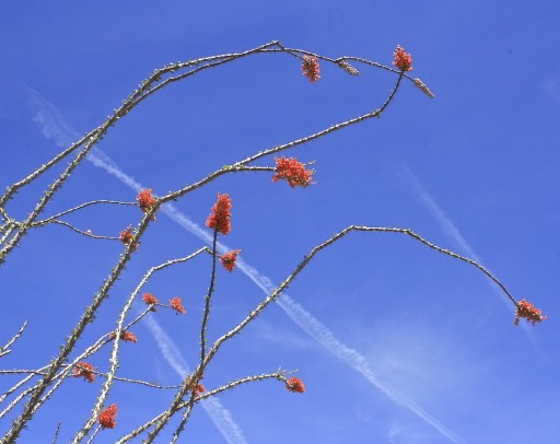 Ocatillo & contrails
Photographed by Marilyn McKinney
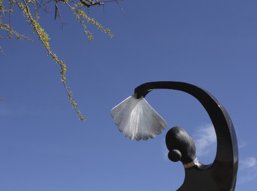
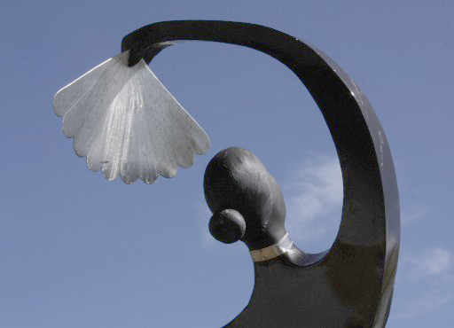
 Balance by curves
Photographed by Marilyn McKinney
Although I really liked the composition of Marilyn's
Balance by curves image, I thought that overall it was a bit too dark. The in-camera exposure was appropriate (in order to protect detail in the highlights); however, this was an image that I thought would benefit from bringing up the mid-tones in post processing in order to make the sky a more natural blue and reveal just a bit more detail in the sculpture. As you probably know by now, there are
many different ways of accomplishing almost every type of correction in your image editing application. Some of the options we might consider for correcting the mid-tones in this image might be an exposure correction using the simple slider in that dialog window, or bringing up the shadows using the "shadows and highlights" tool, dragging the midpoint to the left to brighten the mid-tones using the "levels" adjustment, or sampling the sky color and then using a more targeted curves adjustment on that region of tonalities. Just out of curiosity I decided to try all these methods, and I've posted the results below so you can see the differences. (The best method of course is to make these changes in the raw processor.)
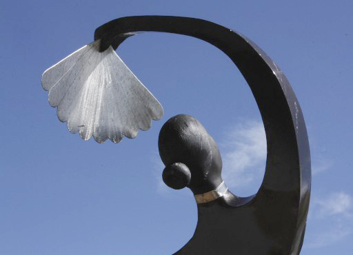
 Balance by curves
 with "exposure" adjustment in Photoshop
(Not bad; however we can see that this adjustment bumps up the saturation (perhaps "over-compensating" for the loss in saturation due to simply raising the levels) and the highlights have been pushed just a little too much.)
 Balance by curves
 with Levels adjustment in Photoshop
(This adjustment shows the typical loss in saturation and "flat" tonalities and colors from a Levels adjustment)
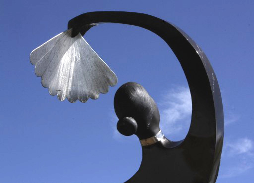
 Balance by curves
 with Shadows and Highlights adjustment in Photoshop
(This adjustment also defaults to bumping up the color saturation. The sky colors are nice, but the shadows have been lifted too much and I'm surprised by the "halo" around the sculpture.)
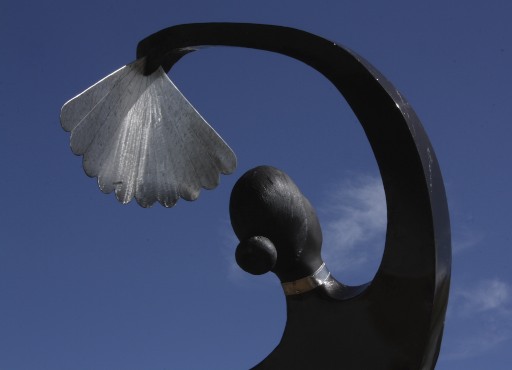
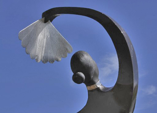
 Balance by curves
 with Curves adjustment targeted towards the tonal range of the sky
(This is the most natural looking adjustment to my eye, with a "targeted" adjustment that affects the tonal range of the sky more than other areas of the image, and "tails off" towards the highlight and shadow ends of the curve. Some might also consider the more saturated colors and higher contrast of the "exposure" adjustment (first correction) to be more pleasing. Your preference will depend on how important it is be able to see the details in the highlights and shadows. The curves dialog gives you the most control, allowing you to tweak the luminosity and contrast curve in different tonal areas.)
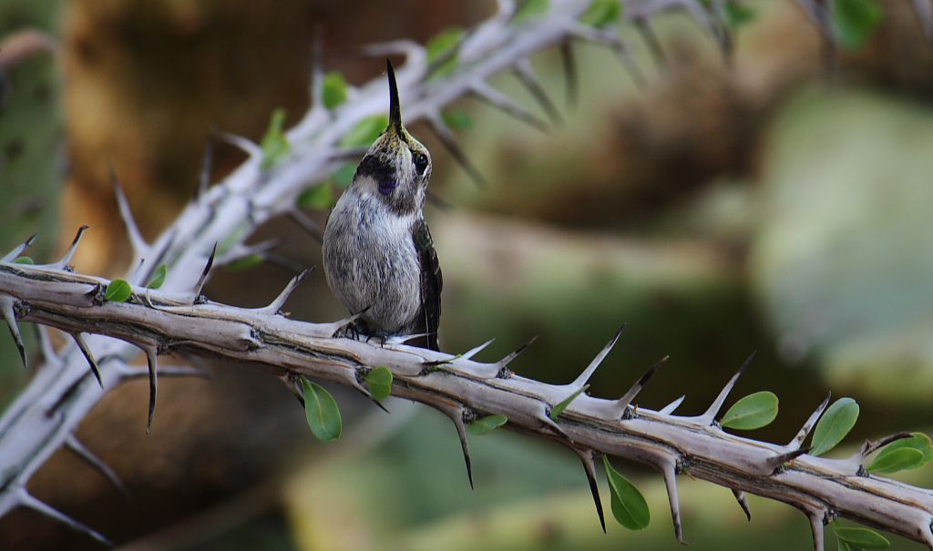
Marilyn's
Balancing between thorns 2 was a wonderful image captured at just the right moment to portray the hummingbird appearing to mimic the thorns that surround it. Overall this was a nicely balanced image, with the prominence of the thorns on the right side of the image helping to balance the visual weight of the bird on the left side of the image, and the other background elements falling into place nicely. The clarity of the thorns in this image was simply outstanding, and it was the well deserved selection for
People's Choice.
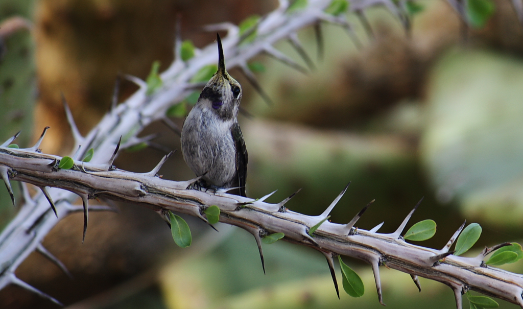 Balancing between thorns 2People's Choice
Photographed by Marilyn McKinney
The exposure on the hummingbird was just a little lower than that on the thorn branch, causing the hummingbird to get a little lost in the background. I used layers and masks in Photoshop to subtly adjust the exposure on the hummingbird, bringing it up about 0.3 stops above the background. Then I added another layer, took the background down about 0.3 stops from what it started at, and then used a layer mask to hide most of that layer. I then "painted" back in portions of the borders of the frame with a soft edged brush to add a slight vignette, and then painted over the brighter out-of-focus cactus in the background to tone down their prominence in relation to the primary subject. I think these minor corrections help an already strong image. (Oh, and I also added a catchlight

.)
 Balancing between thorns 2People's Choice
Photographed by Marilyn McKinney, minor Photoshop adjustments to enhance the prominence of the hummingbird
Dave's image of Erwin was a wonderful, well balanced composition that portrayed both the character of the subject and a wonderful sense of place.
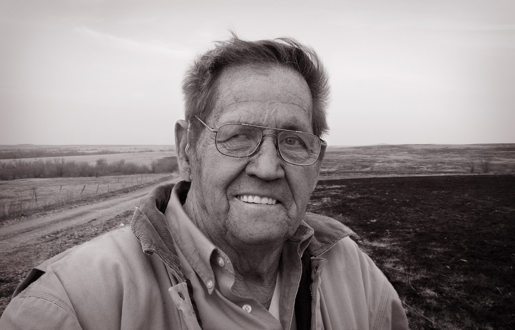 Erwin - BW version
Photographed by Dave Leiker (prairiedust)
It was fun and educational watching this composition evolve, from this:

Erwin with his truck
Photographed by Dave Leiker (prairiedust)
To this:

Erwin with composite of burned fields
Photographed by Dave Leiker (prairiedust)
To this:

Erwin with background flipped
Photographed by Dave Leiker (prairiedust)
And then to the final version. Although I like the final monochrome version Dave submitted in the assignment gallery, I think I like the color version (with the background flipped) even better. The color version shows the ash on Erwin's face, and to me it tells the story a bit better than the monochrome version. As usual Dave did a wonderful job capturing the unique character of rural Kansas.
Thank you again to everyone that participated in the Balance assignment. I love to watch your photography evolve, and seeing the results you achieve motivates me to make the time to get out and photograph.
I'll look forward to our next assignment,
Keith


