The
guidelines for this assignment were to produce aesthetically pleasing out-of-focus areas in your images. Several methods for accomplishing this were recommended, such as looking for a scene that had a enough separation between the primary subject and the background in order to blur the background, and controlling your depth of field so that the background was rendered with a smooth blur instead of a distracting jumble of partially focused detail. Ultimately the goal is to learn to pay more attention to the backgrounds in our images, and try to create backgrounds that contribute to the overall design of the image.
The background in Chris'
Horses Fed image provided useful context for the portrait; however, several areas in the background were relatively high contrast when compared to the primary subject and tended to draw my eye away from Jim Hoy's face. I wonder if using fill flash to add just a bit more punch (a little brighter, with slightly more contrast and cleaner colors) to Jim's face might have done the trick? Just a bit of fill flash would have also helped add a bit of sparkle to Jim's eyes, which I think would have helped add "character" to this portrait. This image appeared to be shot in one of those tricky heavy overcast days that make it really difficult to get the white balance right. That said, it appears to me that Chris did a great job capturing the personality of this very interesting man, and
that[/i,] after all, is what counts the most in successful portraiture. Nice job Chris.
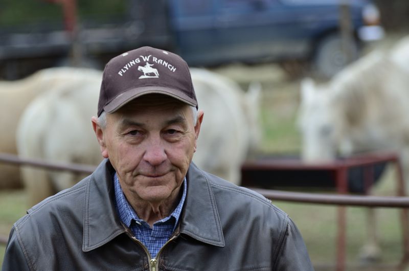 Horses Fed
Photographed by Chris Franklin
Chris' second image titled
Jim Hoy provided a great example of how much difference focal length (and magnification) can make in blurring out the background. I did think the white balance was "off" a bit in this image too, and that it was a bit flat. I pulled the image into Photoshop and increased the contrast and tweaked the color with the "enhance per color contrast" option in the curves dialog. I think the use of just a bit of fill flash would have also added "sparkle" in Jim's eye and really made this portrait stand out. (And yes, I "cheated" in the modified image and added just a touch of catch light to Jim's right eye and the smallest amount of smart sharpen.)
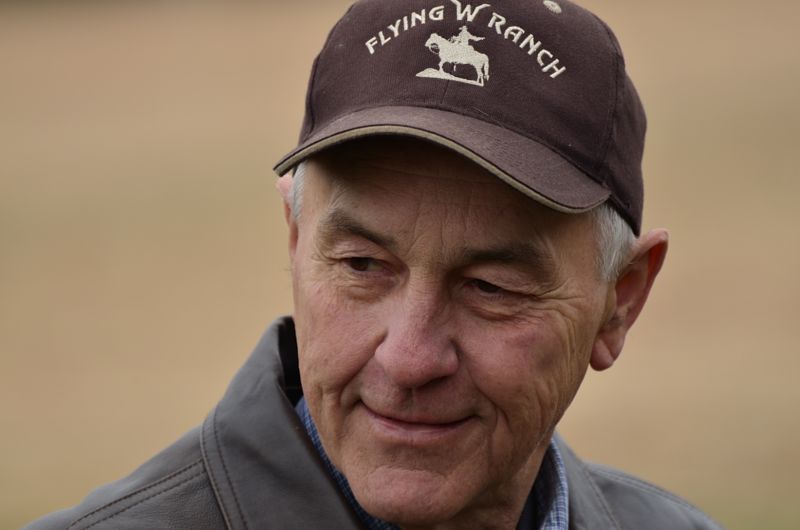 Jim Hoy
Photographed by Chris Franklin
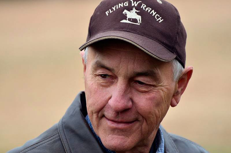 Jim Hoy
 (enhanced per channel contrast in Photoshop curves dialog)
Photographed by Chris Franklin
Alan's Splashes of Color image was a great example of "toning down" a potentially distracting background, while still using the colors and shapes in that background as part of the overall design of the image. Given my predisposition to avoid centering the primary subject, and the fact that I really like the background on the left side of the image, I wonder if a crop showing only the left two thirds of the image might provide a little bit stronger composition?
 Splashes of Color
Photographed by Alan Albrecht
I would propose a crop like this:
 Splashes of Color
Photographed by Alan Albrecht (proposed alternate crop)
My objective in my
Pansies image was to create a softly blurred background that would contribute to the overall design of the image, so as I explained when I posted the image, I chose to trade off detail in the primary flower in order to achieve the narrow depth of field required to blur the background. I think it works OK because there are still a few areas of sharp detail, and the transition from in-focus to out-of-focus isn't too distracting.
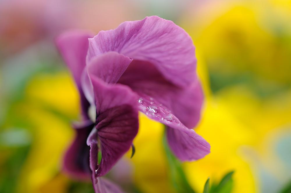 Pansies
Photographed by Keith
Rick's image titled
The other team scored again! showcased the outstanding clarity that can be achieved by using a top quality lens and good technique. As others noted, the blurred players in the background added interesting context without being too distracting. Nice.
 The other team scored again!
Photographed by Rick Pepin
Michele's image titled
Après la pluie, le beau temps was a fascinating exploration of the effects that can be achieved with an extremely narrow depth of field produced by shooting with the aperture "wide open" at high magnifications. I believe one of the effects that Michele was experimenting with was how to make the interesting round highlights from the out-of-focus water droplets. I think what really made this shot though was the interesting light on the leaves.
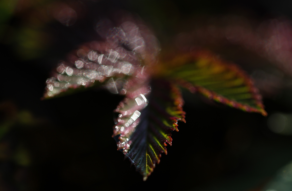 Après la pluie, le beau temps
Photographed by Michele Bollhalder
I think Michele really nailed the effect she was looking for with her
After the rain image. It takes a creative eye to see the possibilities in this scene, and solid technical skills to be able to capture this type of image. The colors work together extremely well in this image, the water droplets add to the "lush" feeling, and the bokeh of the out-of-focus highlights adds a magical element to the image. This image tied for
People's Choice and I've selected it as
Editor's Choice for Artistic and Technical Merit. Outstanding!
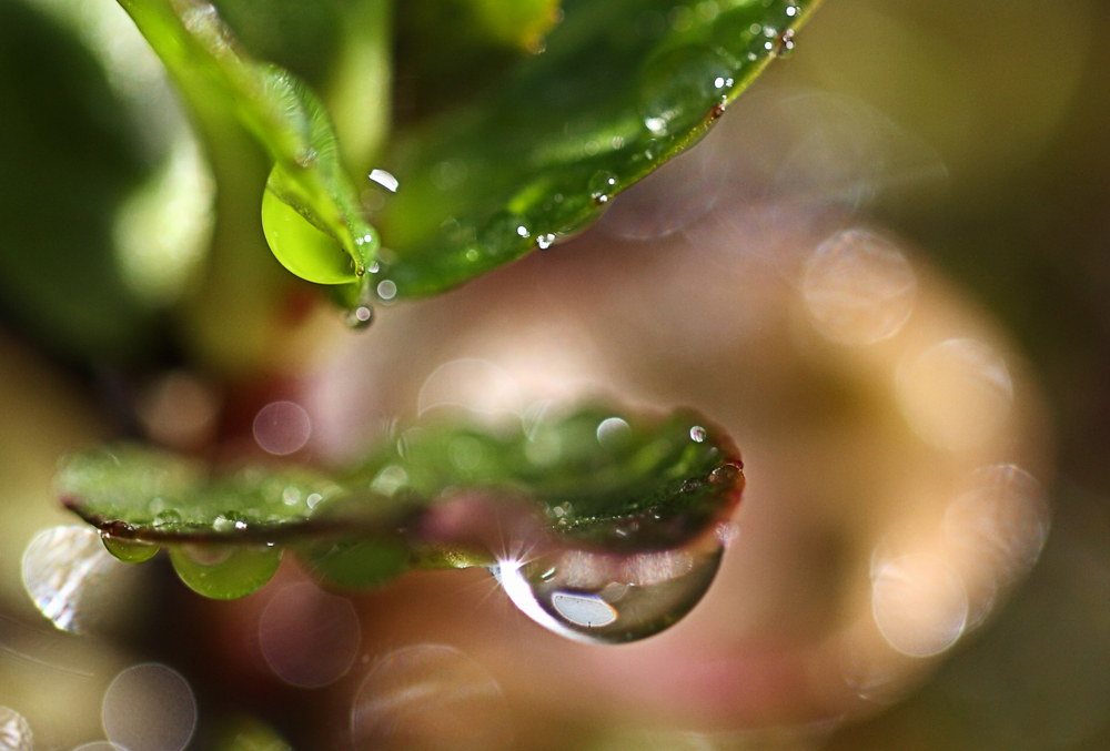 After the rainEditor's Choice for Artistic and Technical Merit
 and tied for
People's ChoicePhotographed by Michele Bollhalder
Michele's
Little Bird image also had wonderful bokeh. Somehow though, the harsh lighting on the bird in conjunction with the dark background reminded me of the Alfred Hitchcock movie "The Birds."

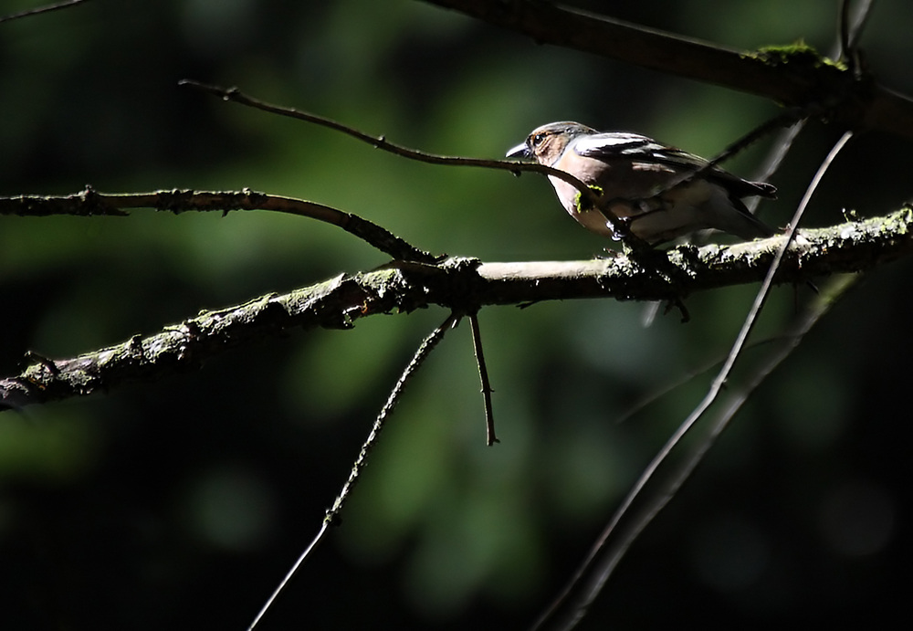 Little bird
Photographed by Michele Bollhalder
I was captivated by the eyes in Lar's
Cat Bokeh image and the beautiful background colors complemented the eyes very well; however, I felt that the saturated colors of the background fought for my attention and drew too much focus away from the eyes. I experimented by decreasing the saturation of the background a bit in Photoshop, and I think the modified image still provides a complementary background without pulling too much of my attention away from the primary subject. I've uploaded the modified image for your consideration.
 Cat Bokeh
Photographed by Lars
 Cat Bokeh
 (slight color desaturation in background)
Photographed by Lars
Lar's image of the cup was a creative way to add a "soft" background to an image. I like the effect and may have to experiment with this idea too!
 Cup Bokeh
Photographed by Lars
Chris' use of a narrow depth-of-field in his image titled
The Floor is Lava was a creative way to illustrate what the band is about. The image definitely gives us a sense of the character of the band, without being too overwhelming. Nicely done Chris. (And GREAT job capturing a useable and artistic image at those light levels.)
 The Floor is Lava
Photographed by Chris Franklin
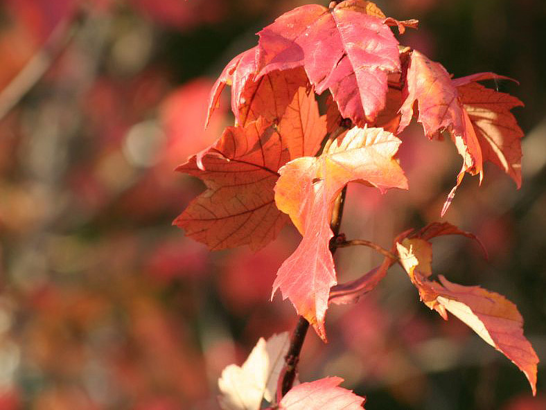
In the course of creating my Tulips image, I looked for a scene with enough separation between the foreground and background to enable me to get crisp detail in the primary subject and a very smooth blur in the background. I might have overdone the soft blur a bit in this image; however, I kind of like the mix of the two distinct styles of realism and impressionism in this composition.
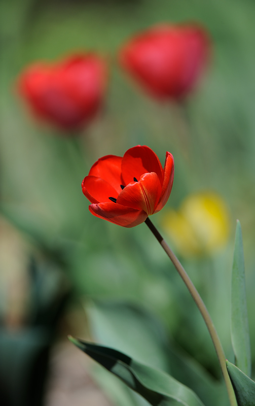 Tulips
Photographed by Keith
Dave's
Glass Trees image was another composition that illustrated his wonderful artistic vision. The "echo" and repeating patterns of the glass tree in the background bokeh was very effective in making this image more than the "sum of its parts." The degree of blur in the first tree in the background was just about perfect, creating an "echo" of the primary subject without being too distracting. Wonderful work Dave.
 Glass Trees
Photographed by Dave Leiker (prairiedust)
Dave's image titled
Quince Bokeh 1 was another very nice image that was composed to take advantage of an "echo" in the background that reinforced the foreground elements. The Quince bushes we have in our yard are extremely "busy" and although I've looked at them several times in the hopes of finding something that would support a decent composition, I've failed to come up with anything that I thought was worthwhile. This makes me appreciate Dave's beautiful
Quince images even more. This is a wonderfully artistic interpretation of a difficult subject.
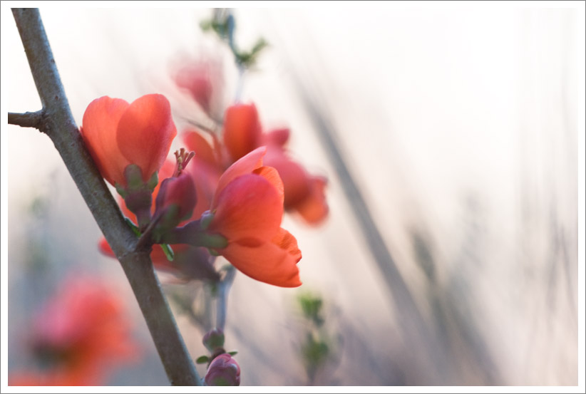 Quince Bokeh 1
Photographed by Dave Leiker (prairiedust)
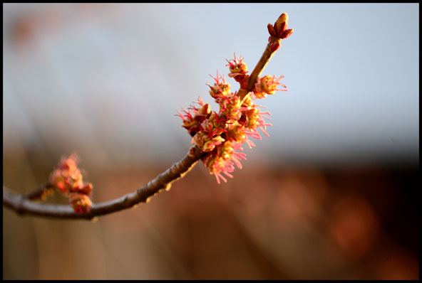
My
Pure Bokeh image was an experiment based on one of the views I noticed when I was searching for tulip compositions with decent bokeh. As I manually adjusted the focus and examined the scene, I saw this view that reminded me of a painting in the style of impressionism, and I liked it. I thought it also provided an example of potential backgrounds that could be placed behind tulips that were about to bloom. The slight double image on the tulips is caused by the wind gusting during the exposure, so it wouldn't have been possible to take a conventional image at this time anyway, and so I just played around with the possibilities.
 Pure Bokeh
Photographed by Keith
The colors and tonality in Ree's image titled
Morning Bud - Bokeh were a great complement to the primary subject, and definitely contributed to the overall design of the image. Nicely done Ree.
 Morning Bud - Bokeh
Photographed by Reecha Lal (goes by Ree in the forum and May in the gallery)
Marilyn's image of the
Cholla fruit was another image that very effectively used a subtle "echo" of the patterns in the primary subject in the background bokeh. Marilyn captured wonderful detail in the primary subject, and the slightly brighter light on the foreground fruit definitely helped the subject "pop" from the background.
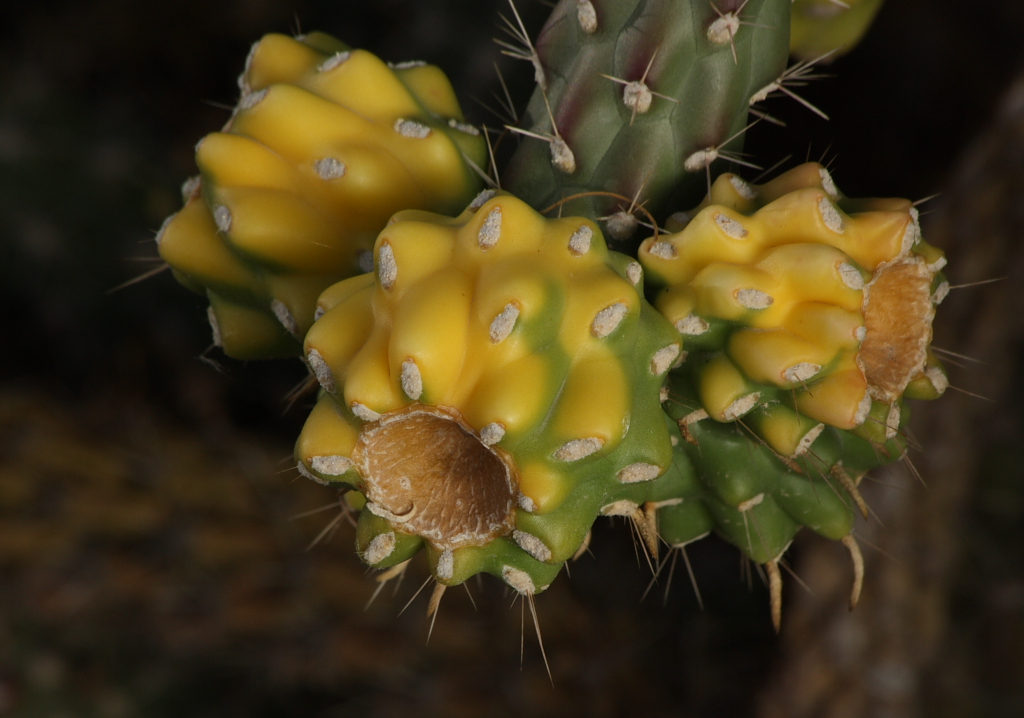 Cholla fruit
Photographed by Marilyn McKinney
Marilyn did a great job creating nice bokeh in the background of her
Lady bug & lavender image, but I suspect the windy conditions prevented her from getting "tack sharp" details in the primary subject. Still, this is a pleasing composition that shows the possibilities, if only the wind would cooperate. Very nice composition Marilyn.
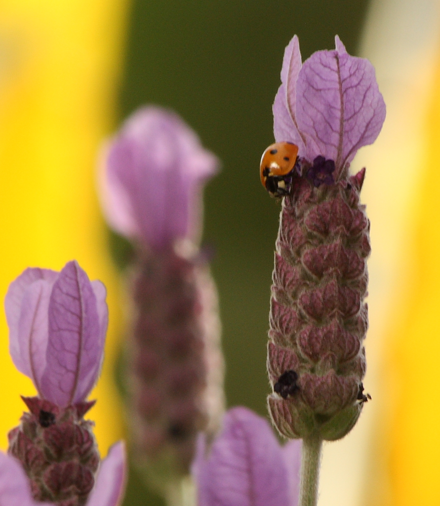 Lady bug & lavender
Photographed by Marilyn McKinney
Marilyn captured a wonderfully sharp flower in her
Red fairy duster image while still creating such a smooth (and complimentary) background. Great job arranging your composition in order to achieve sufficient separation between the foreground and background Marilyn.
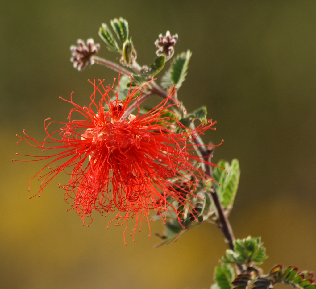 Red fairy duster
Photographed by Marilyn McKinney
Rebecca's
Double Tulip image had great clarity and color in the tulip. This tulip was on a fairly short stem, and relatively close to the ground, so Rebecca couldn't quite get the separation between foreground and background that she wanted, but this is still a beautiful rendition.
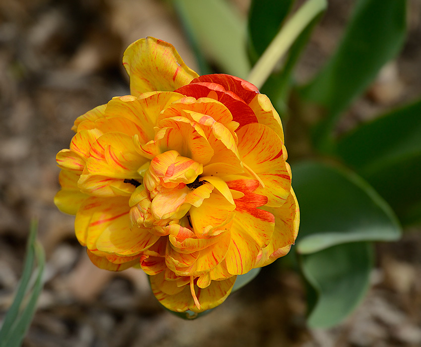 Double Tulip
Photographed by Rebecca
Julie's
Statue Bokeh was a fun image that used the bokeh of the out-of-focus lights in the background to convey a sense of celebration. The different intensities of the lights add a wonderful sense of depth to the image and really help to draw the viewer in. Nicely done Julie
 Statue Bokeh
Photographed by Julie Schroeder (WriteHeart)
Thank you again to everyone that participated in this assignment. Your beautiful images were a wonderful inspiration to me.
Keith


