Thank you to everyone that participated in the "Hands" assignment. I apologize for being so late to provide feedback. We were traveling for several weeks and had very limited internet access during our travels.
The guidelines for this assignment were to compose a portrait where the subject's hands play a key role in defining their mood, relationship or character, or helped to flatter the subject (such as framing the face, etc.). The assignment description suggested that the composition could be a portrait of just the person's hands, or a portrait that includes more of their body, with their hands being a primary contributor to the success of the image.
Marilyn did a wonderful job capturing the range of emotions that can be expressed through hands in her collage of
Commencement Hands. I appreciated the ones that showed hands clenched with nervousness, since they seemed to best reflect the nervous anticipation of the event. Nicely done Marilyn.
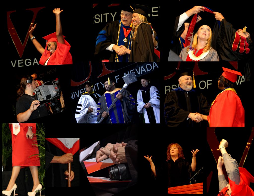 Commencement Hands
Photographed by Marilyn McKinney
I thought my
Together image did a decent job illustrating how the simple act of holding hands helped convey a connection between the two that wouldn't have been apparent if they had simply been walking side-by-side.
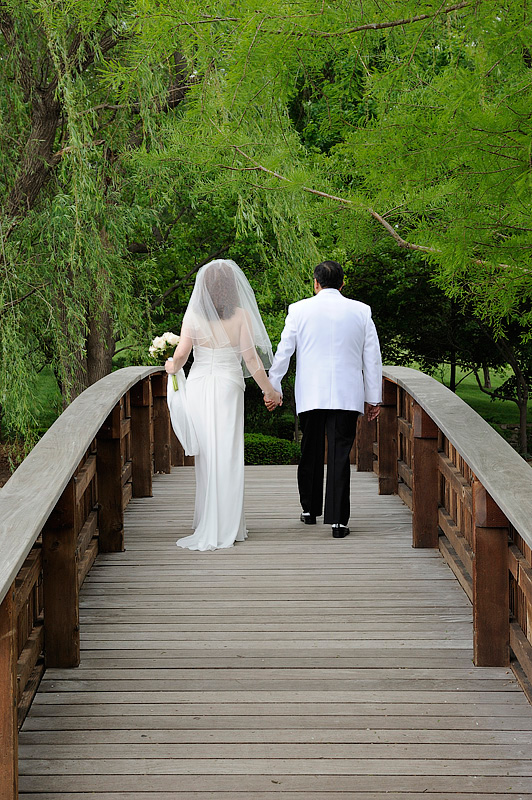 Together
Photographed by Keith
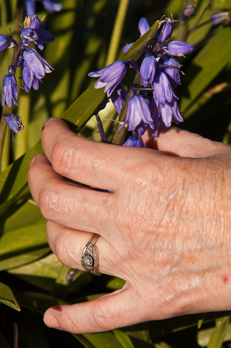
I tried to keep the hands in a flattering position (not "broadside") for my image titled
Rings Take Two. It is often challenging to find a nice (not distracting) background for the hands, and in this case the slightly out-of-focus wedding dress provides a nice context that completes the picture.
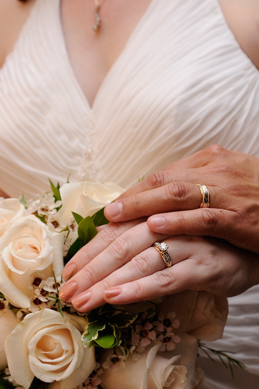 Rings Take Two
Photographed by Keith
Congratulations to Alan Albrecht (Ribot) who's
Trimmed and presentable image was selected as
People's Choice. This image did a very nice job of conveying that the gorilla is "in many ways much like us." Shooting through the glass can significantly reduce the contrast of an image, and can sometimes impart a green color cast, so I used the levels adjustment in Photoshop to adjust the contrast (by dragging the white point and black point sliders inward until they were just even with the ends of the histogram) and then using the "gray" eyedropper to click on a neutral color and correct the color cast. I also added a bit of smart sharpening to bring out the detail in the hands (and make them appear more life-like.)
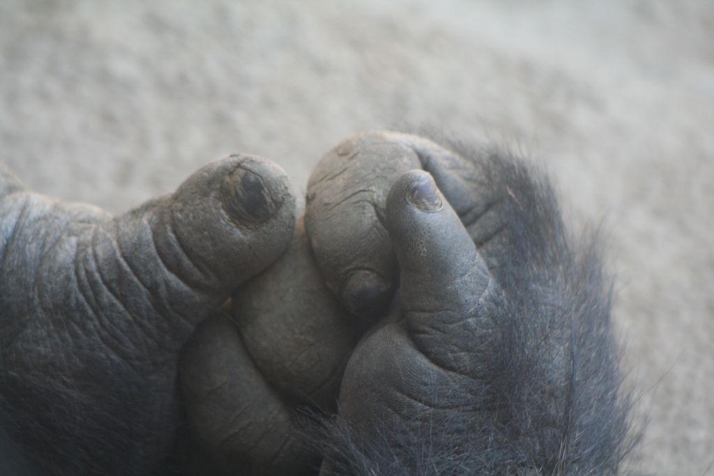 Trimmed and presentablePeople's Choice
Photographed by Alan Albrecht (Ribot)
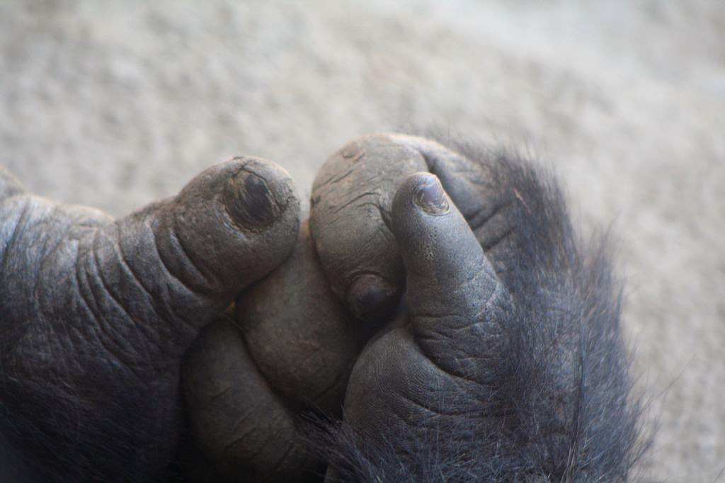 Trimmed and presentablePeople's Choice
Photographed by Alan Albrecht (Ribot) with contrast (levels) correction by Keith
Luc's series of images of
Healing hands across race and colour was very nicely done. The soft light of the first image helped Luc portray the hands with natural looking skin tones and a more life-like rendition. The harsher light of the 2nd and 3rd images made this more of a challenge, and the slightly overexposed skin tones result in images that look less life-like (and therefore less engaging) than the first. The third image is a wonderful portrayal of the relationship of the individuals, as I can sense the trusting relaxation of the individual being massaged.
The first image stands out due to the combination of soft light that provides wonderful 3-dimensional modeling of the hands and beautiful life-like skin tones, and the beautiful background that perfectly compliments the mood of the interaction between the hands. This is an outstanding image and was selected as
Editor's Choice for Artistic and Technical Merit. Well done!
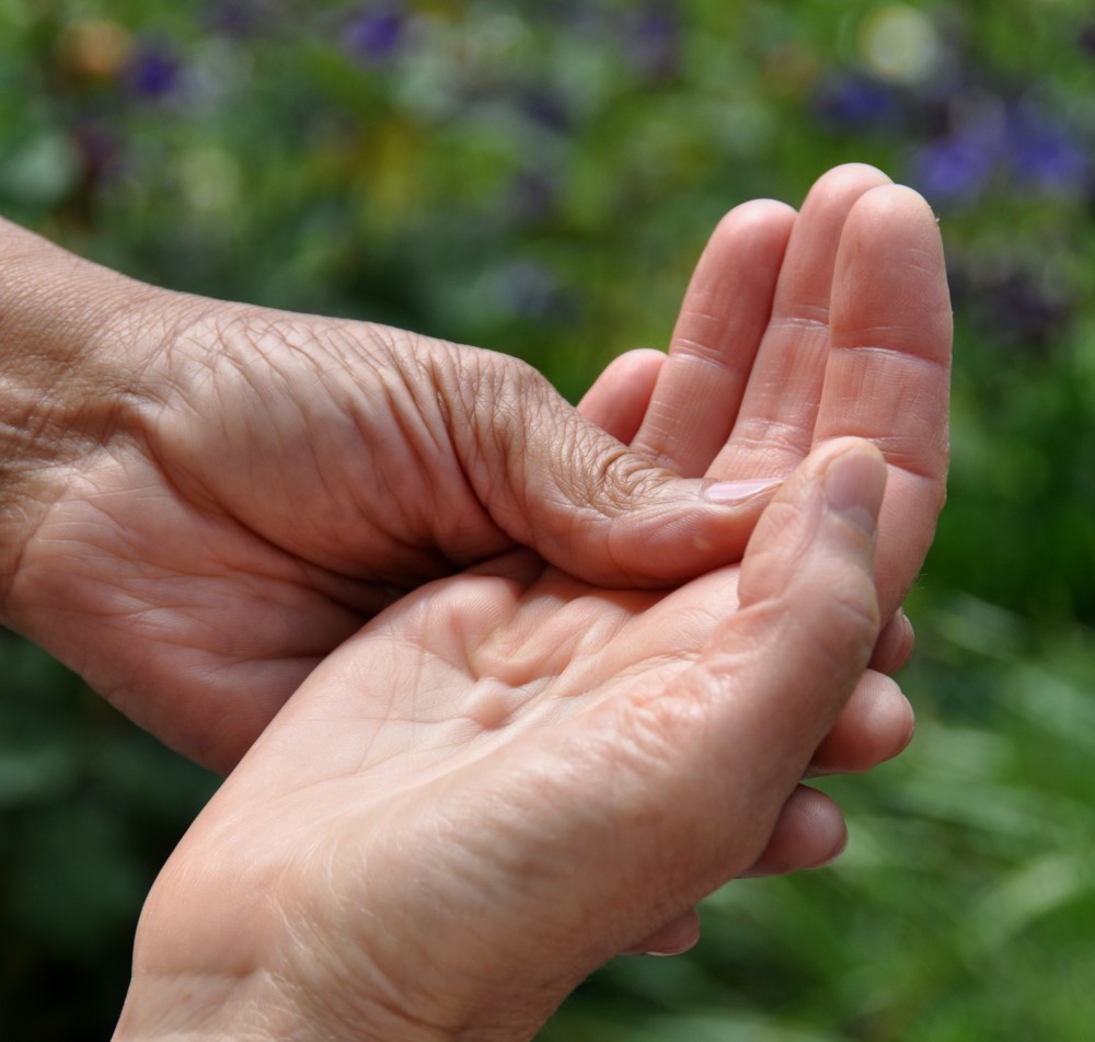 Healing hands across race and colourEditor's Choice for Artistic and Technical Merit
Photographed by Luc Bigler
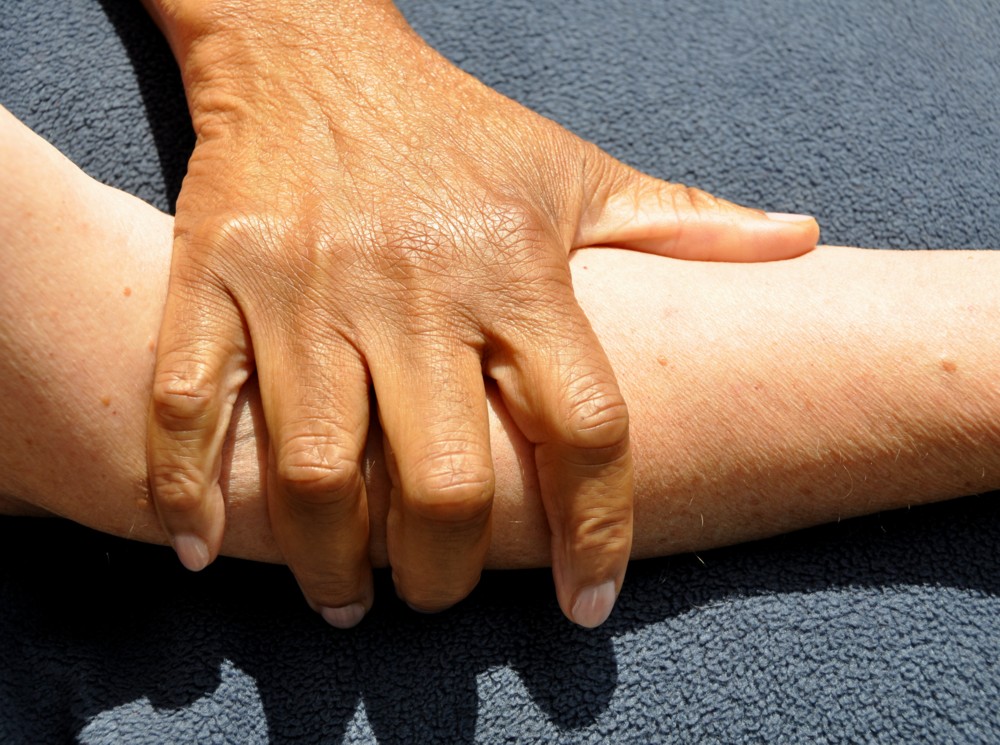
Healing hands across race and colour 2
Photographed by Luc Bigler
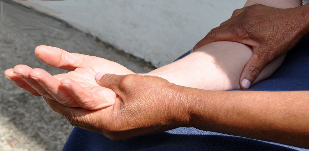
Healing hands across race and colour 3
Photographed by Luc Bigler
Julie's fragile image was nicely captured, with good exposure and nice detail. Somehow though the crop on the right side of the image seems to cut off the hand a little too abruptly.
 fragile
Photographed by Julie Schroeder
Rebecca captured a great expression in her
GQ Pose image. I like that she cropped the image so that Evan isn't smack dab in the center. The skin tones look a bit "off" to me (too green), and at least on my monitor I think they would look more natural with just a touch more magenta. (In general I think Nikon's default setting for flash white balance is just a bit too green. I often prefer to move the white balance tint slider one "tick" towards magenta, or select daylight white balance instead of flash. Note that if you have "auto" white balance selected, the camera will sense the flash and then use that as the basis for the "auto" white balance. Again, selecting "daylight" in post processing can sometimes provide a more pleasing rendition.)
 GQ Pose
Photographed by Rebecca
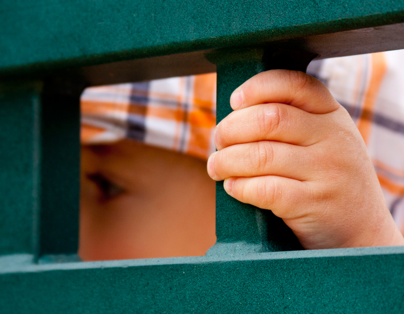
Julie's series of
Playing images were nicely composed, with the third image being my favorite. Somehow the child's posture, along with the grip on the railing bring to mind the movements of a child that is still learning how to make his body do what he wants it to. I
really like the composition in the third image, and find it intriguing that so much of a sense of a child's movements can be conveyed with such a simple composition.
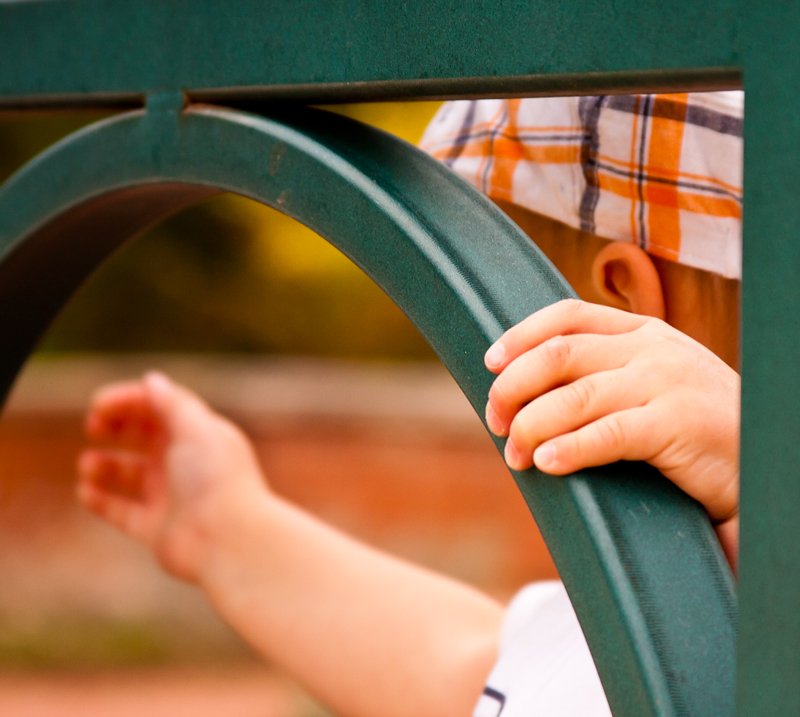 Playing
Photographed by Julie Schroeder
 Playing 2
Photographed by Julie Schroeder
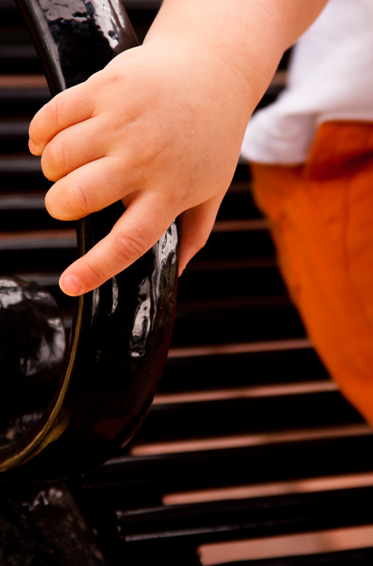 Playing 3
Photographed by Julie Schroeder
I also wanted to include Michele's
Parenthood image in the results and feedback. Michele submitted the image too late for it to be included in the voting thread, but it is definitely worth including here. This image is a wonderful example of how focusing in on the hands can be used to effectively convey the connections and emotions between two (or three) people. Wonderful job capturing a beautiful moment. I'm sure the parents will treasure this image.
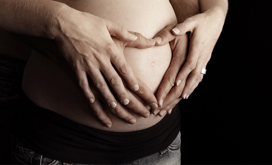 Parenthood
Photographed by Michele Bollhalder
Thank you again to everyone that participated in the assignment, and thank you for continuing to visit the site while we were away.


