The
guidelines for this assignment were to create an image by composing a silhouette (or silhouettes) into a pleasing or intriguing arrangement of shapes.
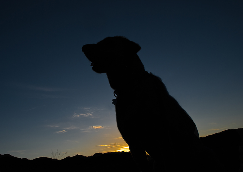
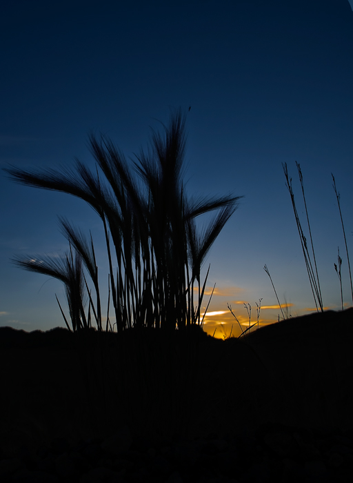
Rick's images of B
odie at Sunrise and
Sunrise Silhouette were nice examples that simple compositions with clean lines often work best for silhouettes. The subdued colors in both of these images imparted a relaxed mood reminiscent of sitting on the front porch enjoying a summer evening. Nicely done Rick
 Bodie at Sunrise Silhouette
Photographed by Rick Pepin (trvlrick)
 Sunrise Silhouette
Photographed by Rick Pepin (trvlrick)
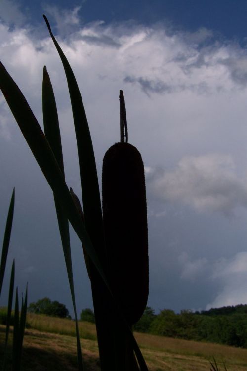
Becky Jenner's
Stormy Cat Tail image was another example of nice clean lines. It's tough to second guess the composition, but I might have tried composing this image to avoid centering the cat tail, perhaps shifting the silhouette of the cat tail a bit to the right, and trying to better balance the overall "weight" of the image across the frame. I loved the cool clouds at the top of this image.
 Stormy Cat Tail
Photographed by Becky Jenner
Marilyn's images of the
Hercules Beetle Sculpture and the
Staff Kempf sculpture of a phoenix were both fun images that piqued the viewers curiosity. I thought it was interesting how several viewers commented on the small details in these images, recognizing the effect these details had on the impression presented by the image. For the
Beetle Sculpture image, both Michele and Rebecca commented that the wires and fence contributed to the "menacing" feel of the image by implying that the beetle was about to break out of it's enclosure and go on a rampage. This illustrates how much impact these small details can have on the overall impression an image imparts. The same was true for the Starr Kempf sculpture, for which Dave Leiker noted "The [small] sculptural forms at bottom right do a lot to enhance the effect." Michele noticed "the battle between the little tiny "flying machine" in the sky next to the wing against this mighty bird!" And I thought that the conjunction of the silhouettes in the
Phoenix image made it look like the phoenix was craning forward in order to nibble on the tree to the right.

So yes, small details can make a big difference in the viewers' perceptions of your images. Nice job composing these images, Marilyn.
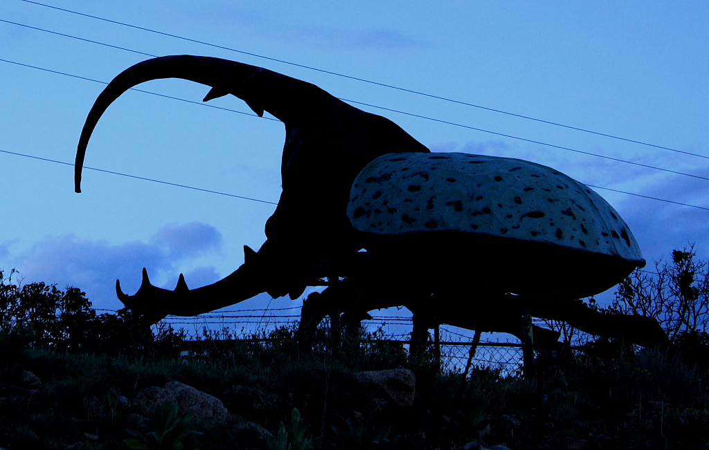 Hercules beetle sculpture
Photographed by Marilyn McKinney
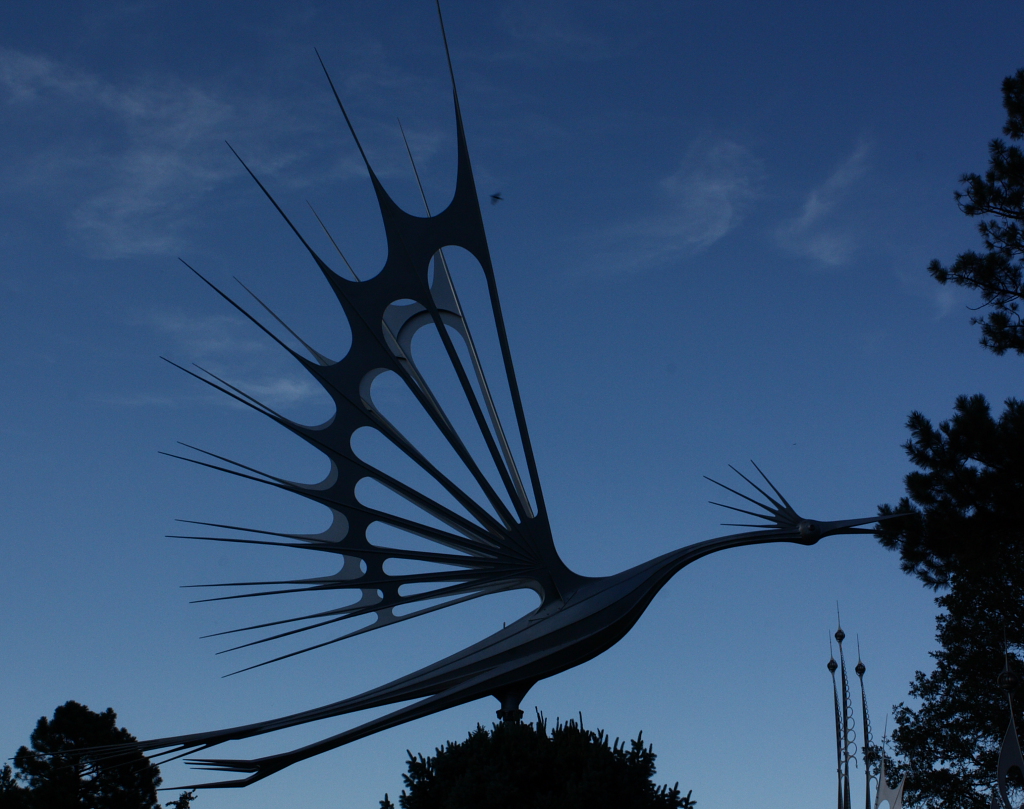 Starr Kempf sculpture of a phoenix
Photographed by Marilyn McKinney
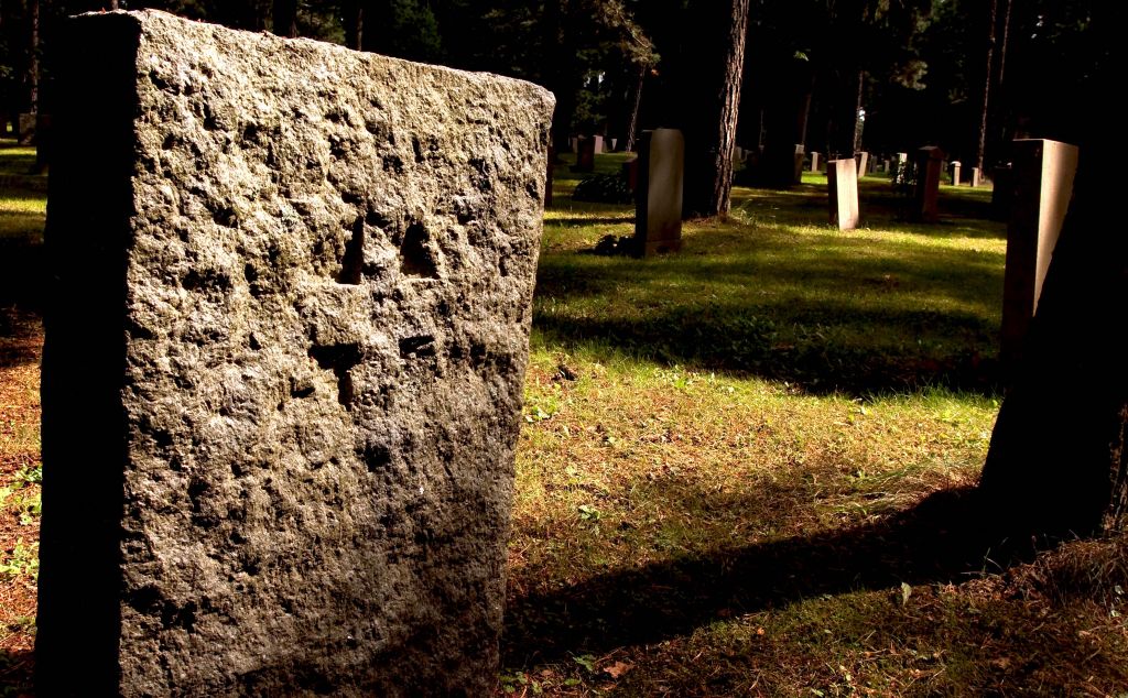
Lars'
Tombstone Silhouettes image was one that required the viewer to take the time to really look at the image in order to appreciate it subtleties. It wasn't until I looked at the image a second time that I noticed the shadow of a cross in the rough hewn face of the tombstone. What a fascinating and mysterious graveyard this must be.
 Tombstone Silhouettes
Photographed by Lars
Michele's
Statue image was a simple silhouette that invites the viewer to explore the expression on the face of the statue and wonder what the subject is thinking about. Simple and effective
 Statue
Photographed by Michele Bollhalder
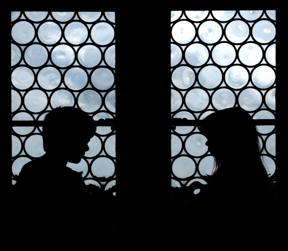
Michele's image of
Lauren and Justin was a captivating composition that worked on two levels. The strong patterns of the frames around the bottle bottoms served to grab the viewers attention, and the silhouettes of Lauren and Justin added an interesting human element to the scene. (To see what I mean about "grabbing the viewers' attention, just look at the thumbnails of the assignment images in the Gallery. This composition stands out from all the others.) The juxtaposition of the two silhouettes (the silhouette of the window and the silhouette of Lauren and Justin) makes me wonder what the connection is between the two? It also made me wonder what the children were doing. (Children don't just sit and look at each other do they? They had to be doing something, but I couldn't discern what it was based on the silhouette.) I imagined that they were playing chess or some ancient board game while sitting in front of the castle windows.
This was an intriguing and very well executed image that very effectively captured the viewers interest.
 Lauren and Justin
Photographed by Michele Bollhalder
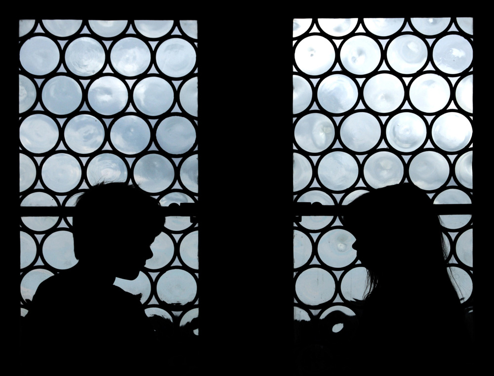
Rebecca recommended cropping some of the black space off the bottom of the image, like this:
 Lauren and Justin
Photographed by Michele Bollhalder, alternate crop suggested by Rebecca
I think I do tend to find Rebecca's recommended crop a bit more "satisfying" since I no longer find myself trying to discern what detail might be hidden in the black space at the bottom of the frame. Both compositions work well; however the new crop takes the "weight" of the composition away from the very bottom of the frame and redistributes it to the childrens' profiles, placing more emphasis on the human element.
Dave's image of the
H.D. Lee Flour Mill Co. was another image that took a little bit of effort in order to discern what the image was about. This is actually a good thing, as long as the image can successfully hold the viewer's attention long enough for them to discern the message.

H.D. Lee Flour Mill Co.
Photographed by Dave Leiker (prairiedust)
The intense colors of the sky in Rick's
Hummingbird Feeding Silhouette were very effective at grabbing the viewers attention. Oddly enough, one of the things I found most interesting about this composition were the gold bubbles in the sugar water, and the colors of the water itself. This was a well balanced and nicely exposed image that effectively conveyed a specific time of day.
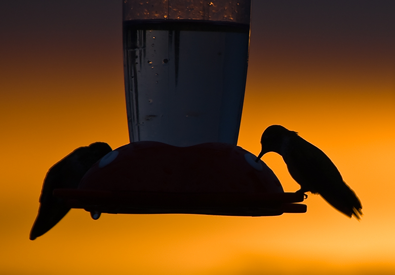 Hummingbird Feeding Silhouette
Photographed by Rick Pepin
Rick's O
ld Snow Fence at Sunset image was a simple and elegant image that displayed the elusive quality of "flow" that we talked about in a previous assignment. The sinuous forms of the snow fence lead the viewers eye in a rhythmic pattern through the image. The beautiful colors of the sunset complement the scene and reinforce the feeling of solitude conveyed by this image. This image was voted
People's Choice and selected as
Editor's Choice for Artistic Merit. Well done Rick! This image was another testament that simple often works best when it comes to silhouettes.
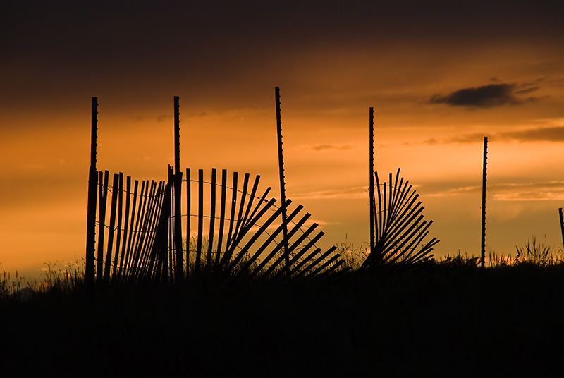 Old Snow Fence at SunsetPeople's Choice
 and
Editor's Choice for Artistic MeritPhotographed by Rick Pepin
My image of Work'n Cattle was a grab shot (through the window no less) of a cowboy herding cattle as we passed by on the road. In retrospect, this image is a bit too static for my taste. I would have preferred an image that showed him actively working the cattle, but somehow I don't think the cowboys were too concerned with my image composition at the time.
The ISO on our point and shoot had accidentally been bumped up to ISO 400 (the button is much to easy to hit accidentally while handling the camera) and so the only way for me to "rescue" the image was to convert to black and white in order to hide the digital noise.
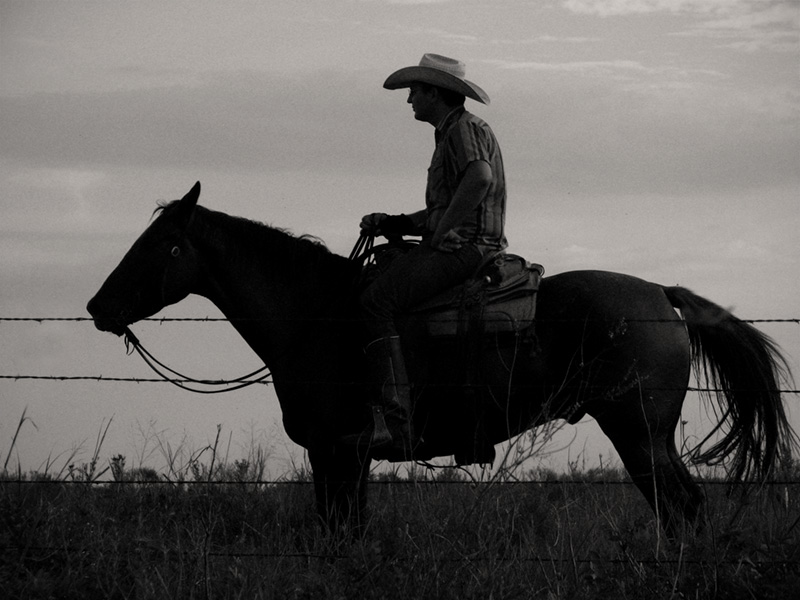
Work'n Cattle
Photographed by Keith
I thought Rebecca's
Roundup at dawn image was much better at conveying the "controlled chaos" of a cattle drive than my more static image. I tried hard to compose an image with a "clean and simple" silhouette; however, in this case Rebecca's jumble of silhouettes was better at conveying the busy activity of "corralling" the cattle across the road and made for a much more dynamic (and engaging) image.
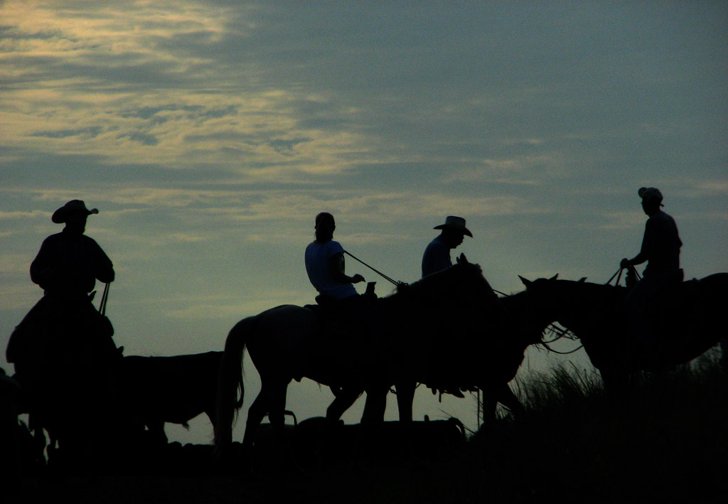
Roundup at dawn
Photographed by Rebecca
Viewers are encouraged to respond to this thread describing why you like a particular image, or think it was particularly successful at meeting the guidelines of the assignment.
Keith


