Congratulations to Naomi whose
Playing the Blues for Lars image, and Rick, whose
George and his Harmonica image tied for
People's Choice in the "Music" assignment.
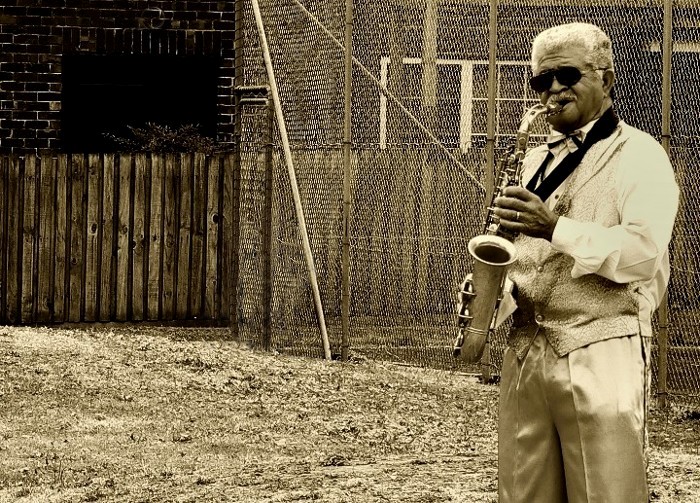 Playing the Blues for Lars
Photographed by Naomi
Naomi's
Playing the Blues for Lars image had a wonderful sense of place and time, and was selected as
Editor's Choice for Technical Merit.
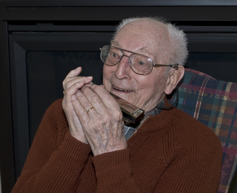 George and his Harmonica
Photographed by Rick
I loved the expression of pure joy Rick captured in his
George and his Harmonica image, and selected this image as
Editor's Choice for Artistic Merit.
I did note that this image was posted in AdobeRGB color space (which doesn't display well in Internet Explorer), so I changed the image to sRGB color space and made a slight "levels" adjustment in Photoshop. (I pulled the white point slider back to the left slightly, which had the effect of brightening the mid-tones.) This took me about 30 seconds in Photoshop and produced the "improved" image below.
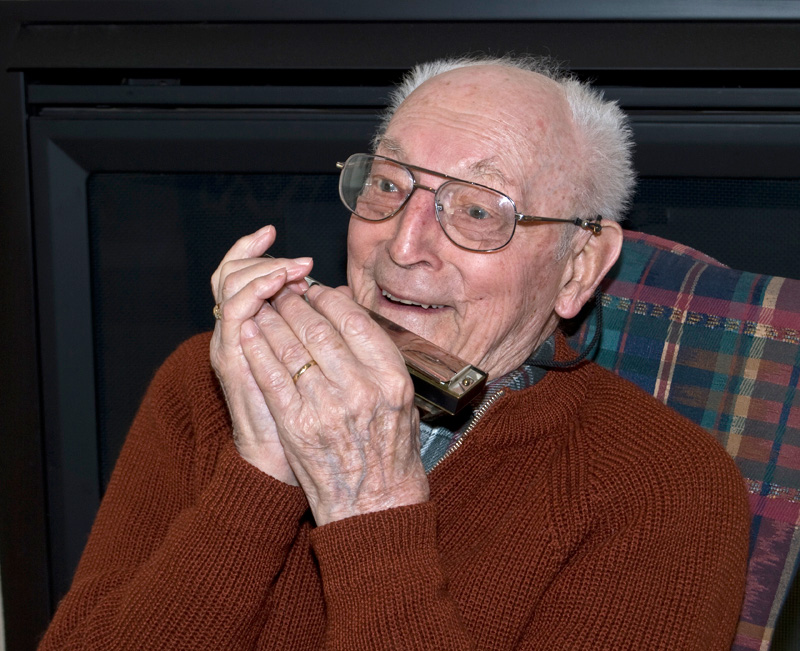
George and his Harmonica (colorspace and levels adjusted)
One of the skills that we should be developing over time as digital photographers is the ability to look at an image, identify what is "not right" and be able to quickly assess what adjustments need to be made to improve the image. Often, all that is needed is a quick white balance, exposure, and contrast adjustment to significantly improve the rendition of our images. As you get more comfortable with these changes, you can start making "selective" adjustments to portions of the image in order to emphasize certain parts, and deemphasize others.
This is the original image of Jaquie. Although the image was OK, I wanted to place less emphasis on her brightly colored shirt and more emphasis on the guitar. I also thought the bright white portions of the backdrop were distracting.
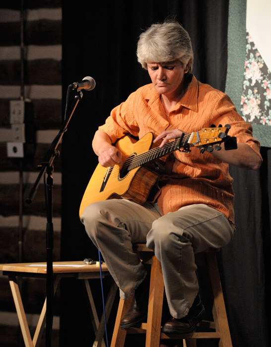
Jaquie
In order to "desaturate" her brightly colored shirt, I duplicated the "background" layer in Photoshop, converted this new top layer to black and white, and then reduced the opacity of the black and white layer to 30%. This desaturated her shirt, but the guitar was affected as well, so I duplicated the base layer again, placing it on top of the black and white layer, applied a layer mask to "hide all" of this layer, and then erased through the portions of the mask corresponding to the guitar. As a final step I added a vignette in Photoshop to darken the corners of the frame and reduce the distraction of the bright backdrop. This only took a few minutes in Photoshop and produced the image below. I felt the modified image (equivalent to the traditonal dodging and burning in the darkroom) reduced the distractions from unimportant elements and better placed the emphasis where I wanted it.

Jaquie (desaturated and vignette added)
Thank you to everyone that participated in this assignment. I hope you enjoyed the music.
Keith


