Thank you to Lars and Becky for participating in the "Serenity" weekly assignment. I thought about extending the assignment in order to encourage more people to find serenity in their lives.

Maybe we will revisit this topic in the future.
The assignment was to compose an image that evokes a feeling of serenity in the viewer. Participants were reminded to use the effects of color as we discussed in the "Color" assignment, as well as compositional techniques such as the use of symmetry and balance to reinforce a feeling of tranquility and "serenity."
Congratulations to Lars whose
Grave image and Becky whose
Goin Back image tied for the "
People's Choice" award.
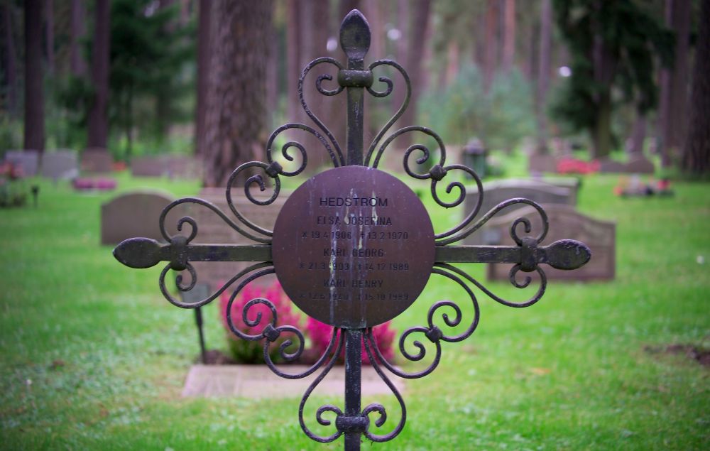
Grave
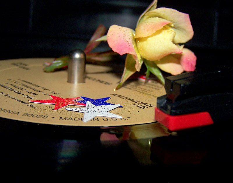
Goin Back
My criteria for selecting "Editor's Choice" was to chose the image that best evoked a feeling of serenity in the viewer. As I mentioned in the assignment description, color and subject placement play key roles in evoking and reinforcing the feeling of serenity. I really liked the concept behind Becky's
Goin Back image; however I felt the bold and vibrant colors in the image detracted from the feeling she was trying to convey. Typically, soft pastel colors are better at conveying a sense of calm, while bold vibrant colors are better at evoking a feeling of excitement in the viewer. I felt the subdued colors, symmetry, and overall scene in Lars'
Grave image was better at conveying a sense of serenity. I could imagine myself there at the grave in a peaceful, reflective mood. I've awarded
Editor's Choice for Artistic Merit to Lars' Grave image.
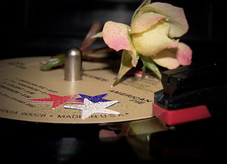
I played around a bit with Becky's image in Photoshop in an attempt to subdue the colors and impart a more "serene" feeling to the image. I added a duplicate layer, desaturated the color (to make the image black and white) and then adjusted the opacity of the top layer to let some of the color from the layer beneath show through. I was aiming for the "faded" look of an old color print. I also cropped the image to remove a little dead space in the bottom of the image and better balance the scene. During the crop I also straightened the image. The little bit of "off kilter" tilt in the original image added a bit of tension or uneasiness that detracted from its ability to evoke a "serene" feeling. Finally, I added a little vignetting (again to replicate the feel of an old, faded color print) and used one of the warming photo filters in Photoshop to get the color balance closer to the "candlelight" feeling that Becky talked about in her image posting. In retrospect, I could have probably warmed up the image a bit more. (Its hard to say for sure until I can get home to a monitor that displays more accurate color calibration than my laptop screen.)
 Goin Back
 with Desaturated Colors, Vignetting, Cropped and Rotated, and Warming Filter
Thank you again to Becky and Lars for contributing images towards the "Serenity" weekly assignment.


