The guidelines for this assignment were to compose an image using a natural frame in the scene to enhance the composition, provide context, or add depth or dimensionality to the image. Thank you to everyone who participated in the "Framed" assignment. There were some great images submitted for this assignment, and it was again difficult for me to chose a favorite.
I was impressed with Rebecca's
Reading Nook image. I had passed by the same scene looking for a composition for this assignment, but didn't see a "frame" that I liked. I'm impressed that Rebecca managed to find a pleasing frame in a scene that I passed by. I really like the curve of the trellis, and like that she "completed" the frame by using the tree. This is a peaceful and relaxing image, and one that is pleasant to look at.
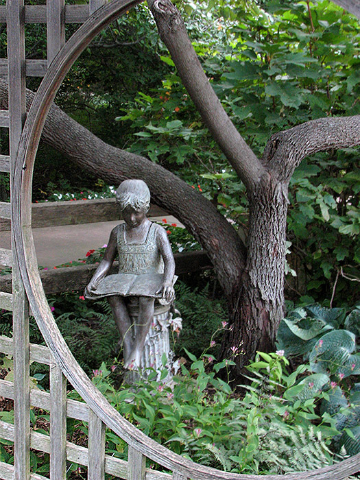 Reading nook
 Photographed by Rebecca
Another image that I liked was Tanya's
Reflections of Wykcoff. I commented in the gallery that this image reminded me of a Japanese painting, and I just couldn't resist the urge to "play" with this image. Here's Tanya's original image:
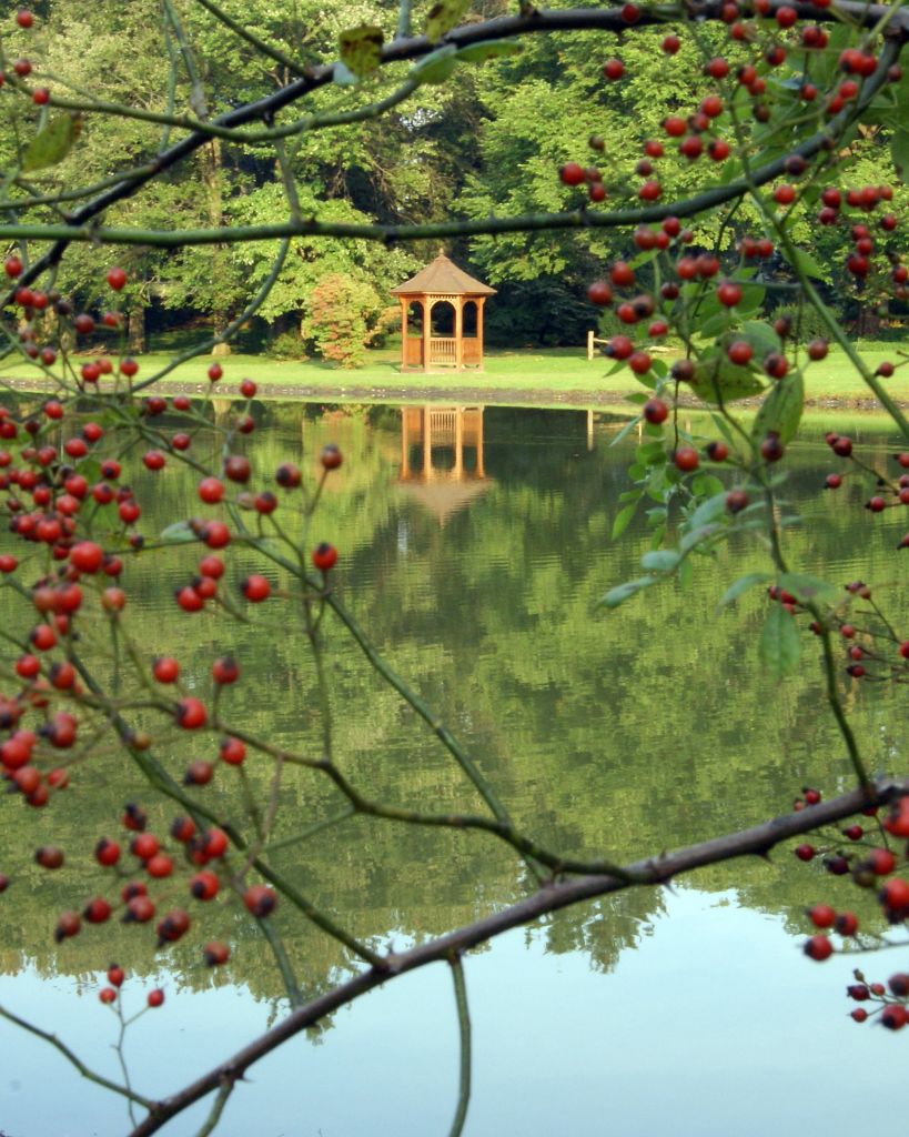 Reflections of Wykcoff
Photographed by Tanya MacKenzie
And here is her image after I "played" with it in Photoshop, in an effort to transform it into one of the paintings it reminded me of initially. The image opened into Photoshop without a color space assigned, so I guessed that it was sRGB. Assigning that color space actually saturated the colors a bit more, but transformed the greens to a more "pure" color. I used the Hue/Saturation adjustment (under
image>adjustments>hue/saturation), selected the red channel using the drop-down menu, and increased the saturation a bit to get more colorful berries. Then I used the "dry brush" filter (
filter>artistic>dry brush) to create the "painting" I had envisioned when I first saw Tanya's image. The filter removed too much of the detail on the gazebo, so Rebecca recommended that I mask that portion of my "dry brush" layer to let the original gazebo show through. I thought the two layers (painting and reality) blended together quite well. Here's the result:
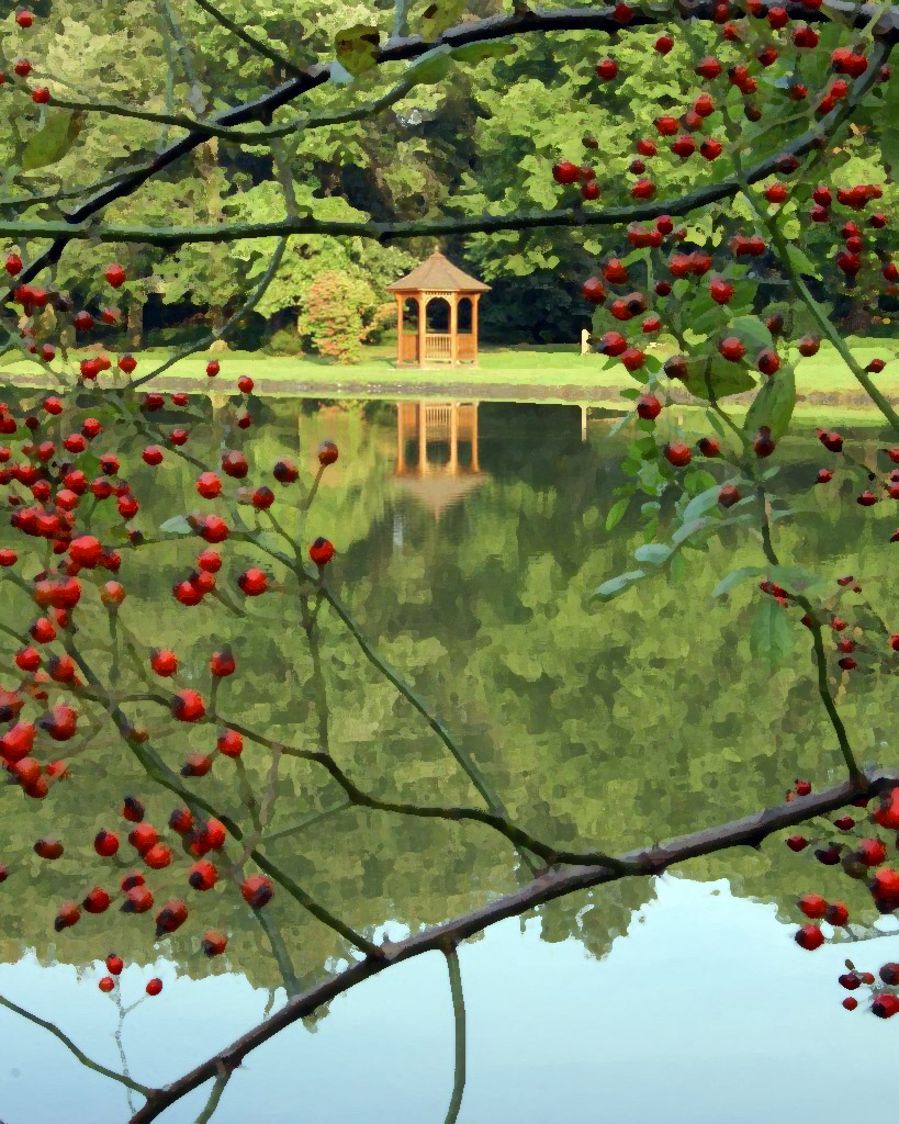 Reflections of Wykcoff
Photographed by Tanya MacKenzie
(sRGB color space assigned, saturated Reds, Photoshop Dry Brush filter)
One of the best examples of using a frame to add "depth or dimensionality" to an image was Dave Leiker's
St. Elizabeth image. The soft light accentuated the "form" of the rock archway, and the relief of the various archways added a wonderful 3-dimensional depth to this image.
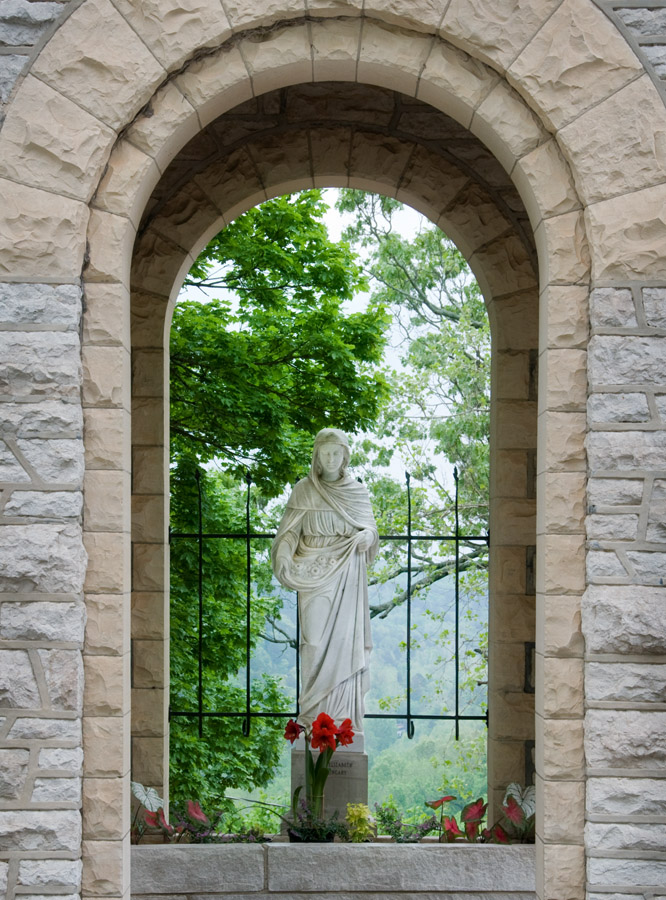 St. Elizabeth
Photographed by Dave Leiker (prairiedust)
Sue Pepin's
Aspen Grove image had a nice natural frame and good depth, but I sensed that it had more potential. Here's the original image, which had beautiful light, but could have used a bit more "pop."
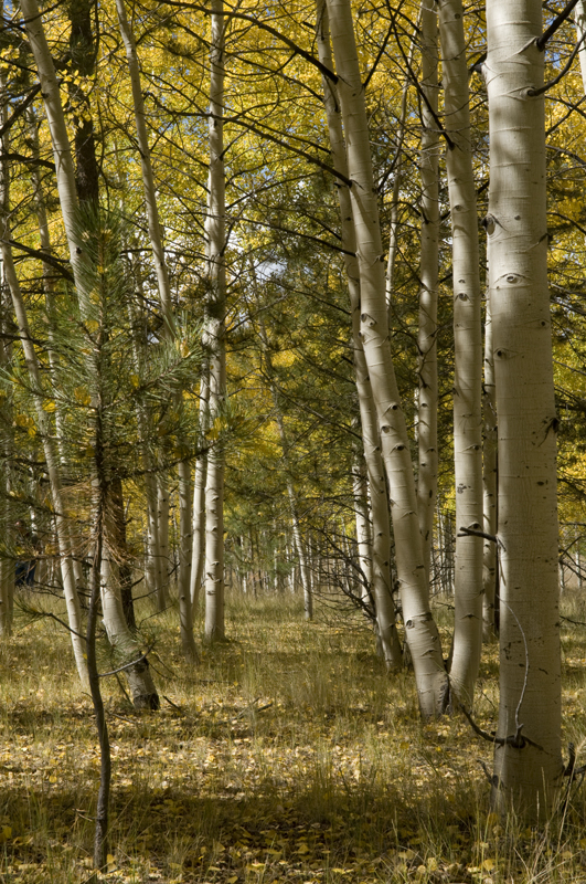 Aspen Grove
Photographed by Sue Pepin
I always feel a bit handicapped when working with the low resolution JPEG files, but think I managed to extract a bit more detail and contrast in the image below. I used a "curves" adjustment in photoshop to increase the contrast. Under "options" in the curves dialog I selected "enhance monochromatic contrast" which automatically pulled in the black point and white points in the image to increase the contrast. At the same time I checked the "snap neutral midtones" selection, which was an easy way to remove any color cast from the image and bring it back to a "neutral" white balance setting. Next I increased saturation a bit, to make the yellow of the aspen leaves pop, and then used a "warming" photo filter to warm up the image to taste. Finally I used selective sharpening to bring out some of the detail on the trunks of the aspen. Here's the final result:
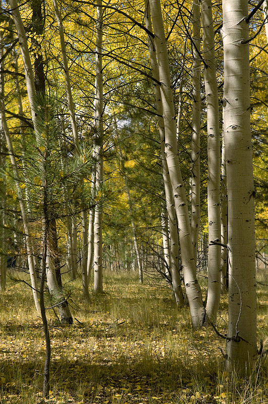 Aspen Grove
 Photographed by Sue Pepin
(curves adjustment, saturation, warming and selective sharpening by Keith)
Dave Leiker's wonderful
Traveler image was nearly perfect, but I couldn't resist tweaking just a tiny bit. Here's the original:
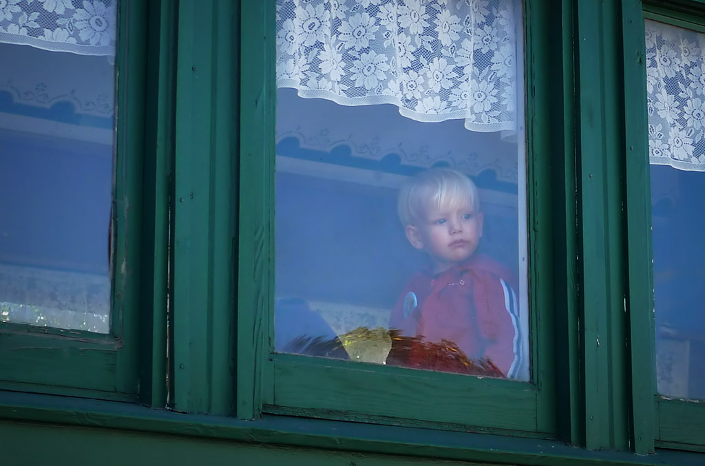 Traveler
 Photographed by Dave Leiker (prairiedust)
My subtle "tweak" consisted of selective sharpening on the boys face in order to make it stand out just a bit more from the background. It is a very subtle change, but I think it helps "connect" the viewer with the boy.
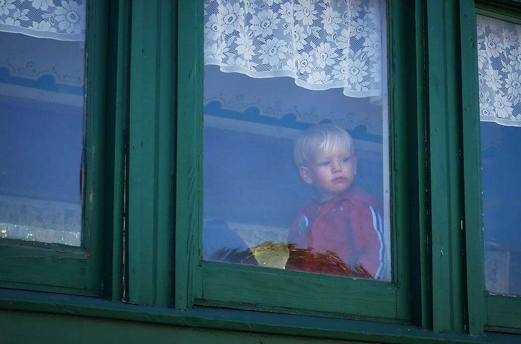 Traveler
Photographed by Dave Leiker (prairiedust)
Finally, congratulations to Rick Pepin who braved the below freezing weather to capture his beautiful image of
Garden of the Gods - Kissing Camels. Rick did a great job framing this rock formation with a Juniper tree to provide depth (and context) to the image, and I loved the early morning light on this scene (it made me wish I were there). This image won the vote for
People's Choice and was awarded
Editor's Choice for Artistic and Technical Merit. Garden of the Gods - Kissing Camels
Photographed by Rick Pepin (trvlrick)
Still, I couldn't help tweaking the image a bit

. I sharpened the image using one of my favorite sharpening "plug ins" for Photoshop, The
Focus Magic plugin is a great little tool that uses "deconvolution sharpening" to bring back detail into an image that was blurred by the anti-aliasing filter or lens diffraction. Here's the final result:
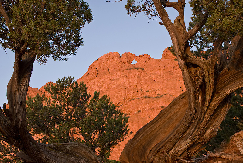 Garden of the Gods - Kissing Camels
Photographed by Rick Pepin (sharpened by Keith)
Thank you to everyone that participated in the "Framed" assignment. I hope you enjoyed practicing this technique, and that actively looking for "frames" helped exercise and strengthen your composition skills. Viewers are encouraged to respond to this thread describing
why you like a particular image, or think it was particularly successful at meeting the guidelines of the assignment.
Keith


