Thank you to everyone that participated in the "Diffused Light" assignment. The
guidelines for this assignment were to use a diffusion panel (which could be "homemade" or appropriate material adopted for this purpose) to modify the light on your subject so that was diffused, soft, and flattering to the subject. One thing that I didn't mention in the assignment description, but probably should have, is how important diffused light is in order to impart a 3-dimensional perception of our subjects. It is because of this that soft light is often described as "round" light, since the shadows formed by soft light contribute towards the gradual changes in tonality that are indicative of a smoothly rounded object.
Michele's
Signs of Spring was a beautiful, nicely composed image with wonderfully soft light and colors. I thought the square crop worked well with this image. Michele and I talked about whether she should post a version without the softly focused leaf in the lower right corner, and we both agreed that the leaf helped balance the composition. This image was very effective at evoking visions of Spring.
 Signs of Spring
Photographed by Michele Bollhalder
Michele's image of
Lauren also had wonderfully soft lighting, and was perfectly composed. The soft diffused lighting provided a very natural looking and very flattering light on her beautiful daughter. I appreciate that Michele took the time to explain her lighting setup and to show us pictures of her lights and diffusion panel. I've awarded this image
Editor's Choice for Technical Merit for the superbly controlled, soft and natural looking light that provided the perfect amount of "modeling" on her subject.
 LaurenEditor's Choice for Technical Merit
Photographed by Michele Bollhalder
Dave's
Green Keys image was an interesting composition that did indeed provide soft light on his subject. I commend Dave for his ingenuity in using a "home made" diffusion screen (green t-shirt) over his moveable light source (a fluorescent lamp) and moving it around during a long exposure to provide diffused light on his subject. Experimenting with different light sources and techniques is a great way to learn how different types of lighting will affect the final image.
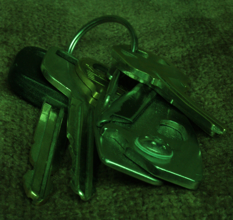 Green Keys
Photographed by Dave Brooks
Jaime's
"Lost in translation" image was the well deserved
People's Choice for this assignment. The softly diffused lighting of Jaime's light tent provided wonderful modeling on his pen, evoking a sense of a 3-dimensional object that had the viewer believing they could reach into the image and pick up the pen. This was a wonderful composition, with supporting elements (the Japanese characters) that reinforced the artist's passion for the pen. Well done!
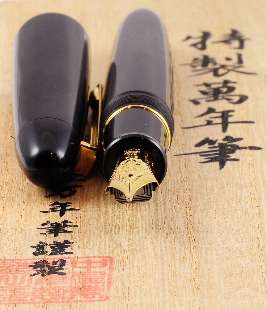 "Lost in translation"People's Choice
Photographed by Jaime Dorotan (girod)
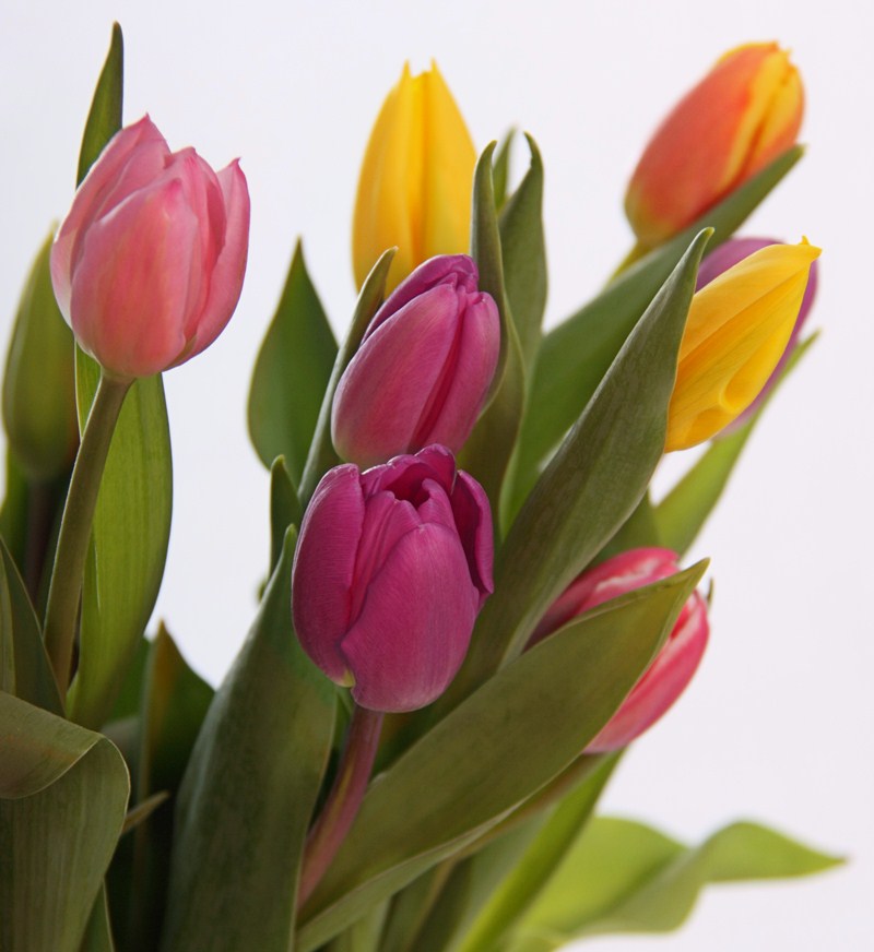
My
Johnny Jump ups image, and Rebecca's
Johnny Jump ups II image were both shot in the butterfly enclosure at Botanica gardens in Wichita. I've included an image of the wonderful "diffusion tent" provided by the roof of the butterfly enclosure.
 Johnny Jumpups
Photographed by Keith
 Johnny Jump ups II
Photographed by Rebecca

Botanica Butterfly Enclosure (aka the diffusion tent)
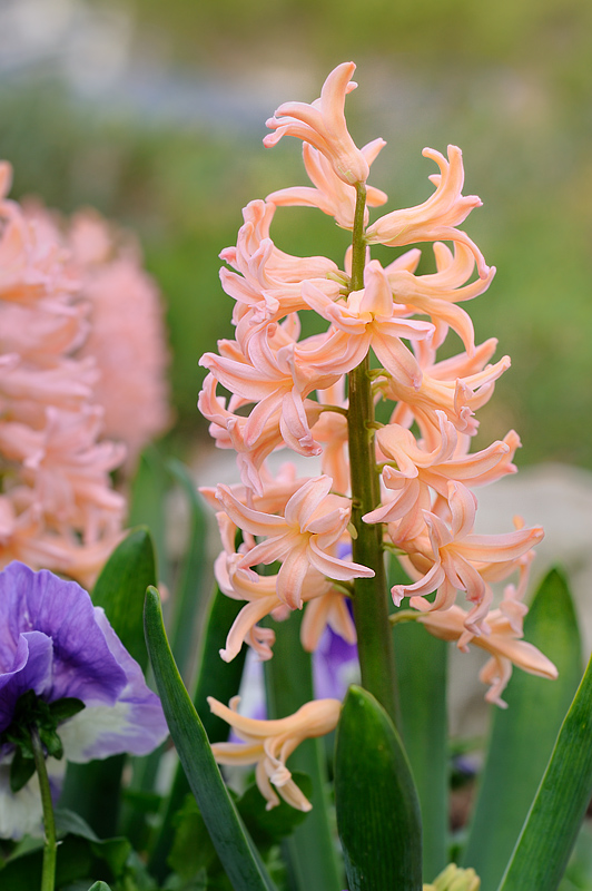
I used a Westcott 1-stop collapsible diffusion panel for both Hyacinth images. In addition, I used my tilt shift lens, which was responsible for the wonderful "bokeh" or beautifully rendered out-of-focus areas in the "wide open" shot of the
Blue Hyacinth.
 Hyacinth
Photographed by Keith
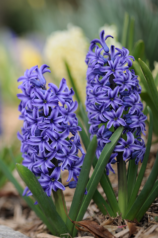 Blue Hyacinth
Photographed by Keith
Dave Leiker's
Madam Ladybug was one of those wonderful images that gives you a different perspective on a subject that you have seen hundreds of times before. The detail in the ladybug was amazing, and I love the way the backlighting highlighted the fine detail on the blossoms.
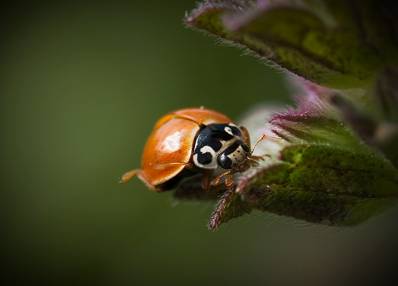 Madam Ladybug
Photographed by Dave Leiker (prairiedust)
I love the harmony between her title and Michele's
Dreaming of Spring image. The soft dreamy quality of the light on the flowers evokes the "dreaming" quality she eludes to in the title. Well done!
 Dreaming of Spring
Photographed by Michele Bollhalder
Sheila's entire series of "product" photography was masterfully executed. I was especially impressed by the backgrounds, and how the transitions in the tonality and color of the background complemented the subjects. VERY well done!
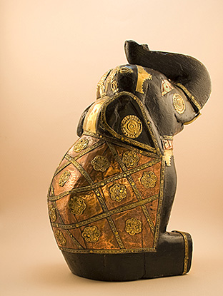 Lucky Elephant 2
Photographed by Sheila Ancheta
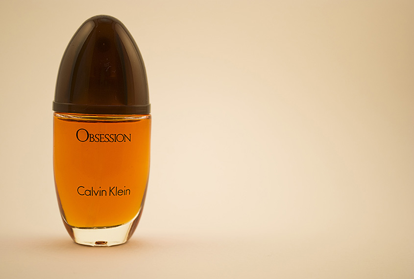 Obsession
Photographed by Sheila Ancheta
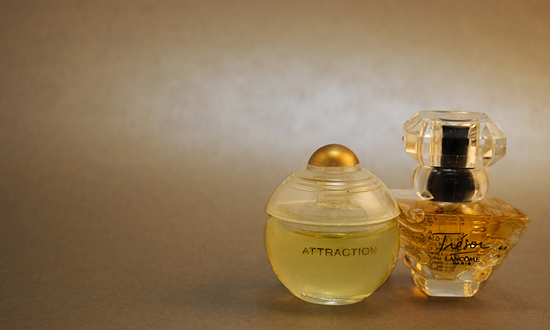 Attraction-Tresor
Photographed by Sheila Ancheta
My favorite of the series was
Euphoria, where the background colors and shape of the tonal transitions perfectly complemented the primary subject. The shape of the bottle was beautifully rendered in this image, with a rich, 3-dimensional feel. Both lighting and subject/camera placement were masterfully executed.
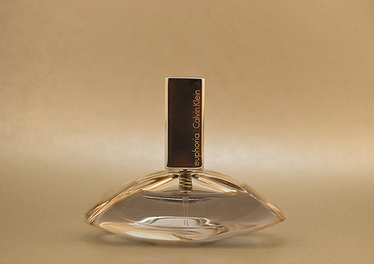 Euphoria
Photographed by Sheila Ancheta
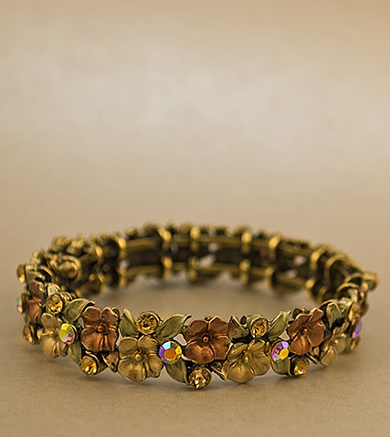 Bracelet
Photographed by Sheila Ancheta
Marilyn's
Spring in the Desert image was the one that struck me the most at "first glance," and the one that most made me want to be there. I was a little distracted by the blown out highlights on the cactus in the background, and so tried to play around with the image a bit in Photoshop to see if I could remove that distraction. I liked the crop and composition, so cropping it out wasn't the best option. Instead, I tried using a combination of layer masks to lower the exposure and desaturate that portion of the image, along with a slight vignette to help focus the viewer's attention on the primary subject. Unfortunately it is very hard to fully recover "blown" or clipped highlights, and even though I spent about 30 minutes on the image in Photoshop, I wasn't able to get a result that I thought looked natural. Capturing this image with a bit less exposure (to protect the highlights), and then bringing up the mid-tones in post processing would have been much easier, and would have enabled the editor to produce a much more natural rendition of the scene, with the proper tonality for both the background and the primary subject. In addition to trying to recover the "blown" area, I guessed at the color space, and I'm not sure I guessed correctly, so the tonality changed a bit in the image I worked on (changing the color space lightened the shadows a bit).
Overall though, this was a wonderful image that captured the feel of
Spring in the Desert. Marilyn captured wonderful detail in the Joshua Tree and blossom in the foreground, and the vegetation and hills in the background are nicely out of focus and provide great context without being too distracting. The lighting and focus resulted in very nice separation between the foreground and background and contributed to the depth of the image. I've awarded this image
Editor's Choice for Artistic Merit. Spring in the desertEditor's Choice for Artistic Merit
Photographed by Marilyn McKinney
 Spring in the desert
Photographed by Marilyn, Photoshop work by Keith
Marilyn's
Tent caterpillars in action was a much more subtle image, but one that "grew on me" the more I looked at it. In addition to the wonderfully soft light on the caterpillars "tent," the background was rendered with beautiful bokeh that complemented the scene.
 Tent caterpillars in action
Photographed by Marilyn McKinney
Thank you to everyone that participated in this assignment. Viewers are encouraged to respond to this thread describing why you like a particular image, or think it was particularly successful at meeting the guidelines of the assignment.
Keith


