Thank you to everyone that participated in the "Shades of Green" assignment. The guidelines for the assignment were that the images should be primarily composed of various shades of green, arranged in a pleasing composition. I noted that the most successful images would most likely be "abstract" images, concentrating on arranging a pleasing composition of patterns and forms made up of different shades of green. We had many wonderful images submitted and ended up with a three-way tie for
People's Choice.
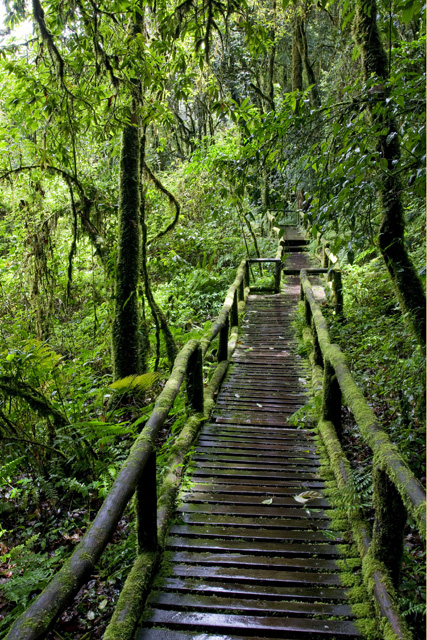 Walk in the Rain ForestPeople's Choice
Photographed by Joyce (csrdrunner)
Congratulations to Joyce Donaldson whose
Walk in the Rain Forest and
Tree Glow images tied for
People's Choice in the "Shades of Green" assignment.
Walk in the Rain Forest was another great example of the effective use of "linear perspective" and leading lines by Joyce. Note how the railing enters the image from the lower left corner and provides a strong "leading line" that draws the viewer into and through the image. The diminishing size of the walkway (linear perspective) provides a strong depth cue to the viewer that enables us to view this image as a three dimensional scene, and invites us in.
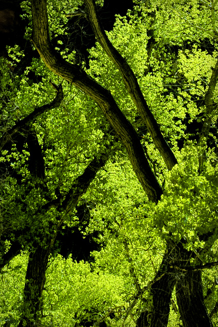 Tree GlowPeople's Choice
Photographed by Joyce (csrdrunner)
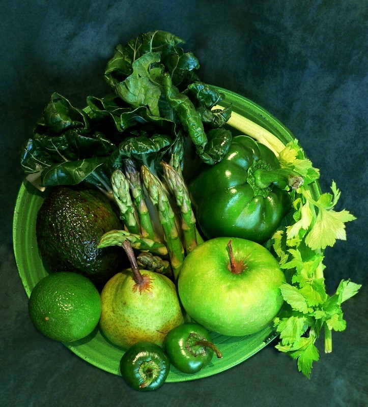 Green are good for you!People's Choice
 and
Editor's Choice for Artistic and Technical MeritPhotographed by Naomi
Congratulations also to Naomi, whose
Greens are good for you! image tied for
People's Choice and was selected as
Editor's Choice for Artistic and Technical Merit. While all of the images submitted for the assignment illustrated "shades of green," Naomi created an image with such rich hues of green that it made you want to reach out and taste the wonderful fruits and vegetables presented in the image. Naomi used well controlled soft light to "wrap" around the fruits and vegetables and portray dimensionality in the image. The soft light also enables the image retain all the gradual transitions of hues of green that make this image so vibrant and lifelike. I liked Naomi's background treatment as well. It complemented the color of the fruits and vegetables, yet was "low key" enough that it didn't compete with the primary subjects.
I thought several of the images could be improved with just a tiny bit of post-processing in Photoshop. Rick's
Green Aspens image showed promise, but was a little "flat" and needed a bit of contrast boost to make it "pop." I adjusted the image with the "levels" adjustment in Photoshop by simply pulling the white point slider back from the right edge to the point where the histogram showed the image data starting. I then cropped the image to remove distracting highlights, and made a very slight adjustment to the white balance by using a very slight "cooling filter" adjustment (under Image=>Adjustments=> Photo Filter=>Cooling Filter (80)) Finally, I blurred the background slightly (using the "blur" brush), and added just a touch of selective sharpening to the foreground aspen branch. I adjusted Rick's
Green Aspens image from this:
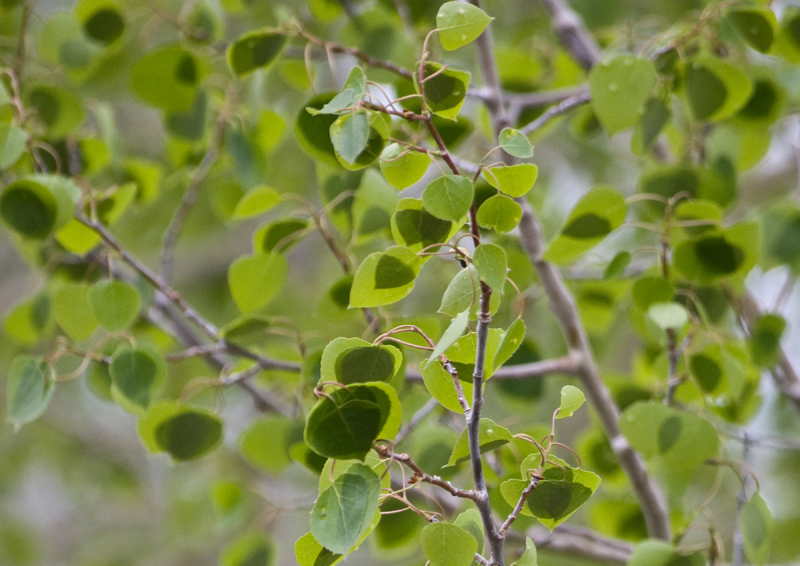
Green Aspens
to this:
I thought Lar's
Garden through a coca cola glass image showed promise as well, and a very simple "levels" adjustment in Photoshop increased the contrast and brightened the image enough to change it from this:
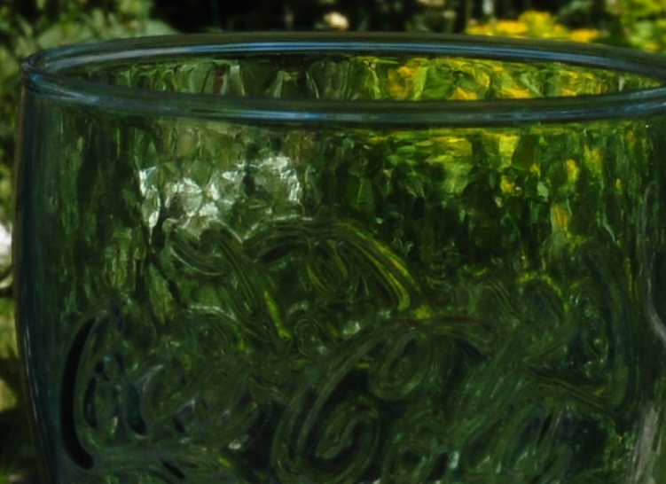 Garden through a coca cola glass
Photographed by Lars
to this:
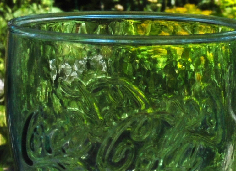 Garden through a coca cola glass
 (slight levels adjustment)
Photographed by Lars
Thank you again to everyone that participated in the "Shades of Green" assignment. I really enjoyed seeing your wonderful images.
Keith


