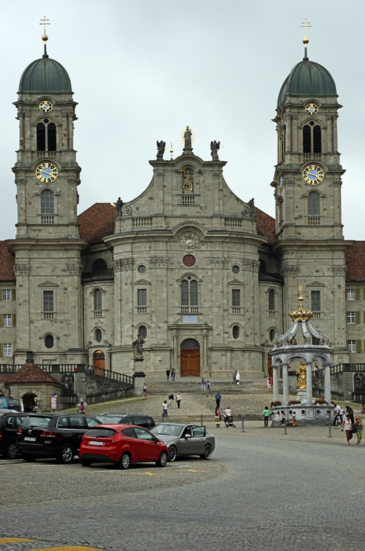
The
guidelines for this assignment were simply to create an image of a building or structure, or an architectural feature that you find interesting.
Rick's
Central Park image was a wonderful glimpse into a world that I haven't experienced, and helped me imagine what it would be like to be on a cruise ship. Rick did a great job handling the exposure on this image, and hand-holding the shot at 1/20th of a second.

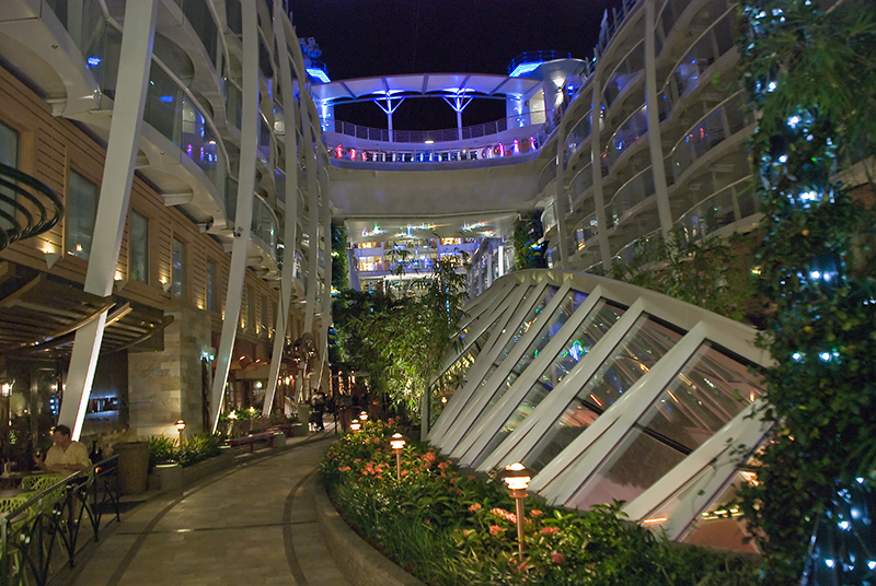 "Central Park"
Photographed by Rick Pepin
I managed to minimize the keystoning in my shot of
Our Temporary Home by shooting from a distance using a wider angle lens then I needed, keeping the lens level with the horizon (not tilting up or down) and then cropping down to the center top portion of the image. (The tree on the left side of the image is actually tilting to the left. It's not a perspective issue with the shot.)
 Our Temporary Home
Photographed by Keith
Congratulations to Michele whose composition of the
Little Bridge tied for
People's Choice. The symmetry of the composition suited the subject, and the framing showed off the wonderful design of the bridge. Michele made a very good choice to convert to black and white. Converting the image to black and white removed any issues with the colors being blown out in the the bright area at the end of the bridge and effectively used the bright area to draw the viewer's attention deeper into the image. Great composition and processing Michele!
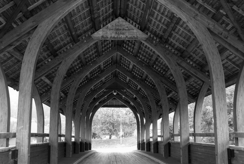 Little bridge
Tied for
People's ChoicePhotographed by Michele Bollhalder
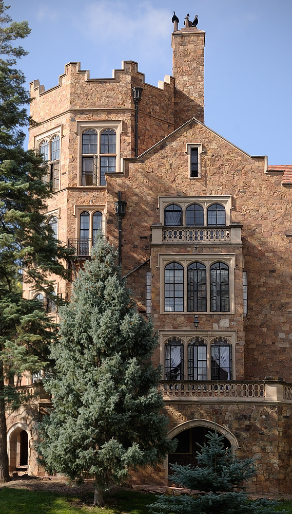
Michele did a great job keeping her image of
Einsiedeln Kloster free of perspective distortions by standing far back from her subject and using a "normal" focal length lens, instead of getting closer and shooting with a wide angle lens. Using a wide angle lens from a closer position would have introduced keystoning and other perspective issues into the image. Good job composing this image Michele. I enjoyed seeing this glimpse of the beautiful architecture of Switzerland.
 Einsiedeln Kloster
Photographed by Michele Bollhalder
The beautiful light in Lars'
Esslingen von oben composition is what made this image so outstanding. The low angle of the warm light highlighted the detail of the clay tile roofs and made the scene much more 3-dimensional and "real" than it would have seemed in flatter light. The jumble of rooflines was very effective at conveying the "feel" of living in this fascinating city. Wonderful image Lars. More than any of the other images submitted for this assignment, it makes me want to visit this fascinating city. I've awarded this image
Editor's Choice for Artistic Merit.
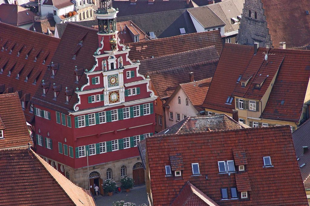 Esslingen von obenEditor's Choice for Artistic Merit
Photographed by Lars
Rebecca's composition of
The Mastermind effectively conveys the rich feel of a bygone era. Rebecca used fill flash to bring out the rich colors and grain in the wood, and then used exposure blending (blending in a second lower exposure in photoshop) to tame the light coming through the window. Including both the wall in the foreground and the more distant stairway added depth to the image and invited the viewer into the scene.
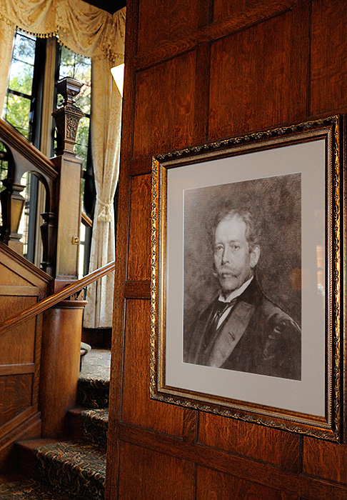 The Mastermind
Photographed by Rebecca
In her
Music Room image, Rebecca used creative composition techniques (utilizing the reflection of the room in the mirror) to allow her to get close enough to illustrate the intricate detail in the fireplace and wall moulding, while also conveying depth. She managed to convey the feel of the
Music Room in a small vignette of the overall scene.
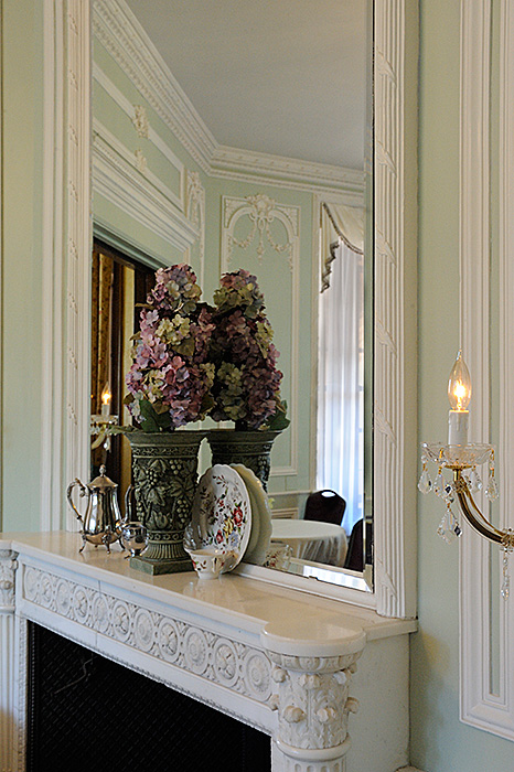 Music Room
Photographed by Rebecca
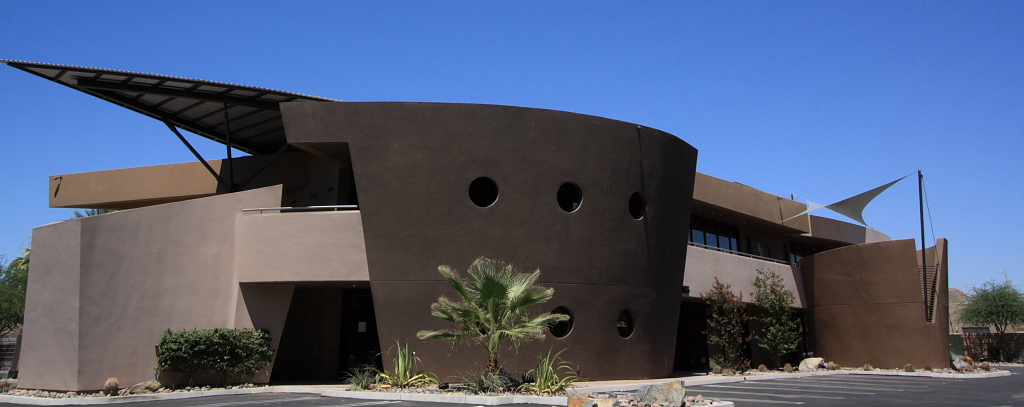
Marilyn's two images of the
Oracle Building were great compositions that effectively illustrated the unusual architectural features of this fascinating building. The crops Marilyn chose for the compositions effectively emphasized the shape of the buildings; however, the "view from the rear" could have used just a little more space on the left side of the image.
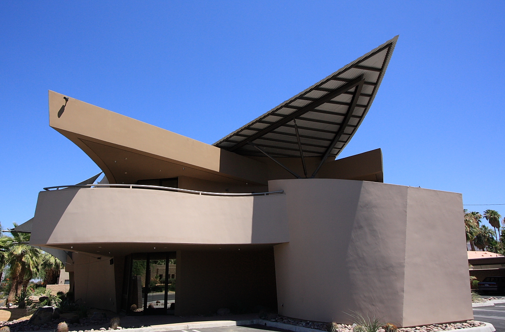
Oracle Building in Palm Springs, CA
Photographed by Marilyn McKinney
Oracle Building from the rear
Photographed by Marilyn McKinney
I forgot to include Dave's very powerful image of the
World War 1 Museum in the voting thread. I encouraged Dave to move this image into the assignment gallery, and then forgot to move it over into the voting thread. It's a very strong image that conveys the architectural style of a very specific time in world history. I've seen many buildings like it throughout the world, and they all date from a very specific time where we seemed enamored with an architectural style that emphasized massive strength. This image conveys that style very effectively.
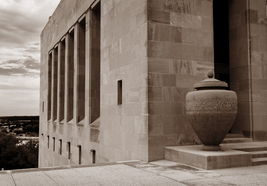 World War 1 Museum - KC Mo
 Photographed by Dave Leiker
Dave's image of
Corporate Woods - Overland Park, KS was an amazing image that illustrated Dave's wonderful creative eye. In his post on the original assignment thread Dave said "I was heading toward the classic limestone construction of Eskridge and Alma, but some lovely clouds drifting overhead spoke of huge expanses of glass and color, so off to Kansas City I went." I'm glad Dave had the creative eye to visualize what the clouds would look like reflected in the glass of a tall high-rise. If you haven't taken the time to view all of the wonderful images Dave created during his trip to Kansas City, you really should. I enjoyed seeing Kansas City through Dave's eyes, and am now excited about visiting and photographing these sites someday in the future. You can follow this direct link to
Dave's Architecture Album. (Be on the lookout for Spiderman and Batman.)
I loved the way the reflections of the clouds made the building appear transparent and produced an interesting optical illusion that engages our minds. This image tied for
People's Choice and was selected as
Editor's Choice for Technical Merit.
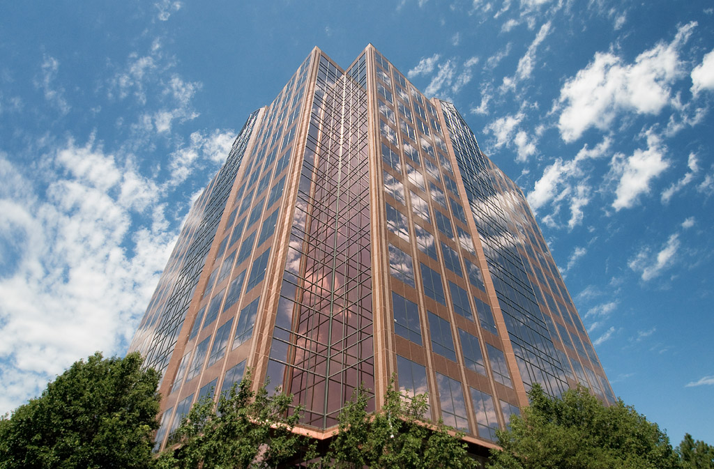
Corporate Woods - Overland Park, KS
People's Choice and
Editor's Choice for Technical MeritPhotographed by Dave Leiker (prairiedust)
Thank you again to everyone that participated in this assignment. I enjoyed viewing a part of the world through your eyes.
Keith


