Thank you to everyone that participated in the "Macro" assignment. There were many wonderful images submitted, and as Rebecca said, it was very difficult to pick a "favorite" from the submissions. As a reminder, the guidelines for the assignment were to compose an image that portrays interesting (close up) details of everyday objects, paying attention to shape and form, since these are often the primary compositional elements of macro images. I reminded participants to control the transition from "in focus" to "out of focus" in order to minimize partially focused distractions in their images.
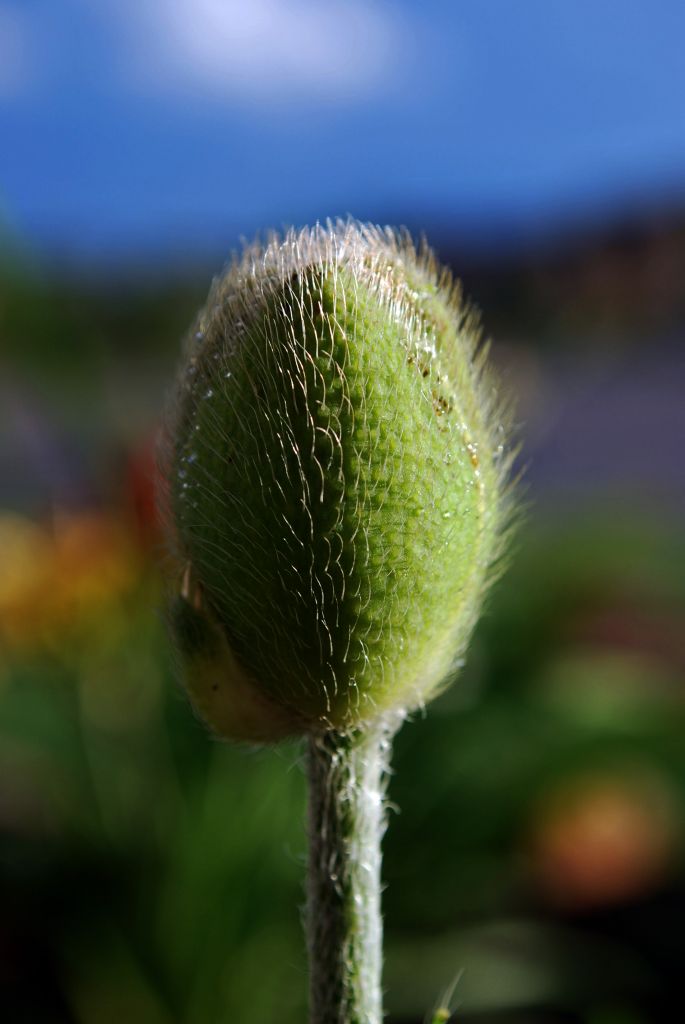
I loved Naomi's
Rise Above the Rest image. This was a well composed and "engaging" conceptual image, where she exquisitly controls the focus and depth of field to influence what the viewer "sees." I've awarded this image
Editor's Choice for Technical Merit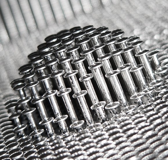
Rise Above The Rest
Photographed by Naomi
Becky did a great job controlling the depth of field and composing her
All a Buzzzzz.. image. The "focus" of this image was exactly where it should have been, on the bee. (And I like the fact that the bee wasn't exactly in the center of the image.)
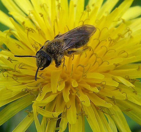
All a Buzzzzz...
Photographed by Becky Jenner
Alan's (Ribot's)
Coffin Nail image was something a bit different, and I thought the "stark" look of this image complemented the subject and message. I would have liked to seen a rendition of this image without the potentially distracting highlights in the lower left corner of the image. We need to recognize that our eyes are naturally drawn to the brighter areas in an image, and overly bright "backgrounds" can distract from the primary subject. (I don't intend to say this is a "bad" image. I thought it was a great image, but would have liked to see Alan try an "alternate" version as well.)
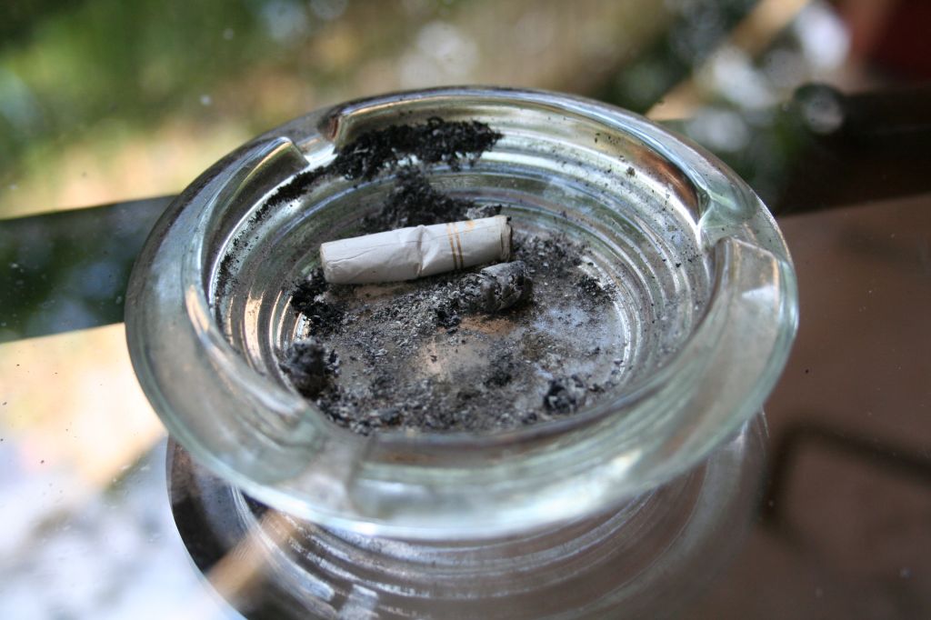
Coffin Nail
Photographed by Alan Albrecht (Ribot)
Sometimes an effective technique is to convert to black and white (especially for high contrast images) and then "colorize" (or restore the color) to selective areas in the image in order to "focus" the viewers' attention. Like this:
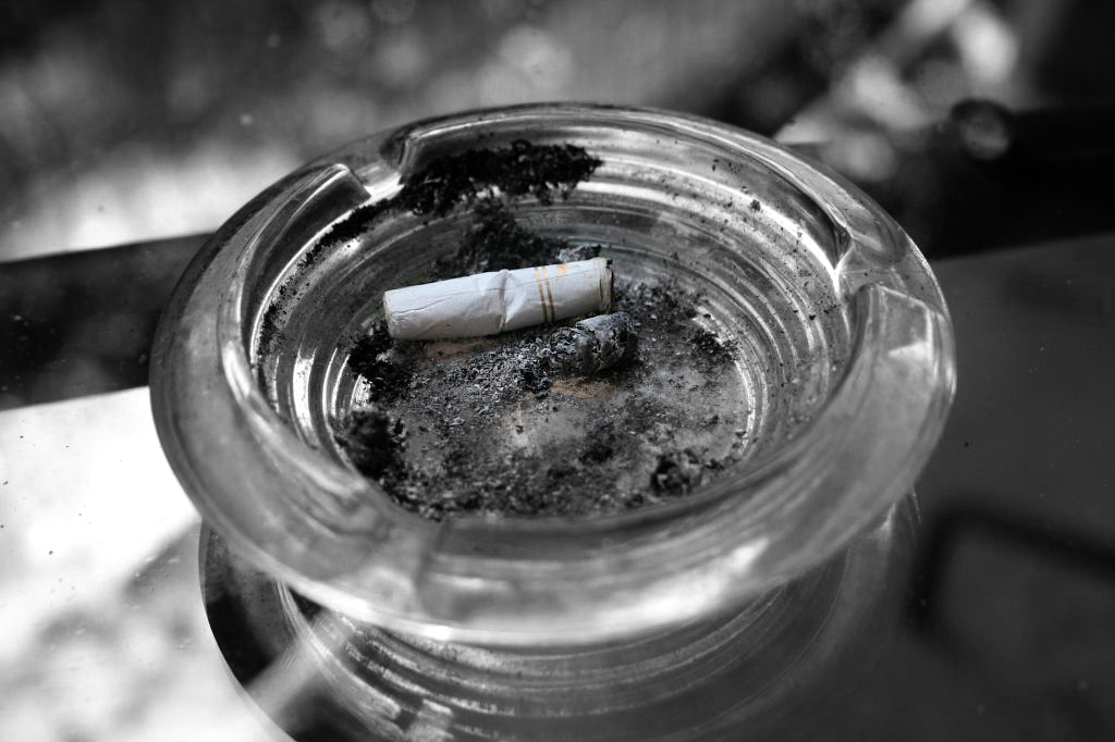
Coffin Nail
Photographed by Alan Albrecht (colorized by Keith)
I absolutely loved the colors, tonality, and pleasing "blur" (this is often called bokeh) in the background of Sheila's (burzilai's)
Lonely Bud image. Very well done! I asked Sheila what focal length and aperture she used, and it turns out the "trick" to getting these results was the use of a "close up lens" (the filter attachment type), which drastically reduced the depth of field for the lens in use. (Higher magnification = less depth of field.) This is one of those images where "centered" works very well, probably because of the "symmetry" in the image. Again, well done! (I would love to have an image like this hanging on my wall, which is always a good indication of the "success" of an image.)
Lonely Bud
Photographed by Sheila Ancheta (burzilai)
Rick's
Water Drops on Flower image was a nearly perfect exposure. Good job with a challenging exposure Rick and great job on the water dropplets, they "made" this image. It is good to see you practicing with manual exposure. I noticed in the EXIF of this image that you were using matrix metering. It can sometimes be a challenge to use matrix metering for scenes like this, since both the background and "active focus point" (in this case, the last focus point you had selected) will potentially change your exposure. It is often easier to use spot metering, since you can then control exactly what the meter is "evaluating" to calculate the exposure. (For a scene like this, I would spot meter on the "lightest area where I want to retain detail" and set the exposure at +2 EV on the scale.) Next time you get the opportunity, you might want to practice with spot metering also.
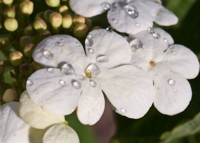
Water Drops on Flower
Photographed by Rick Pepin (trvlRick)
Sheila's
Peek-A-Boo image was another one of my favorites from this assignment. (I told you it was hard to pick a single "favorite.") I love the message conveyed by this image. Sheila and I talked a bit about trying a version of this image where the subject wasn't centered. After trying various crops, I tend to agree with Sheila that it was difficult to come up with another composition that didn't lose the "context" of the bud.
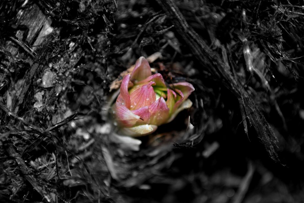
Peek-A-Boo
Photographed by Sheila Ancheta (burzilai)
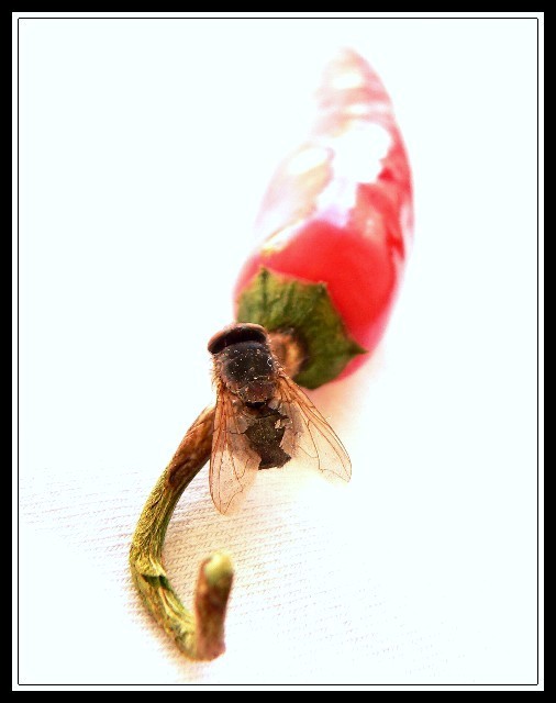
Lar's
A Spy Fly image was another very effective image. The shallow depth of field drew the viewer's attention to the fly, and the composition was very sophisticated, and a bit unsettling, which added emphasis to the subject.
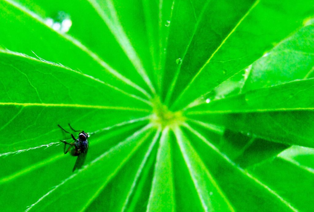
A Spy Fly
Photographed by Lars
I liked the "context" included in Rick's
Lady Bug image, but thought the out of focus leaf in the lower right was a little bit too much of a distraction.
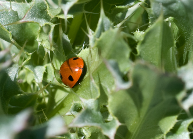
Lady Bug
Photographed by Rick Pepin
Here's an "alternate" composition (crop):
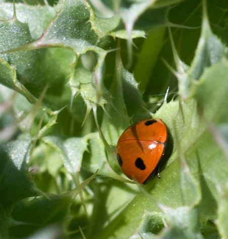
Lady Bug
Photographed by Rick Pepin (cropped by Keith)
Many of us tend to think about "composing" our images when instead we should be thinking about "creating" our images. Naomi's images are usually good examples of "creativity," where it is obvious that she has consciously designed the image to convey a concept. This is the work of a "mature" photographer.
On a Highway to Hell is another great creation from Naomi.
"On A Highway To Hell"
Photographed by Naomi
My
Saw Blade image was nothing artistic; however I wanted to mention the use of a tilt shift lens. By "tilting" the front element of the lens (it is designed so that it tilts in relation to the rear element and film plane) I was able to modify the "plane of focus" so that instead of being parallel to the film (sensor) plane, it ran along the length of the blade. Getting the entire length of the blade in focus would have been impossible otherwise. As usual, this assignment was useful in that it got me out practicing techniques to "optimize" my images. (Just before midnight, right before the assignment closed.

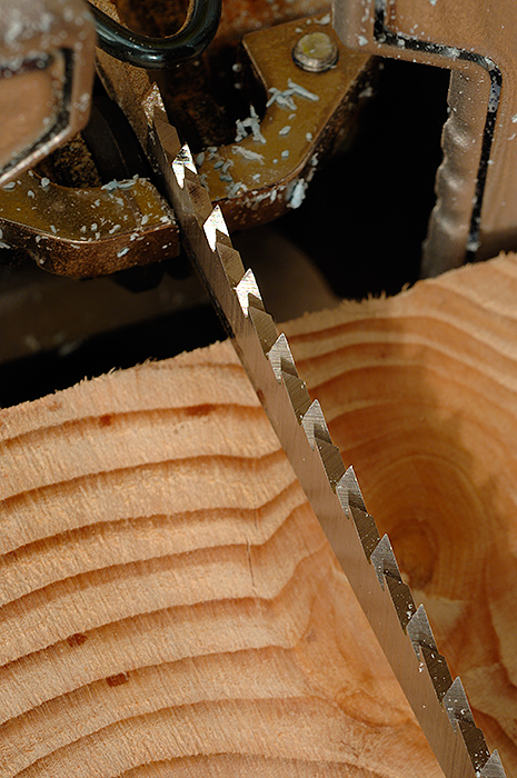
Saw Blade
Photographed by Keith
The winner of the
People's Choice vote, and
Editor's Choice for Artistic Merit was Joyce's
Iris Light image. This is another beautiful image that I would love to have hanging on my wall. Joyce's images also reflect an "element of design" that is hard to achieve without deliberate thought about how to "create" the image you are visualizing. Beautiful work Joyce.
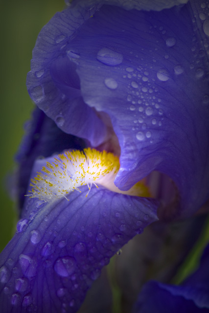
Iris Light
Photographed by Joyce Donaldson
Thank you again to everyone that participated in the "Macro" assignment. Comments and replies to this thread are encouraged.
Keith


