Thank you to everyone that participated in the Portraits by Window Light assignment. I know several of you wanted to participate, but just plain ran out of time. (I can empathize.) I encourage anyone that is interested to continue submitting images for this assignment (or any of the assignments really). I assume that if you are submitting images for one of the assignments (even if it is a past assignment), that you are looking for feedback and constructive critiques on the images. I often have an image or technique in mind for an assignment but don't have the time to follow through; however, I'll file away that idea in the back of my mind and practice that technique when I get the chance. I encourage you to do the same.
The guidelines for this assignment were to create a portrait using window light. The assignment description recommended paying attention to the direction of light relative to the subject as well as the camera angle in order to produce the most flattering portrait.
I enjoy the "street photography" genre and the images of everyday life that Lars often submits. There are many times that I wish I was better at carrying my camera around with me, and Lars' images are a great reminder of all the wonderful scenes I'm missing because I don't have a camera with me. When I mentioned that this image (taken with his amazing Nokia N-8 cell phone camera) was a bit grainier than some of the others, he replied that he was trying to recall the look of Tri-X, one of the classic black and white films used for street photography. I think the "gritty" look of this image fits perfectly with the scene, but following up on Lars' comment about Tri-X, I decided to see how the image would look in black and white.
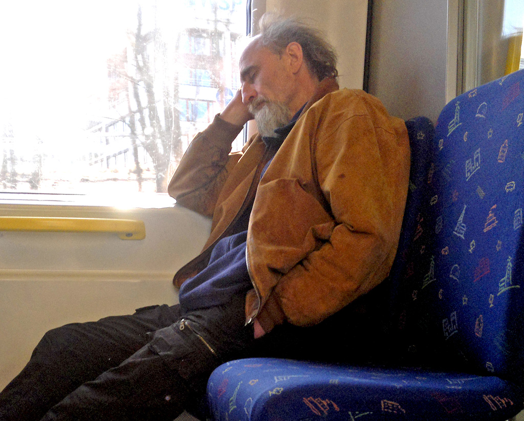 Trying to recall
Photographed by Lars
 Trying to recall
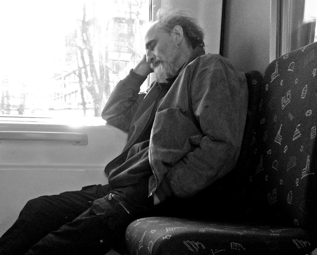
Photographed by Lars, converted to black and white by Keith
One of the advantages of converting this image to black and white was that it allowed me to emphasize what I found most appealing about the image, which was the way the light highlighted the ridge of the subject's nose and his cheekbones. I increased the contrast in all areas of the image, except for the view through the window, which I thought added a nice "context" to the image. It's interesting to note that converting to black and white helped significantly tone down the dominance of the bright light through the window, and the bright colors of the seat, allowing us to concentrate more on the subject's face. What do you think?
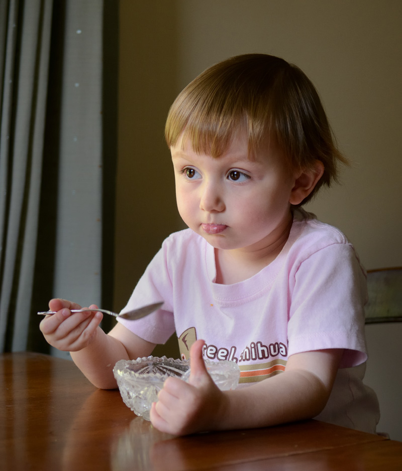
Michele's image of
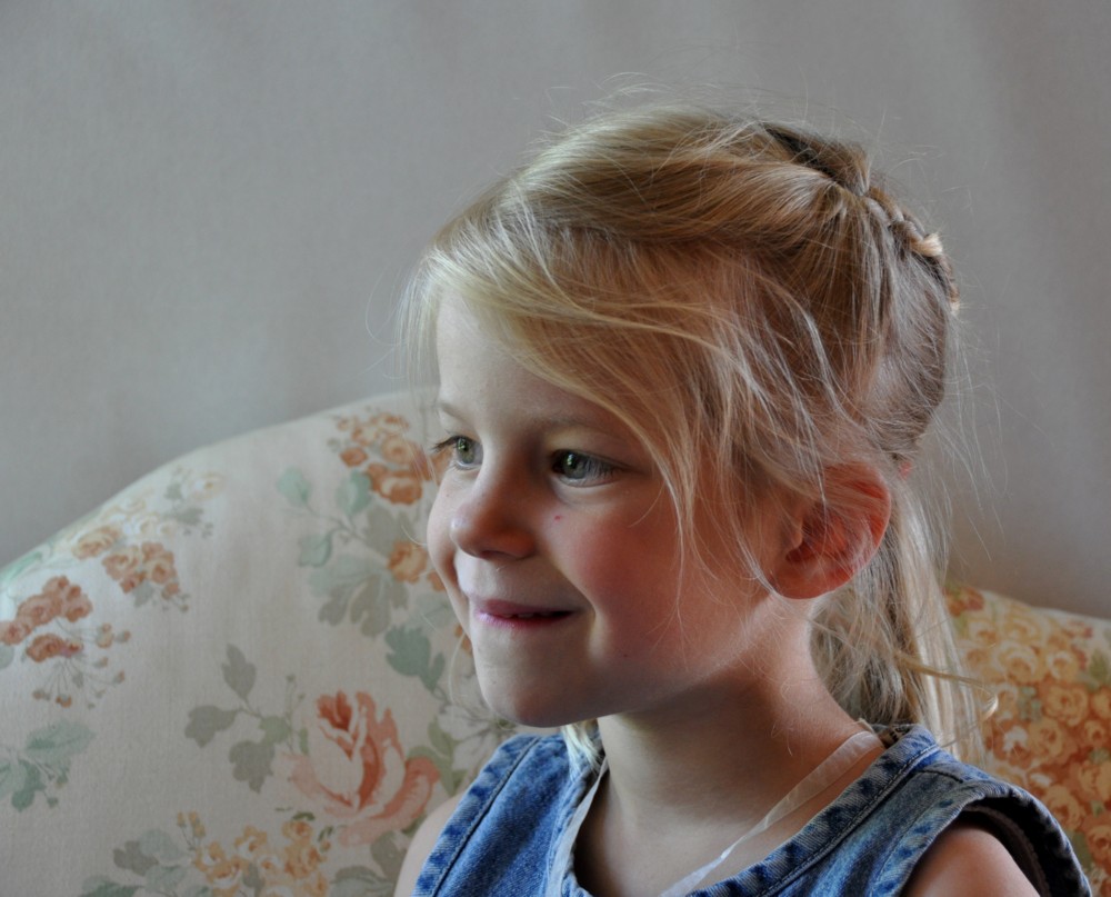
Lauren's 1st Communion Day was a beautiful portrait that wonderfully captured that special day. Michele did a great job handling the light in this scene, with wonderful balance between the interior light (with just enough exposure to see the detail in Lauren's sweater and hair) and the much brighter outside light. I think one of the things that "made" this image was the way the light highlighted Lauren's cheekbones and the area just below her eyes, serving to draw the viewers attention to the front of Lauren's face. This masterful handling of the light gave the image a personality and presence that it wouldn't have had if we had simply been looking at the back of Lauren's head. This image tied for
People's Choice and was selected as
Editor's Choice for Artistic and Technical Merit. Very well done Michele!
 Lauren's 1st Communion DayEditor's Choice for Artistic and Technical Merit
 and tied for
People's ChoicePhotographed by Michele Bollhalder
Luc's image of
Alisha was a beautiful portrait with wonderfully soft light from the window that produced gradual shadow transitions and provided nice 3-dimensional "modeling" on Alisha's features. Luc used a panel to reflect fill light into the shadows on Alisha's face, and another panel to provide a neutral, unobtrusive background. The angle of light to Alisha's face was very close to perfect, with a nice highlight on the "mask" of Alisha's face. Very well done, and a beautiful portrait Luc.
 Alisha
Photographed by Luc Bigler
Luc's portrait of Anna was also very nice, with the same wonderfully soft window light and fill from the reflector. This is a very beautiful portrait; however, as I mentioned in the gallery comments, a more "traditional" pose would have a slightly different angle of light so that it fully illuminated the frontal mask of Anna's face, and the camera would have been shifted more to the front of Anna's face. Most portrait photographers would recommend orienting the camera so that just a little bit of skin shows on the side of the model's eye furthest away from the camera, which tends to produce the traditional 3/4 pose that is flattering to most subjects. Still, this is a wonderful portrait of a beautiful subject and one that Luc should be proud of. And I should mention that the skin tones and colors were beautifully rendered in this image.
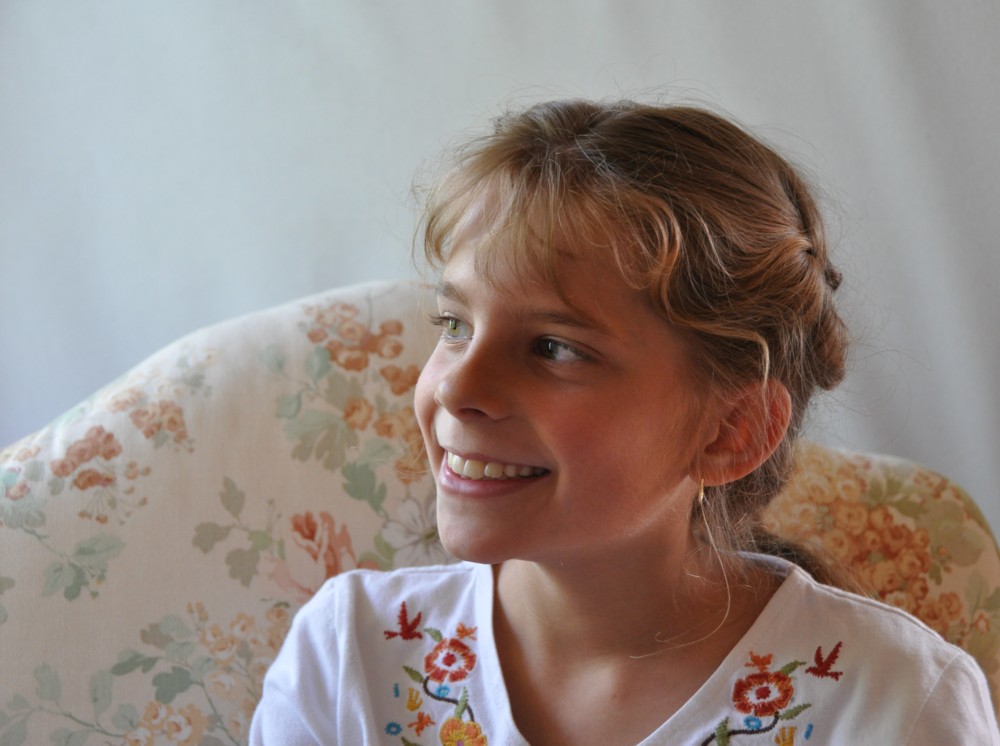 Anna
AnnaPhotographed by Luc Bigler
Jaime's image titled
The Silence of Our Light was a wonderful capture of his son Neo, so enthralled with the magic of the water fountains. I mentioned in the gallery comments that the red channel was clipped in the image that Jaime had submitted, and that led to a discussion about his color management settings in Capture NX2. It turns out that none of the color channels were clipped in the ProPhotoRGB color space, which Jaime was using as a working color space; however, when he converted to sRGB the red channel clipped, which affected the quality of the skin tones on the sunlit side of Neo's face. But that shouldn't detract from the fact that this is a wonderful capture of a special moment.
 The Silence of Our Light
Photographed by Jaime Dorotan
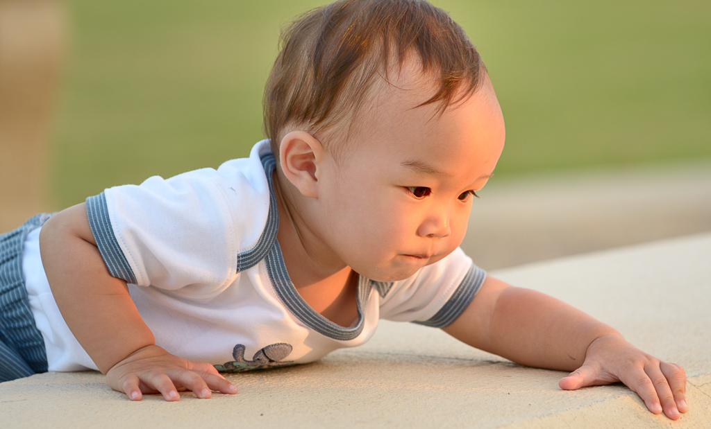
Thank you for all the comments on my image of McKenzie titled
Give me ice cream and I'll pose. I tried to set up the image with the classic 3/4 pose, with the light 45 degrees to the subject (in a short lighting setup that highlights the front of the model's face) and with the camera at a 45 degree angle from the subject. I used a window directly in front of McKenzie (but further away) as a fill light. Normally this would provide pretty defined lighting that highlighted the front of the model's face; however McKenzie's "round" features resulted in a bit more of a gradual falloff of the light on the near side of her face. There was a bit too much range in exposure between the highlight side of her face and the shadows, and I probably should have tried this image with the more traditional setup using a single window and a reflector that I could place for better control of the fill light...but we were running out of ice cream.
 Give me ice cream and I'll pose
Photographed by Keith
Lars'
Relaxing by the window light was another very impressive image from his N-8 cellphone camera. The cat's fur in this image looks so real (and soft) that I have the urge to reach out and pet it. The soft, directional window light definitely helped enhance the perception of detail in the fur. I can almost hear the cat purring.
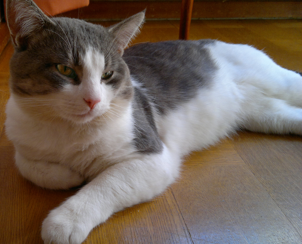 Relaxing by the window light
Photographed by Lars
Thank you again to everyone that participated in this assignment. I encourage all of you that are still interested in practicing your portrait photography to continue contributing to the Portraits by Window Light album.
Keith


