Thank you to everyone that participated in the "Line, Shape and Form" assignment. The guidelines for this assignment were to compose an image where "line, shape and form" were the primary compositional elements within the image. Both Rebecca and I had fun with this assignment, and it helped me exercise my composition skills as I looked for scenes where I could emphasize line, shape and form, and then worked at arranging these elements into a pleasing composition.
I enjoyed Dave Leiker's (prairiedust)
Stones image, and his description of the Photoshop techniques he used to "deepen" the mood of the image and emphasize the form of the rocks. I thought his techniques were very effective, and made the waterfall look much more powerful.
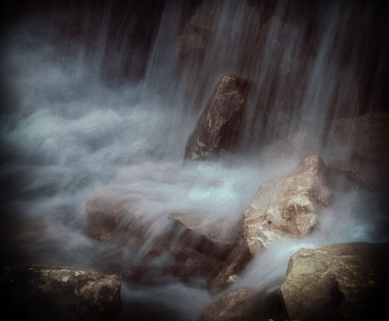 stones
Photographed by Dave Leiker (prairiedust)
Congratulations to Rick Pepin, whose A
ir Force Academy Chapel image won the vote for
People's Choice and was selected as
Editor's Choice for Artistic Merit. The light in this scene was wonderful, and Rick capitalized on this light to emphasize the line and form of the chapel. I did wonder if Rick's choice to include a small part of the tree on the right side was a conscious decision to include some "context" in the scene. Such a small part of the tree is included that it almost looks like it was included inadvertently. It is often better to include the entire element if you are unable to frame the scene to remove small intrusions. Having photographed this scene in the past, I know how difficult it is to get a clear view of the chapel without trees blocking the view, so I commend Rick on finding an angle that gave him a clear shot. It is often very difficult to judge if the camera is level when looking through the viewfinder while using a wide angle lens, so that is one of the situations when using a bubble level can be very helpful.
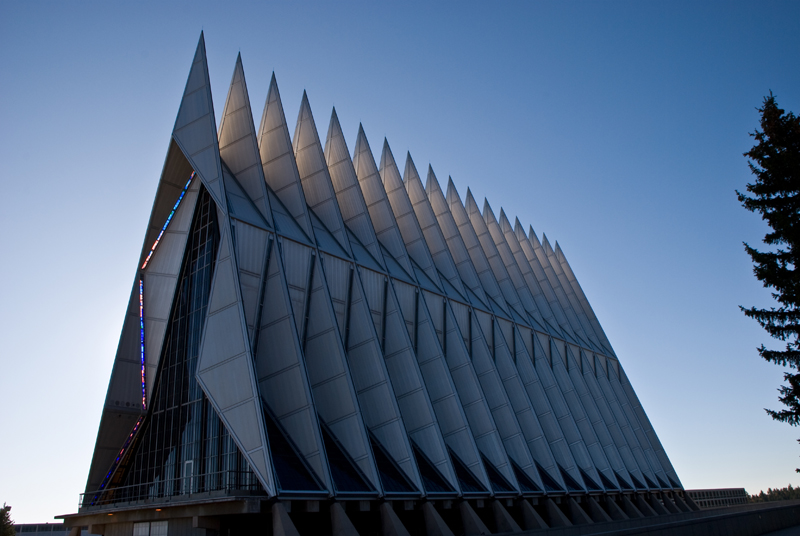 Air Force Academy Chapel
Tied for
People's Choice and
Editor's Choice for Artistic Merit Photographed by Rick Pepin
Congratulations also to Rebecca whose image of the
Keeper of the Plains catching the sun tied for
People's Choice and was awarded
Editor's Choice for Technical Merit. By silhouetting the sculpture, she emphasized the graphic shapes and flowing lines of the sculpture, and including the "sun star" in the image was a great technique to capture the viewer's attention and add interest to the scene.
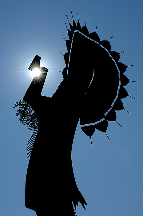 Keeper of the Plains catching the sunPeople's Choice
 and
Editor's Choice for Technical MeritPhotographed by Rebecca
Viewers are encouraged to respond to this thread describing
why you like a particular image, or think it was particularly successful at meeting the guidelines of the assignment.
Thank you to everyone that participated in the "Line, Shape and Form" assignment. I hope that our discussions on "line, shape and form," and the exercise of looking for these characteristics in your scene and composing an image around them will help you to use these elements to strengthen future compositions.
Keith


