Thank you to everyone that participated in the "Pastels" assignment. The guidelines for the assignment were simply to "create an image for which the primary compositional element is pastel colors."
Congratulations to Becky Jenner whose
Sailors Warning image was selected as
People's Choice. The soft, harmonious colors in this scene evoke a calm, relaxing mood. I can imagine myself sitting on a knoll, watching the scene unfold and quietly welcoming the day.
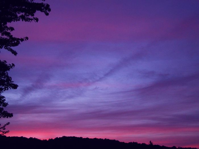 Sailors WarningPeople's Choice
Photographed by Becky Jenner
There were several other very beautiful images submitted for this assignment; however, I had my doubts about whether some of these images were actually "pastel." There is no widely agreed upon book definition of "pastel;" however, the general consensus is that in order to be considered pastel a color should be "tending toward white" with a hint of color.
I loved the creativity of Rick's
Pastel Flower Fun image, but thought the colors were a bit too saturated to qualify as pastel (especially when viewed in a color-managed browser like Safari).
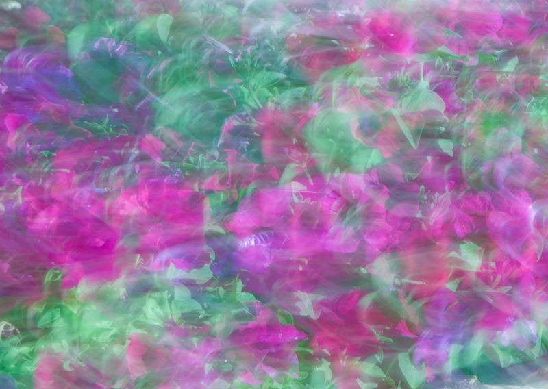 Pastel Flower Fun
Photographed by Rick Pepin
I've awarded
Editor's Choice for Artistic Merit to Rebecca's
Peaches to Cream image. (Although even with this image, the bottom part of the rose is a bit too dark to be considered "pastel.")
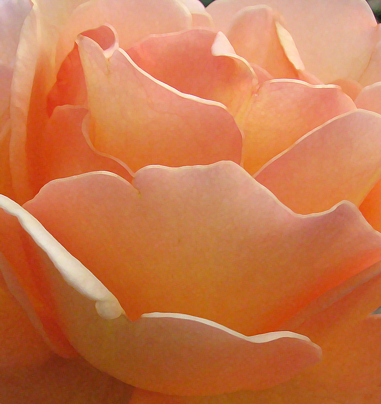 Peaches to CreamEditor's Choice for Artistic Merit
Photographed by Rebecca
Thank you again to everyone that participated in the assignment, I enjoyed seeing your images.
Keith


