Thank you to everyone that participated in the "Color of Light" assignment. The purpose of this assignment was to encourage participants to pay attention to the color of light from your light source, and to use this color to help describe the setting or enhance the mood or feeling of your composition.
Jaime's
Winter Euphoria was a striking image, and Jaime described how he indirectly capitalized on the color of of his light source by shooting under fluorescent lighting, but consciously choosing the "incandescent" white balance setting in his raw processing software. It is OK to change the white balance of an image so that it doesn't match the source, if this change better meets your "artistic vision." This was a striking, well composed and well executed image.
 Winter Euphoria
 Photographed by Jaime Dorotan
I thought Dave Leiker did a great job in his
Lights of the Season image by capitalizing on the warm glow from the incandescent Christmas lights to evoke a warm and welcoming feel to the image of his neighbor's house. Rebecca and I often learn to recognize a photographer's style, even by looking at a small thumbnail of their images. As he often does, Dave used vignetting around the edges of this composition to help direct the viewer's attention towards the primary subject and keep their eyes from wandering out of the scene. This was another well composed and well executed image from Dave.
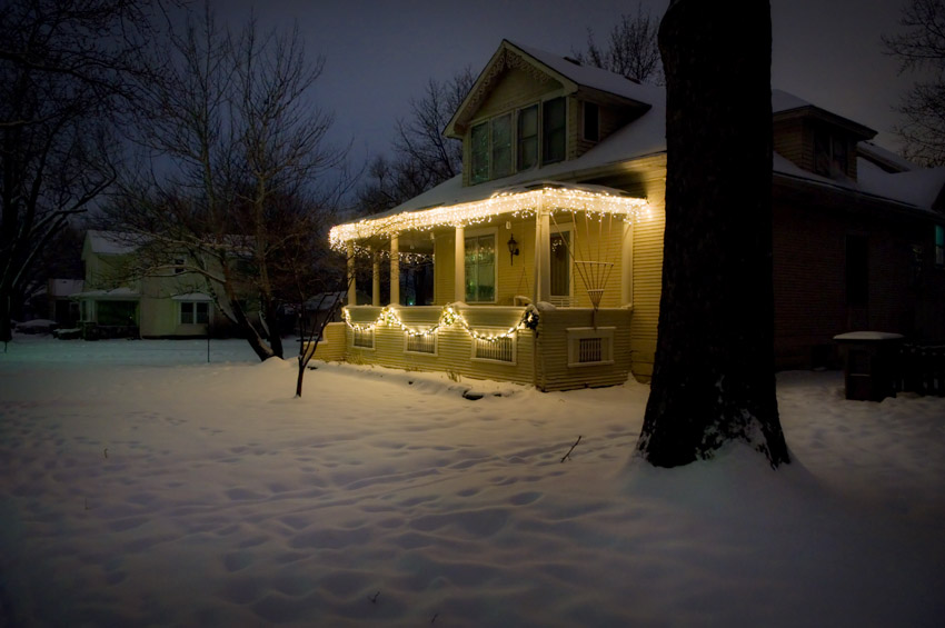 Lights of the Season
 Photographed by Dave Leiker
Rick Pepin's
Tree Shadow image illustrates a similar point to what I was trying to illustrate in my
Evening Light image. Shadows in an image (or objects in the shadows) will usually appear "cooler" than the portions of the scene that are in direct sunlight. If you use white balance settings appropriate for the shadows, the surrounding sunlit areas will appear warm. On the other hand, if you use white balance settings appropriate for the sunlit areas, the shadows will appear cool. Which white balance setting to use will depend on the primary subject, and your "artistic vision." In general, it is best to use daylight setting and let the shadows fall "cool" since this is more "true to life." However, if you are photographing people in the shade, while the rest of the scene is in sunlight, and you choose daylight white balance, the skin tones will look "pasty" and lifeless. In this case, it is often better to use the white balance setting appropriate for shade, and let the surroundings appear "warm." You should make a conscious decision on what white balance setting is best in mixed light, and not just let the camera decide for you.
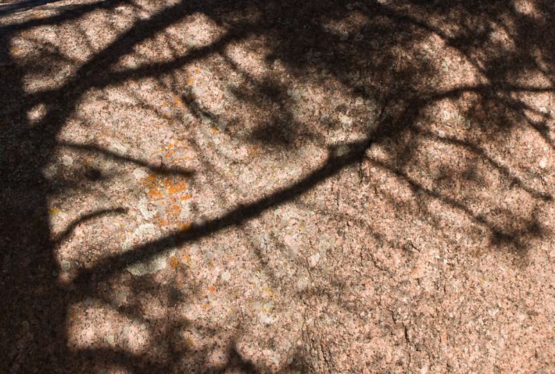 Tree Shadow
 Photographed by Rick Pepin
Sheila Ancheta's
Twilight image was a beautiful composition capitalizing on the warm glow of a dawn sky. By the way, if you ever want to predict what size the moon will be in your images, just divide the focal length of your lens by 109. For example, with a 100mm lens, the size of the moon on your sensor will be 0.92mm (100/109 = 0.92). If you are using a 100mm lens on an APS-C size sensor (the sensor is 15.8mm tall), then the size of the moon in relation to your image height will be 0.92mm divided by 15.8mm or 5.8% of the vertical height of your frame. In the field, I am usually happy with calculating a rough approximation by dividing the focal length by 100 (this makes calculating the value in my head much easier). This means that for a 500mm lens, the size of the moon on the frame will be 5mm (500/100 = 5). If I'm using an APS-C size sensor, this means the height of the moon in this image will be just under 1/3 the height of the frame (5mm/15.8mm = 0.32; however, if I'm doing this calculation in my head, I'll round down the 15.8mm to 15mm, so that dividing 5 by 15 = 1/3). Simple yes?

The point is, that in order to get a large moon in your scene, you will have to either use a very long focal length lens, or crop just a small portion of the frame in order to make the moon appear larger in relation to its surroundings, or use Photoshop to paste in a larger moon.
I thought Sheila's image was a beautiful composition, and commend her for getting out early enough to capture this scene.
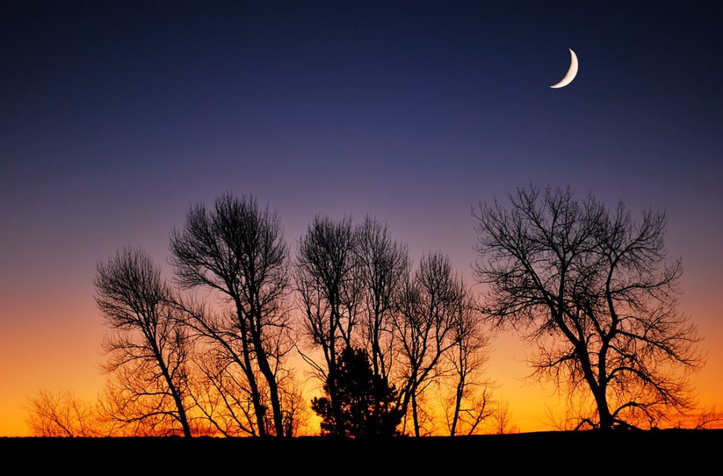 Twilight
 Photographed by Sheila Ancheta
Lars'
outside inside image was one of my favorites from this assignment. It had a warm glow reminiscent of images shot on older Kodak film under incandescent light, and reminded me of an image from a photography instruction book from the 1970s. This image is also a great example of an "implied leading line" like what we talked about in the leading lines assignment. The woman's gaze into the upper right corner of the image creates a strong "implied" leading line. The resulting diagonal line through the image, tracing from the lower left of the frame to the upper right of the frame, makes this potentially "unbalanced" image into a strong composition. The warm incandescent light in this image is one of the primary compositional elements, helping to define the setting and evoke a warm mood that matches the woman's expression. Well done! I've awarded this image
Editor's Choice for Artistic Merit. This image is the most effective submission at using the "color of light" to define the setting and enhance the mood or feeling of the composition.
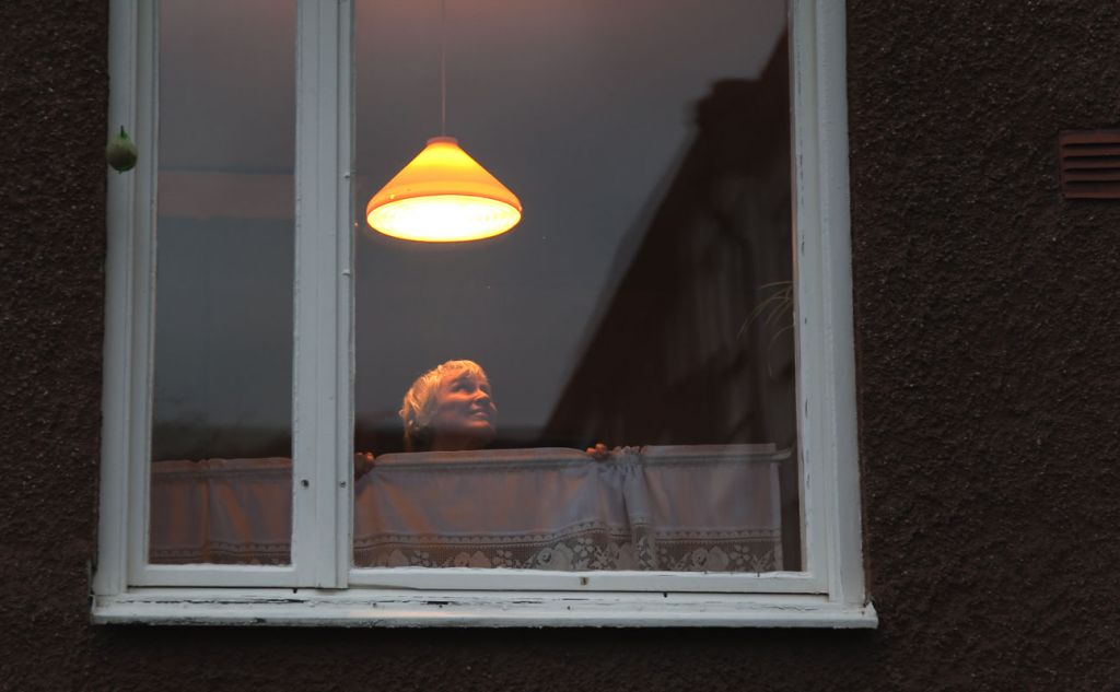 outside inside Editor's Choice for Artistic Merit
Photographed by Lars
Thank you to everyone that chose
Evening Light for the
People's Choice image. I submitted this image more as an example of the varying colors of light, not as anything deserving merit, so I appreciate your votes for this image.
 Evening Light People's Choice
Photographed by Keith
Thank you to everyone that participated in this assignment. Hopefully this assignment helped make you more aware of the "color of light" and provided an opportunity to practice using the light to reinforce a mood or feeling within your composition.
Viewers are encouraged to respond to this thread describing why you like a particular image, or think it was particularly successful at meeting the guidelines of the assignment.
Keith


