The
guidelines for this assignment were to capture an
insightful image that helps the viewer to see and understand something about our world that they otherwise might not have noticed or understood.
Michele's
Egg for two image was simply outstanding. The lighting was exquisite, and served to highlight the curvaceous forms and shapes in the image. The reflective surface highlighted the geometric shapes and curves and complemented the image very well, and the background faded out very nicely so that it didn't detract from the image. Like Dave, I liked thought the concept of cradling the fragile egg in the hard tines of the fork was symbolic. The image could be considered "insightful" because it explored the potential relationships between such diverse objects, and showed us that simple utilitarian objects can become "art" in the hands of an artist. Again, this was an outstanding image. Thank you for sharing your artistic vision and inspiration Michele.
 Egg for two
Photographed by Michele Bollhalder
Michele's
Home Office image was a fun contrast to the simple forms of her previous image. I love the way she set up her "story" in this image, and used the expressions of the woman to convey the frustrations we often feel when trying to work in the typical "home office." I thought the dog added a fun element of discontinuity to the image, and helped us "laugh at ourselves." This was another outstanding image (and one from a series of images similar to it) from our muse Michele.
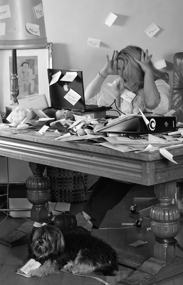 Home Office
Photographed by Michele Bollhalder
I really liked the rich tonalities and colors in Jack's image titled
Yes Father, I Understand... Jack captured a great moment between the two lions, and the strong composition did a great job highlighting the relationship between them. I thought the background was a bit distracting, and when I pulled the image into Photoshop to try to soften the background, I noticed that the website hadn't been reading the color space tag correctly, and that the version I opened into Photoshop had quite different colors (more of a green tint, and colors and contrast that produced a much flatter image). Since I liked the "rich colors and tonality" in the version I had seen on the website, I tried to adjust the Photoshop version to match.
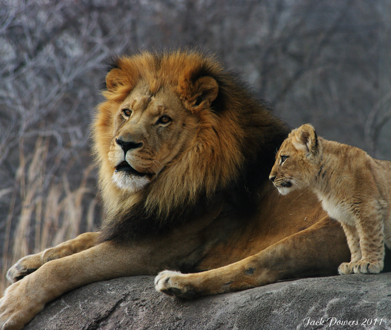 Yes Father, I Understand...
Photographed by Jack Powers
Here's the version I played with in Photoshop. I used the lens blur filter in Photoshop to add a soft blur to the background, and then manually darkened the edges in select places in order to focus the viewer's attention in the center of the frame. NOTE: You will need to view these images in a color managed browser like Safari. If you don't, you will think I've been smoking something since the second image will look WAY too saturated in a browser like Internet Explorer that doesn't have color management.
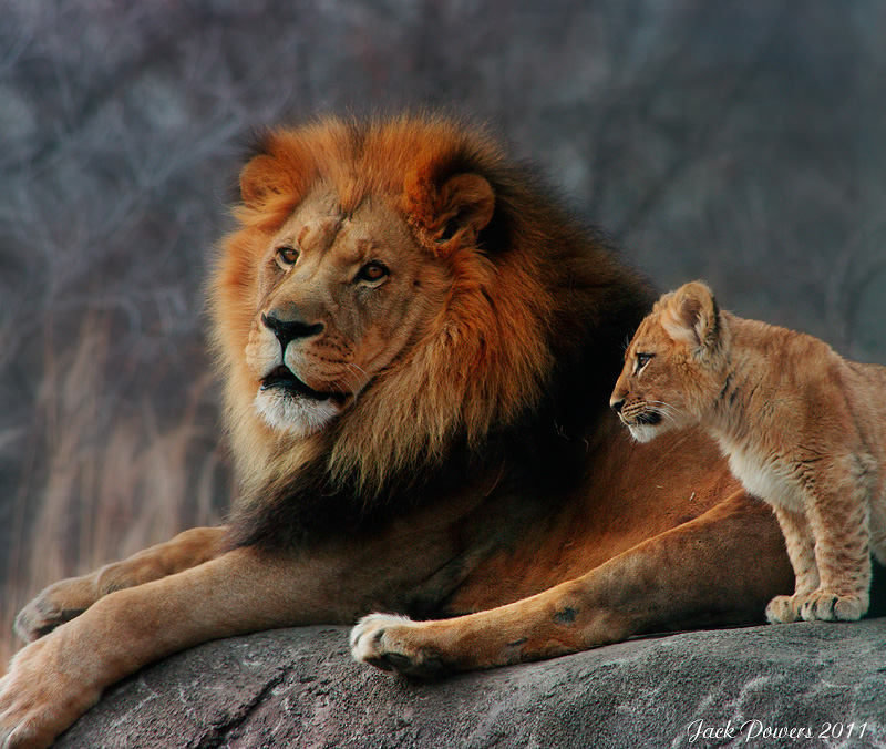 Yes Father, I Understand...
Photographed by Jack Powers, background blurred and vignetted by Keith
Alan did a great job conveying the texture of the stone (concrete?) in his
Big Money image. Both the angle of the light, and good technique were responsible for being able to render this much realistic detail in the rough surface. I can almost feel the rough texture as I imagine rubbing my fingers across the surface.
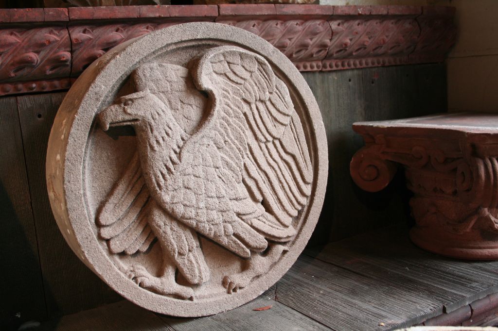 Big Money
Photographed by Alan Albrecht (Ribot)
I had a tough time picking my favorite between Marilyn's two images of the
Navajo rug weaver. In the end, I think I prefer her second image, titled
Alice Turquoise: Demonstrating Spinning of wool because the colors are a bit cleaner, there's no shadow from the flash (the camera was held horizontal instead of vertical so the shadow from the flash fell behind instead of beside the subject) and because it shows more detail and expression in Alice's face.
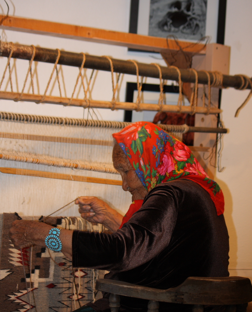 Navajo rug weaver
Photographed by Marilyn McKinney
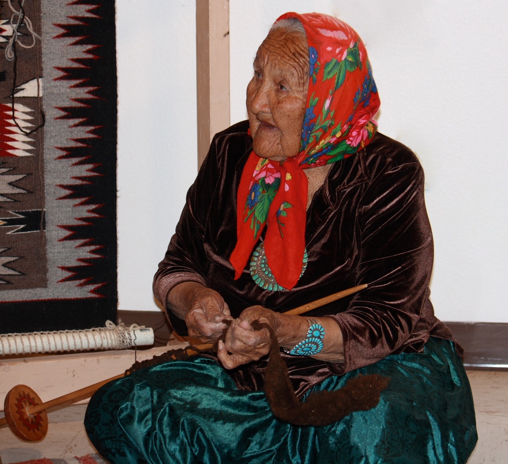 Alice Turquoise: Demonstrating Spinning of wool
Photographed by Marilyn McKinney
My image titled
In Between was just a simple image of moss in the cracks between patio pavers. The exercise did get me looking, and helped me to see this small patch of beauty, with the moss being one of the first signs of Spring in our area.
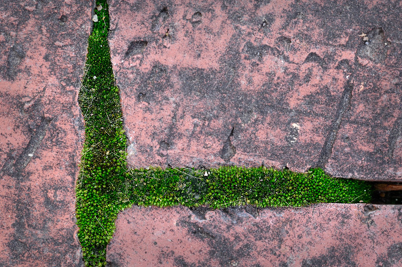 In Between
Photographed by Keith
I love the way Dave processed his
Tin-clad Shed image to give it the feel he was looking for. Dave explained that "this was changed to a black & white image, given a touch of toning, then a bit of the original color blended back in until it had the feeling I wanted." I also like the philosophy that this image conveyed, that "you make do with what you have."
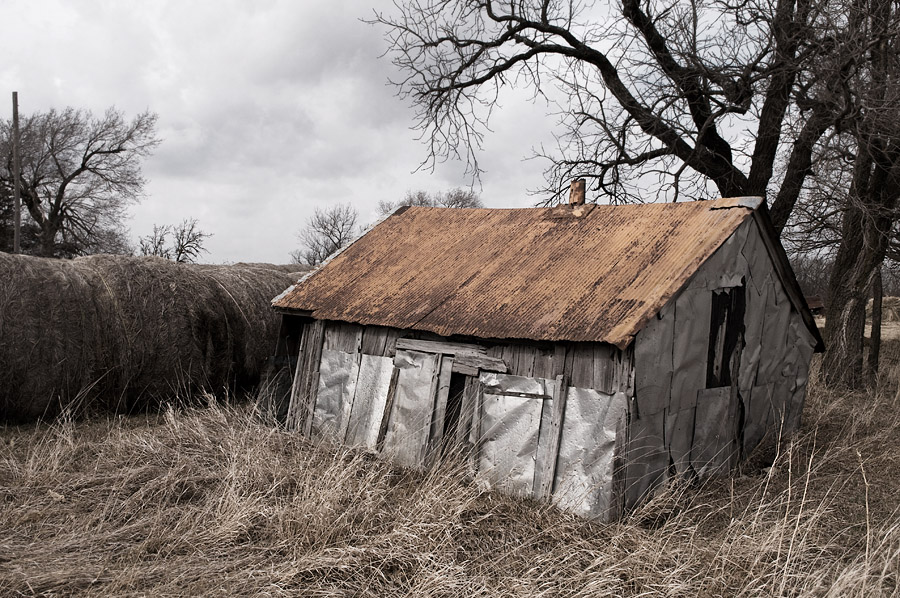 Tin-clad Shed
Photographed by Dave Leiker (prairiedust)
Alan's
Two Worlds was another image that benefited from processing that gave it an artistic effect that enhanced the feeling Alan was trying to create. I like the "gritty" feeling to the image, and the surreal feeling of the watercolor like effect on the skyline. Very nicely done.
 Two Worlds
Photographed by Alan Albrecht (Ribot)
Michele's
Food in the fast lane! series of images were a fun series that explored the effects of using a slow shutter speed to convey the way we rush through life. The second image titled
Faster, faster! was my favorite, with motion blur that perfectly conveyed the feeling of rushing (almost running) down the grocery store aisle. (It makes me smile to think of all the times I've been the one rushing through the aisle, frantically trying to meet my self-imposed timeline so that I can get on to the next task.) The girl's smile added to the image as well, almost as a counterpoint to convey that even though the person in charge was rushing through the task, a child could still take pleasure in the activity. Great job experimenting with this series Michele. (As a "learning point" it is worth mentioning that both Michele and Dave seemed to agree that 1/4 second was about the right speed for "people motion studies.")
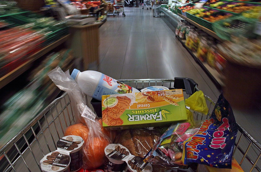 Food in the fast lane!
Photographed by Michele Bollhalder
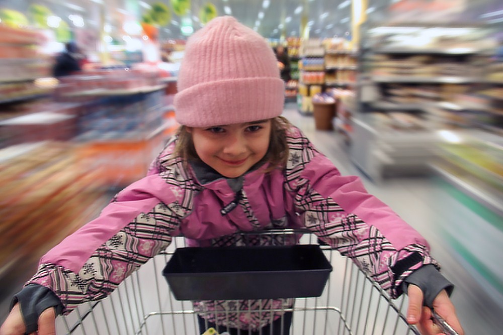 Faster, faster!
Photographed by Michele Bollhalder
Lars'
Running Through Life image was another great commentary on the way that we rush through modern life. I love the fact that Lars captures a lot of his images with the camera in his cell phone. This just goes to show that "artistic vision" is usually much more important, and that we don't need fancy equipment to communicate through our photography.
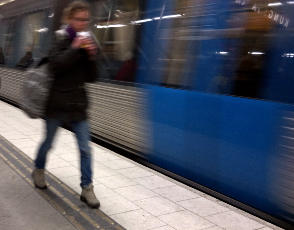 Running Through Life
Photographed by Lars
It seems like a recurring theme throughout the assignment was a commentary on the pace of modern life. Rebecca portrayed the issue from the other perspective, celebrating those who
Take time to care for the babies. I like the natural pose she captured, and the image helped me to realized that it is the day to day "priorities" in our lives that teach our children the most about life.
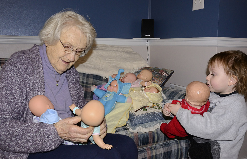 Take time to care for the babies
Photographed by Rebecca
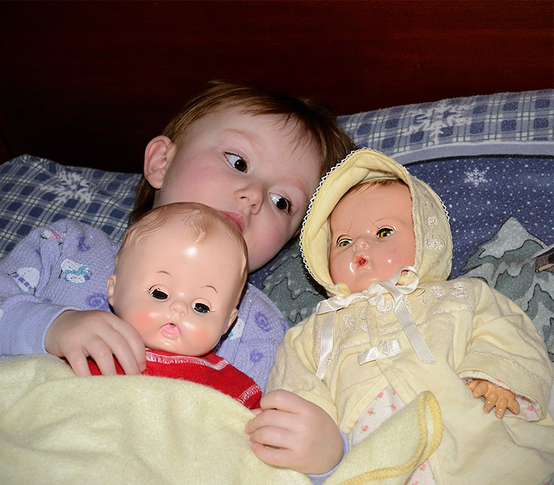 Three Generations of Babies
Photographed by Rebecca
Jaime did a wonderful job capturing the backlighting on the wings of the Ibis in his image titled
"Ibon man may layang lumipad (Even birds are free to fly)..... This scene presented an extremely challenging range of exposure values, and I think Jaime handled it just about right. I suspect that the histogram was probably clipping slightly in the backlit areas of the wings, but the rendering of this image is faithful to how I would have expected the scene to look in real life. That said, I might have tried lowering the exposure a bit for this image in order to preserve a bit more detail in the wings, and then bringing it up a bit more in post processing in order to get the proper rendering. (A quick "sunny sixteen" calculation tells me that the shutter speed I would expect to use for a normal daylight scene with an ISO of 100 and aperture of 2.8 would be about 1/3200, so I would expect that bright highlights shot at ISO 100, f2.8, and a shutter speed of 1/1250 would be a bit over-exposed.) I'm wondering now if a future assignment on "compressed highlights" (a method for handling these extreme exposure ranges) might be a good idea. The strong diagonal from the Ibis to its intended landing spot gives this image a very dynamic feeling. Very nice image Jaime.
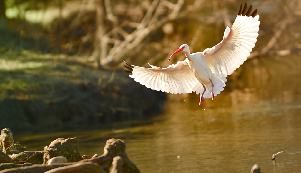 "Ibon man may layang lumipad (Even birds are free to fly).....
Photographed by Jaime Dorotan (girod)
The detail and clarity in Jaime's
"Waiting to exhale" image definitely helped me to see and understand more about the seal? sea lion? than I would have probably seen in real life. Very nicely done!
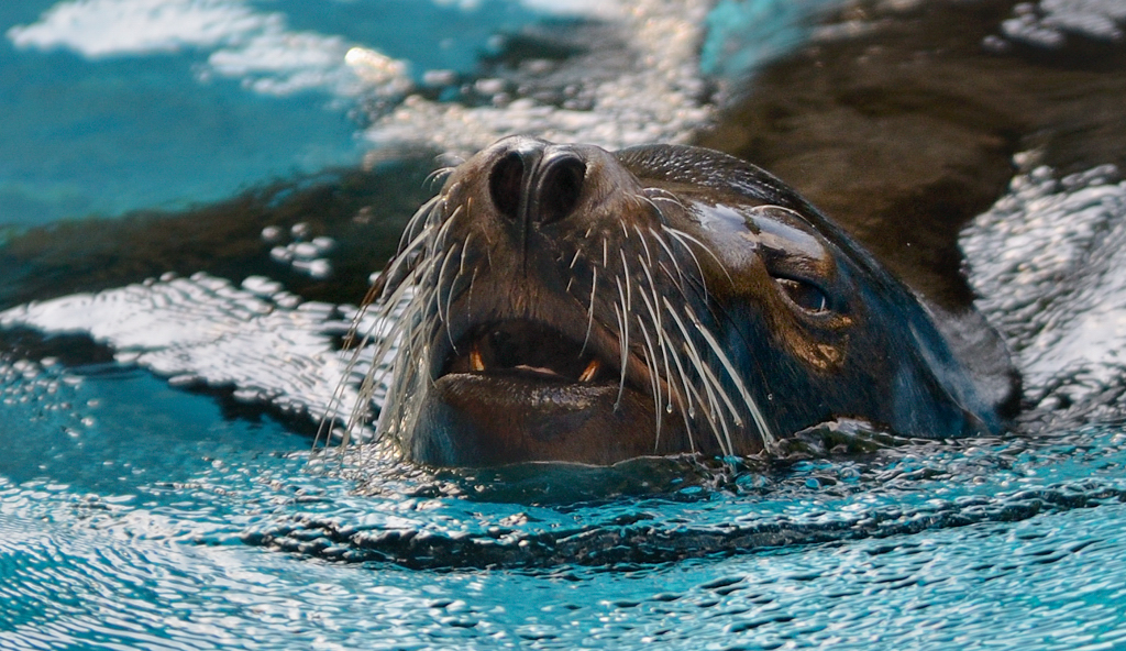 "Waiting to exhale"
Photographed by Jaime Dorotan (girod)
Dave's
Sea Wall #2 image was another great example of the use of a super wide-angle lens to convey the vast distances and scale of life on the plains. Everything about the image was calculated to show that scale, including the tree on the far horizon. To someone that was not familiar with the central plains in the US and Canada, this image would have indeed been "insightful." It does a wonderful job of conveying the feeling of being diminished by those vast distances. Wonderful image Dave, and well deserving of
People's Choice and
Editor's Choice for Artistic Merit.
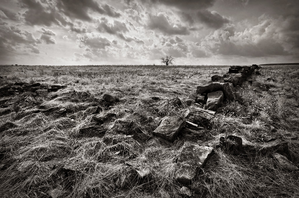 Sea Wall #2 - fixedPeople's Choice
 and
Editor's Choice for Artistic MeritPhotographed by Dave Leiker (prairedust)


