Weve had a couple of easy and fun assignments, so now it is time for a more conceptually challenging assignment. The assignment for the week of 30 Jun through 6 July 2008 is Balance. Balance is one of those Ill know it when I see it concepts that is hard to explain in concrete terms, but is integral to any successful image.
To lay the basic groundwork for understanding balance, it is important to remember that the purpose of your photography is to
communicate. Often, including supporting elements in a composition can help tell a story. It is the placement and prominence of the primary and supporting elements in the composition that affect the balance of the image. Obviously, the larger an object is within the frame, the more prominent it will be. In addition, bright saturated colors will be more prominent then subdued colors and darker tones. The secondary elements in the scene should reinforce the story without being so prominent that they draw attention away from the primary subject.
Placement of the elements within the frame will also affect the prominence of those elements. A key principle is that the main subject should occupy a strong position in the frame. Traditional rules of composition teach the rule of thirds for determining the strong points within the frame. If you divide the scene in the viewfinder into thirds, both horizontally and vertically, you will end up with a grid like this:
The four intersecting points are all areas of strength within the frame, and placing the main subject at one of these intersections can give it more prominence over elements placed in other locations.
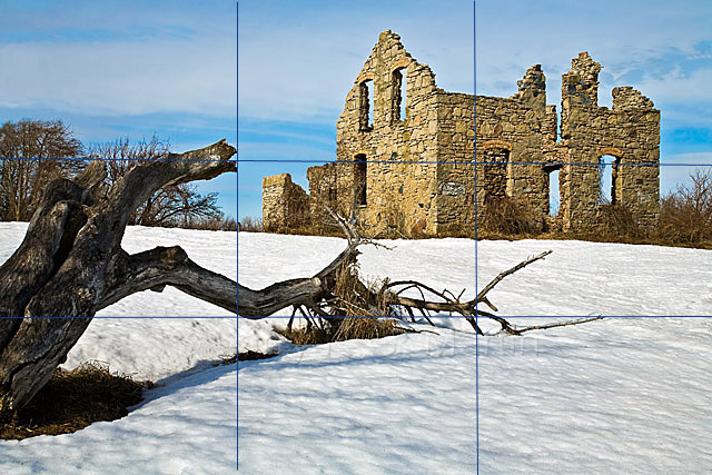
Ill use Larrys Forgotten Farmstead as an example here. The primary subject is the stone farmhouse in the upper right of the scene. The supporting element is the fallen tree, which both acts as a leading line to direct the viewer into the scene, and as a reinforcement of the fallen and forgotten motif of the image. The stone farmhouse obviously has more prominence in the image, not only are the colors brighter and more saturated than the fallen tree, the farmhouse is also placed in a position of strength at the intersection of thirds in the upper right of the frame. Placing a supporting element of slightly less prominence in the lower left of the frame helps to balance the image, so that the right and left sides of the frame are of relatively equal weight.
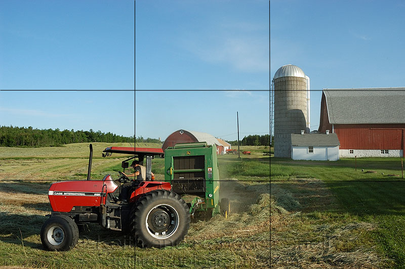
This next image, while not as beautiful a scene as Larrys, also serves to illustrate some of the concepts discussed above. The primary subject (the farmer bailing hay on his tractor) is placed at a rule of thirds position of strength in the lower left corner of the image. The relatively bright saturated colors of the tractor serve to draw the readers attention to the primary subject. The barn is a secondary element which serves to provide context and contributes to the story. With the inclusion of the barn we can see that the farmer is bailing hay on a dairy farm in the Midwestern U.S. The placement of the barn on the right edge of the frame serves to balance the weight of the tractor on the left side of the frame, while the comparatively subdued colors and tonality of the barn ensure that it doesnt draw too much attention away from the primary subject.
These are just two examples to illustrate the concept of "balance." The key is to compose an image that balances the "weight" of the elements across the frame, while using the attributes that affect the prominence of elements to highlight the primary subject. Browsing through the "Landscape and Scenic" album in the gallery will reveal many more images that illustrate the concept of balance.
Back in my film days when I shot primarily with a large format view camera, I found that "balance" was much easier to achieve in my images. Why? Because the image on the ground glass of the large format camera was reversed and upside-down. This "abstracted" the subjects in the viewfinder and enabled the photographer to see them as forms and shapes, and made it much more obvious when the resulting scene was "unbalanced." When you are composing your images for this assignment, try to concentrate on the shapes and forms you are seeing in the viewfinder, and "balancing" these shapes and forms across the frame. Use the attributes we've discussed above to ensure the primary subject remains prominent. Don't be afraid to use subtle photoshop techniques, (dodging and burning, saturating or desaturating) to change the emphasis on key elements in the scene during post processing.
As I said in the beginning, this assignment is conceptually more challenging than some of the previous assignments; however, understanding and utilizing the concept of "balance" will result in a significant improvement in your images.
Have fun. Please upload your images for this assignment to the "balance" album in the "Weekly Assignment" category of the gallery prior to midnight, Mountain Standard Time (GMT -07:00) on Sunday, 6 July.


